Willkommen bei den Top‑Schriften – hier treffen Beliebtheit und Qualität aufeinander. Das sind die in diesem Jahr am häufigsten heruntergeladenen und genutzten Fonts. Wenn Sie sichere Optionen für Logo, Web oder Social suchen, starten Sie hier.
Jeder Top‑Font überzeugt durch Balance, Lesbarkeit und Vielseitigkeit. Sie finden moderne Sans‑Serifs, elegante Scripts, Vintage‑Serifs und minimalistische Displays.
-
( Iconian Fonts - Daniel Zadorozny - www.iconian.com )
A bold, rounded font with a playful and modern aesthetic.
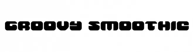 Herunterladen 82 Downloads@WebFont
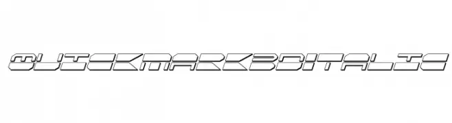
 -
![QuickMark 3D Italic Frei Schriftart Herunterladen]() Herunterladen 82 Downloads@WebFont
Herunterladen 82 Downloads@WebFont -
( Fonts by Peter Wiegel - www.peter-wiegel.de - Personal-use only. For commercial use please contact owner. )
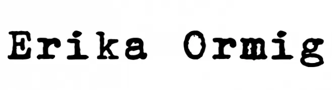
A vintage typewriter-style font with a distressed, hand-crafted look.
![Erika Ormig Frei Schriftart Herunterladen]() Herunterladen 82 Downloads@WebFont
Herunterladen 82 Downloads@WebFont -
( Fonts by CalligraphyFonts - Personal-use only. For commercial use please contact owner. )
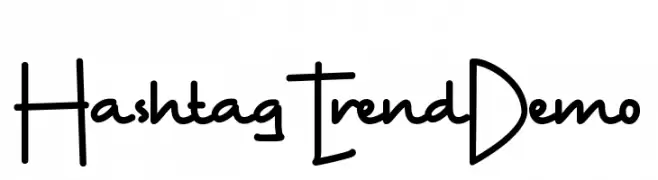
A playful, casual handwritten font with smooth curves and a friendly appearance.
![Hashtag Trend Demo Frei Schriftart Herunterladen]() Herunterladen 82 Downloads@WebFont
Herunterladen 82 Downloads@WebFont -
( Fonts by Kat`s Fun Fonts - Personal-use only. For commercial use please contact owner. )
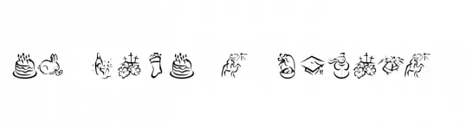
A decorative font with holiday-themed icons for various celebrations.
![KR Pick A Holiday 2 Frei Schriftart Herunterladen]() Herunterladen 82 Downloads@WebFont
Herunterladen 82 Downloads@WebFont -
( Iconian Fonts - Daniel Zadorozny - www.iconian.com )
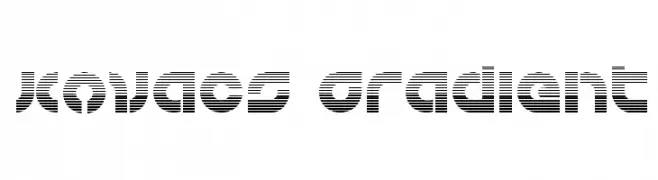
A bold, striped font with a futuristic and digital aesthetic.
![Kovacs Gradient Frei Schriftart Herunterladen]() Herunterladen 82 Downloads@WebFont
Herunterladen 82 Downloads@WebFont -
( Iordanis Passas - http:/ip-art.info )
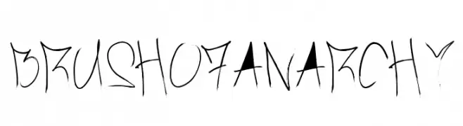
A rebellious, brush-stroke font with jagged edges and dynamic energy.
![Brush_Of_Anarchy Frei Schriftart Herunterladen]() Herunterladen 82 Downloads@WebFont
Herunterladen 82 Downloads@WebFont -
( Omegaville - B.J. Winzer )
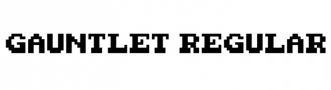
A bold, pixelated font with a retro, video game-inspired design.
![Gauntlet Regular Frei Schriftart Herunterladen]() Herunterladen 82 Downloads@WebFont
Herunterladen 82 Downloads@WebFont -
( Fonts by StringLabs - stringlabscreative.com - Personal-use only. For commercial use please contact owner. )
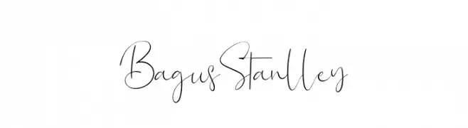
A delicate and flowing script font with elegant cursive letterforms.
![Bagus Stanlley Frei Schriftart Herunterladen]() Herunterladen 82 Downloads@WebFont
Herunterladen 82 Downloads@WebFont -
( Fonts by Katatrad Team - Personal-use only. For commercial use please contact owner. )
A sleek, extra light italic font with a modern and elegant style.
![Readiness ExtraLight Italic Frei Schriftart Herunterladen]() Herunterladen 82 Downloads@WebFont
Herunterladen 82 Downloads@WebFont -
( Fonts by Daniel Zadorozny - www.iconian.com - Personal-use only. For commercial use please contact owner. )
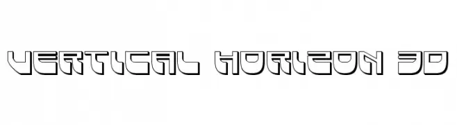
A futuristic, geometric font with a 3D effect and bold outlines.
![Vertical Horizon 3D Frei Schriftart Herunterladen]() Herunterladen 82 Downloads@WebFont
Herunterladen 82 Downloads@WebFont -
( Fonts by Union Sozialer Einrichtungen gGmbH - Mediengestaltung - Personal-use only. For commercial use please contact owner. )
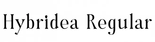
A modern serif font with elegant curves and moderate contrast.
![Hybridea Regular Frei Schriftart Herunterladen]() Herunterladen 82 Downloads@WebFont
Herunterladen 82 Downloads@WebFont -
( Iconian Fonts - Daniel Zadorozny - www.iconian.com )
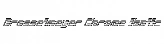
A futuristic, italic font with a three-dimensional line effect.
![Drosselmeyer Chrome Italic Frei Schriftart Herunterladen]() Herunterladen 82 Downloads@WebFont
Herunterladen 82 Downloads@WebFont -
( ADT )
A playful and jagged font with bold, irregular shapes and dynamic energy.
![Le Joel Frei Schriftart Herunterladen]() Herunterladen 82 Downloads@WebFont
Herunterladen 82 Downloads@WebFont -
( Fonts by Edric Studio - Personal-use only. For commercial use please contact owner. )
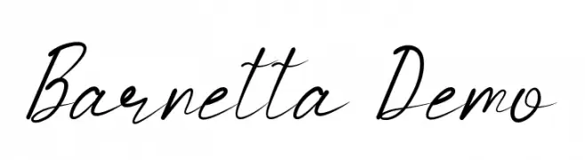
A graceful, cursive script font with elegant, flowing lines.
![Barnetta Demo Frei Schriftart Herunterladen]() Herunterladen 82 Downloads@WebFont
Herunterladen 82 Downloads@WebFont -
( Fonts by Get Studio - Hermansyah , - Personal-use only. For commercial use please contact owner. )
A bold, flowing script font with elegant, connected characters.
![Selphia Frei Schriftart Herunterladen]() Herunterladen 82 Downloads@WebFont
Herunterladen 82 Downloads@WebFont -
( DrJohnDee - www.fontspace.com/profile/drjohndee )
A bold, geometric stencil-style font with unique cutouts.
![CheGuevara Barry Blue Frei Schriftart Herunterladen]() Herunterladen 82 Downloads@WebFont
Herunterladen 82 Downloads@WebFont -
( Fonts by Michael Muranaka - muraknockout.com - Personal-use only. For commercial use please contact owner. )
A bold, geometric font with a modern, tech-inspired design.
![Gorila Bold Frei Schriftart Herunterladen]() Herunterladen 82 Downloads@WebFont
Herunterladen 82 Downloads@WebFont -
( Fonts by www.junkohanhero.com - Personal-use only. For commercial use please contact owner. )
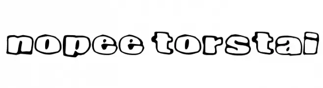
A playful, bold font with a bubble-like outline and cartoonish style.
![Nopee Torstai Frei Schriftart Herunterladen]() Herunterladen 82 Downloads@WebFont
Herunterladen 82 Downloads@WebFont -
( Fonts by Vladimir Nikolic - Personal-use only. For commercial use please contact owner. )
A bold, modern font with a geometric structure and consistent thickness.
![Congestion Regular Frei Schriftart Herunterladen]() Herunterladen 82 Downloads@WebFont
Herunterladen 82 Downloads@WebFont -
( Fonts by Tyler Finck )
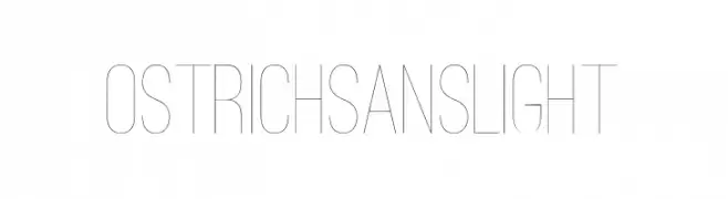
A modern, minimalist font with tall, slender characters and uniform stroke width.
![Ostrich Sans Light Frei Schriftart Herunterladen]() Herunterladen 82 Downloads@WebFont
Herunterladen 82 Downloads@WebFont -
( Fonts by Jan Fromm - Personal-use only. For commercial use please contact owner. )
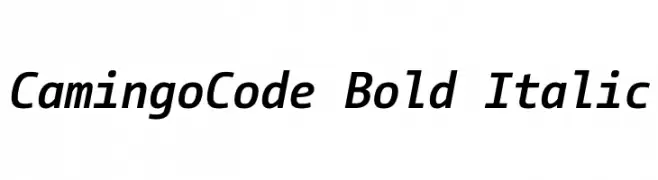
A modern, bold, italic monospaced font with medium contrast, perfect for coding.
![CamingoCode Bold Italic Frei Schriftart Herunterladen]() Herunterladen 82 Downloads@WebFont
Herunterladen 82 Downloads@WebFont -
( Fonts by Digi Temply )
A modern dashed inline font with a geometric structure.
![LesPaul-DashedInline Frei Schriftart Herunterladen]() Herunterladen 82 Downloads@WebFont
Herunterladen 82 Downloads@WebFont -
( Fonts by a Neale Davidson - www.pixelsagas.com. Personal-use only. For commercial use please contact owner. )
A bold, italicized, and decorative font with sharp, angular strokes and a dynamic appearance.
![Iokharic Bold Italic Frei Schriftart Herunterladen]() Herunterladen 82 Downloads@WebFont
Herunterladen 82 Downloads@WebFont -
( Fonts by Debut Studio - Ari Fadli - Personal-use only. For commercial use please contact owner. )
A dynamic, expressive script font with fluid, cursive strokes and a handcrafted feel.
![Hustler Frei Schriftart Herunterladen]() Herunterladen 82 Downloads@WebFont
Herunterladen 82 Downloads@WebFont -
( EvasUniqueFonts - Eva Barabas - www.etsy.com/ie/shop/DigitalTypefaceS )
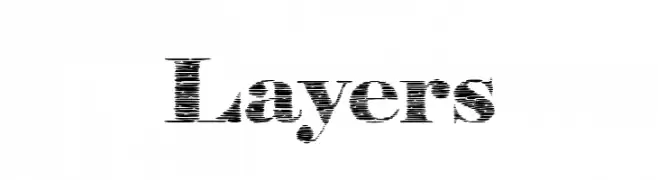
A textured, layered font with a vintage, hand-drawn aesthetic.
![Layers Frei Schriftart Herunterladen]() Herunterladen 82 Downloads@WebFont
Herunterladen 82 Downloads@WebFont -
( Iconian Fonts - Daniel Zadorozny - www.iconian.com )
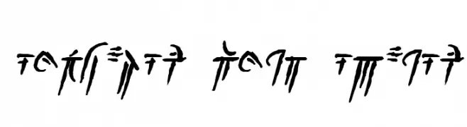
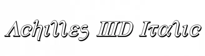
A bold, italicized font with a 3D effect and sharp serifs.
![Achilles 3D Italic Frei Schriftart Herunterladen]() Herunterladen 82 Downloads@WebFont
Herunterladen 82 Downloads@WebFont -
( Fonts by Misti's Fonts )
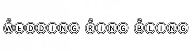
A decorative font with characters encased in diamond-topped rings, perfect for elegant occasions.
![Wedding Ring Bling Frei Schriftart Herunterladen]() Herunterladen 82 Downloads@WebFont
Herunterladen 82 Downloads@WebFont -
( Fonts by Letterena Studios - letterena.com - Personal-use only. For commercial use please contact owner. )
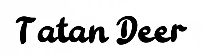
A bold, playful script font with thick, rounded strokes and a whimsical style.
![Tatan Deer Frei Schriftart Herunterladen]() Herunterladen 82 Downloads@WebFont
Herunterladen 82 Downloads@WebFont -
( Fonts by CannotIntoSpaceFonts - KineticPlasma Fonts - Personal-use only. For commercial use please contact owner. )
A playful, ultra-light handwritten font with a whimsical and airy style.
![HoneyBee UltraLight Frei Schriftart Herunterladen]() Herunterladen 82 Downloads@WebFont
Herunterladen 82 Downloads@WebFont -
( Daddi Daryawan )
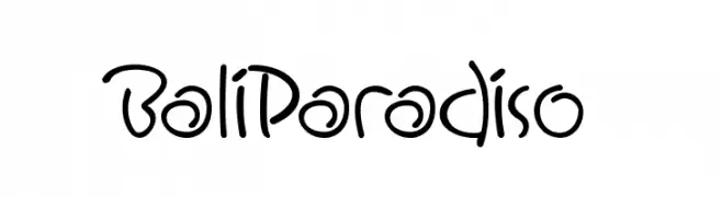
A playful and casual handwritten font with fluid, organic letterforms.
![BaliParadiso Frei Schriftart Herunterladen]() Herunterladen 82 Downloads@WebFont
Herunterladen 82 Downloads@WebFont -
( weknow - Wino S Kadir - www.creativefabrica.com/designer/weknow/ )
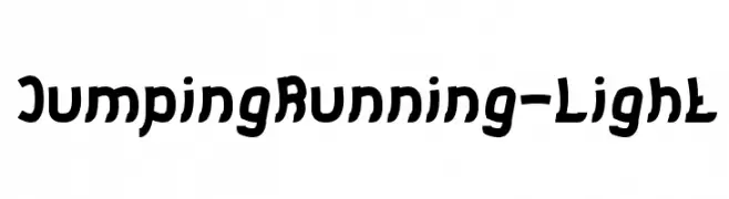
A bold, playful font with dynamic, irregular letterforms.
![Jumping Running-Light Frei Schriftart Herunterladen]() Herunterladen 82 Downloads@WebFont
Herunterladen 82 Downloads@WebFont -
( Fonts by Adult Ramblings - Anastacia E. Zittel - Personal-use only. For commercial use please contact owner. )
A collection of intricate and ornate decorative symbols and shapes.
![AEZ deco dings Frei Schriftart Herunterladen]() Herunterladen 82 Downloads@WebFont
Herunterladen 82 Downloads@WebFont -
( MrtheNoronha - Daniel Noronha )
A bold, geometric font with artistic negative space and circular elements.
![Nameator Regular Frei Schriftart Herunterladen]() Herunterladen 82 Downloads@WebFont
Herunterladen 82 Downloads@WebFont -
( Pisto Casero - Gilberto Moya Perona - www.pistocasero.com )
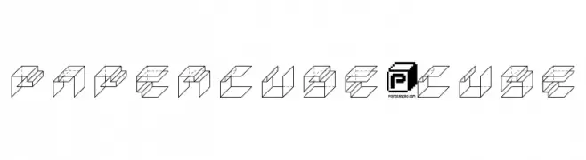
A 3D geometric font with a modern, playful design.
![PaperCube-Cube Frei Schriftart Herunterladen]() Herunterladen 82 Downloads@WebFont
Herunterladen 82 Downloads@WebFont


Welche Schriften sind gerade am populärsten?
Poppins, Roboto, Montserrat, Open Sans und Lato sind wegen ihrer klaren Formen und breiten Einsetzbarkeit sehr gefragt – von Markenauftritt über Landingpages bis hin zu Postern.
Welche Fonts eignen sich für Logos?
Geometrische Sans‑Serifs (z. B. Poppins, Familien im Gotham‑Stil) sind ein häufiger Griff für sauberes, skalierbares Branding. Für eine persönlichere Note bleiben Scripts und Handschrift‑Stile beliebt. Kombinieren Sie einen prägnanten Headline‑Font mit einer neutralen Brotschrift für Wiedererkennung und Harmonie.
Wie oft wird die Top‑Liste aktualisiert?
Regelmäßig – basierend auf realen Downloads und Interaktionen. Schauen Sie öfter vorbei, um aufstrebende Favoriten früh zu entdecken.
💡 Tipp: Seite bookmarken – Trends wechseln schnell, und heutige Top‑Schriften inspirieren morgen vielleicht das Rebranding.