Willkommen bei den Top‑Schriften – hier treffen Beliebtheit und Qualität aufeinander. Das sind die in diesem Jahr am häufigsten heruntergeladenen und genutzten Fonts. Wenn Sie sichere Optionen für Logo, Web oder Social suchen, starten Sie hier.
Jeder Top‑Font überzeugt durch Balance, Lesbarkeit und Vielseitigkeit. Sie finden moderne Sans‑Serifs, elegante Scripts, Vintage‑Serifs und minimalistische Displays.
-
( Fonts by Apostrophic Lab )
A bold, narrow serif font with strong vertical emphasis and consistent stroke width.
 Herunterladen 484 Downloads@WebFont
 -
( Copyright )
A modern, clean sans-serif typeface designed for clarity and readability.
![Noto Sans Tamil Regular Frei Schriftart Herunterladen]() Herunterladen 484 Downloads@WebFont
Herunterladen 484 Downloads@WebFont -
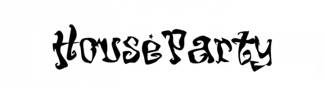
Schriftart von NicholasJudy456. For commercial use please contact the owner.
![HouseParty Frei Schriftart Herunterladen]() Herunterladen 484 Downloads@WebFont
Herunterladen 484 Downloads@WebFont -
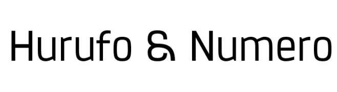
( Fonts by a Situjuh Nazara - c7n1.wordpress.com. Personal-use only. For commercial use please contact owner. )
A modern, geometric sans-serif font with balanced character spacing.
![Hurufo & Numero Frei Schriftart Herunterladen]() Herunterladen 484 Downloads@WebFont
Herunterladen 484 Downloads@WebFont -
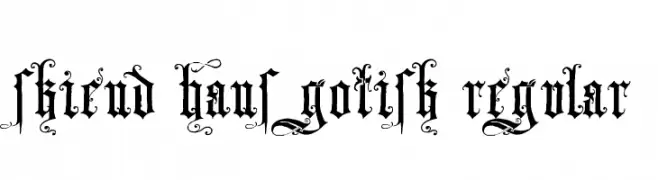
![Skjend Hans Gotisk Regular Frei Schriftart Herunterladen]() Herunterladen 484 Downloads@WebFont
Herunterladen 484 Downloads@WebFont -
-
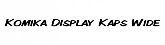
( Fonts by Apostrophic Lab )
A bold, playful font with a handwritten style and wide, rounded letters.
![Komika Display Kaps Wide Frei Schriftart Herunterladen]() Herunterladen 484 Downloads@WebFont
Herunterladen 484 Downloads@WebFont -
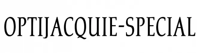
( Fonts by Castcraft Software - opti.netii.net - check the website before use )
A classic serif font with elegant, elongated strokes and subtle curves.
![OPTIJacquie-Special Frei Schriftart Herunterladen]() Herunterladen 484 Downloads@WebFont
Herunterladen 484 Downloads@WebFont -
![hardcore_pen Frei Schriftart Herunterladen]() Herunterladen 484 Downloads@WebFont
Herunterladen 484 Downloads@WebFont -
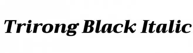
( Copyright (c) 2015, Cadson Demak (info@cadsondemak.com) )
A bold, italic serif font with high contrast and elegant style.
![Trirong Black Italic Frei Schriftart Herunterladen]() Herunterladen 484 Downloads@WebFont
Herunterladen 484 Downloads@WebFont -
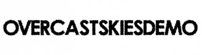
( Fonts by Kevin Christopher - www.kcfonts.com )
A bold, textured font with a hand-drawn, irregular edge style.
![OvercastSkiesDemo Frei Schriftart Herunterladen]() Herunterladen 484 Downloads@WebFont
Herunterladen 484 Downloads@WebFont

Welche Schriften sind gerade am populärsten?
Poppins, Roboto, Montserrat, Open Sans und Lato sind wegen ihrer klaren Formen und breiten Einsetzbarkeit sehr gefragt – von Markenauftritt über Landingpages bis hin zu Postern.
Welche Fonts eignen sich für Logos?
Geometrische Sans‑Serifs (z. B. Poppins, Familien im Gotham‑Stil) sind ein häufiger Griff für sauberes, skalierbares Branding. Für eine persönlichere Note bleiben Scripts und Handschrift‑Stile beliebt. Kombinieren Sie einen prägnanten Headline‑Font mit einer neutralen Brotschrift für Wiedererkennung und Harmonie.
Wie oft wird die Top‑Liste aktualisiert?
Regelmäßig – basierend auf realen Downloads und Interaktionen. Schauen Sie öfter vorbei, um aufstrebende Favoriten früh zu entdecken.
💡 Tipp: Seite bookmarken – Trends wechseln schnell, und heutige Top‑Schriften inspirieren morgen vielleicht das Rebranding.