Willkommen bei den Top‑Schriften – hier treffen Beliebtheit und Qualität aufeinander. Das sind die in diesem Jahr am häufigsten heruntergeladenen und genutzten Fonts. Wenn Sie sichere Optionen für Logo, Web oder Social suchen, starten Sie hier.
Jeder Top‑Font überzeugt durch Balance, Lesbarkeit und Vielseitigkeit. Sie finden moderne Sans‑Serifs, elegante Scripts, Vintage‑Serifs und minimalistische Displays.
-
( Fonts by Andrey Font Design - Personal-use only. For commercial use please contact owner. )
A playful, script-style font with flowing, interconnected letters.
 Herunterladen 81 Downloads@WebFont
 -
( Fonts by Vunira Design - Personal-use only. For commercial use please contact owner. )
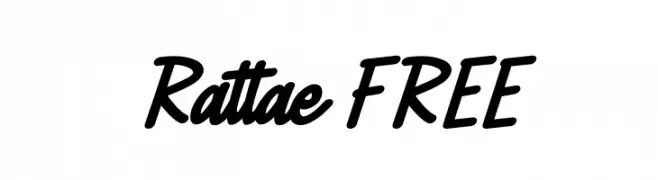
A bold, dynamic script font with fluid, connected letterforms.
![Rattae FREE Frei Schriftart Herunterladen]() Herunterladen 81 Downloads@WebFont
Herunterladen 81 Downloads@WebFont -
( Deb Kerkhof - www.xquizart.blogspot.com )
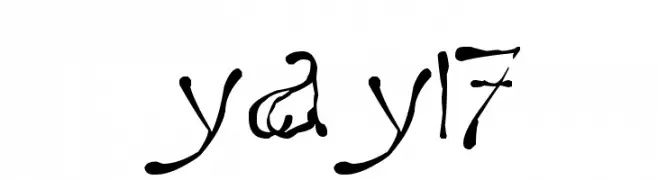
A whimsical, decorative font with star-like embellishments and a hand-drawn appearance.
![yay17 Frei Schriftart Herunterladen]() Herunterladen 81 Downloads@WebFont
Herunterladen 81 Downloads@WebFont -
( Noto is a trademark of Google Inc. Noto fonts are open source. All Noto fonts are published under the SIL Open Font License, Version 1.1 )
A bold, semi-condensed sans-serif font with modern, clean lines.
![Noto Sans Devanagari UI SemiCondensed Bold Frei Schriftart Herunterladen]() Herunterladen 81 Downloads@WebFont
Herunterladen 81 Downloads@WebFont -
( Fonts by Woodcutter )
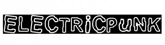
A bold, playful font with a hand-drawn, outlined style.
![electric Punk Frei Schriftart Herunterladen]() Herunterladen 81 Downloads@WebFont
Herunterladen 81 Downloads@WebFont -
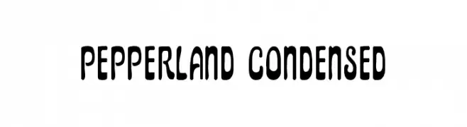
( Fonts by Daniel Zadorozny - www.iconian.com - Personal-use only. For commercial use please contact owner. )
A playful, condensed font with rounded, elongated shapes and consistent style.
![Pepperland Condensed Frei Schriftart Herunterladen]() Herunterladen 81 Downloads@WebFont
Herunterladen 81 Downloads@WebFont -
( Fonts by VÃt ÄŒondák - Personal-use only. For commercial use please contact owner. )
A decorative font with a hieroglyphic-inspired design and rounded edges.
![Hieroglyphos Frei Schriftart Herunterladen]() Herunterladen 81 Downloads@WebFont
Herunterladen 81 Downloads@WebFont -
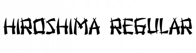
( Fonts by Vladimir Nikolic - https://www.creativefabrica.com/product/educated-deers/ref/144265/ - Personal-use only. For commercial use please contact owner. )
A bold, edgy font with sharp, angular strokes and a graffiti-like style.
![Hiroshima Regular Frei Schriftart Herunterladen]() Herunterladen 81 Downloads@WebFont
Herunterladen 81 Downloads@WebFont -
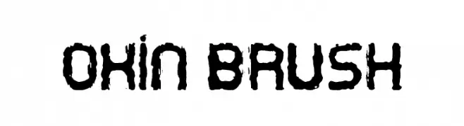
( Fonts by Carlos Daniel Matteoli - Qbotype Fonts - http://carlosmatteoli.wix.com/qbotype. Personal-use only. For commercial use please contact owner. )
A bold, textured brush font with rugged, hand-painted strokes.
![Oxin Brush Frei Schriftart Herunterladen]() Herunterladen 81 Downloads@WebFont
Herunterladen 81 Downloads@WebFont -
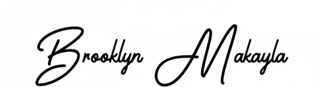
( Fonts by Kotak Kuning Studio - kotakkuning.com - Personal-use only. For commercial use please contact owner. )
A modern cursive font with elegant, flowing strokes.
![Brooklyn Makayla Frei Schriftart Herunterladen]() Herunterladen 81 Downloads@WebFont
Herunterladen 81 Downloads@WebFont -
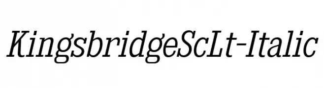
( Fonts by Typodermic Fonts )
An elegant serif font with an italic slant, featuring moderate contrast and a classic style.
![KingsbridgeScLt-Italic Frei Schriftart Herunterladen]() Herunterladen 81 Downloads@WebFont
Herunterladen 81 Downloads@WebFont -
( Iconian Fonts - Daniel Zadorozny - www.iconian.com )
A bold, futuristic font with geometric and industrial design elements.
![Drone Tracker Laser Frei Schriftart Herunterladen]() Herunterladen 81 Downloads@WebFont
Herunterladen 81 Downloads@WebFont -
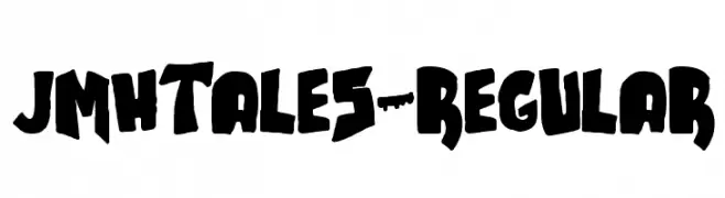
( Fonts by joorgemoron - Personal-use only. For commercial use please contact owner. )
A bold, graffiti-inspired font with thick, uneven strokes and a hand-drawn feel.
![JMHTALES-Regular Frei Schriftart Herunterladen]() Herunterladen 81 Downloads@WebFont
Herunterladen 81 Downloads@WebFont -
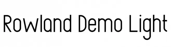
( Fonts by Edric Studio - Personal-use only. For commercial use please contact owner. )
A modern, geometric sans-serif font with a sleek and uniform appearance.
![Rowland Demo Light Frei Schriftart Herunterladen]() Herunterladen 81 Downloads@WebFont
Herunterladen 81 Downloads@WebFont -
( Fonts by Bangkit Tri Setiadi - Personal-use only. For commercial use please contact owner. )
A playful, casual handwritten font with fluid strokes and a friendly appearance.
![Berlion Regular Frei Schriftart Herunterladen]() Herunterladen 81 Downloads@WebFont
Herunterladen 81 Downloads@WebFont -
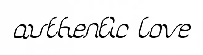
( Fonts by Wino S Kadir - weknow - www.revolge.com/shop/weknow/ - Personal-use only. For commercial use please contact owner. )
A flowing, cursive script font with interconnected letters and artistic flair.
![authentic love Frei Schriftart Herunterladen]() Herunterladen 81 Downloads@WebFont
Herunterladen 81 Downloads@WebFont -
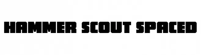
( Fonts by Iconian Fonts - Daniel Zadorozny - Personal-use only. For commercial use please contact owner. )
A bold, geometric font with a modern, industrial feel.
![Hammer Scout Spaced Frei Schriftart Herunterladen]() Herunterladen 81 Downloads@WebFont
Herunterladen 81 Downloads@WebFont -
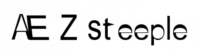
( Fonts by Adult Ramblings - Anastacia E. Zittel - Personal-use only. For commercial use please contact owner. )
A modern, playful font with bold characters and high contrast.
![AEZ steeple Frei Schriftart Herunterladen]() Herunterladen 81 Downloads@WebFont
Herunterladen 81 Downloads@WebFont -
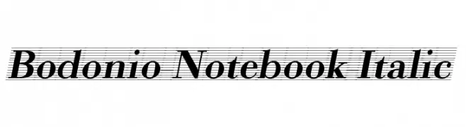
( Fonts by vladimirnikolic - Personal-use only. For commercial use please contact owner. )
A classic serif font with high contrast and elegant italic styling.
![Bodonio Notebook Italic Frei Schriftart Herunterladen]() Herunterladen 81 Downloads@WebFont
Herunterladen 81 Downloads@WebFont -
( Noto is a trademark of Google Inc. Noto fonts are open source. All Noto fonts are published under the SIL Open Font License, Version 1.1 )
Modern sans-serif Hebrew font with semi-condensed style.
![Noto Sans Hebrew SemiCondensed SemiBold Frei Schriftart Herunterladen]() Herunterladen 81 Downloads@WebFont
Herunterladen 81 Downloads@WebFont -
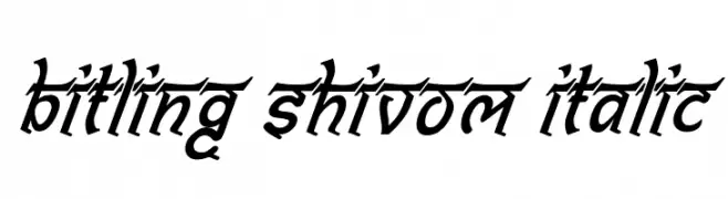
( Rajendra Bitling - www.rbitling.com )
A dynamic, italicized font with sharp, angular strokes and dramatic flair.
![Bitling shivom Italic Frei Schriftart Herunterladen]() Herunterladen 81 Downloads@WebFont
Herunterladen 81 Downloads@WebFont -
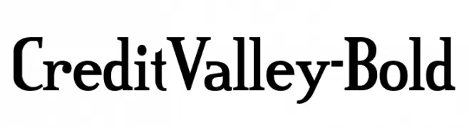
( Fonts by Typodermic Fonts - Raymond Larabie - Personal-use only. For commercial use please contact owner. )
A bold serif font with strong strokes and a modern yet classic appeal.
![CreditValley-Bold Frei Schriftart Herunterladen]() Herunterladen 81 Downloads@WebFont
Herunterladen 81 Downloads@WebFont -
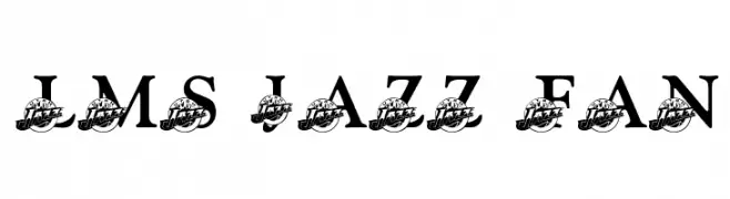
( London's Letters - www.londonsletters.com/ )
A bold, dynamic font with a sporty, energetic style.
![LMS Jazz Fan Frei Schriftart Herunterladen]() Herunterladen 81 Downloads@WebFont
Herunterladen 81 Downloads@WebFont -
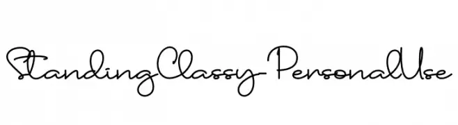
( Fonts by Haksen Studio - Sarwo Edhi Prayitno - Personal-use only. For commercial use please contact owner. )
A sophisticated cursive script with elegant loops and flowing connections.
![Standing Classy - Personal Use Frei Schriftart Herunterladen]() Herunterladen 81 Downloads@WebFont
Herunterladen 81 Downloads@WebFont -
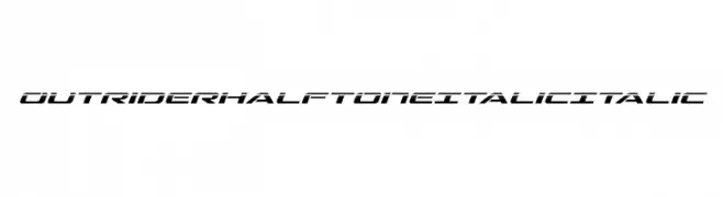
( Iconian Fonts - Daniel Zadorozny - www.iconian.com )
A dynamic, italicized font with a futuristic halftone effect.
![Outrider Halftone Italic Italic Frei Schriftart Herunterladen]() Herunterladen 81 Downloads@WebFont
Herunterladen 81 Downloads@WebFont -
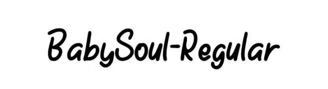
( Fonts by Forberas Club - Personal-use only. For commercial use please contact owner. )
A playful, handwritten font with smooth, rounded edges and a casual flow.
![BabySoul-Regular Frei Schriftart Herunterladen]() Herunterladen 81 Downloads@WebFont
Herunterladen 81 Downloads@WebFont -
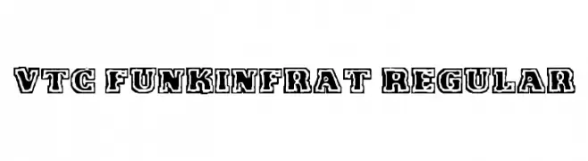
( Fonts by Vigilante Typeface Corporation Larry Yerkes. Personal-use only. For commercial use please contact owner. )
A bold, outlined font with a playful, collegiate style.
![VTC FunkinFrat Regular Frei Schriftart Herunterladen]() Herunterladen 81 Downloads@WebFont
Herunterladen 81 Downloads@WebFont -
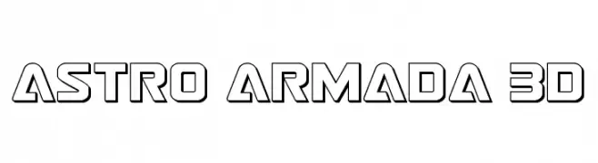
( Fonts by Daniel Zadorozny - www.iconian.com - Personal-use only. For commercial use please contact owner. )
A bold, futuristic font with a 3D outline effect and geometric design.
![Astro Armada 3D Frei Schriftart Herunterladen]() Herunterladen 81 Downloads@WebFont
Herunterladen 81 Downloads@WebFont -
( Fonts by Faqih Fawaji - Personal-use only. For commercial use please contact owner. )
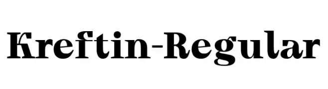
A bold, serif font with strong strokes and a modern twist.
![Kreftin-Regular Frei Schriftart Herunterladen]() Herunterladen 81 Downloads@WebFont
Herunterladen 81 Downloads@WebFont -
( Woodcutter - woodcutter Manero - www.woodcutter.es )
A geometric and futuristic font with blocky, angular letterforms.
![Orientalismus Frei Schriftart Herunterladen]() Herunterladen 81 Downloads@WebFont
Herunterladen 81 Downloads@WebFont -
( 76Type - 76design.com )
A pixelated, geometric font inspired by retro digital displays.
![Digitol Frei Schriftart Herunterladen]() Herunterladen 81 Downloads@WebFont
Herunterladen 81 Downloads@WebFont -
( Fonts by Abo Daniel Studio )
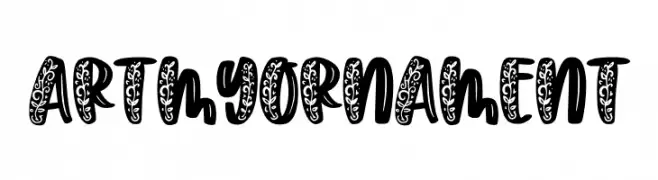
A bold, decorative font with intricate floral patterns on each character.
![Artmy Ornament Frei Schriftart Herunterladen]() Herunterladen 81 Downloads@WebFont
Herunterladen 81 Downloads@WebFont -
( Jecko Development - www.jeckodevelopment.com/ )
A playful, handwritten font with a casual and friendly style.
![JDTyr Frei Schriftart Herunterladen]() Herunterladen 81 Downloads@WebFont
Herunterladen 81 Downloads@WebFont -
( Fonts by joorgemoron - Personal-use only. For commercial use please contact owner. )
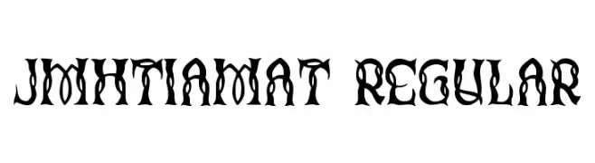
A bold, gothic-style font with intricate, decorative elements.
![JMHTiamat-Regular Frei Schriftart Herunterladen]() Herunterladen 81 Downloads@WebFont
Herunterladen 81 Downloads@WebFont -
( Noto is a trademark of Google Inc. Noto fonts are open source. All Noto fonts are published under the SIL Open Font License, Version 1.1 )
A bold, semi-condensed font with strong, uniform strokes.
![Noto Sans Sinhala UI SemiCondensed Black Frei Schriftart Herunterladen]() Herunterladen 81 Downloads@WebFont
Herunterladen 81 Downloads@WebFont


Welche Schriften sind gerade am populärsten?
Poppins, Roboto, Montserrat, Open Sans und Lato sind wegen ihrer klaren Formen und breiten Einsetzbarkeit sehr gefragt – von Markenauftritt über Landingpages bis hin zu Postern.
Welche Fonts eignen sich für Logos?
Geometrische Sans‑Serifs (z. B. Poppins, Familien im Gotham‑Stil) sind ein häufiger Griff für sauberes, skalierbares Branding. Für eine persönlichere Note bleiben Scripts und Handschrift‑Stile beliebt. Kombinieren Sie einen prägnanten Headline‑Font mit einer neutralen Brotschrift für Wiedererkennung und Harmonie.
Wie oft wird die Top‑Liste aktualisiert?
Regelmäßig – basierend auf realen Downloads und Interaktionen. Schauen Sie öfter vorbei, um aufstrebende Favoriten früh zu entdecken.
💡 Tipp: Seite bookmarken – Trends wechseln schnell, und heutige Top‑Schriften inspirieren morgen vielleicht das Rebranding.