Willkommen bei den Top‑Schriften – hier treffen Beliebtheit und Qualität aufeinander. Das sind die in diesem Jahr am häufigsten heruntergeladenen und genutzten Fonts. Wenn Sie sichere Optionen für Logo, Web oder Social suchen, starten Sie hier.
Jeder Top‑Font überzeugt durch Balance, Lesbarkeit und Vielseitigkeit. Sie finden moderne Sans‑Serifs, elegante Scripts, Vintage‑Serifs und minimalistische Displays.
-
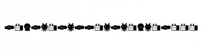
( Fonts by Rodrigo Araya Salas )
A playful dingbat font featuring cute, cartoonish characters and objects.
 Herunterladen 81 Downloads@WebFont
 -
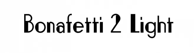
( Luc Mahler )
A modern, geometric font with a sleek and dynamic style.
![Bonafetti 2 Light Frei Schriftart Herunterladen]() Herunterladen 81 Downloads@WebFont
Herunterladen 81 Downloads@WebFont -
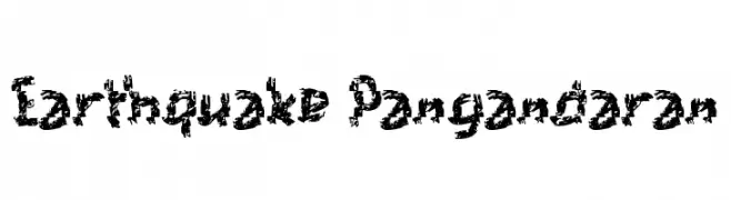
( Fonts by Wahyu Eka Prasetya - wepfont.com - Personal-use only. For commercial use please contact owner. )
A distressed, chaotic font with a shattered, energetic appearance.
![Earthquake Pangandaran Frei Schriftart Herunterladen]() Herunterladen 81 Downloads@WebFont
Herunterladen 81 Downloads@WebFont -
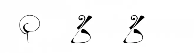
( Fonts by Kat`s Fun Fonts - Personal-use only. For commercial use please contact owner. )
An ornate and whimsical decorative font with intricate flourishes.
![KR Fleur Flair 6 Frei Schriftart Herunterladen]() Herunterladen 81 Downloads@WebFont
Herunterladen 81 Downloads@WebFont -
( Fonts by Dmitry Astakhov - www.behance.net/adonis-abe1e - Personal-use only. For commercial use please contact owner. )
A decorative, hand-drawn style font with bold outlines and hollow interiors.
![Astakhov Access Degree Serif S Frei Schriftart Herunterladen]() Herunterladen 81 Downloads@WebFont
Herunterladen 81 Downloads@WebFont -
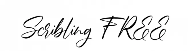
( Fonts by Vunira Design - Personal-use only. For commercial use please contact owner. )
A lively, elegant handwritten font with fluid cursive strokes.
![Scribling FREE Frei Schriftart Herunterladen]() Herunterladen 81 Downloads@WebFont
Herunterladen 81 Downloads@WebFont -
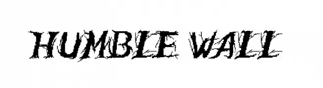
( Poemhaiku - Huong Le Thi Thu - www.behance.net/poemhaiku )
A bold, jagged font with a brush-like texture and dynamic style.
![Humble Wall Frei Schriftart Herunterladen]() Herunterladen 81 Downloads@WebFont
Herunterladen 81 Downloads@WebFont -
( Fonts by Almarkhatype - Abdul Malik Wisnu - Personal-use only. For commercial use please contact owner. )
A bold, condensed font with a modern and impactful style.
![Delluza Frei Schriftart Herunterladen]() Herunterladen 81 Downloads@WebFont
Herunterladen 81 Downloads@WebFont -
( Iconian Fonts - Daniel Zadorozny - www.iconian.com )
A bold, futuristic 3D italic font with geometric shapes and sharp angles.
![Laser Wolf 3D Italic Frei Schriftart Herunterladen]() Herunterladen 81 Downloads@WebFont
Herunterladen 81 Downloads@WebFont -
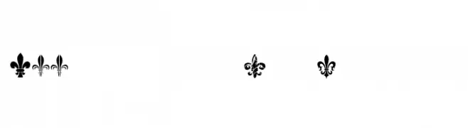
( CloutierFontes - Steve Cloutier - www.cloutierfontes.ca/ )
A decorative font featuring diverse fleur-de-lis symbols with intricate designs.
![CF Fleurs de Lys Regular Frei Schriftart Herunterladen]() Herunterladen 81 Downloads@WebFont
Herunterladen 81 Downloads@WebFont -
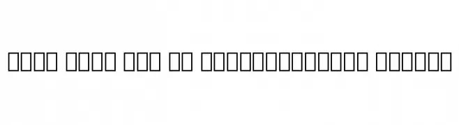
( Noto is a trademark of Google Inc. Noto fonts are open source. All Noto fonts are published under the SIL Open Font License, Version 1.1 )
A clean, modern font with a semi-condensed style and medium weight, ideal for readability.
![Noto Sans Lao UI SemiCondensed Medium Frei Schriftart Herunterladen]() Herunterladen 81 Downloads@WebFont
Herunterladen 81 Downloads@WebFont -
( Fonts by Goma Shin - Personal-use only. For commercial use please contact owner. )
A bold, geometric font with octagonal shapes and a modern, industrial feel.
![Goma Octagon Frei Schriftart Herunterladen]() Herunterladen 81 Downloads@WebFont
Herunterladen 81 Downloads@WebFont -
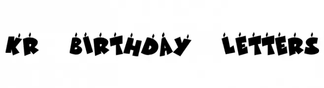
( Fonts by Kat`s Fun Fonts - Personal-use only. For commercial use please contact owner. )
A bold, festive font with candle-topped letters, perfect for celebrations.
![KR Birthday Letters Frei Schriftart Herunterladen]() Herunterladen 81 Downloads@WebFont
Herunterladen 81 Downloads@WebFont -
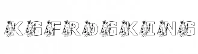
( Katz Fontz - katzfonts.50megs.com/kg.html )
A whimsical font with crowned frog illustrations integrated into outlined letters.
![KGFROGKING Frei Schriftart Herunterladen]() Herunterladen 81 Downloads@WebFont
Herunterladen 81 Downloads@WebFont -
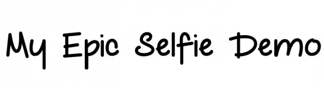
( Fonts by Misti`s Fonts - mistifonts.com - Personal-use only. For commercial use please contact owner. )
A playful, handwritten font with rounded edges and a casual style.
![My Epic Selfie Demo Frei Schriftart Herunterladen]() Herunterladen 81 Downloads@WebFont
Herunterladen 81 Downloads@WebFont -
( Fonts by mahyud creatif - Personal-use only. For commercial use please contact owner. )
An elegant script font with flowing, cursive letterforms and sophisticated style.
![Regina Lover Frei Schriftart Herunterladen]() Herunterladen 81 Downloads@WebFont
Herunterladen 81 Downloads@WebFont -
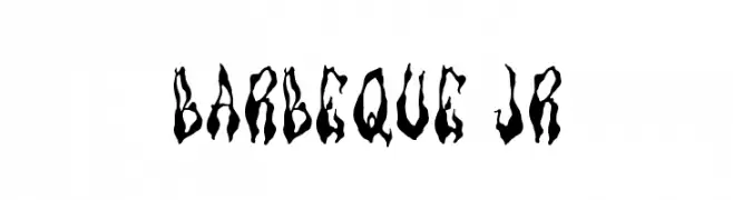
( Barbuh Q )
A bold, flame-inspired decorative font with dynamic, jagged edges.
![Barbeque Jr Frei Schriftart Herunterladen]() Herunterladen 81 Downloads@WebFont
Herunterladen 81 Downloads@WebFont -
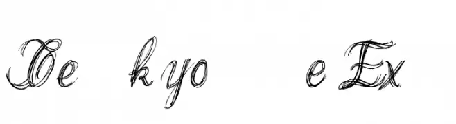
( Poemhaiku - Huong Le Thi Thu - www.behance.net/poemhaiku )
A dynamic, cursive script with a hand-drawn, calligraphic style.
![Thank you Drf Extra Frei Schriftart Herunterladen]() Herunterladen 81 Downloads@WebFont
Herunterladen 81 Downloads@WebFont -
( imagex - www.imagex-fonts.com )
A chaotic, graffiti-inspired font with jagged, hand-drawn letters.
![Hard Dumb Frei Schriftart Herunterladen]() Herunterladen 81 Downloads@WebFont
Herunterladen 81 Downloads@WebFont -
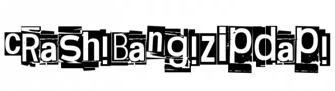
( Fonts by junkohanhero )
A chaotic, ransom note-style font with high contrast and eclectic character designs.
![Crash! Bang! Zipdap! Frei Schriftart Herunterladen]() Herunterladen 81 Downloads@WebFont
Herunterladen 81 Downloads@WebFont -
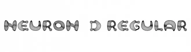
( Fonts by Vladimir Nikolic - https://www.creativefabrica.com/product/educated-deers/ref/144265/ - Personal-use only. For commercial use please contact owner. )
A bold, 3D wireframe font with a decorative and futuristic style.
![Neuron 3D Regular Frei Schriftart Herunterladen]() Herunterladen 81 Downloads@WebFont
Herunterladen 81 Downloads@WebFont -
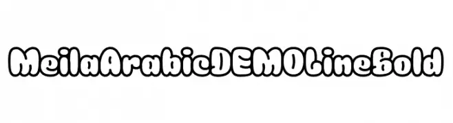
( Fonts by Namela Type )
A bold, bubble-like font with rounded edges and a playful, whimsical style.
![Meila Arabic DEMO Line Bold Frei Schriftart Herunterladen]() Herunterladen 81 Downloads@WebFont
Herunterladen 81 Downloads@WebFont -
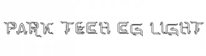
( Fonts by Galdino Otten - galdinootten.com )
A futuristic, circuit-inspired font with intricate linework and electronic motifs.
![Park Tech CG Light Frei Schriftart Herunterladen]() Herunterladen 81 Downloads@WebFont
Herunterladen 81 Downloads@WebFont -
( Fonts by DmLetter31 - Dimas Prasetyo - Personal-use only. For commercial use please contact owner. )
A playful, cobweb-themed font perfect for Halloween designs.
![Spooky Webbie Frei Schriftart Herunterladen]() Herunterladen 81 Downloads@WebFont
Herunterladen 81 Downloads@WebFont -
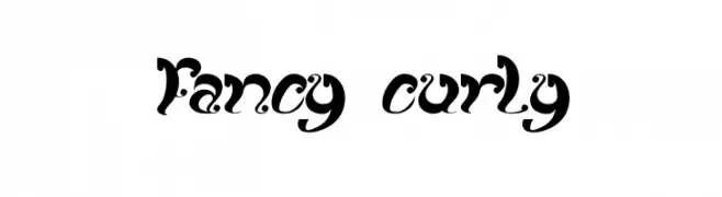
( Fonts by Wino S Kadir - weknow - www.revolge.com/shop/weknow/ - Personal-use only. For commercial use please contact owner. )
An ornate, curly font with bold strokes and intricate swirls.
![fancy curly Frei Schriftart Herunterladen]() Herunterladen 81 Downloads@WebFont
Herunterladen 81 Downloads@WebFont -
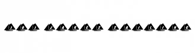
( Nght's Place - www.crosswinds.net/~nghtmvs/font/fonts1.html )
A nautical-themed font with characters integrated into sailboat silhouettes.
![101! Jake's Sailing Frei Schriftart Herunterladen]() Herunterladen 81 Downloads@WebFont
Herunterladen 81 Downloads@WebFont -
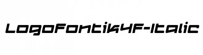
( Fonts by 4th february - Personal-use only. For commercial use please contact owner. )
A bold, italicized font with a modern, angular design.
![Logofontik4F-Italic Frei Schriftart Herunterladen]() Herunterladen 81 Downloads@WebFont
Herunterladen 81 Downloads@WebFont -
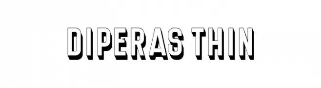
( Fonts by Vladimir Nikolic - www.creativefabrica.com/designer/vladimirnikolic/ - Personal-use only. For commercial use please contact owner. )
A bold, three-dimensional font with strong shadow effects and a modern, impactful style.
![Diperas Thin Frei Schriftart Herunterladen]() Herunterladen 81 Downloads@WebFont
Herunterladen 81 Downloads@WebFont -
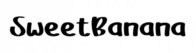
( Fonts by Rangkai Aksara - Personal-use only. For commercial use please contact owner. )
A bold, playful handwritten font with smooth, rounded edges.
![Sweet Banana Frei Schriftart Herunterladen]() Herunterladen 81 Downloads@WebFont
Herunterladen 81 Downloads@WebFont -
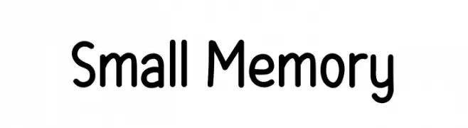
( Fonts by Salamahtype.com - Aswangga - Personal-use only. For commercial use please contact owner. )
A playful, rounded font with smooth curves and a friendly appearance.
![Small Memory Frei Schriftart Herunterladen]() Herunterladen 81 Downloads@WebFont
Herunterladen 81 Downloads@WebFont -
( Fonts by WDfont - WD font - Personal-use only. For commercial use please contact owner. )
An elegant, flowing script font with high contrast and refined style.
![modistascript Frei Schriftart Herunterladen]() Herunterladen 81 Downloads@WebFont
Herunterladen 81 Downloads@WebFont -
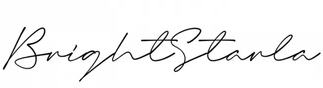
( Fonts by Namara Creative )
Elegant cursive script with a handwritten feel.
![Bright Starla Frei Schriftart Herunterladen]() Herunterladen 81 Downloads@WebFont
Herunterladen 81 Downloads@WebFont -
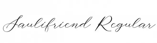
( Fonts by Brithos Type - Personal-use only. For commercial use please contact owner. )
A graceful script font with fluid, connected letters and elegant curves.
![Saulifriend Regular Frei Schriftart Herunterladen]() Herunterladen 81 Downloads@WebFont
Herunterladen 81 Downloads@WebFont -
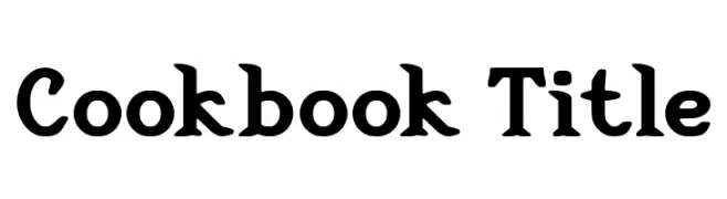
( Fonts by Walter E Stewart - Personal-use only. For commercial use please contact owner. )
A bold, playful serif font with rounded serifs and a vintage charm.
![Cookbook Title Frei Schriftart Herunterladen]() Herunterladen 81 Downloads@WebFont
Herunterladen 81 Downloads@WebFont -
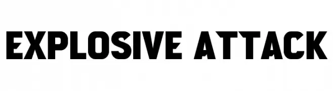
( Fonts by Wahyu Eka Prasetya - wepfont.com - Personal-use only. For commercial use please contact owner. )
A bold, geometric font with strong, impactful letterforms.
![Explosive Attack Frei Schriftart Herunterladen]() Herunterladen 81 Downloads@WebFont
Herunterladen 81 Downloads@WebFont


Welche Schriften sind gerade am populärsten?
Poppins, Roboto, Montserrat, Open Sans und Lato sind wegen ihrer klaren Formen und breiten Einsetzbarkeit sehr gefragt – von Markenauftritt über Landingpages bis hin zu Postern.
Welche Fonts eignen sich für Logos?
Geometrische Sans‑Serifs (z. B. Poppins, Familien im Gotham‑Stil) sind ein häufiger Griff für sauberes, skalierbares Branding. Für eine persönlichere Note bleiben Scripts und Handschrift‑Stile beliebt. Kombinieren Sie einen prägnanten Headline‑Font mit einer neutralen Brotschrift für Wiedererkennung und Harmonie.
Wie oft wird die Top‑Liste aktualisiert?
Regelmäßig – basierend auf realen Downloads und Interaktionen. Schauen Sie öfter vorbei, um aufstrebende Favoriten früh zu entdecken.
💡 Tipp: Seite bookmarken – Trends wechseln schnell, und heutige Top‑Schriften inspirieren morgen vielleicht das Rebranding.