Willkommen bei den Top‑Schriften – hier treffen Beliebtheit und Qualität aufeinander. Das sind die in diesem Jahr am häufigsten heruntergeladenen und genutzten Fonts. Wenn Sie sichere Optionen für Logo, Web oder Social suchen, starten Sie hier.
Jeder Top‑Font überzeugt durch Balance, Lesbarkeit und Vielseitigkeit. Sie finden moderne Sans‑Serifs, elegante Scripts, Vintage‑Serifs und minimalistische Displays.
-
( Fonts by Daniel Zadorozny - www.iconian.com - Personal-use only. For commercial use please contact owner. )
A bold, italicized font with sharp angles and a dynamic, modern style.
 Herunterladen 80 Downloads@WebFont
 -
( Fonts by Billy Argel - www.billyargel.com - Personal-use only. For commercial use please contact owner. )
A modern, geometric font with angular lines and a sleek, futuristic appearance.
![MANABU Frei Schriftart Herunterladen]() Herunterladen 80 Downloads@WebFont
Herunterladen 80 Downloads@WebFont -
( Anke van der Meer - ankepanke.nl )
A playful, handwritten font with smooth, rounded letterforms.
![i&esnailmail Frei Schriftart Herunterladen]() Herunterladen 80 Downloads@WebFont
Herunterladen 80 Downloads@WebFont -
( Kristie Feltner )
A modern, geometric font with rounded edges and uniform width.
![SalientRegular Frei Schriftart Herunterladen]() Herunterladen 80 Downloads@WebFont
Herunterladen 80 Downloads@WebFont -
( Noto is a trademark of Google Inc. Noto fonts are open source. All Noto fonts are published under the SIL Open Font License, Version 1.1 )
Ultra-thin, geometric sans-serif with a minimalist style.
![Noto Sans Myanmar UI Thin Frei Schriftart Herunterladen]() Herunterladen 80 Downloads@WebFont
Herunterladen 80 Downloads@WebFont -
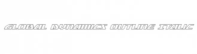
( Fonts by Daniel Zadorozny - www.iconian.com - Free for personal use )
A futuristic, italicized outline font with geometric shapes and sharp angles.
![Global Dynamics Outline Italic Frei Schriftart Herunterladen]() Herunterladen 80 Downloads@WebFont
Herunterladen 80 Downloads@WebFont -
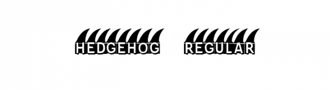
( Fonts by Vladimir Nikolic )
A bold, playful font with spiky, hedgehog-like accents on uppercase letters.
![Hedgehog Regular Frei Schriftart Herunterladen]() Herunterladen 80 Downloads@WebFont
Herunterladen 80 Downloads@WebFont -
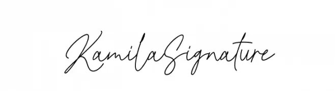
( Fonts by GFR Creative - Personal-use only. For commercial use please contact owner. )
A graceful and elegant handwritten script font with fluid, connected letters.
![Kamila Signature Frei Schriftart Herunterladen]() Herunterladen 80 Downloads@WebFont
Herunterladen 80 Downloads@WebFont -
( Fonts by Zuzulgo Studio - Muhammad Zulfani - Personal-use only. For commercial use please contact owner. )
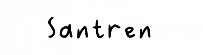
A playful, handwritten font with bold, rounded characters and a casual style.
![Santren Frei Schriftart Herunterladen]() Herunterladen 80 Downloads@WebFont
Herunterladen 80 Downloads@WebFont -
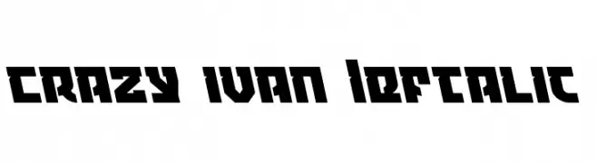
( Iconian Fonts - Daniel Zadorozny - www.iconian.com )
A bold, left-slanted font with angular, blocky characters.
![Crazy Ivan Leftalic Frei Schriftart Herunterladen]() Herunterladen 80 Downloads@WebFont
Herunterladen 80 Downloads@WebFont -
( Fonts by LetterStock - Guguh Gumantoro - Personal-use only. For commercial use please contact owner. )
A modern, tall, and narrow font with a geometric and elegant style.
![wavecraft Frei Schriftart Herunterladen]() Herunterladen 80 Downloads@WebFont
Herunterladen 80 Downloads@WebFont -
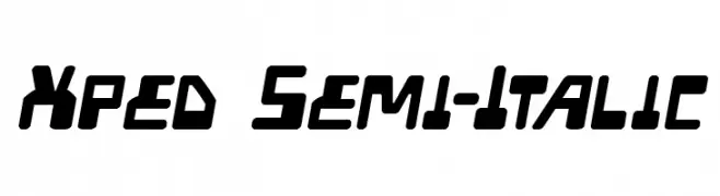
( Iconian Fonts - Daniel Zadorozny - www.iconian.com )
A bold, italicized font with a futuristic and dynamic design.
![Xped Semi-Italic Frei Schriftart Herunterladen]() Herunterladen 80 Downloads@WebFont
Herunterladen 80 Downloads@WebFont -
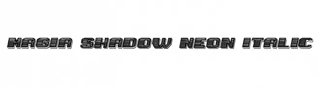
( Fonts by Vladimir Nikolic - https://www.creativefabrica.com/product/educated-deers/ref/144265/ - Personal-use only. For commercial use please contact owner. )
A bold, italicized font with a neon-like dotted shadow effect.
![Magia Shadow Neon Italic Frei Schriftart Herunterladen]() Herunterladen 80 Downloads@WebFont
Herunterladen 80 Downloads@WebFont -
( Fonts by Asep Rendi )
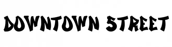
A bold, graffiti-inspired font with sharp angles and high contrast.
![Downtown Street Frei Schriftart Herunterladen]() Herunterladen 80 Downloads@WebFont
Herunterladen 80 Downloads@WebFont -
( Noto is a trademark of Google Inc. Noto fonts are open source. All Noto fonts are published under the SIL Open Font License, Version 1.1 )
A bold, semi-condensed font with a modern and robust design.
![Noto Sans Devanagari SemiCondensed Black Frei Schriftart Herunterladen]() Herunterladen 80 Downloads@WebFont
Herunterladen 80 Downloads@WebFont -
( Fonts by Daniel Zadorozny - www.iconian.com - Personal-use only. For commercial use please contact owner. )
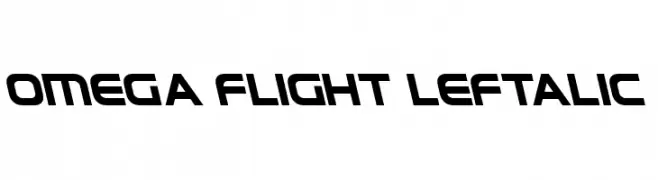
A bold, futuristic font with a leftward slant and geometric design.
![Omega Flight Leftalic Frei Schriftart Herunterladen]() Herunterladen 80 Downloads@WebFont
Herunterladen 80 Downloads@WebFont -
( Fonts by Zetafonts - Personal-use only. For commercial use please contact owner. )
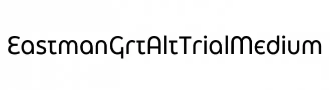
A modern geometric sans-serif font with clean, uniform strokes.
![Eastman Grt Alt Trial Medium Frei Schriftart Herunterladen]() Herunterladen 80 Downloads@WebFont
Herunterladen 80 Downloads@WebFont -
( gluk - Grzegorz l - www.glukfonts.pl )
An elegant and sophisticated font with decorative swashes and a refined appearance.
![GarineldoNo02 Frei Schriftart Herunterladen]() Herunterladen 80 Downloads@WebFont
Herunterladen 80 Downloads@WebFont -
( Fonts by Vladimir Nikolic - https://www.creativefabrica.com/product/educated-deers/ref/144265/ - Personal-use only. For commercial use please contact owner. )
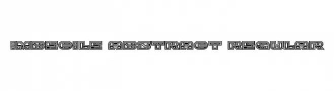
An abstract, geometric font with intricate patterns and a modern style.
![Imbecile Abstract Regular Frei Schriftart Herunterladen]() Herunterladen 80 Downloads@WebFont
Herunterladen 80 Downloads@WebFont -
( Fonts by Darrell Flood )
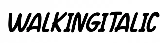
A bold, italic script font with smooth curves and dynamic flow.
![Walking Italic Frei Schriftart Herunterladen]() Herunterladen 80 Downloads@WebFont
Herunterladen 80 Downloads@WebFont -
( Fonts by Vladimir Nikolic - www.creativefabrica.com/designer/vladimirnikolic/ - Personal-use only. For commercial use please contact owner. )
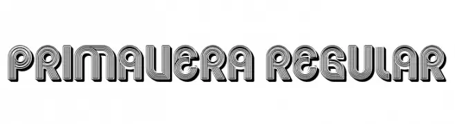
A bold, decorative font with a layered, dimensional effect.
![Primavera Regular Frei Schriftart Herunterladen]() Herunterladen 80 Downloads@WebFont
Herunterladen 80 Downloads@WebFont -
( Fonts by Cloutierfontes - Steve Cloutier - Personal-use only. For commercial use please contact owner. )
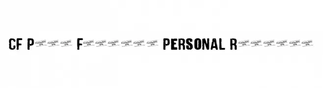
A bold, distressed font with a grunge, punk aesthetic.
![CF Punk Fashion PERSONAL Regular Frei Schriftart Herunterladen]() Herunterladen 80 Downloads@WebFont
Herunterladen 80 Downloads@WebFont -
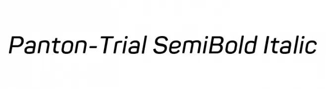
( Fonts by Fontfabric - Svetoslav Simov - Personal-use only. For commercial use please contact owner. )
A modern, semi-bold italic sans-serif font with a sleek design.
![Panton-Trial SemiBold Italic Frei Schriftart Herunterladen]() Herunterladen 80 Downloads@WebFont
Herunterladen 80 Downloads@WebFont -
( Fonts by Vacatype Co. - Vacatype - Personal-use only. For commercial use please contact owner. )
A bold, brushstroke font with dynamic and energetic styling.
![ForrestaPersonalUse-Regular Frei Schriftart Herunterladen]() Herunterladen 80 Downloads@WebFont
Herunterladen 80 Downloads@WebFont -
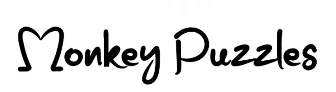
( Fonts by erlosDESIGN - Erlangga Suherman - Personal-use only. For commercial use please contact owner. )
A playful, handwritten font with lively curves and a whimsical style.
![Monkey Puzzles Frei Schriftart Herunterladen]() Herunterladen 80 Downloads@WebFont
Herunterladen 80 Downloads@WebFont -
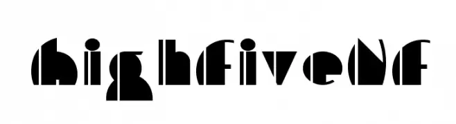
( Fonts by Nick Curtis - Personal-use only. For commercial use please contact owner. )
A bold, geometric font with high contrast and modern, abstract shapes.
![HighFiveNF Frei Schriftart Herunterladen]() Herunterladen 80 Downloads@WebFont
Herunterladen 80 Downloads@WebFont -
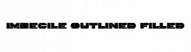
( Fonts by Vladimir Nikolic - https://www.creativefabrica.com/product/educated-deers/ref/144265/ - Personal-use only. For commercial use please contact owner. )
A bold, geometric font with outlined and filled segments, offering a modern and striking appearance.
![Imbecile Outlined Filled Frei Schriftart Herunterladen]() Herunterladen 80 Downloads@WebFont
Herunterladen 80 Downloads@WebFont -
( Fonts by www.gliphmaker.com. Personal-use only. For commercial use please contact owner. )
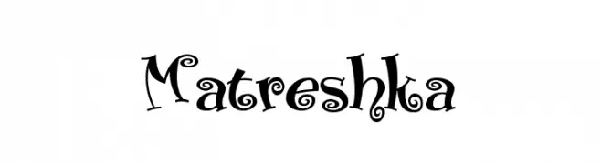
A whimsical and decorative font with curly, playful elements.
![Matreshka Frei Schriftart Herunterladen]() Herunterladen 80 Downloads@WebFont
Herunterladen 80 Downloads@WebFont -
( Fonts by Daniel Zadorozny - www.iconian.com - Personal-use only. For commercial use please contact owner. )
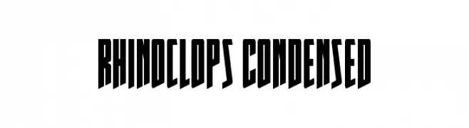
A bold, condensed font with sharp, angular lines and a modern, impactful style.
![Rhinoclops Condensed Frei Schriftart Herunterladen]() Herunterladen 80 Downloads@WebFont
Herunterladen 80 Downloads@WebFont -
( Fonts by Edric Studio - Personal-use only. For commercial use please contact owner. )
A bold stencil font with geometric cuts and a modern, industrial style.
![Vlorens Flower DEMO Stencil Frei Schriftart Herunterladen]() Herunterladen 80 Downloads@WebFont
Herunterladen 80 Downloads@WebFont -
( surotype - Adil Budianto - www.surotype.com )
A dynamic and elegant script font with a modern twist.
![Brayline Frei Schriftart Herunterladen]() Herunterladen 80 Downloads@WebFont
Herunterladen 80 Downloads@WebFont -
( Fonts by DumadiStyle - Toni Dzulham - Personal-use only. For commercial use please contact owner. )
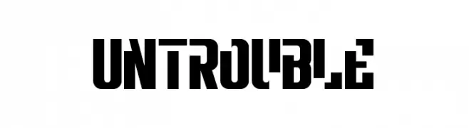
A bold, geometric font with a modern and dynamic style.
![Untrouble Frei Schriftart Herunterladen]() Herunterladen 80 Downloads@WebFont
Herunterladen 80 Downloads@WebFont -
( Fonts by Kat`s Fun Fonts - Personal-use only. For commercial use please contact owner. )
A whimsical, decorative font with Valentine-themed doodles and playful illustrations.
![KR Valentine Kids 2006 Frei Schriftart Herunterladen]() Herunterladen 80 Downloads@WebFont
Herunterladen 80 Downloads@WebFont -
( Fonts by Dmitry Astakhov - www.behance.net/adonis-abe1e - Personal-use only. For commercial use please contact owner. )
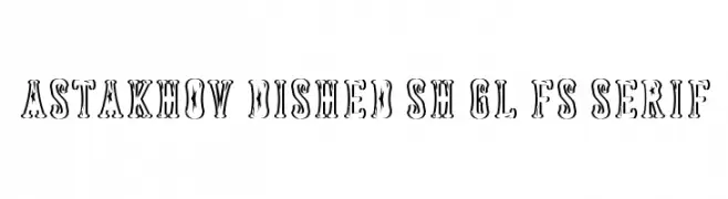
A bold, decorative serif font with star motifs and a vintage flair.
![Astakhov Dished Sh Gl FS Serif Frei Schriftart Herunterladen]() Herunterladen 80 Downloads@WebFont
Herunterladen 80 Downloads@WebFont -
( Fonts by imagex - Personal-use only. For commercial use please contact owner. )
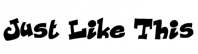
A playful, bold font with exaggerated curves and a cartoon-like appearance.
![Just Like This Frei Schriftart Herunterladen]() Herunterladen 80 Downloads@WebFont
Herunterladen 80 Downloads@WebFont


Welche Schriften sind gerade am populärsten?
Poppins, Roboto, Montserrat, Open Sans und Lato sind wegen ihrer klaren Formen und breiten Einsetzbarkeit sehr gefragt – von Markenauftritt über Landingpages bis hin zu Postern.
Welche Fonts eignen sich für Logos?
Geometrische Sans‑Serifs (z. B. Poppins, Familien im Gotham‑Stil) sind ein häufiger Griff für sauberes, skalierbares Branding. Für eine persönlichere Note bleiben Scripts und Handschrift‑Stile beliebt. Kombinieren Sie einen prägnanten Headline‑Font mit einer neutralen Brotschrift für Wiedererkennung und Harmonie.
Wie oft wird die Top‑Liste aktualisiert?
Regelmäßig – basierend auf realen Downloads und Interaktionen. Schauen Sie öfter vorbei, um aufstrebende Favoriten früh zu entdecken.
💡 Tipp: Seite bookmarken – Trends wechseln schnell, und heutige Top‑Schriften inspirieren morgen vielleicht das Rebranding.