Willkommen bei den Top‑Schriften – hier treffen Beliebtheit und Qualität aufeinander. Das sind die in diesem Jahr am häufigsten heruntergeladenen und genutzten Fonts. Wenn Sie sichere Optionen für Logo, Web oder Social suchen, starten Sie hier.
Jeder Top‑Font überzeugt durch Balance, Lesbarkeit und Vielseitigkeit. Sie finden moderne Sans‑Serifs, elegante Scripts, Vintage‑Serifs und minimalistische Displays.
-
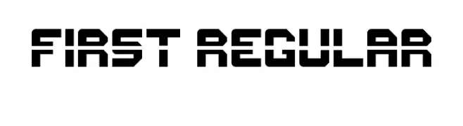
( Anthony Robinson - www.redbubble.com/people/anfa/portfolio )
A bold, geometric font with a futuristic and industrial style.
 Herunterladen 80 Downloads@WebFont
 -
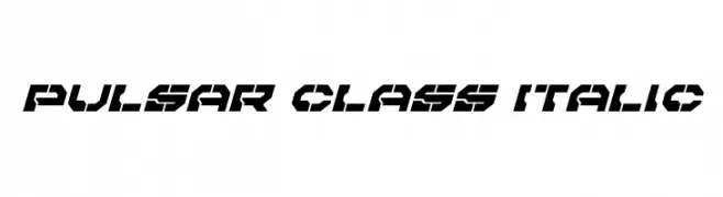
( Iconian Fonts - Daniel Zadorozny - www.iconian.com )
A bold, italicized font with a futuristic and geometric design.
![Pulsar Class Italic Frei Schriftart Herunterladen]() Herunterladen 80 Downloads@WebFont
Herunterladen 80 Downloads@WebFont -
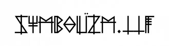
( Lucas Moriceau )
A geometric, angular font with a futuristic and symbolic design.
![Symbolïzm.ttf Frei Schriftart Herunterladen]() Herunterladen 80 Downloads@WebFont
Herunterladen 80 Downloads@WebFont -
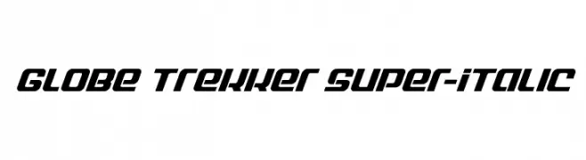
( Fonts by Daniel Zadorozny - www.iconian.com - Personal-use only. For commercial use please contact owner. )
A bold, italic typeface with a modern, dynamic style and strong geometric shapes.
![Globe Trekker Super-Italic Frei Schriftart Herunterladen]() Herunterladen 80 Downloads@WebFont
Herunterladen 80 Downloads@WebFont -
( Fonts by Riki - Personal-use only. For commercial use please contact owner. )
A bold, cursive font with a playful and energetic style.
![Alexa Frei Schriftart Herunterladen]() Herunterladen 80 Downloads@WebFont
Herunterladen 80 Downloads@WebFont -
( Iconian Fonts - Daniel Zadorozny - www.iconian.com )
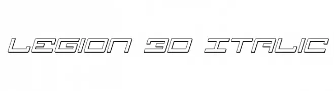
A futuristic, 3D, italicized font with bold geometric shapes and outlined characters.
![Legion 3D Italic Frei Schriftart Herunterladen]() Herunterladen 80 Downloads@WebFont
Herunterladen 80 Downloads@WebFont -
( weknow - Wino S Kadir - www.creativefabrica.com/designer/weknow/ )
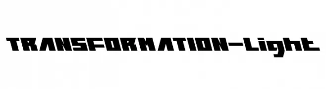
A bold, geometric font with a futuristic and angular design.
![TRANSFORMATION-Light Frei Schriftart Herunterladen]() Herunterladen 80 Downloads@WebFont
Herunterladen 80 Downloads@WebFont -
( Fonts by Woodcutter )
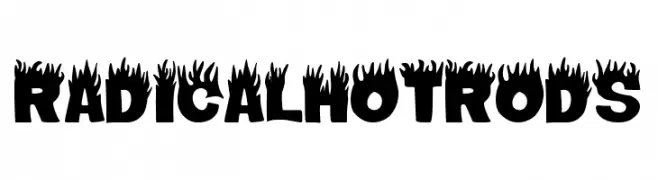
A bold, flame-themed font with a dynamic and energetic style.
![Radical Hot Rods Frei Schriftart Herunterladen]() Herunterladen 80 Downloads@WebFont
Herunterladen 80 Downloads@WebFont -
( Fonts by Google - Personal-use only. For commercial use please contact owner. )
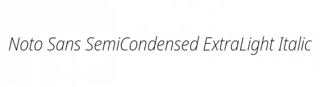
A sleek, modern, semi-condensed, extra light italic font with balanced spacing.
![Noto Sans SemiCondensed ExtraLight Italic Frei Schriftart Herunterladen]() Herunterladen 80 Downloads@WebFont
Herunterladen 80 Downloads@WebFont -
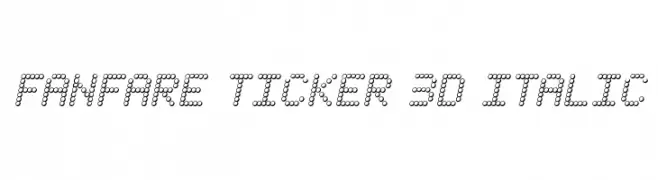
( Iconian Fonts - Daniel Zadorozny - www.iconian.com )
A 3D dotted italic font with a digital ticker display style.
![Fanfare Ticker 3D Italic Frei Schriftart Herunterladen]() Herunterladen 80 Downloads@WebFont
Herunterladen 80 Downloads@WebFont -
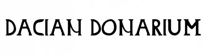
( tudy1311 - Tudor Banciu - www.tudy1311.com )
A bold, angular font with historical and modern influences, featuring sharp edges and subtle curves.
![Dacian Donarium Frei Schriftart Herunterladen]() Herunterladen 80 Downloads@WebFont
Herunterladen 80 Downloads@WebFont -
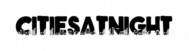
( Fonts by Woodcutter )
A bold, textured font with a cityscape-inspired design, perfect for impactful visuals.
![Cities at Night Frei Schriftart Herunterladen]() Herunterladen 80 Downloads@WebFont
Herunterladen 80 Downloads@WebFont -
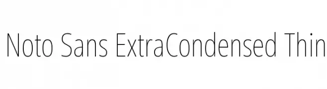
( Fonts by Google - Personal-use only. For commercial use please contact owner. )
A modern, extra-condensed sans-serif font with thin strokes and a clean aesthetic.
![Noto Sans ExtraCondensed Thin Frei Schriftart Herunterladen]() Herunterladen 80 Downloads@WebFont
Herunterladen 80 Downloads@WebFont -
( Fonts by olexstudio - Firman Syah - Personal-use only. For commercial use please contact owner. )
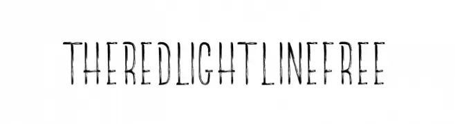
A distressed, hand-drawn font with a vintage, grunge aesthetic.
![TheRedlightLineFree Frei Schriftart Herunterladen]() Herunterladen 80 Downloads@WebFont
Herunterladen 80 Downloads@WebFont -
( Walter Paggioro - www.raptuscreativi.com/site/fields/type-design/ )
A whimsical, hand-drawn font with elongated, irregular characters.
![Anoressic Frei Schriftart Herunterladen]() Herunterladen 80 Downloads@WebFont
Herunterladen 80 Downloads@WebFont -
( Fonts by Abir - Personal-use only. For commercial use please contact owner. )
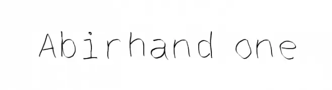
A casual, handwritten font with a personal and authentic touch.
![Abirhand one Frei Schriftart Herunterladen]() Herunterladen 80 Downloads@WebFont
Herunterladen 80 Downloads@WebFont -
( Fonts by Khurasan )
A playful, rounded font with a casual, handwritten style.
![Hey Fun Frei Schriftart Herunterladen]() Herunterladen 80 Downloads@WebFont
Herunterladen 80 Downloads@WebFont -
( Fonts by Hatf Type - Personal-use only. For commercial use please contact owner. )
A dynamic and expressive script font with flowing, cursive letterforms.
![Jakarta Night - Free Personal Frei Schriftart Herunterladen]() Herunterladen 80 Downloads@WebFont
Herunterladen 80 Downloads@WebFont -
( Fonts by Ketikata Studio - Fuad Hasan - Personal-use only. For commercial use please contact owner. )
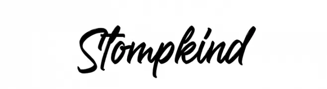
A bold, cursive font with a lively and energetic style.
![Stompkind Frei Schriftart Herunterladen]() Herunterladen 80 Downloads@WebFont
Herunterladen 80 Downloads@WebFont -
( Fonts by www.woodcutter.es - woodcutter Manero - Personal-use only. For commercial use please contact owner. )
A playful, skull-themed decorative font with bold outlines.
![Skully Frei Schriftart Herunterladen]() Herunterladen 80 Downloads@WebFont
Herunterladen 80 Downloads@WebFont -
( Fonts by Typographer Mediengestaltung - Personal-use only. For commercial use please contact owner. )
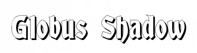
A bold, shadowed font with a three-dimensional effect, perfect for striking designs.
![Globus Shadow Frei Schriftart Herunterladen]() Herunterladen 80 Downloads@WebFont
Herunterladen 80 Downloads@WebFont -
( Fonts by zamjump - Ahmad Zamzami - Personal-use only. For commercial use please contact owner. )
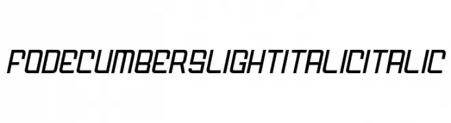
A sleek, modern italic font with a streamlined and futuristic design.
![FODECUMBERS LIGHT ITALIC Italic Frei Schriftart Herunterladen]() Herunterladen 80 Downloads@WebFont
Herunterladen 80 Downloads@WebFont -
( Fonts by Weape Studio - Wahyu Andi - Personal-use only. For commercial use please contact owner. )
A playful, bold font with rounded, thick strokes and a hand-drawn feel.
![Mochido Frei Schriftart Herunterladen]() Herunterladen 80 Downloads@WebFont
Herunterladen 80 Downloads@WebFont -
( Fonts by Integritype Studio )
An elegant script font with flowing, interconnected letters and refined swirls.
![Latteuqeles Frei Schriftart Herunterladen]() Herunterladen 80 Downloads@WebFont
Herunterladen 80 Downloads@WebFont -
( Fonts by Situjuh Nazara - 7ntypes.com - Personal-use only. For commercial use please contact owner. )
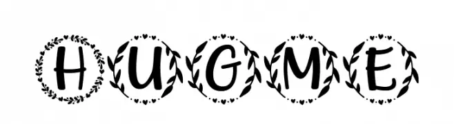
A decorative font with characters encased in leafy wreaths, offering a whimsical and nature-inspired style.
![Hugme Frei Schriftart Herunterladen]() Herunterladen 80 Downloads@WebFont
Herunterladen 80 Downloads@WebFont -
( Iconian Fonts - Daniel Zadorozny - www.iconian.com )
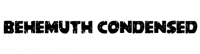
A bold, condensed font with a distressed, rugged texture.
![Behemuth Condensed Frei Schriftart Herunterladen]() Herunterladen 80 Downloads@WebFont
Herunterladen 80 Downloads@WebFont -
( Fonts by Barry Schwartz - Personal-use only. For commercial use please contact owner. )
A classic serif font with elegant proportions and moderate contrast, ideal for traditional and refined designs.
![Goudy Bookletter 1911 Frei Schriftart Herunterladen]() Herunterladen 80 Downloads@WebFont
Herunterladen 80 Downloads@WebFont -
( weknow - Wino S Kadir - www.creativefabrica.com/designer/weknow/ )
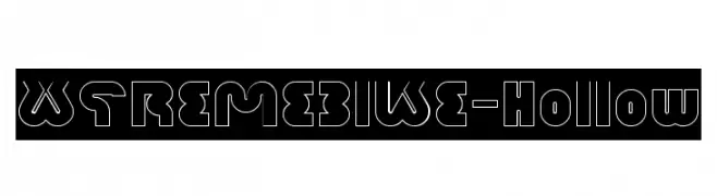
A bold, hollow, geometric font with a futuristic style.
![XTREME BIKE-Hollow Frei Schriftart Herunterladen]() Herunterladen 80 Downloads@WebFont
Herunterladen 80 Downloads@WebFont -
( Fonts by Wino S Kadir - weknow - www.revolge.com/shop/weknow/ - Personal-use only. For commercial use please contact owner. )
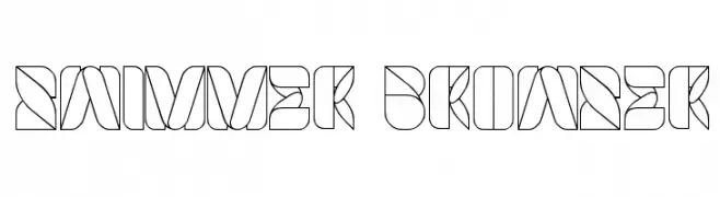
A bold, geometric font with intricate patterns and a modern, futuristic style.
![SWIMMER BROWSER Frei Schriftart Herunterladen]() Herunterladen 80 Downloads@WebFont
Herunterladen 80 Downloads@WebFont -
( Fonts by Kat`s Fun Fonts - Personal-use only. For commercial use please contact owner. )
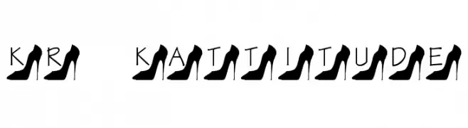
A decorative font featuring high-heeled shoe silhouettes integrated into each letter.
![KR Kattitude Frei Schriftart Herunterladen]() Herunterladen 80 Downloads@WebFont
Herunterladen 80 Downloads@WebFont -
( Fonts by Sizimon.id - Personal-use only. For commercial use please contact owner. )
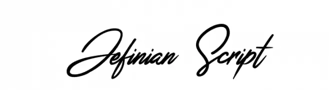
An elegant, flowing script font with a cursive style and graceful connections.
![Jefinian Script Frei Schriftart Herunterladen]() Herunterladen 80 Downloads@WebFont
Herunterladen 80 Downloads@WebFont -
( Fonts by Billy Argel Fonts - www.billyargel.com - Personal-use only. For commercial use please contact owner. )
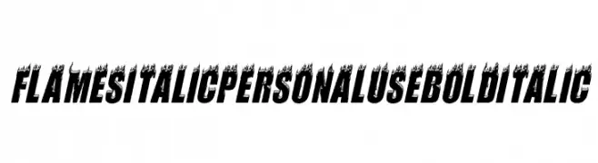
A bold, italic font with flame accents for a dynamic and fiery look.
![FLAMES ITALIC PERSONAL USE Bold Italic Frei Schriftart Herunterladen]() Herunterladen 80 Downloads@WebFont
Herunterladen 80 Downloads@WebFont -
( Character )
A playful, rope-themed decorative font with a textured, dynamic appearance.
![Rope5 Frei Schriftart Herunterladen]() Herunterladen 80 Downloads@WebFont
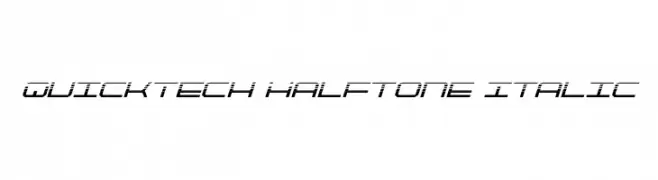
Herunterladen 80 Downloads@WebFont -
![QuickTech Halftone Italic Frei Schriftart Herunterladen]() Herunterladen 80 Downloads@WebFont
Herunterladen 80 Downloads@WebFont -
( Fonts by Vladimir Nikolic - https://www.creativefabrica.com/product/educated-deers/ref/144265/ - Personal-use only. For commercial use please contact owner. )
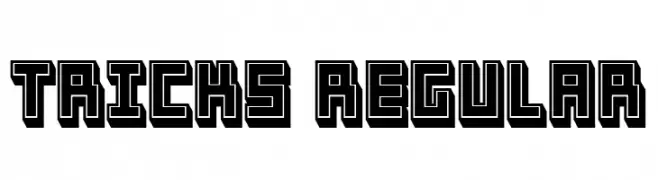
A bold, geometric font with a 3D shadow effect, ideal for impactful designs.
![Tricks Regular Frei Schriftart Herunterladen]() Herunterladen 80 Downloads@WebFont
Herunterladen 80 Downloads@WebFont


Welche Schriften sind gerade am populärsten?
Poppins, Roboto, Montserrat, Open Sans und Lato sind wegen ihrer klaren Formen und breiten Einsetzbarkeit sehr gefragt – von Markenauftritt über Landingpages bis hin zu Postern.
Welche Fonts eignen sich für Logos?
Geometrische Sans‑Serifs (z. B. Poppins, Familien im Gotham‑Stil) sind ein häufiger Griff für sauberes, skalierbares Branding. Für eine persönlichere Note bleiben Scripts und Handschrift‑Stile beliebt. Kombinieren Sie einen prägnanten Headline‑Font mit einer neutralen Brotschrift für Wiedererkennung und Harmonie.
Wie oft wird die Top‑Liste aktualisiert?
Regelmäßig – basierend auf realen Downloads und Interaktionen. Schauen Sie öfter vorbei, um aufstrebende Favoriten früh zu entdecken.
💡 Tipp: Seite bookmarken – Trends wechseln schnell, und heutige Top‑Schriften inspirieren morgen vielleicht das Rebranding.