Willkommen bei den Top‑Schriften – hier treffen Beliebtheit und Qualität aufeinander. Das sind die in diesem Jahr am häufigsten heruntergeladenen und genutzten Fonts. Wenn Sie sichere Optionen für Logo, Web oder Social suchen, starten Sie hier.
Jeder Top‑Font überzeugt durch Balance, Lesbarkeit und Vielseitigkeit. Sie finden moderne Sans‑Serifs, elegante Scripts, Vintage‑Serifs und minimalistische Displays.
-
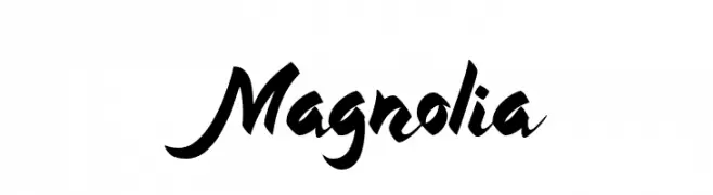
( Fonts by Anomali Creative - Krisna Teja - Personal-use only. For commercial use please contact owner. )
A bold, expressive script font with dynamic, flowing strokes.
 Herunterladen 80 Downloads@WebFont
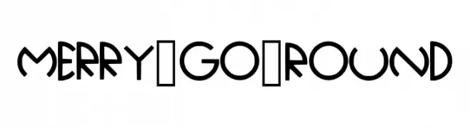
 -
![Merry_Go_Round Frei Schriftart Herunterladen]() Herunterladen 80 Downloads@WebFont
Herunterladen 80 Downloads@WebFont -
( Fonts by Balpirick Studio - https://www.creativefabrica.com/designer/balpirick/ref/308299/ - Personal-use only. For commercial use please contact owner. )
A bold, playful script font with smooth, interconnected letters.
![Jingle Binder Frei Schriftart Herunterladen]() Herunterladen 80 Downloads@WebFont
Herunterladen 80 Downloads@WebFont -
( Fonts by Wino S Kadir - weknow - www.revolge.com/shop/weknow/ - Personal-use only. For commercial use please contact owner. )
A bold, angular font inspired by Japanese calligraphy with a modern edge.
![Samurai Sword Frei Schriftart Herunterladen]() Herunterladen 80 Downloads@WebFont
Herunterladen 80 Downloads@WebFont -
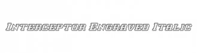
( Iconian Fonts - Daniel Zadorozny - www.iconian.com )
A bold, engraved italic font with a three-dimensional outline effect.
![Interceptor Engraved Italic Frei Schriftart Herunterladen]() Herunterladen 80 Downloads@WebFont
Herunterladen 80 Downloads@WebFont -
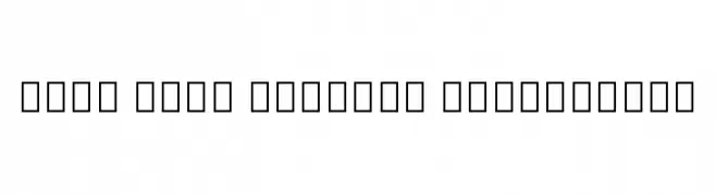
( Noto is a trademark of Google Inc. Noto fonts are open source. All Noto fonts are published under the SIL Open Font License, Version 1.1 )
A modern, clean sans-serif typeface designed for clarity and readability.
![Noto Sans Bengali ExtraLight Frei Schriftart Herunterladen]() Herunterladen 80 Downloads@WebFont
Herunterladen 80 Downloads@WebFont -
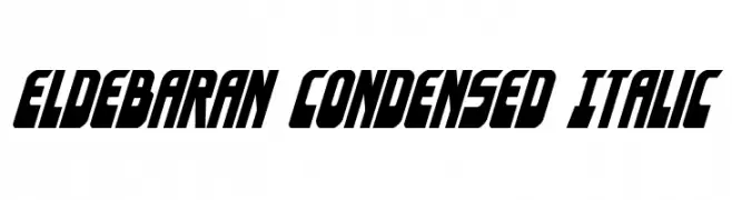
( Fonts by Daniel Zadorozny - www.iconian.com - Free for personal use )
Bold, condensed, and italic with a modern, angular design.
![Eldebaran Condensed Italic Frei Schriftart Herunterladen]() Herunterladen 80 Downloads@WebFont
Herunterladen 80 Downloads@WebFont -
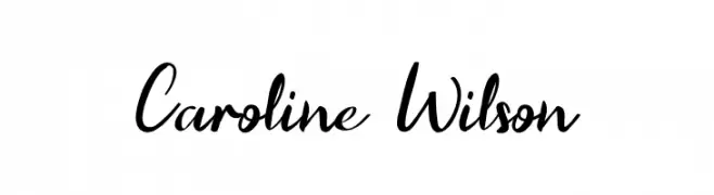
( Fonts by UI Creative - Personal-use only. For commercial use please contact owner. )
A dynamic and elegant handwritten font with fluid strokes and natural flow.
![Caroline Wilson Frei Schriftart Herunterladen]() Herunterladen 80 Downloads@WebFont
Herunterladen 80 Downloads@WebFont -
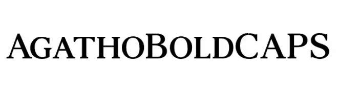
( Fonts by andfonts - Andrii Shevchyk - Personal-use only. For commercial use please contact owner. )
A bold serif font with strong, authoritative strokes and classic design.
![AgathoBoldCAPS Frei Schriftart Herunterladen]() Herunterladen 80 Downloads@WebFont
Herunterladen 80 Downloads@WebFont -
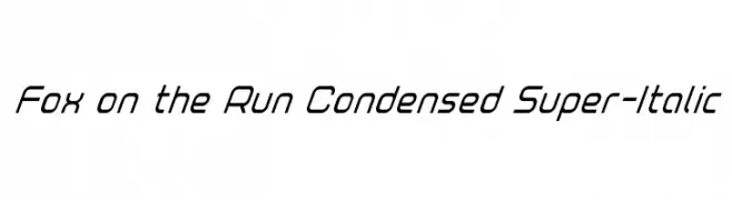
( Iconian Fonts - Daniel Zadorozny - www.iconian.com )
A sleek, condensed, and italicized font with a modern and dynamic appearance.
![Fox on the Run Condensed Super-Italic Frei Schriftart Herunterladen]() Herunterladen 80 Downloads@WebFont
Herunterladen 80 Downloads@WebFont -
( Iconian Fonts - Daniel Zadorozny - www.iconian.com )
A bold, italicized decorative font with a chrome-like, striped pattern.
![Questlok Chrome Italic Frei Schriftart Herunterladen]() Herunterladen 80 Downloads@WebFont
Herunterladen 80 Downloads@WebFont -
( Fonts by www.chequered.ink - Chequered Ink - Personal-use only. For commercial use please contact owner. )
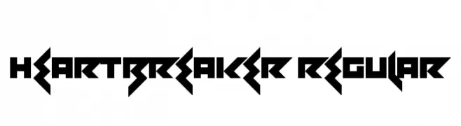
A bold, geometric font with sharp angles and a futuristic style.
![Heartbreaker Regular Frei Schriftart Herunterladen]() Herunterladen 80 Downloads@WebFont
Herunterladen 80 Downloads@WebFont -
( Fonts by Zetafonts - Personal-use only. For commercial use please contact owner. )
Bold slab serif font with unique inline detailing.
![Amazing Slab Trial Inline Bold Frei Schriftart Herunterladen]() Herunterladen 80 Downloads@WebFont
Herunterladen 80 Downloads@WebFont -
( Fonts by Goma Shin - www.geocities.jp/gomarice_font/ - Personal-use only. For commercial use please contact owner. )
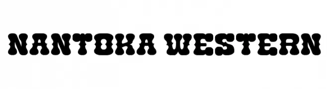
A bold, playful font with rounded serifs and a Western flair.
![Nantoka Western Frei Schriftart Herunterladen]() Herunterladen 80 Downloads@WebFont
Herunterladen 80 Downloads@WebFont -
( Fonts by Dmitry Astakhov - www.behance.net/adonis-abe1e - Personal-use only. For commercial use please contact owner. )
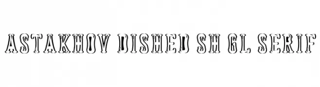
A bold, decorative serif font with shadow effects and ornate curves.
![Astakhov Dished Sh Gl Serif Frei Schriftart Herunterladen]() Herunterladen 80 Downloads@WebFont
Herunterladen 80 Downloads@WebFont -
( Fonts by 7NTypes - Personal-use only. For commercial use please contact owner. )
A playful, modern font with tall, narrow, and rounded characters.
![GLARESOME Frei Schriftart Herunterladen]() Herunterladen 80 Downloads@WebFont
Herunterladen 80 Downloads@WebFont -
( Fonts by Redy Studio )
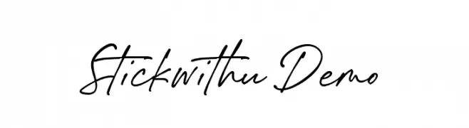
Elegant cursive script with a handwritten feel.
![Stickwithu Demo Frei Schriftart Herunterladen]() Herunterladen 80 Downloads@WebFont
Herunterladen 80 Downloads@WebFont -
( Fonts by Kong Font - fontkong.com - Personal-use only. For commercial use please contact owner. )
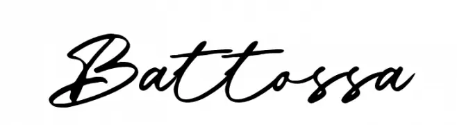
A dynamic and fluid cursive font with elegant, interconnected letters.
![Battossa Frei Schriftart Herunterladen]() Herunterladen 80 Downloads@WebFont
Herunterladen 80 Downloads@WebFont -
( Fonts by Marwah Store - Alexe Crisna - Personal-use only. For commercial use please contact owner. )
A bold, expressive brushstroke font with a dynamic and artistic style.
![contania Frei Schriftart Herunterladen]() Herunterladen 80 Downloads@WebFont
Herunterladen 80 Downloads@WebFont -
( Fonts by Symphony Studio - Personal-use only. For commercial use please contact owner. )
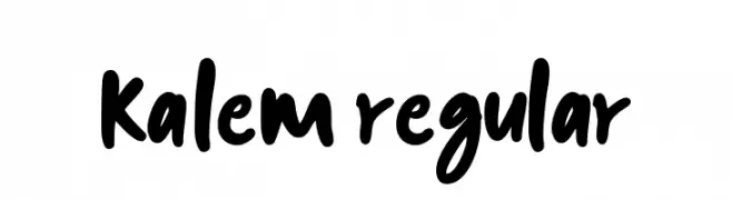
A bold, expressive handwritten font with fluid, dynamic strokes.
![kalem-Regular Frei Schriftart Herunterladen]() Herunterladen 80 Downloads@WebFont
Herunterladen 80 Downloads@WebFont -
( Fonts by Bearytype )
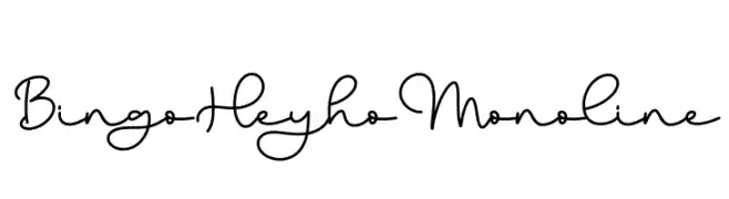
Playful monoline script with a handwritten style.
![Bingo Heyho Monoline Frei Schriftart Herunterladen]() Herunterladen 80 Downloads@WebFont
Herunterladen 80 Downloads@WebFont -
![Delta Ray Punch Frei Schriftart Herunterladen]() Herunterladen 80 Downloads@WebFont
Herunterladen 80 Downloads@WebFont -
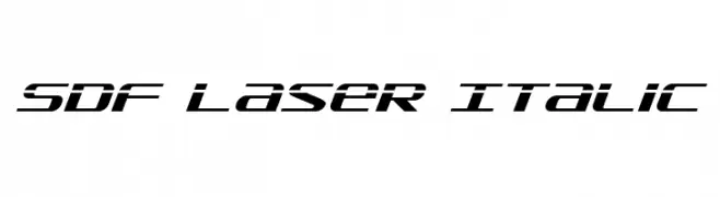
( Fonts by Daniel Zadorozny - www.iconian.com )
A bold, italic, futuristic font with angular, streamlined characters.
![SDF Laser Italic Frei Schriftart Herunterladen]() Herunterladen 80 Downloads@WebFont
Herunterladen 80 Downloads@WebFont -
( Fonts by Letterhend Studio - Hendry Juanda - Personal-use only. For commercial use please contact owner. )
A dynamic, cursive script font with elegant, flowing strokes.
![MajestikaScriptDEMO Frei Schriftart Herunterladen]() Herunterladen 80 Downloads@WebFont
Herunterladen 80 Downloads@WebFont -
( Fonts by Kong Font - fontkong.com - Personal-use only. For commercial use please contact owner. )
A bold, handwritten font with a playful and dynamic style.
![Handmix Frei Schriftart Herunterladen]() Herunterladen 80 Downloads@WebFont
Herunterladen 80 Downloads@WebFont -
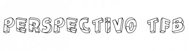
( Fonts by Zanatlija - Personal-use only. For commercial use please contact owner. )
A bold, 3D block-style font with strong outlines and a playful aesthetic.
![Perspectivo tfb Frei Schriftart Herunterladen]() Herunterladen 80 Downloads@WebFont
Herunterladen 80 Downloads@WebFont -
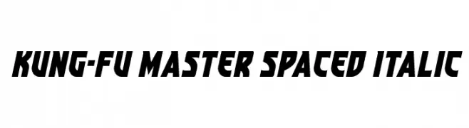
( Fonts by Daniel Zadorozny - www.iconian.com - Personal-use only. For commercial use please contact owner. )
A bold, italicized font with angular, dynamic characters and wide spacing.
![Kung-Fu Master Spaced Italic Frei Schriftart Herunterladen]() Herunterladen 80 Downloads@WebFont
Herunterladen 80 Downloads@WebFont -
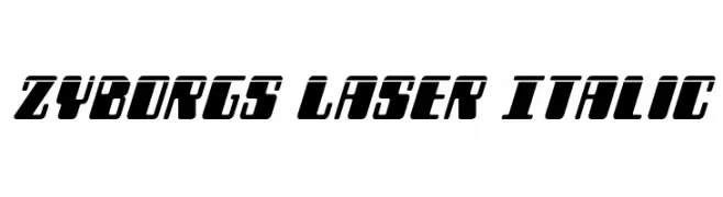
( Iconian Fonts - Daniel Zadorozny - www.iconian.com )
A bold, futuristic italic font with sharp, angular edges and high contrast.
![Zyborgs Laser Italic Frei Schriftart Herunterladen]() Herunterladen 80 Downloads@WebFont
Herunterladen 80 Downloads@WebFont -
( Fonts by Burhan Afif - hanscostudio.com - Personal-use only. For commercial use please contact owner. )
A sophisticated script font with flowing, interconnected strokes and decorative flourishes.
![Roseytha Frei Schriftart Herunterladen]() Herunterladen 80 Downloads@WebFont
Herunterladen 80 Downloads@WebFont -
( Fonts by Darrell Flood - Personal-use only. For commercial use please contact owner. )
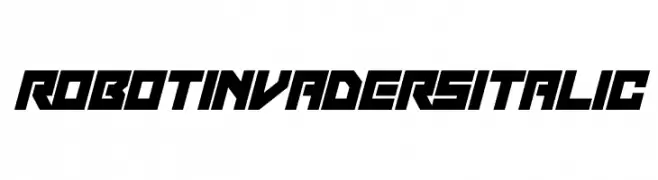
A bold, futuristic italic font with sharp angles and a sci-fi aesthetic.
![Robot Invaders Italic Frei Schriftart Herunterladen]() Herunterladen 80 Downloads@WebFont
Herunterladen 80 Downloads@WebFont -
( Fonts by Pia Frauss - Personal-use only. For commercial use please contact owner. )
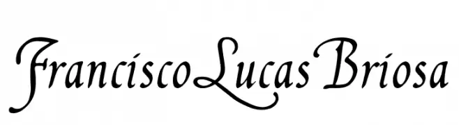
A classic and elegant script font with ornate uppercase and smooth lowercase letters.
![FranciscoLucas Briosa Frei Schriftart Herunterladen]() Herunterladen 80 Downloads@WebFont
Herunterladen 80 Downloads@WebFont -
( Fonts by Peter Wiegel - www.peter-wiegel.de - Personal-use only. For commercial use please contact owner. )
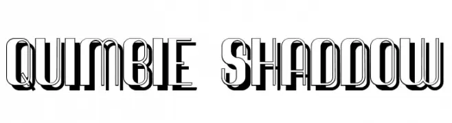
A bold, decorative font with a three-dimensional shadow effect.
![Quimbie Shaddow Frei Schriftart Herunterladen]() Herunterladen 80 Downloads@WebFont
Herunterladen 80 Downloads@WebFont -
( Fonts by Situjuh Nazara - 7ntypes.com - Personal-use only. For commercial use please contact owner. )
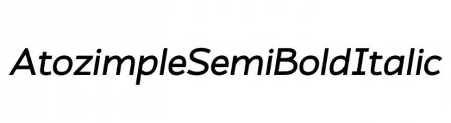
A modern, semi-bold italic font with clean lines and a dynamic style.
![Atozimple SemiBold Italic Frei Schriftart Herunterladen]() Herunterladen 80 Downloads@WebFont
Herunterladen 80 Downloads@WebFont -
( Fonts by Daniel Zadorozny - www.iconian.com )
A bold, condensed font with a playful and irregular design.
![Nobody's Home Condensed Frei Schriftart Herunterladen]() Herunterladen 80 Downloads@WebFont
Herunterladen 80 Downloads@WebFont -
( Fonts by www.chequered.ink - Chequered Ink - Personal-use only. For commercial use please contact owner. )
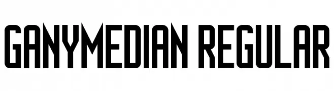
A bold, modern font with tall, narrow letterforms and high contrast.
![Ganymedian Regular Frei Schriftart Herunterladen]() Herunterladen 80 Downloads@WebFont
Herunterladen 80 Downloads@WebFont


Welche Schriften sind gerade am populärsten?
Poppins, Roboto, Montserrat, Open Sans und Lato sind wegen ihrer klaren Formen und breiten Einsetzbarkeit sehr gefragt – von Markenauftritt über Landingpages bis hin zu Postern.
Welche Fonts eignen sich für Logos?
Geometrische Sans‑Serifs (z. B. Poppins, Familien im Gotham‑Stil) sind ein häufiger Griff für sauberes, skalierbares Branding. Für eine persönlichere Note bleiben Scripts und Handschrift‑Stile beliebt. Kombinieren Sie einen prägnanten Headline‑Font mit einer neutralen Brotschrift für Wiedererkennung und Harmonie.
Wie oft wird die Top‑Liste aktualisiert?
Regelmäßig – basierend auf realen Downloads und Interaktionen. Schauen Sie öfter vorbei, um aufstrebende Favoriten früh zu entdecken.
💡 Tipp: Seite bookmarken – Trends wechseln schnell, und heutige Top‑Schriften inspirieren morgen vielleicht das Rebranding.