Willkommen bei den Top‑Schriften – hier treffen Beliebtheit und Qualität aufeinander. Das sind die in diesem Jahr am häufigsten heruntergeladenen und genutzten Fonts. Wenn Sie sichere Optionen für Logo, Web oder Social suchen, starten Sie hier.
Jeder Top‑Font überzeugt durch Balance, Lesbarkeit und Vielseitigkeit. Sie finden moderne Sans‑Serifs, elegante Scripts, Vintage‑Serifs und minimalistische Displays.
-
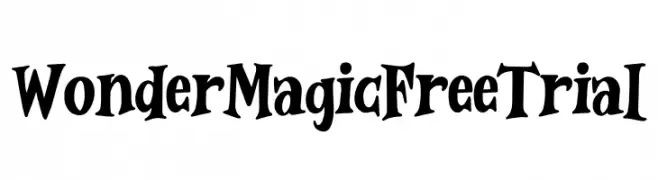
( Fonts by Typefactoryco )
A whimsical and playful font with exaggerated curves and a hand-drawn style.
 Herunterladen 80 Downloads@WebFont
 -
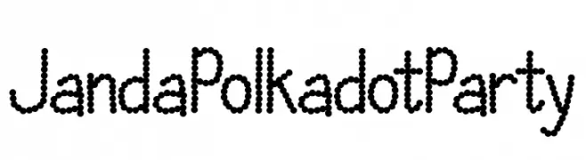
![Janda Polkadot Party Frei Schriftart Herunterladen]() Herunterladen 80 Downloads@WebFont
Herunterladen 80 Downloads@WebFont -
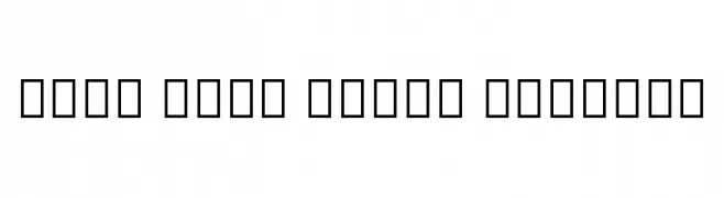
( Noto is a trademark of Google Inc. Noto fonts are open source. All Noto fonts are published under the SIL Open Font License, Version 1.1 )
A modern sans-serif font supporting the Osage script with clarity and precision.
![Noto Sans Osage Regular Frei Schriftart Herunterladen]() Herunterladen 80 Downloads@WebFont
Herunterladen 80 Downloads@WebFont -
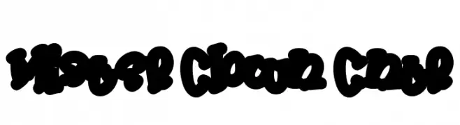
( Fonts by Daddi Daryawan )
A bold, playful script with a decorative, graffiti-like style.
![Mister Clown Cntr Frei Schriftart Herunterladen]() Herunterladen 80 Downloads@WebFont
Herunterladen 80 Downloads@WebFont -
( Kassandra Danaé - disenodanart.wix.com/danartdesign )
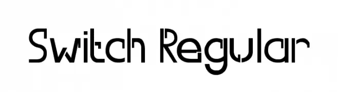
A modern, geometric font with clean lines and a futuristic style.
![Switch Regular Frei Schriftart Herunterladen]() Herunterladen 80 Downloads@WebFont
Herunterladen 80 Downloads@WebFont -
( LJ Design Studios - www.ljdesignstudios.com )
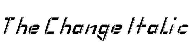
A bold, italicized font with a futuristic and angular design.
![The Change Italic Frei Schriftart Herunterladen]() Herunterladen 80 Downloads@WebFont
Herunterladen 80 Downloads@WebFont -
( Fonts by Kelly Sánchez )
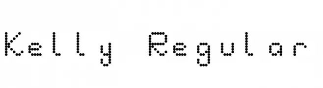
A playful, dotted font with a unique and informal style.
![Kelly Regular Frei Schriftart Herunterladen]() Herunterladen 80 Downloads@WebFont
Herunterladen 80 Downloads@WebFont -
( Fonts by Origin Type )
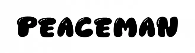
Bold, rounded, playful display font with bubble-like shapes.
![Peace Man Frei Schriftart Herunterladen]() Herunterladen 80 Downloads@WebFont
Herunterladen 80 Downloads@WebFont -
( Fonts by Vladimir Nikolic - https://www.creativefabrica.com/product/educated-deers/ref/144265/ - Personal-use only. For commercial use please contact owner. )
Expressive, brushstroke figures form each glyph, evoking motion and artistry.
![Body Moving Regular Frei Schriftart Herunterladen]() Herunterladen 80 Downloads@WebFont
Herunterladen 80 Downloads@WebFont -
( Fonts by Yoga Letter )
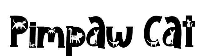
A playful decorative font with cat silhouettes integrated into each letter.
![Pimpaw Cat Frei Schriftart Herunterladen]() Herunterladen 80 Downloads@WebFont
Herunterladen 80 Downloads@WebFont -
( Fonts by www.junkohanhero.com - Personal-use only. For commercial use please contact owner. )
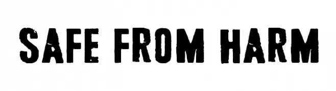
A bold, distressed font with a rugged, vintage appearance.
![Safe from harm Frei Schriftart Herunterladen]() Herunterladen 80 Downloads@WebFont
Herunterladen 80 Downloads@WebFont -
( Cédric Dequidt - www.cedric-dequidt.fr/ )
A playful cursive font with interconnected, flowing digits.
![cursive digits Frei Schriftart Herunterladen]() Herunterladen 80 Downloads@WebFont
Herunterladen 80 Downloads@WebFont -
( Rajendra Bitling - www.rbitling.com )
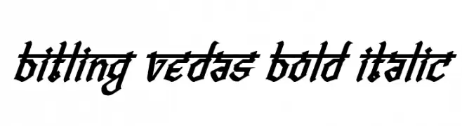
A bold, italicized font with sharp angles and a dynamic, modern style.
![Bitling vedas Bold Italic Frei Schriftart Herunterladen]() Herunterladen 80 Downloads@WebFont
Herunterladen 80 Downloads@WebFont -
( Colorful Typhoon - www.geocities.jp/kitschlabo/ )
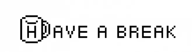
A pixelated, monospaced font with a retro digital aesthetic.
![Have a break Frei Schriftart Herunterladen]() Herunterladen 80 Downloads@WebFont
Herunterladen 80 Downloads@WebFont -
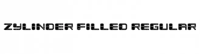
( Fonts by Vladimir Nikolic )
A bold, industrial font with intricate internal detailing and a futuristic look.
![Zylinder Filled Regular Frei Schriftart Herunterladen]() Herunterladen 80 Downloads@WebFont
Herunterladen 80 Downloads@WebFont -
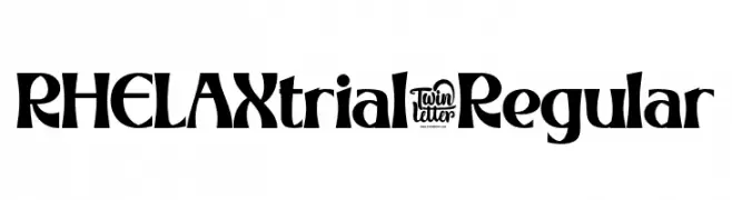
( Fonts by twinletter )
A bold, dynamic font with artistic flair and striking visual impact.
![RHELAXtrial-Regular Frei Schriftart Herunterladen]() Herunterladen 80 Downloads@WebFont
Herunterladen 80 Downloads@WebFont -
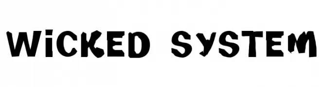
( Font Emporium - web.archive.org/web/20020126112915/www.fontemporium.com/ )
A bold, distressed font with a grunge aesthetic and irregular shapes.
![Wicked System Frei Schriftart Herunterladen]() Herunterladen 80 Downloads@WebFont
Herunterladen 80 Downloads@WebFont -
( Fonts by Masa Aska Sanurumi )
A bold, hand-drawn font with a playful and chaotic style.
![Grave Party Frei Schriftart Herunterladen]() Herunterladen 80 Downloads@WebFont
Herunterladen 80 Downloads@WebFont -
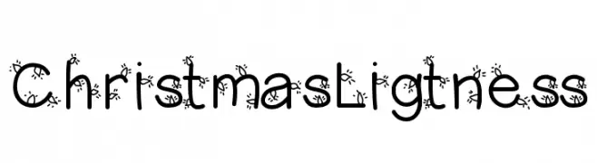
( Fonts by Vanessa Bays - bythebutterfly.com )
A festive, snowflake-adorned font perfect for holiday-themed designs.
![ChristmasLigtness Frei Schriftart Herunterladen]() Herunterladen 80 Downloads@WebFont
Herunterladen 80 Downloads@WebFont -
( Fonts by Iconian Fonts )
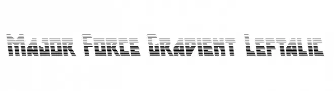
A bold, futuristic font with a horizontal stripe gradient effect.
![Major Force Gradient Leftalic Frei Schriftart Herunterladen]() Herunterladen 80 Downloads@WebFont
Herunterladen 80 Downloads@WebFont -
( Fonts by uglygerry.com - Personal-use only. For commercial use please contact owner. )
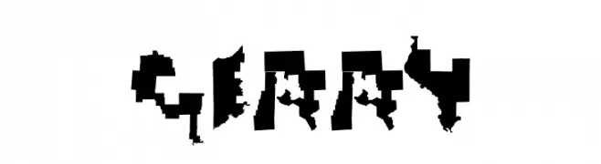
A distressed, fragmented font with a rugged, chaotic appearance.
![Gerry Frei Schriftart Herunterladen]() Herunterladen 80 Downloads@WebFont
Herunterladen 80 Downloads@WebFont -
( Fonts by Asd Studio - Ghazi Humam Fauzan - Personal-use only. For commercial use please contact owner. )
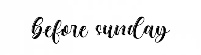
A lively and elegant script font with flowing, cursive letterforms.
![before sunday Frei Schriftart Herunterladen]() Herunterladen 80 Downloads@WebFont
Herunterladen 80 Downloads@WebFont -
( 100% Free - www.typodermicfonts.com/ )
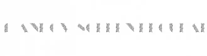
A bold, dotted font with a modern and playful geometric design.
![ManbowScreen-Regular Frei Schriftart Herunterladen]() Herunterladen 80 Downloads@WebFont
Herunterladen 80 Downloads@WebFont -
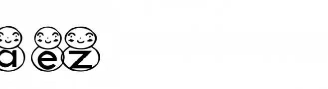
( Fonts by Adult Ramblings - Anastacia E. Zittel - Personal-use only. For commercial use please contact owner. )
A playful font with characters inside snowman faces, ideal for festive designs.
![AEZ snowman Frei Schriftart Herunterladen]() Herunterladen 80 Downloads@WebFont
Herunterladen 80 Downloads@WebFont -
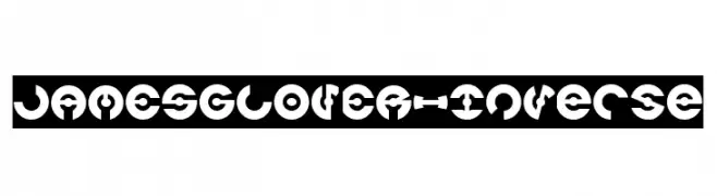
( weknow - Wino S Kadir - www.creativefabrica.com/designer/weknow/ )
A bold, geometric font with medium contrast and a futuristic, decorative style.
![JAMES GLOVER-Inverse Frei Schriftart Herunterladen]() Herunterladen 80 Downloads@WebFont
Herunterladen 80 Downloads@WebFont -
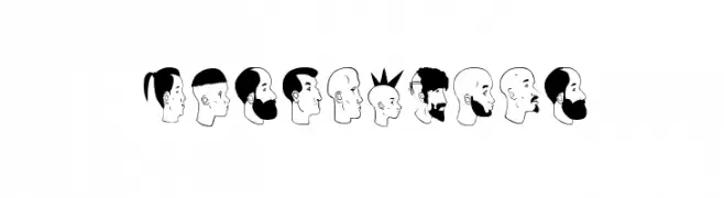
( Fonts by Greg Medina - www.dcoxy.com - Personal-use only. For commercial use please contact owner. )
Decorative font using illustrated human profiles and tribal-style symbols.
![profilsdco Frei Schriftart Herunterladen]() Herunterladen 80 Downloads@WebFont
Herunterladen 80 Downloads@WebFont -
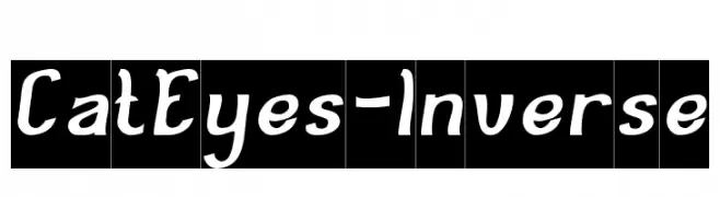
( weknow - Wino S Kadir - www.creativefabrica.com/designer/weknow/ )
A playful, handwritten-style font with bold, slightly italicized characters.
![Cat Eyes-Inverse Frei Schriftart Herunterladen]() Herunterladen 80 Downloads@WebFont
Herunterladen 80 Downloads@WebFont -
( Fonts by Shanaya Studio )
A bold, angular font with a dynamic, edgy style.
![Wilkey Frei Schriftart Herunterladen]() Herunterladen 80 Downloads@WebFont
Herunterladen 80 Downloads@WebFont -
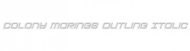
( Fonts by Iconian Fonts )
A modern, outlined, italic font with a futuristic and dynamic design.
![Colony Marines Outline Italic Frei Schriftart Herunterladen]() Herunterladen 80 Downloads@WebFont
Herunterladen 80 Downloads@WebFont -
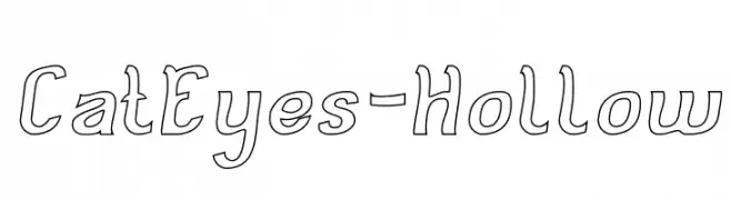
( weknow - Wino S Kadir - www.creativefabrica.com/designer/weknow/ )
A playful, hollow, hand-drawn font with rounded edges and a whimsical style.
![Cat Eyes-Hollow Frei Schriftart Herunterladen]() Herunterladen 80 Downloads@WebFont
Herunterladen 80 Downloads@WebFont -
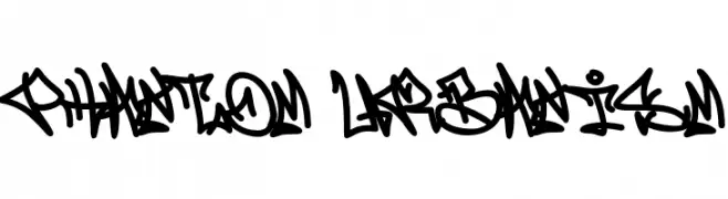
( Fonts by Cikareotype Studio )
A bold, graffiti-inspired font with dynamic, interconnected strokes.
![Phantom Urbanism Frei Schriftart Herunterladen]() Herunterladen 80 Downloads@WebFont
Herunterladen 80 Downloads@WebFont -
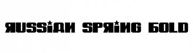
( Vladimir Nikolic - www.coroflot.com/vladimirnikolic )
A bold, geometric font with a modern, industrial style.
![Russian Spring Bold Frei Schriftart Herunterladen]() Herunterladen 80 Downloads@WebFont
Herunterladen 80 Downloads@WebFont -
( Fonts by Zulfikar Ali - Personal-use only. For commercial use please contact owner. )
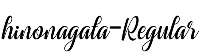
An elegant, flowing script font with graceful curves and decorative flourishes.
![hinonagata-Regular Frei Schriftart Herunterladen]() Herunterladen 80 Downloads@WebFont
Herunterladen 80 Downloads@WebFont -
( Zetafonts - www.zetafonts.com )
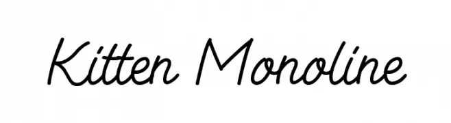
A playful and elegant monoline script font with smooth, flowing lines.
![Kitten Monoline Frei Schriftart Herunterladen]() Herunterladen 80 Downloads@WebFont
Herunterladen 80 Downloads@WebFont -
( Dingfontbats )
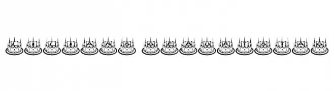
Whimsical, cake-themed decorative font with bold, rounded letters.
![Lilians Geburtstag Frei Schriftart Herunterladen]() Herunterladen 80 Downloads@WebFont
Herunterladen 80 Downloads@WebFont


Welche Schriften sind gerade am populärsten?
Poppins, Roboto, Montserrat, Open Sans und Lato sind wegen ihrer klaren Formen und breiten Einsetzbarkeit sehr gefragt – von Markenauftritt über Landingpages bis hin zu Postern.
Welche Fonts eignen sich für Logos?
Geometrische Sans‑Serifs (z. B. Poppins, Familien im Gotham‑Stil) sind ein häufiger Griff für sauberes, skalierbares Branding. Für eine persönlichere Note bleiben Scripts und Handschrift‑Stile beliebt. Kombinieren Sie einen prägnanten Headline‑Font mit einer neutralen Brotschrift für Wiedererkennung und Harmonie.
Wie oft wird die Top‑Liste aktualisiert?
Regelmäßig – basierend auf realen Downloads und Interaktionen. Schauen Sie öfter vorbei, um aufstrebende Favoriten früh zu entdecken.
💡 Tipp: Seite bookmarken – Trends wechseln schnell, und heutige Top‑Schriften inspirieren morgen vielleicht das Rebranding.