Willkommen bei den Top‑Schriften – hier treffen Beliebtheit und Qualität aufeinander. Das sind die in diesem Jahr am häufigsten heruntergeladenen und genutzten Fonts. Wenn Sie sichere Optionen für Logo, Web oder Social suchen, starten Sie hier.
Jeder Top‑Font überzeugt durch Balance, Lesbarkeit und Vielseitigkeit. Sie finden moderne Sans‑Serifs, elegante Scripts, Vintage‑Serifs und minimalistische Displays.
-
( Fonts by Hoperative )
A bold, playful font with rounded, thick strokes and a bubbly appearance.
 Herunterladen 78 Downloads@WebFont
 -
( Fonts by Hugefonts - Personal-use only. For commercial use please contact owner. )
A playful, bold handwritten font with dynamic strokes and a casual style.
![hello berlin Frei Schriftart Herunterladen]() Herunterladen 78 Downloads@WebFont
Herunterladen 78 Downloads@WebFont -
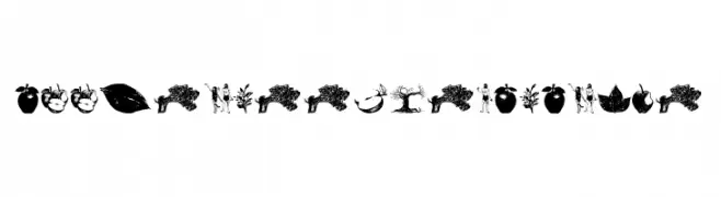
( Fonts by FHFont )
A decorative font with intricate illustrations of apples, trees, and figures.
![AppleTree-Decorative Frei Schriftart Herunterladen]() Herunterladen 78 Downloads@WebFont
Herunterladen 78 Downloads@WebFont -
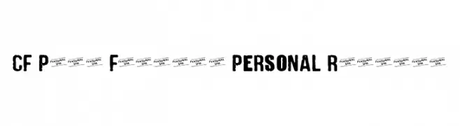
( Fonts by Cloutierfontes - Steve Cloutier - Personal-use only. For commercial use please contact owner. )
A bold, distressed font with a grunge, punk aesthetic.
![CF Punk Fashion PERSONAL Regular Frei Schriftart Herunterladen]() Herunterladen 78 Downloads@WebFont
Herunterladen 78 Downloads@WebFont -
( Iconian Fonts - Daniel Zadorozny - www.iconian.com )
A bold, italicized font with a halftone effect, perfect for modern designs.
![Banjin Halftone Italic Frei Schriftart Herunterladen]() Herunterladen 78 Downloads@WebFont
Herunterladen 78 Downloads@WebFont -
( Fonts by Polah Type - Personal-use only. For commercial use please contact owner. )
A playful, handwritten font with a casual and friendly style.
![Go Jackie Frei Schriftart Herunterladen]() Herunterladen 78 Downloads@WebFont
Herunterladen 78 Downloads@WebFont -
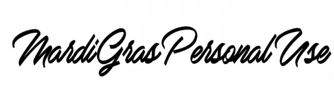
( Fonts by Billy Argel Fonts - www.billyargel.com - Personal-use only. For commercial use please contact owner. )
A bold, cursive font with dynamic, flowing characters and a decorative style.
![Mardi Gras Personal Use Frei Schriftart Herunterladen]() Herunterladen 78 Downloads@WebFont
Herunterladen 78 Downloads@WebFont -
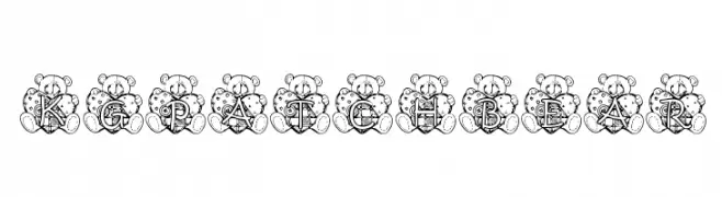
( Katz Fontz - katzfonts.50megs.com/kg.html )
A whimsical font with letters inside teddy bear designs, perfect for playful projects.
![KG PATCHBEAR Frei Schriftart Herunterladen]() Herunterladen 78 Downloads@WebFont
Herunterladen 78 Downloads@WebFont -
( Fonts by Nick Curtis - Personal-use only. For commercial use please contact owner. )
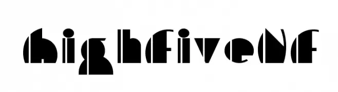
A bold, geometric font with high contrast and modern, abstract shapes.
![HighFiveNF Frei Schriftart Herunterladen]() Herunterladen 78 Downloads@WebFont
Herunterladen 78 Downloads@WebFont -
( Fonts by www.gliphmaker.com. Personal-use only. For commercial use please contact owner. )
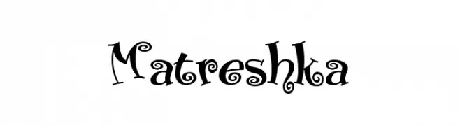
A whimsical and decorative font with curly, playful elements.
![Matreshka Frei Schriftart Herunterladen]() Herunterladen 78 Downloads@WebFont
Herunterladen 78 Downloads@WebFont -
( Simon Murdoch )
A bold, geometric font with a unique cut-out style and high contrast.
![Inkie Block Regular Frei Schriftart Herunterladen]() Herunterladen 78 Downloads@WebFont
Herunterladen 78 Downloads@WebFont -
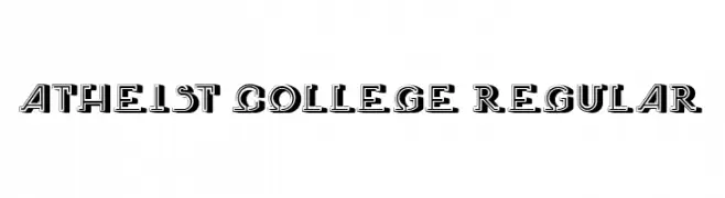
( Fonts by Vladimir Nikolic - www.creativefabrica.com/designer/vladimirnikolic/ - Personal-use only. For commercial use please contact owner. )
A bold, collegiate-style font with strong serifs and a layered, outlined design.
![Atheist College Regular Frei Schriftart Herunterladen]() Herunterladen 78 Downloads@WebFont
Herunterladen 78 Downloads@WebFont -
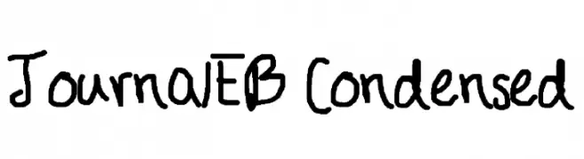
![JournalEB Condensed Frei Schriftart Herunterladen]() Herunterladen 78 Downloads@WebFont
Herunterladen 78 Downloads@WebFont -
( Noto is a trademark of Google Inc. Noto fonts are open source. All Noto fonts are published under the SIL Open Font License, Version 1.1 )
No valid font is visible due to missing glyphs.
![Noto Sans Myanmar UI SemiBold Frei Schriftart Herunterladen]() Herunterladen 78 Downloads@WebFont
Herunterladen 78 Downloads@WebFont -
( Fonts by DumadiStyle - Toni Dzulham - Personal-use only. For commercial use please contact owner. )
A bold, geometric font with a modern and dynamic style.
![Untrouble Frei Schriftart Herunterladen]() Herunterladen 78 Downloads@WebFont
Herunterladen 78 Downloads@WebFont -
( Fonts by Magang Letterhend - Personal-use only. For commercial use please contact owner. )
A playful, handwritten font with tall, narrow letters and a casual style.
![BOLICA Frei Schriftart Herunterladen]() Herunterladen 78 Downloads@WebFont
Herunterladen 78 Downloads@WebFont -
( Fonts by Zetafonts - Personal-use only. For commercial use please contact owner. )
A bold, italic serif font with a classic and elegant style.
![CalvinoTrial Bold Italic Frei Schriftart Herunterladen]() Herunterladen 78 Downloads@WebFont
Herunterladen 78 Downloads@WebFont -
( Fonts by HollieInk )
A playful, hand-drawn font with whimsical, decorative elements.
![Hollies Webs Regular Frei Schriftart Herunterladen]() Herunterladen 78 Downloads@WebFont
Herunterladen 78 Downloads@WebFont -
( Fonts by CalligraphyFonts - Personal-use only. For commercial use please contact owner. )
A flowing script font with elegant curves and a handwritten feel.
![Suffragist Demo Frei Schriftart Herunterladen]() Herunterladen 78 Downloads@WebFont
Herunterladen 78 Downloads@WebFont -
( Fonts by Slava Krivonosov - Personal-use only. For commercial use please contact owner. )
A modern, narrow font with elongated letterforms and a sleek design.
![LAMPA Frei Schriftart Herunterladen]() Herunterladen 78 Downloads@WebFont
Herunterladen 78 Downloads@WebFont -
( Fonts by Ethan Huang )
A bold, geometric font with a modern and technical appearance.
![MDDasher-Regular Frei Schriftart Herunterladen]() Herunterladen 78 Downloads@WebFont
Herunterladen 78 Downloads@WebFont -
( Daniel Plant - www.fontmonster.org )
A decorative and abstract font with geometric shapes and patterns.
![Etc Frei Schriftart Herunterladen]() Herunterladen 78 Downloads@WebFont
Herunterladen 78 Downloads@WebFont -
( Fonts by Mans Greback - Personal-use only. For commercial use please contact owner. )
A bold, elegant calligraphic font with dynamic, flowing strokes.
![Silian Calligraphy Bold PERSONAL Regular Frei Schriftart Herunterladen]() Herunterladen 78 Downloads@WebFont
Herunterladen 78 Downloads@WebFont -
( Fonts by Khurasan - Syaf Rizal - Personal-use only. For commercial use please contact owner. )
A dynamic, expressive handwritten font with fluid, cursive letterforms.
![Avture Frei Schriftart Herunterladen]() Herunterladen 78 Downloads@WebFont
Herunterladen 78 Downloads@WebFont -
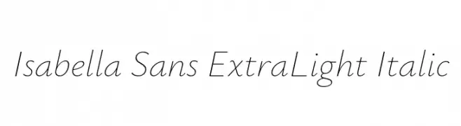
( Fonts by Original fonts by Christian Thalmann (Catharsis Fonts), Modifications by Cristiano Sobral - Personal-use only. For commercial use please contact owner. )
An elegant, extra light italic font with sleek, elongated characters.
![Isabella Sans ExtraLight Italic Frei Schriftart Herunterladen]() Herunterladen 78 Downloads@WebFont
Herunterladen 78 Downloads@WebFont -
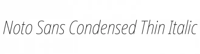
( Fonts by Google - Personal-use only. For commercial use please contact owner. )
A sleek, thin, condensed sans-serif font with an elegant italic style.
![Noto Sans Condensed Thin Italic Frei Schriftart Herunterladen]() Herunterladen 78 Downloads@WebFont
Herunterladen 78 Downloads@WebFont -
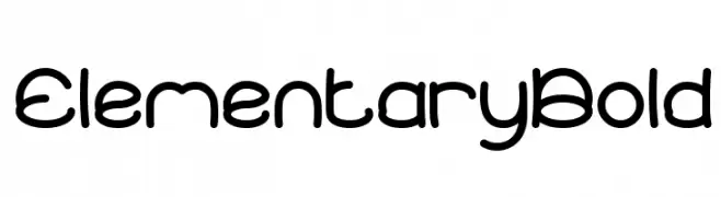
( weknow - Wino S Kadir - www.creativefabrica.com/designer/weknow/ )
A bold, rounded font with smooth curves and a playful, friendly appearance.
![Elementary Bold Frei Schriftart Herunterladen]() Herunterladen 78 Downloads@WebFont
Herunterladen 78 Downloads@WebFont -
( Fonts by Hamzah Muhamad Ihsan - Typesthetic Studio - Personal-use only. For commercial use please contact owner. )
A casual, handwritten font with a friendly and approachable style.
![Bold Lining Frei Schriftart Herunterladen]() Herunterladen 78 Downloads@WebFont
Herunterladen 78 Downloads@WebFont -
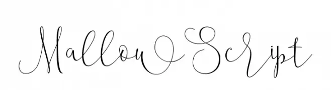
( Roiyani Teungku - creativemarket.com/artisans )
An elegant script font with flowing, intricate loops and flourishes.
![MallowScript Frei Schriftart Herunterladen]() Herunterladen 78 Downloads@WebFont
Herunterladen 78 Downloads@WebFont -
( Fonts by Kong Font - fontkong.com - Personal-use only. For commercial use please contact owner. )
A flowing, cursive font with a modern yet classic handwritten style.
![Candle Fest Frei Schriftart Herunterladen]() Herunterladen 78 Downloads@WebFont
Herunterladen 78 Downloads@WebFont -
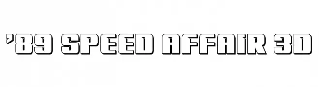
( Fonts by Iconian Fonts - Daniel Zadorozny - Personal-use only. For commercial use please contact owner. )
A bold, 3D block font with a modern, industrial style.
!['89 Speed Affair 3D Frei Schriftart Herunterladen]() Herunterladen 78 Downloads@WebFont
Herunterladen 78 Downloads@WebFont -
( Fonts by Meir Sadan - www.sadan.com Sponsoren Schriftart )
A whimsical, hand-drawn font with dynamic strokes and artistic flair.
![Chaiee Thin Frei Schriftart Herunterladen]() Herunterladen 78 Downloads
Herunterladen 78 Downloads -
( Fonts by Yahhya Anas - Personal-use only. For commercial use please contact owner. )
A bold, playful script font with rounded strokes and smooth curves.
![DaddyBee Frei Schriftart Herunterladen]() Herunterladen 78 Downloads@WebFont
Herunterladen 78 Downloads@WebFont -
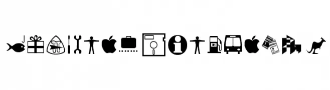
( Fonts by Typographer Mediengestaltung - Personal-use only. For commercial use please contact owner. )
A versatile set of bold, clear pictograms ideal for signage and instructional use.
![Journal Dingbats 2 Frei Schriftart Herunterladen]() Herunterladen 78 Downloads@WebFont
Herunterladen 78 Downloads@WebFont -
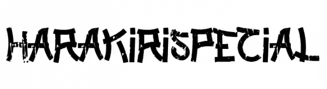
( Fonts by Woodcutter Manero - http://www.woodcutter.es - Personal-use only. For commercial use please contact owner. )
A bold, distressed font with a grungy, hand-drawn appearance.
![Harakiri Special Frei Schriftart Herunterladen]() Herunterladen 78 Downloads@WebFont
Herunterladen 78 Downloads@WebFont


Welche Schriften sind gerade am populärsten?
Poppins, Roboto, Montserrat, Open Sans und Lato sind wegen ihrer klaren Formen und breiten Einsetzbarkeit sehr gefragt – von Markenauftritt über Landingpages bis hin zu Postern.
Welche Fonts eignen sich für Logos?
Geometrische Sans‑Serifs (z. B. Poppins, Familien im Gotham‑Stil) sind ein häufiger Griff für sauberes, skalierbares Branding. Für eine persönlichere Note bleiben Scripts und Handschrift‑Stile beliebt. Kombinieren Sie einen prägnanten Headline‑Font mit einer neutralen Brotschrift für Wiedererkennung und Harmonie.
Wie oft wird die Top‑Liste aktualisiert?
Regelmäßig – basierend auf realen Downloads und Interaktionen. Schauen Sie öfter vorbei, um aufstrebende Favoriten früh zu entdecken.
💡 Tipp: Seite bookmarken – Trends wechseln schnell, und heutige Top‑Schriften inspirieren morgen vielleicht das Rebranding.