Willkommen bei den Top‑Schriften – hier treffen Beliebtheit und Qualität aufeinander. Das sind die in diesem Jahr am häufigsten heruntergeladenen und genutzten Fonts. Wenn Sie sichere Optionen für Logo, Web oder Social suchen, starten Sie hier.
Jeder Top‑Font überzeugt durch Balance, Lesbarkeit und Vielseitigkeit. Sie finden moderne Sans‑Serifs, elegante Scripts, Vintage‑Serifs und minimalistische Displays.
-
 Herunterladen 78 Downloads@WebFont
 -
( Fonts by Airotype Studio - Personal-use only. For commercial use please contact owner. )
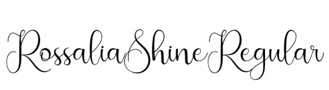
An elegant, flowing script font with intricate loops and swirls.
![RossaliaShineRegular Frei Schriftart Herunterladen]() Herunterladen 78 Downloads@WebFont
Herunterladen 78 Downloads@WebFont -
( Fonts by AminMario - Amin Mario - Personal-use only. For commercial use please contact owner. )
An elegant script font with flowing, cursive letterforms and moderate contrast.
![Moline Frei Schriftart Herunterladen]() Herunterladen 78 Downloads@WebFont
Herunterladen 78 Downloads@WebFont -
( Fonts by weknow - Wino S Kadir - Personal-use only. For commercial use please contact owner. )
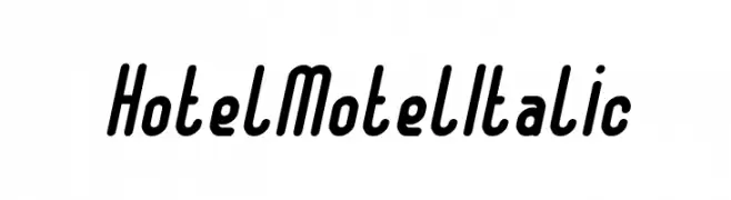
A bold, italic font with rounded, dynamic characters.
![Hotel Motel Italic Frei Schriftart Herunterladen]() Herunterladen 78 Downloads@WebFont
Herunterladen 78 Downloads@WebFont -
( Fonts by weknow - Wino S Kadir - Personal-use only. For commercial use please contact owner. )
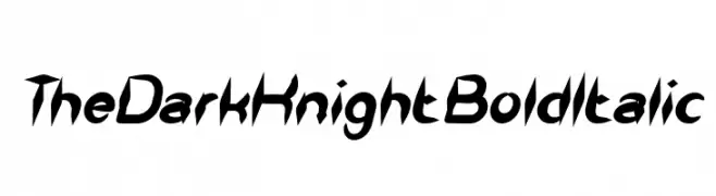
A bold, italic font with sharp, angular edges and high contrast, exuding energy and modernity.
![The Dark Knight Bold Italic Frei Schriftart Herunterladen]() Herunterladen 78 Downloads@WebFont
Herunterladen 78 Downloads@WebFont -
( Joorgemoron@gmail.com )
A classic typewriter-style font with monospaced characters and distinct serifs.
![JMHTypewriterFine-Regular Frei Schriftart Herunterladen]() Herunterladen 78 Downloads@WebFont
Herunterladen 78 Downloads@WebFont -
( Fonts by Vladimir Nikolic )
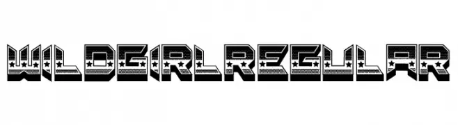
A bold, decorative font with a 3D effect and star embellishments.
![Wild Girl Regular Frei Schriftart Herunterladen]() Herunterladen 78 Downloads@WebFont
Herunterladen 78 Downloads@WebFont -
( Fonts by Edric Studio - Personal-use only. For commercial use please contact owner. )
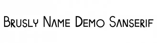
A modern sans-serif font with geometric influences and uniform stroke width.
![Brusly Name Demo Sanserif Frei Schriftart Herunterladen]() Herunterladen 78 Downloads@WebFont
Herunterladen 78 Downloads@WebFont -
( Fonts by Jayde Garrow - GarrowGlitch - http://jaydegarrow.wix.com/jaydefonts. Personal-use only. For commercial use please contact owner. )
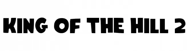
A bold, playful font with rounded, cartoonish characters.
![King Of The Hill 2 Frei Schriftart Herunterladen]() Herunterladen 78 Downloads@WebFont
Herunterladen 78 Downloads@WebFont -
( Fonts by Kat`s Fun Fonts - Personal-use only. For commercial use please contact owner. )
A decorative font with playful holiday-themed icons.
![KR More Holidays Frei Schriftart Herunterladen]() Herunterladen 78 Downloads@WebFont
Herunterladen 78 Downloads@WebFont -
( Fonts by Thomas Canale - Personal-use only. For commercial use please contact owner. )
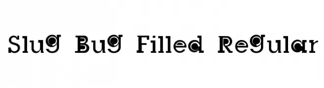
A bold, playful font with a unique filled style and strong decorative elements.
![Slug Bug Filled Regular Frei Schriftart Herunterladen]() Herunterladen 78 Downloads@WebFont
Herunterladen 78 Downloads@WebFont -
( Fonts by Krunoslav Sokic - model850.deviantart.com - Personal-use only. For commercial use please contact owner. )
A futuristic, angular font with a techno-inspired design.
![Technostroked Frei Schriftart Herunterladen]() Herunterladen 78 Downloads@WebFont
Herunterladen 78 Downloads@WebFont -
( Collection of Korean web fonts - Personal-use only. For commercial use please contact owner. )
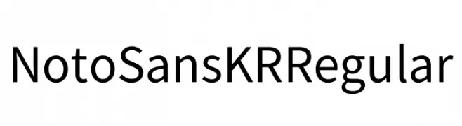
A modern, clean sans-serif typeface with excellent readability and balance.
![Noto Sans KR Regular Frei Schriftart Herunterladen]() Herunterladen 78 Downloads@WebFont
Herunterladen 78 Downloads@WebFont -
( Fonts by Zanatlija - Personal-use only. For commercial use please contact owner. )
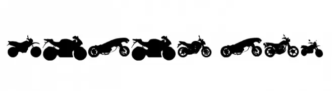
Motorcycle silhouette dingbat font.
![motos tfb Frei Schriftart Herunterladen]() Herunterladen 78 Downloads@WebFont
Herunterladen 78 Downloads@WebFont -
( Fonts by wep - Wahyu Eka Prasetya - Personal-use only. For commercial use please contact owner. )
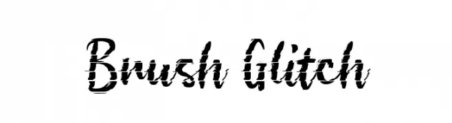
A brush-style font with a glitch effect, offering a modern and edgy look.
![Brush Glitch Frei Schriftart Herunterladen]() Herunterladen 78 Downloads@WebFont
Herunterladen 78 Downloads@WebFont -
( madeDeduk )
A bold, cursive font with flowing, interconnected strokes.
![Claiborne Frei Schriftart Herunterladen]() Herunterladen 78 Downloads@WebFont
Herunterladen 78 Downloads@WebFont -
( Em Nazar )
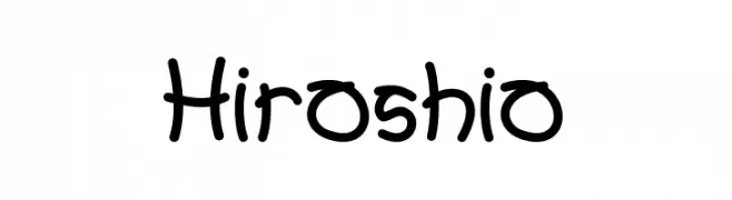
A playful handwritten font with a casual and friendly style.
![Hiroshio Frei Schriftart Herunterladen]() Herunterladen 78 Downloads@WebFont
Herunterladen 78 Downloads@WebFont -
( Fonts by Daniel Zadorozny - www.iconian.com - Personal-use only. For commercial use please contact owner. )
A bold, geometric font with a futuristic and industrial design.
![Arctic Guardian Frei Schriftart Herunterladen]() Herunterladen 78 Downloads@WebFont
Herunterladen 78 Downloads@WebFont -
( Fonts by Daniel Zadorozny - www.iconian.com - Personal-use only. For commercial use please contact owner. )
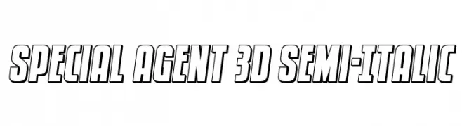
A bold, 3D semi-italic font with outlined characters and a dynamic style.
![Special Agent 3D Semi-Italic Frei Schriftart Herunterladen]() Herunterladen 78 Downloads@WebFont
Herunterladen 78 Downloads@WebFont -
( Chequered Ink - chequered.ink/ )
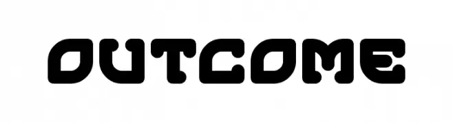
A bold, rounded, geometric font with a modern and futuristic style.
![Outcome Frei Schriftart Herunterladen]() Herunterladen 78 Downloads@WebFont
Herunterladen 78 Downloads@WebFont -
( Fonts by Elbanadha Creative )
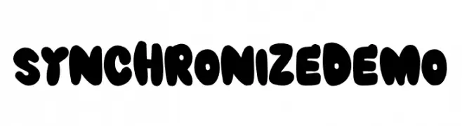
A bold, rounded, and playful font with a retro vibe.
![SYNCHRONIZE DEMO Frei Schriftart Herunterladen]() Herunterladen 78 Downloads@WebFont
Herunterladen 78 Downloads@WebFont -
( Fonts by K_IN Studio - Personal-use only. For commercial use please contact owner. )
An elegant cursive font with graceful curves and delicate serifs.
![Love Sonnia Frei Schriftart Herunterladen]() Herunterladen 78 Downloads@WebFont
Herunterladen 78 Downloads@WebFont -
( Josen Tan - www.roblox.com )
A bold, geometric font with angular letterforms and a strong, modern aesthetic.
![xxjjoosengx33xx Bold Frei Schriftart Herunterladen]() Herunterladen 78 Downloads@WebFont
Herunterladen 78 Downloads@WebFont -
( Fonts by Benjamin Blåholtz - Personal-use only. For commercial use please contact owner. )
A bold slab serif font with a modern yet classic appeal.
![Grundsten Frei Schriftart Herunterladen]() Herunterladen 78 Downloads@WebFont
Herunterladen 78 Downloads@WebFont -
![Radio Grave Regular Frei Schriftart Herunterladen]() Herunterladen 78 Downloads@WebFont
Herunterladen 78 Downloads@WebFont -
( Fonts by Vladimir Nikolic )
A bold, decorative font with gear-like circular enclosures around each character.
![Neuron Capitals Regular Frei Schriftart Herunterladen]() Herunterladen 78 Downloads@WebFont
Herunterladen 78 Downloads@WebFont -
( London's Letters - www.londonsletters.com/ )
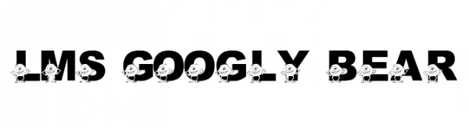
A bold, playful font with cartoon characters embedded in each letter.
![LMS Googly Bear Frei Schriftart Herunterladen]() Herunterladen 78 Downloads@WebFont
Herunterladen 78 Downloads@WebFont -
( Fonts by Daniel Zadorozny - www.iconian.com )
A decorative and futuristic font with circular accents and geometric shapes.
![Underground Rose Leftalic Frei Schriftart Herunterladen]() Herunterladen 78 Downloads@WebFont
Herunterladen 78 Downloads@WebFont -
( Fonts by Garisman Studio - Risman Ginarwan - Personal-use only. For commercial use please contact owner. )
An elegant, flowing script font with a handwritten style.
![Sacreditty Frei Schriftart Herunterladen]() Herunterladen 78 Downloads@WebFont
Herunterladen 78 Downloads@WebFont -
( Fonts by Balpirick Studio - https://www.creativefabrica.com/designer/balpirick/ref/308299/ - Personal-use only. For commercial use please contact owner. )
A lively handwritten font with fluid, dynamic strokes and a playful touch.
![Scholastica Frei Schriftart Herunterladen]() Herunterladen 78 Downloads@WebFont
Herunterladen 78 Downloads@WebFont -
( Fonts by Muhammad Rafif )
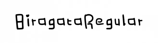
Playful and quirky handwritten font.
![Biragata Regular Frei Schriftart Herunterladen]() Herunterladen 78 Downloads@WebFont
Herunterladen 78 Downloads@WebFont -
( Fonts by Wino S Kadir - weknow - www.revolge.com/shop/weknow/ - Personal-use only. For commercial use please contact owner. )
A bold, angular font with geometric and blocky letterforms.
![alot of love Frei Schriftart Herunterladen]() Herunterladen 78 Downloads@WebFont
Herunterladen 78 Downloads@WebFont -
( Fonts by Wino S Kadir - weknow - www.revolge.com/shop/weknow/ - Personal-use only. For commercial use please contact owner. )
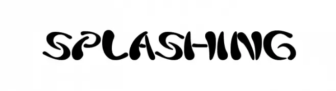
A bold, playful font with fluid, splash-like strokes.
![splashing Frei Schriftart Herunterladen]() Herunterladen 78 Downloads@WebFont
Herunterladen 78 Downloads@WebFont -
( Tomm Warham - www.TommWarham.com )
A playful, hand-drawn font with a scribbled texture and dynamic style.
![skribler Regular Frei Schriftart Herunterladen]() Herunterladen 78 Downloads@WebFont
Herunterladen 78 Downloads@WebFont -
( Fonts by Leonard Posavec - leosupply.co - Personal-use only. For commercial use please contact owner. )
A bold, playful font with cartoonish, exaggerated characters.
![FunnyTeca Frei Schriftart Herunterladen]() Herunterladen 78 Downloads@WebFont
Herunterladen 78 Downloads@WebFont


Welche Schriften sind gerade am populärsten?
Poppins, Roboto, Montserrat, Open Sans und Lato sind wegen ihrer klaren Formen und breiten Einsetzbarkeit sehr gefragt – von Markenauftritt über Landingpages bis hin zu Postern.
Welche Fonts eignen sich für Logos?
Geometrische Sans‑Serifs (z. B. Poppins, Familien im Gotham‑Stil) sind ein häufiger Griff für sauberes, skalierbares Branding. Für eine persönlichere Note bleiben Scripts und Handschrift‑Stile beliebt. Kombinieren Sie einen prägnanten Headline‑Font mit einer neutralen Brotschrift für Wiedererkennung und Harmonie.
Wie oft wird die Top‑Liste aktualisiert?
Regelmäßig – basierend auf realen Downloads und Interaktionen. Schauen Sie öfter vorbei, um aufstrebende Favoriten früh zu entdecken.
💡 Tipp: Seite bookmarken – Trends wechseln schnell, und heutige Top‑Schriften inspirieren morgen vielleicht das Rebranding.