Willkommen bei den Top‑Schriften – hier treffen Beliebtheit und Qualität aufeinander. Das sind die in diesem Jahr am häufigsten heruntergeladenen und genutzten Fonts. Wenn Sie sichere Optionen für Logo, Web oder Social suchen, starten Sie hier.
Jeder Top‑Font überzeugt durch Balance, Lesbarkeit und Vielseitigkeit. Sie finden moderne Sans‑Serifs, elegante Scripts, Vintage‑Serifs und minimalistische Displays.
-
( Shara Weber - sharasfonts.com )
A bold, rounded sans-serif font with smooth curves and uniform strokes.
 Herunterladen 1685 Downloads@WebFont
 -
( Blambot - www.blambot.com )
A playful, comic-style handwritten font with bold, rounded characters.
![Anime Ace Frei Schriftart Herunterladen]() Herunterladen 1685 Downloads@WebFont
Herunterladen 1685 Downloads@WebFont -
( Fonts by Måns Grebäck )
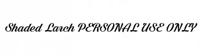
A bold, elegant script font with dynamic curves and smooth connections.
![Shaded Larch PERSONAL USE ONLY Frei Schriftart Herunterladen]() Herunterladen 1685 Downloads@WebFont
Herunterladen 1685 Downloads@WebFont -
( Fonts by www.studiotypo.com - Personal-use only. For commercial use please contact owner. )
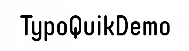
A modern, rounded sans-serif font with excellent readability.
![Typo Quik Demo Frei Schriftart Herunterladen]() Herunterladen 1685 Downloads@WebFont
Herunterladen 1685 Downloads@WebFont -
( Fonts by The League of Moveable Type - theleagueofmoveabletype.com )
A minimalist, thin-line font with a modern and elegant style.
![Ostrich Sans Light Frei Schriftart Herunterladen]() Herunterladen 1685 Downloads@WebFont
Herunterladen 1685 Downloads@WebFont -
![Serif72Beta-Italic Frei Schriftart Herunterladen]() Herunterladen 1685 Downloads@WebFont
Herunterladen 1685 Downloads@WebFont -
( Fonts by Casady & Greene )
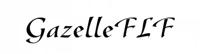
A sophisticated, calligraphic font with elegant, flowing strokes and sharp serifs.
![GazelleFLF Frei Schriftart Herunterladen]() Herunterladen 1685 Downloads@WebFont
Herunterladen 1685 Downloads@WebFont -
( Fonts by BLKBK - https://blkbk.ink - Personal-use only. For commercial use please contact owner. Sponsoren Schriftart )
A bold, expressive handwritten font with dynamic brush strokes.
![After Hours Frei Schriftart Herunterladen]() Herunterladen 1685 Downloads
Herunterladen 1685 Downloads -
( Fonts by Daniel Zadorozny - www.iconian.com - Free for personal use )
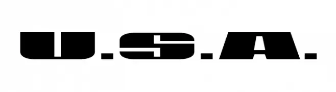
A bold, geometric stencil-style font with strong, angular lines.
![U.S.A. Frei Schriftart Herunterladen]() Herunterladen 1685 Downloads@WebFont
Herunterladen 1685 Downloads@WebFont -
( Fonts by Nirmala Creative )
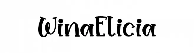
A playful, hand-drawn font with bold, irregular strokes and a whimsical style.
![Wina Elicia Frei Schriftart Herunterladen]() Herunterladen 1684 Downloads@WebFont
Herunterladen 1684 Downloads@WebFont -
( Fonts by Fontry - M.G. Adkins - Personal-use only. For commercial use please contact owner. )
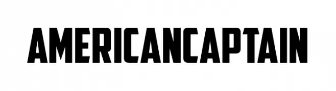
A bold, blocky font with a vintage military style.
![American Captain Frei Schriftart Herunterladen]() Herunterladen 1684 Downloads@WebFont
Herunterladen 1684 Downloads@WebFont -
![Party Pocket DEMO Regular Frei Schriftart Herunterladen]() Herunterladen 1684 Downloads@WebFont
Herunterladen 1684 Downloads@WebFont -
( Fonts by Situjuh Nazara - 7ntypes.com - Personal-use only. For commercial use please contact owner. )
A bold, geometric typeface with strong, uniform strokes and modern appeal.
![Chosence Bold Frei Schriftart Herunterladen]() Herunterladen 1684 Downloads@WebFont
Herunterladen 1684 Downloads@WebFont -
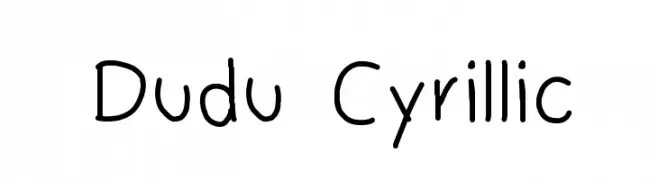
![Dudu Cyrillic Frei Schriftart Herunterladen]() Herunterladen 1684 Downloads@WebFont
Herunterladen 1684 Downloads@WebFont -
( Fonts by Galdino Otten - galdinootten.com )
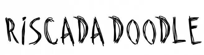
A playful, hand-drawn font with a sketch-like, whimsical appearance.
![Riscada Doodle Frei Schriftart Herunterladen]() Herunterladen 1684 Downloads@WebFont
Herunterladen 1684 Downloads@WebFont -
Schriftart von antipixel. For commercial use please contact the owner.
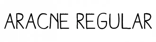
![Aracne Regular Frei Schriftart Herunterladen]() Herunterladen 1684 Downloads@WebFont
Herunterladen 1684 Downloads@WebFont -
( Fonts by Paul Lloyd )
A modern font with Art Deco-inspired uppercase and geometric lowercase characters.
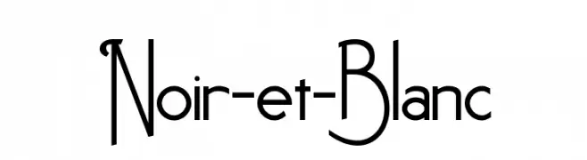
![Noir-et-Blanc Frei Schriftart Herunterladen]() Herunterladen 1684 Downloads@WebFont
Herunterladen 1684 Downloads@WebFont -
Schriftart von glyphstyle. For commercial use please contact the owner.
( NOTE: This demo font is for PERSONAL USE ONLY! But any donation are very appreciated. Paypal account for donation : https://www.paypal.me/dimasardhi full version: https://www.glyphstyle.net/mofulina/ contact us at styleglyph@gmail.com And follow my i )
A bold, high-contrast serif font with elegant and classic styling.
![Mofulina Regular Frei Schriftart Herunterladen]() Herunterladen 1683 Downloads@WebFont
Herunterladen 1683 Downloads@WebFont -
( Copyright 2011 The Podkova Project Authors (contact@cyreal.org) )
A bold slab serif font with strong, block-like serifs and consistent stroke widths.
![Podkova ExtraBold Frei Schriftart Herunterladen]() Herunterladen 1683 Downloads@WebFont
Herunterladen 1683 Downloads@WebFont -
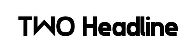
![TWO Headline Frei Schriftart Herunterladen]() Herunterladen 1683 Downloads@WebFont
Herunterladen 1683 Downloads@WebFont -
( Fonts by HPLHS Prop Fonts - Andrew H. Leman http://www.cthulhulives.org/toybox/propdocs/propfonts.html )
A classic serif font with a vintage and elegant style.
![OldStyle 1 HPLHS Frei Schriftart Herunterladen]() Herunterladen 1683 Downloads@WebFont
Herunterladen 1683 Downloads@WebFont -
( Fonts by Lauren Thompson - www.nymfont.com )
A sleek, elegant italic font with thin strokes and modern appeal.
![Champagne & Limousines Italic Frei Schriftart Herunterladen]() Herunterladen 1683 Downloads@WebFont
Herunterladen 1683 Downloads@WebFont -
( Fonts by www.peter-wiegel.de. Personal-use only. For commercial use please contact owner. )
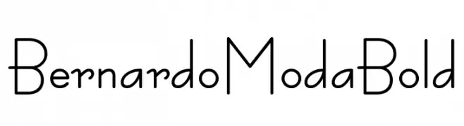
A modern, geometric font with rounded edges and consistent stroke widths.
![BernardoModaBold Frei Schriftart Herunterladen]() Herunterladen 1682 Downloads@WebFont
Herunterladen 1682 Downloads@WebFont -
( Fonts by Nestor Delgado )
A modern, italicized font with a sleek and dynamic design.
![Expansiva-BoldItalic Frei Schriftart Herunterladen]() Herunterladen 1682 Downloads@WebFont
Herunterladen 1682 Downloads@WebFont -
( Fonts by Castcraft Software - opti.netii.net - check the website before use )
A bold, geometric font with clean lines and a modern aesthetic.
![OPTIEton-Bold Frei Schriftart Herunterladen]() Herunterladen 1682 Downloads@WebFont
Herunterladen 1682 Downloads@WebFont -
( Fonts by CannotIntoSpaceFonts - KineticPlasma Fonts - Personal-use only. For commercial use please contact owner. )
A bold, wide font with strong, thick strokes for a modern look.
![Hussar Bold Wide Frei Schriftart Herunterladen]() Herunterladen 1681 Downloads@WebFont
Herunterladen 1681 Downloads@WebFont -
( Fonts by Francis John - Francis Studio - Personal-use only. For commercial use please contact owner. )
A bold, expressive script font with dynamic strokes and artistic flair.
![Lost in Wild Regular Frei Schriftart Herunterladen]() Herunterladen 1681 Downloads@WebFont
Herunterladen 1681 Downloads@WebFont -
Schriftart von NicholasJudy456. For commercial use please contact the owner.
![YTV Bold Frei Schriftart Herunterladen]() Herunterladen 1681 Downloads@WebFont
Herunterladen 1681 Downloads@WebFont -
( Copyright (c) 2011-2012, Sorkin Type Co (www.sorkintype.com), with Reserved Font Name "Headland" )
A modern serif font with clean lines and balanced proportions.
![Headland One Frei Schriftart Herunterladen]() Herunterladen 1681 Downloads@WebFont
Herunterladen 1681 Downloads@WebFont -
( Copyright (c) 2011, Eduardo Tunni (http://www.tipo.net.ar) )
A classic serif font with elegant proportions and refined serifs.
![Mate SC Regular Frei Schriftart Herunterladen]() Herunterladen 1681 Downloads@WebFont
Herunterladen 1681 Downloads@WebFont -
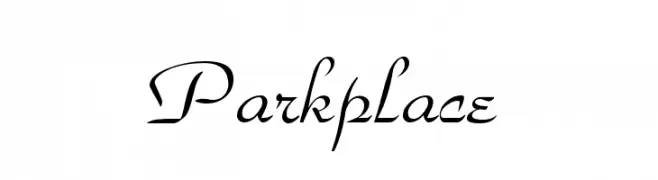
![Parkplace Frei Schriftart Herunterladen]() Herunterladen 1681 Downloads
Herunterladen 1681 Downloads -
( Fonts by Nick Curtis - www.nicksfonts.com )
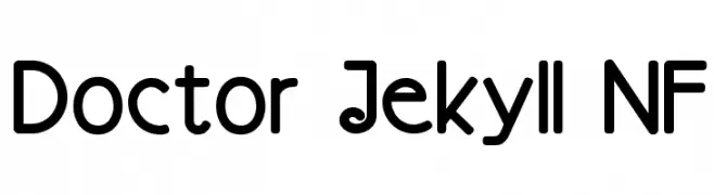
A modern, rounded font with a playful and approachable style.
![Doctor Jekyll NF Frei Schriftart Herunterladen]() Herunterladen 1681 Downloads@WebFont
Herunterladen 1681 Downloads@WebFont -
( Fonts by wepfont - Wahyu Eka Prasetya - Personal-use only. For commercial use please contact owner. )
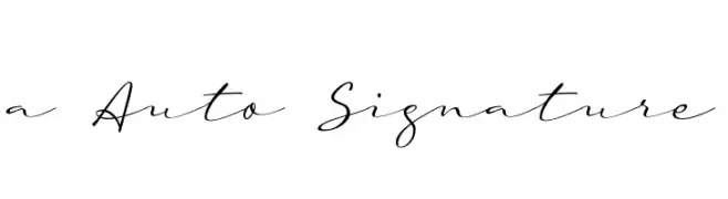
A graceful script font with fluid, cursive strokes and connected characters.
![a Auto Signature Frei Schriftart Herunterladen]() Herunterladen 1680 Downloads@WebFont
Herunterladen 1680 Downloads@WebFont -
( Fonts by wepfont - Wahyu Eka Prasetya - Personal-use only. For commercial use please contact owner. )
A bold, modern sans-serif font with clean lines and strong legibility.
![AREA KILOMETER 50 Frei Schriftart Herunterladen]() Herunterladen 1680 Downloads@WebFont
Herunterladen 1680 Downloads@WebFont -
![UVN Ke Chuyen2 Frei Schriftart Herunterladen]() Herunterladen 1680 Downloads@WebFont
Herunterladen 1680 Downloads@WebFont


Welche Schriften sind gerade am populärsten?
Poppins, Roboto, Montserrat, Open Sans und Lato sind wegen ihrer klaren Formen und breiten Einsetzbarkeit sehr gefragt – von Markenauftritt über Landingpages bis hin zu Postern.
Welche Fonts eignen sich für Logos?
Geometrische Sans‑Serifs (z. B. Poppins, Familien im Gotham‑Stil) sind ein häufiger Griff für sauberes, skalierbares Branding. Für eine persönlichere Note bleiben Scripts und Handschrift‑Stile beliebt. Kombinieren Sie einen prägnanten Headline‑Font mit einer neutralen Brotschrift für Wiedererkennung und Harmonie.
Wie oft wird die Top‑Liste aktualisiert?
Regelmäßig – basierend auf realen Downloads und Interaktionen. Schauen Sie öfter vorbei, um aufstrebende Favoriten früh zu entdecken.
💡 Tipp: Seite bookmarken – Trends wechseln schnell, und heutige Top‑Schriften inspirieren morgen vielleicht das Rebranding.