Willkommen bei den Top‑Schriften – hier treffen Beliebtheit und Qualität aufeinander. Das sind die in diesem Jahr am häufigsten heruntergeladenen und genutzten Fonts. Wenn Sie sichere Optionen für Logo, Web oder Social suchen, starten Sie hier.
Jeder Top‑Font überzeugt durch Balance, Lesbarkeit und Vielseitigkeit. Sie finden moderne Sans‑Serifs, elegante Scripts, Vintage‑Serifs und minimalistische Displays.
-
 Herunterladen 76 Downloads@WebFont
 -
( Fonts by Wino S Kadir - weknow - www.revolge.com/shop/weknow/ - Personal-use only. For commercial use please contact owner. )
A bold, playful font with rounded, whimsical characters.
![Great Job Frei Schriftart Herunterladen]() Herunterladen 76 Downloads@WebFont
Herunterladen 76 Downloads@WebFont -
( Fonts by K_IN Studio - Personal-use only. For commercial use please contact owner. )
An elegant cursive font with graceful curves and delicate serifs.
![Love Sonnia Frei Schriftart Herunterladen]() Herunterladen 76 Downloads@WebFont
Herunterladen 76 Downloads@WebFont -
( Fonts by Mans Greback - Personal-use only. For commercial use please contact owner. )
A bold, expressive script font with high contrast and fluid connections.
![Kanvas Black PERSONAL USE Frei Schriftart Herunterladen]() Herunterladen 76 Downloads@WebFont
Herunterladen 76 Downloads@WebFont -
( Fonts by Vladimir Nikolic )
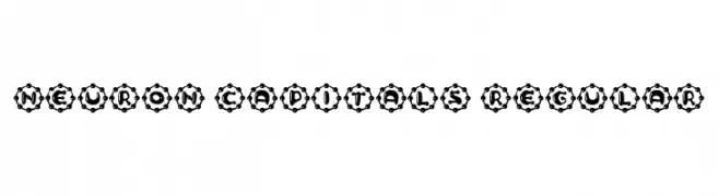
A bold, decorative font with gear-like circular enclosures around each character.
![Neuron Capitals Regular Frei Schriftart Herunterladen]() Herunterladen 76 Downloads@WebFont
Herunterladen 76 Downloads@WebFont -
( Fonts by Haksen Studio - Sarwo Edhi Prayitno - Personal-use only. For commercial use please contact owner. )
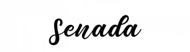
A bold, flowing script font with elegant curves and connected strokes.
![Senada Frei Schriftart Herunterladen]() Herunterladen 76 Downloads@WebFont
Herunterladen 76 Downloads@WebFont -
( Fonts by herulogo - Herulogo budi Santoso - Personal-use only. For commercial use please contact owner. )
A bold, geometric font with a modern, futuristic style.
![BIOSI Frei Schriftart Herunterladen]() Herunterladen 76 Downloads@WebFont
Herunterladen 76 Downloads@WebFont -
( Vladimir Nikolic - www.coroflot.com/vladimirnikolic )
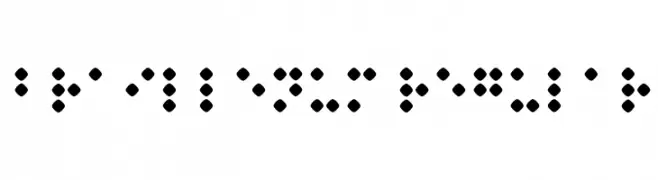
A Braille font representing characters with raised dot patterns for tactile reading.
![Braillenum Regular Frei Schriftart Herunterladen]() Herunterladen 76 Downloads@WebFont
Herunterladen 76 Downloads@WebFont -
( London's Letters - www.londonsletters.com/ )
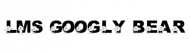
A bold, playful font with cartoon characters embedded in each letter.
![LMS Googly Bear Frei Schriftart Herunterladen]() Herunterladen 76 Downloads@WebFont
Herunterladen 76 Downloads@WebFont -
( Fonts by Aluyeah Studio - Personal-use only. For commercial use please contact owner. )
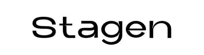
A modern, geometric font with clean lines and a minimalist style.
![Stagen Frei Schriftart Herunterladen]() Herunterladen 76 Downloads@WebFont
Herunterladen 76 Downloads@WebFont -
( Fonts by Biham Santoso - Personal-use only. For commercial use please contact owner. )
A classic serif font with elegant thin strokes and subtle curves.
![Estrella Frei Schriftart Herunterladen]() Herunterladen 76 Downloads@WebFont
Herunterladen 76 Downloads@WebFont -
( Fonts by Wino S Kadir - weknow - www.revolge.com/shop/weknow/ - Personal-use only. For commercial use please contact owner. )
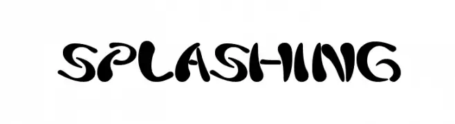
A bold, playful font with fluid, splash-like strokes.
![splashing Frei Schriftart Herunterladen]() Herunterladen 76 Downloads@WebFont
Herunterladen 76 Downloads@WebFont -
( Fonts by UI Creative - Personal-use only. For commercial use please contact owner. )
A cursive, elegant font with flowing curves and a sophisticated style.
![Beach Front Frei Schriftart Herunterladen]() Herunterladen 76 Downloads@WebFont
Herunterladen 76 Downloads@WebFont -
( Fonts by Creaditive Design )
Casual handwritten script font.
![Unique Surfer Frei Schriftart Herunterladen]() Herunterladen 76 Downloads@WebFont
Herunterladen 76 Downloads@WebFont -
( Fonts by Out of Step Font Company - Dan Steinbok - outofstepfontco.com - Personal-use only. For commercial use please contact owner. )
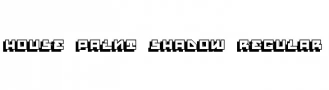
A bold, geometric font with a three-dimensional shadow effect.
![House Paint Shadow Regular Frei Schriftart Herunterladen]() Herunterladen 76 Downloads@WebFont
Herunterladen 76 Downloads@WebFont -
( Fonts by Wei Huang - Personal-use only. For commercial use please contact owner. )
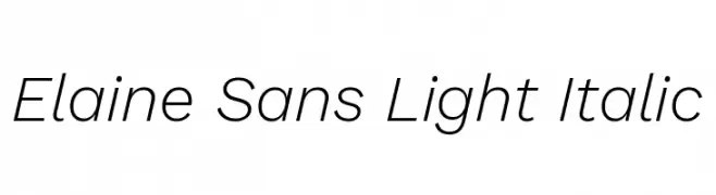
A sleek, modern sans-serif font with a light, italicized style.
![Elaine Sans Light Italic Frei Schriftart Herunterladen]() Herunterladen 76 Downloads@WebFont
Herunterladen 76 Downloads@WebFont -
( Fonts by GGBot - www.ggbot.net - Personal-use only. For commercial use please contact owner. )
A chaotic, vine-like decorative font with jagged, intricate strokes.
![Depres Frei Schriftart Herunterladen]() Herunterladen 76 Downloads@WebFont
Herunterladen 76 Downloads@WebFont -
( Fonts by Moove Studio )
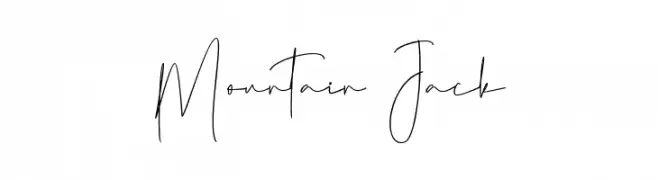
![Mountain Jack Frei Schriftart Herunterladen]() Herunterladen 76 Downloads@WebFont
Herunterladen 76 Downloads@WebFont -
( Fonts by Emanes Dsign - Personal-use only. For commercial use please contact owner. )
A bold, playful font with a 3D extruded effect and script-like connected characters.
![Blora Extrude Frei Schriftart Herunterladen]() Herunterladen 76 Downloads@WebFont
Herunterladen 76 Downloads@WebFont -
( Fonts by ingoFonts - Ingo Zimmermann - Personal-use only. For commercial use please contact owner. )
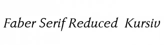
An elegant serif font with a classic italic slant, perfect for sophisticated designs.
![Faber Serif Reduced 56 Kursiv Frei Schriftart Herunterladen]() Herunterladen 76 Downloads@WebFont
Herunterladen 76 Downloads@WebFont -
( Fonts by imagex )
A bold, brush-stroke style font with an expressive and artistic flair.
![Ghost Crazy Frei Schriftart Herunterladen]() Herunterladen 76 Downloads@WebFont
Herunterladen 76 Downloads@WebFont -
( Fonts by Nirmala Creative )
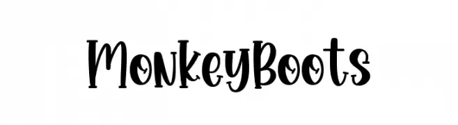
A playful, handwritten-style font with bold, rounded characters.
![Monkey Boots Frei Schriftart Herunterladen]() Herunterladen 76 Downloads@WebFont
Herunterladen 76 Downloads@WebFont -
( Noto is a trademark of Google Inc. Noto fonts are open source. All Noto fonts are published under the SIL Open Font License, Version 1.1 )
Image contains placeholder glyphs, not a valid font sample.
![Noto Sans Myanmar UI Condensed SemiBold Frei Schriftart Herunterladen]() Herunterladen 76 Downloads@WebFont
Herunterladen 76 Downloads@WebFont -
( Fonts by 7NTypes )
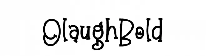
A playful, whimsical font with uneven strokes and quirky serifs.
![Olaugh Bold Frei Schriftart Herunterladen]() Herunterladen 76 Downloads@WebFont
Herunterladen 76 Downloads@WebFont -
( Fonts by Skiiller Studio )
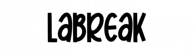
A playful, bold, and hand-drawn font with a whimsical flair.
![Labreak Frei Schriftart Herunterladen]() Herunterladen 76 Downloads@WebFont
Herunterladen 76 Downloads@WebFont -
( Perry Mason )
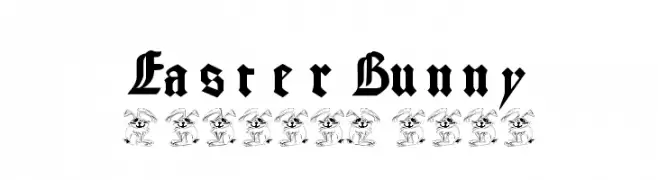
A bold, intricate blackletter font with a medieval aesthetic.
![EasterBunny Frei Schriftart Herunterladen]() Herunterladen 76 Downloads@WebFont
Herunterladen 76 Downloads@WebFont -
( Fonts by ToniStudio )
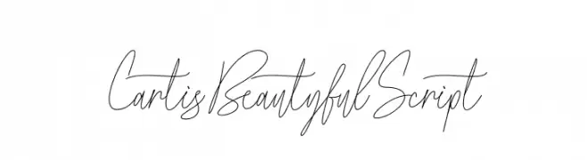
A graceful and elegant script font with flowing, connected characters.
![Cartis Beautyful Script Frei Schriftart Herunterladen]() Herunterladen 76 Downloads@WebFont
Herunterladen 76 Downloads@WebFont -
( Fonts by Vladimir Nikolic )
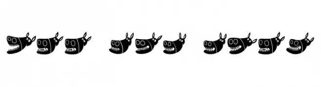
A playful font with cartoon donkey heads as characters.
![Silly Donkey Regular Frei Schriftart Herunterladen]() Herunterladen 76 Downloads@WebFont
Herunterladen 76 Downloads@WebFont -
( Fonts by Kong Font - fontkong.com - Personal-use only. For commercial use please contact owner. )
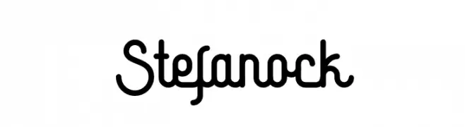
A playful, rounded font with bold, consistent strokes and a modern feel.
![Stefanock Frei Schriftart Herunterladen]() Herunterladen 76 Downloads@WebFont
Herunterladen 76 Downloads@WebFont -
( Fonts by Letterena Studios )
Casual handwritten font with playful style.
![Scarlettik Frei Schriftart Herunterladen]() Herunterladen 76 Downloads@WebFont
Herunterladen 76 Downloads@WebFont -
( Fonts by Peter Wiegel - www.peter-wiegel.de - Personal-use only. For commercial use please contact owner. )
A bold, blackletter font with a medieval Gothic aesthetic.
![Moderne Fette Schwabacher UNZ1A Italic Frei Schriftart Herunterladen]() Herunterladen 76 Downloads@WebFont
Herunterladen 76 Downloads@WebFont -
( Fonts by Kat`s Fun Fonts - Personal-use only. For commercial use please contact owner. )
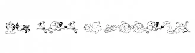
Cartoon animal dingbat font with playful, hand-drawn style.
![KR Lil Buddies Frei Schriftart Herunterladen]() Herunterladen 76 Downloads@WebFont
Herunterladen 76 Downloads@WebFont -
( Mirz123 - Michelle Lehmann - www.scriptmonkeys.us )
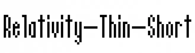
A geometric, condensed font with a modern, digital aesthetic.
![Relativity-Thin-Short Frei Schriftart Herunterladen]() Herunterladen 76 Downloads@WebFont
Herunterladen 76 Downloads@WebFont -
( Fonts by Letteralle Studios - Annas Yahya - Personal-use only. For commercial use please contact owner. )
A bold, brush-style font with a hand-drawn, energetic appearance.
![Aerobrush Frei Schriftart Herunterladen]() Herunterladen 76 Downloads@WebFont
Herunterladen 76 Downloads@WebFont -
( Fonts by Zane Studio - Personal-use only. For commercial use please contact owner. )
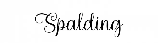
An elegant, flowing script font with sophisticated cursive letterforms.
![Spalding Frei Schriftart Herunterladen]() Herunterladen 76 Downloads@WebFont
Herunterladen 76 Downloads@WebFont


Welche Schriften sind gerade am populärsten?
Poppins, Roboto, Montserrat, Open Sans und Lato sind wegen ihrer klaren Formen und breiten Einsetzbarkeit sehr gefragt – von Markenauftritt über Landingpages bis hin zu Postern.
Welche Fonts eignen sich für Logos?
Geometrische Sans‑Serifs (z. B. Poppins, Familien im Gotham‑Stil) sind ein häufiger Griff für sauberes, skalierbares Branding. Für eine persönlichere Note bleiben Scripts und Handschrift‑Stile beliebt. Kombinieren Sie einen prägnanten Headline‑Font mit einer neutralen Brotschrift für Wiedererkennung und Harmonie.
Wie oft wird die Top‑Liste aktualisiert?
Regelmäßig – basierend auf realen Downloads und Interaktionen. Schauen Sie öfter vorbei, um aufstrebende Favoriten früh zu entdecken.
💡 Tipp: Seite bookmarken – Trends wechseln schnell, und heutige Top‑Schriften inspirieren morgen vielleicht das Rebranding.