Willkommen bei den Top‑Schriften – hier treffen Beliebtheit und Qualität aufeinander. Das sind die in diesem Jahr am häufigsten heruntergeladenen und genutzten Fonts. Wenn Sie sichere Optionen für Logo, Web oder Social suchen, starten Sie hier.
Jeder Top‑Font überzeugt durch Balance, Lesbarkeit und Vielseitigkeit. Sie finden moderne Sans‑Serifs, elegante Scripts, Vintage‑Serifs und minimalistische Displays.
-
( Fonts by Font Monger - Chris Vile - Personal-use only. For commercial use please contact owner. )
A chilling, jagged font ideal for horror-themed designs.
 Herunterladen 77 Downloads@WebFont
 -
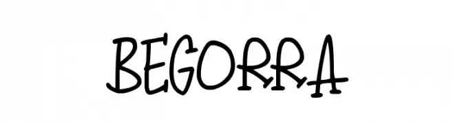
( Darrell Flood )
A playful, hand-drawn font with bold strokes and a whimsical style.
![Begorra Frei Schriftart Herunterladen]() Herunterladen 77 Downloads@WebFont
Herunterladen 77 Downloads@WebFont -
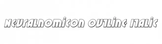
( Iconian Fonts - Daniel Zadorozny - www.iconian.com )
A bold, futuristic outline font with an italic slant and geometric design.
![Neuralnomicon Outline Italic Frei Schriftart Herunterladen]() Herunterladen 77 Downloads@WebFont
Herunterladen 77 Downloads@WebFont -
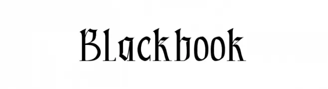
( Fonts by Kong Font - Personal-use only. For commercial use please contact owner. )
A classic Blackletter font with sharp, angular lines and intricate detailing.
![Blackbook Frei Schriftart Herunterladen]() Herunterladen 77 Downloads@WebFont
Herunterladen 77 Downloads@WebFont -
![Nightporter-Regular Frei Schriftart Herunterladen]() Herunterladen 77 Downloads@WebFont
Herunterladen 77 Downloads@WebFont -
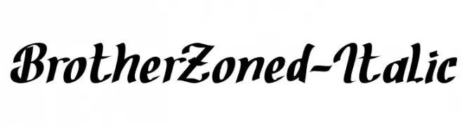
( Fonts by Situjuh Nazara - 7ntypes.com - Personal-use only. For commercial use please contact owner. )
A bold, italic script font with dynamic and fluid strokes.
![BrotherZoned-Italic Frei Schriftart Herunterladen]() Herunterladen 77 Downloads@WebFont
Herunterladen 77 Downloads@WebFont -
( Fonts by AVType - Personal-use only. For commercial use please contact owner. )
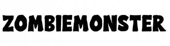
A bold, playful font with a spooky, distressed appearance.
![Zombie Monster Frei Schriftart Herunterladen]() Herunterladen 77 Downloads@WebFont
Herunterladen 77 Downloads@WebFont -
( Fonts by Letterhend Studio - Hendry Juanda - Personal-use only. For commercial use please contact owner. )
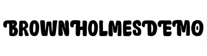
A bold, playful font with rounded edges and a whimsical flair.
![BrownHolmesDEMO Frei Schriftart Herunterladen]() Herunterladen 77 Downloads@WebFont
Herunterladen 77 Downloads@WebFont -
( Fonts by www.chequered.ink - Chequered Ink - Personal-use only. For commercial use please contact owner. )
A modern, elongated font with a vertical emphasis and consistent line thickness.
![Sothin Frei Schriftart Herunterladen]() Herunterladen 77 Downloads@WebFont
Herunterladen 77 Downloads@WebFont -
( Fonts by Misti`s Fonts - mistifonts.com - Personal-use only. For commercial use please contact owner. )
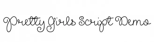
A playful and whimsical script font with elegant, flowing curls and loops.
![Pretty Girls Script Demo Frei Schriftart Herunterladen]() Herunterladen 77 Downloads@WebFont
Herunterladen 77 Downloads@WebFont -
( Fonts by Apria - Anton Priyatna - Personal-use only. For commercial use please contact owner. )
A clean, modern font with balanced proportions and excellent readability.
![Mellow Regular Frei Schriftart Herunterladen]() Herunterladen 77 Downloads@WebFont
Herunterladen 77 Downloads@WebFont -
( Fonts by Kat`s Fun Fonts - Personal-use only. For commercial use please contact owner. )
A whimsical font with numbers decorated in birthday-themed elements like cakes and balloons.
![KR Birthday Numbers Frei Schriftart Herunterladen]() Herunterladen 77 Downloads@WebFont
Herunterladen 77 Downloads@WebFont -
( Fonts by Nick Curtis - Personal-use only. For commercial use please contact owner. )
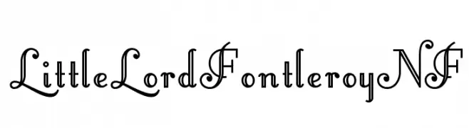
An elegant, decorative font with intricate, ornate letterforms and a vintage flair.
![LittleLordFontleroyNF Frei Schriftart Herunterladen]() Herunterladen 77 Downloads@WebFont
Herunterladen 77 Downloads@WebFont -
( Fonts by Siti Nurjannah - Personal-use only. For commercial use please contact owner. )
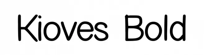
A bold, rounded sans-serif font with a friendly and modern appearance.
![Kioves Bold Frei Schriftart Herunterladen]() Herunterladen 77 Downloads@WebFont
Herunterladen 77 Downloads@WebFont -
( Fonts by BBA Key - Personal-use only. For commercial use please contact owner. )
A modern, geometric sans-serif font with clean lines and balanced spacing.
![Qualio Frei Schriftart Herunterladen]() Herunterladen 77 Downloads@WebFont
Herunterladen 77 Downloads@WebFont -
( Glyphobet Font Foundry - glyphobet.net/typography/ )
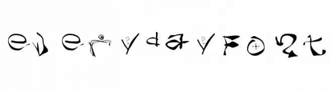
A highly decorative and artistic font with whimsical, abstract elements.
![everydayFont Frei Schriftart Herunterladen]() Herunterladen 77 Downloads@WebFont
Herunterladen 77 Downloads@WebFont -
( Fonts by Vladimir Nikolic )
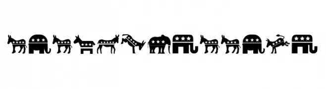
A decorative font featuring political party symbols for thematic use.
![Elections Regular Frei Schriftart Herunterladen]() Herunterladen 77 Downloads@WebFont
Herunterladen 77 Downloads@WebFont -
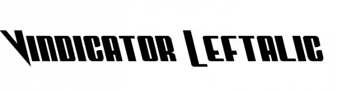
( Fonts by Daniel Zadorozny - www.iconian.com )
A bold, left-leaning font with sharp angles and a dynamic style.
![Vindicator Leftalic Frei Schriftart Herunterladen]() Herunterladen 77 Downloads@WebFont
Herunterladen 77 Downloads@WebFont -
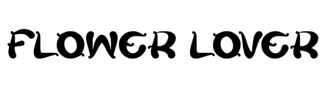
( Fonts by Wino S Kadir - weknow - www.revolge.com/shop/weknow/ - Personal-use only. For commercial use please contact owner. )
A decorative font with floral elements and artistic curves.
![flower lover Frei Schriftart Herunterladen]() Herunterladen 77 Downloads@WebFont
Herunterladen 77 Downloads@WebFont -
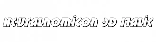
( Iconian Fonts - Daniel Zadorozny - www.iconian.com )
A bold, italic 3D font with outlined characters and a futuristic style.
![Neuralnomicon 3D Italic Frei Schriftart Herunterladen]() Herunterladen 77 Downloads@WebFont
Herunterladen 77 Downloads@WebFont -
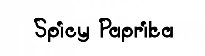
( weknow - Wino S Kadir - www.creativefabrica.com/designer/weknow/ )
A playful, bold font with rounded, whimsical characters.
![Spicy Paprika Frei Schriftart Herunterladen]() Herunterladen 77 Downloads@WebFont
Herunterladen 77 Downloads@WebFont -
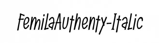
( Fonts by Situjuh Nazara - 7ntypes.com - Personal-use only. For commercial use please contact owner. )
A playful, handwritten italic font with a casual and modern style.
![FemilaAuthenty-Italic Frei Schriftart Herunterladen]() Herunterladen 77 Downloads@WebFont
Herunterladen 77 Downloads@WebFont -
( Fonts by Graphix Line Studio - Personal-use only. For commercial use please contact owner. )
A playful, hand-drawn font with a quirky and informal style.
![THE BONES Frei Schriftart Herunterladen]() Herunterladen 77 Downloads@WebFont
Herunterladen 77 Downloads@WebFont -
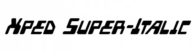
( Iconian Fonts - Daniel Zadorozny - www.iconian.com )
A bold, italicized font with a futuristic and dynamic style.
![Xped Super-Italic Frei Schriftart Herunterladen]() Herunterladen 77 Downloads@WebFont
Herunterladen 77 Downloads@WebFont -
( London's Letters - www.londonsletters.com/ )
A playful font with baby animal illustrations integrated into each letter.
![LMS Ty Babies Frei Schriftart Herunterladen]() Herunterladen 77 Downloads@WebFont
Herunterladen 77 Downloads@WebFont -
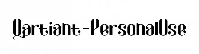
( Fonts by Attype Studio - Fadli Ramadhan Iskandar - Personal-use only. For commercial use please contact owner. )
A bold, decorative font with modern and elegant swashes.
![Qartiant-PersonalUse Frei Schriftart Herunterladen]() Herunterladen 77 Downloads@WebFont
Herunterladen 77 Downloads@WebFont -
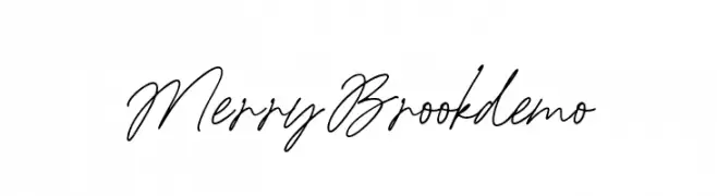
( Fonts by Letterhend Studio )
Handwritten cursive script font.
![MerryBrookdemo Frei Schriftart Herunterladen]() Herunterladen 77 Downloads@WebFont
Herunterladen 77 Downloads@WebFont -
( Fonts by twinletter - Rozikan - Personal-use only. For commercial use please contact owner. )
A modern, geometric font with clean lines and a professional appearance.
![Digofa Thin Personal Frei Schriftart Herunterladen]() Herunterladen 77 Downloads@WebFont
Herunterladen 77 Downloads@WebFont -
( Projeto Tipo da Fonte - Eduardo Novais - tipodafonte.wordpress.com )
A decorative, hand-drawn font with a distressed, textured effect.
![assperiments Frei Schriftart Herunterladen]() Herunterladen 77 Downloads@WebFont
Herunterladen 77 Downloads@WebFont -
( Fonts by Daniel Zadorozny - www.iconian.com - Personal-use only. For commercial use please contact owner. )
A bold, expanded font with a modern, industrial aesthetic.
![Heavy Falcon Expanded Frei Schriftart Herunterladen]() Herunterladen 77 Downloads@WebFont
Herunterladen 77 Downloads@WebFont -
( Fonts by CalligraphyFonts - Personal-use only. For commercial use please contact owner. )
A modern, geometric sans-serif font with a clean and professional look.
![True Private Demo Frei Schriftart Herunterladen]() Herunterladen 77 Downloads@WebFont
Herunterladen 77 Downloads@WebFont -
( Iconian Fonts - Daniel Zadorozny - www.iconian.com )
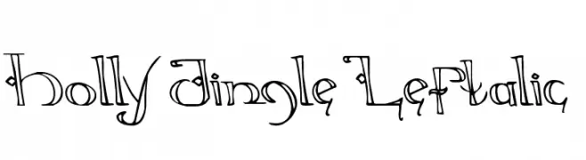
A whimsical and decorative font with playful flourishes and embellishments.
![Holly Jingle Leftalic Frei Schriftart Herunterladen]() Herunterladen 77 Downloads@WebFont
Herunterladen 77 Downloads@WebFont -
( imagex - www.imagex-fonts.com )
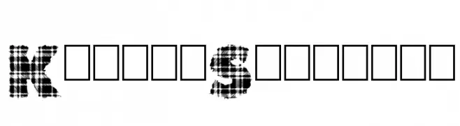
A bold, tartan-patterned font with a strong Scottish influence.
![King of Scotland Frei Schriftart Herunterladen]() Herunterladen 77 Downloads@WebFont
Herunterladen 77 Downloads@WebFont -
( Fonts by Vladimir Nikolic - https://www.creativefabrica.com/product/educated-deers/ref/144265/ - Personal-use only. For commercial use please contact owner. )
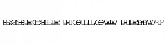
A bold, geometric font with hollow interiors and a modern, futuristic style.
![Imbecile Hollow Heavy Frei Schriftart Herunterladen]() Herunterladen 77 Downloads@WebFont
Herunterladen 77 Downloads@WebFont -
( Fonts by Geranium Space - Megi Satyo Widodo - Personal-use only. For commercial use please contact owner. )
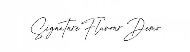
A sophisticated, elegant handwritten font with fluid, cursive letterforms.
![Signature Flavour Demo Frei Schriftart Herunterladen]() Herunterladen 77 Downloads@WebFont
Herunterladen 77 Downloads@WebFont


Welche Schriften sind gerade am populärsten?
Poppins, Roboto, Montserrat, Open Sans und Lato sind wegen ihrer klaren Formen und breiten Einsetzbarkeit sehr gefragt – von Markenauftritt über Landingpages bis hin zu Postern.
Welche Fonts eignen sich für Logos?
Geometrische Sans‑Serifs (z. B. Poppins, Familien im Gotham‑Stil) sind ein häufiger Griff für sauberes, skalierbares Branding. Für eine persönlichere Note bleiben Scripts und Handschrift‑Stile beliebt. Kombinieren Sie einen prägnanten Headline‑Font mit einer neutralen Brotschrift für Wiedererkennung und Harmonie.
Wie oft wird die Top‑Liste aktualisiert?
Regelmäßig – basierend auf realen Downloads und Interaktionen. Schauen Sie öfter vorbei, um aufstrebende Favoriten früh zu entdecken.
💡 Tipp: Seite bookmarken – Trends wechseln schnell, und heutige Top‑Schriften inspirieren morgen vielleicht das Rebranding.