Willkommen bei den Top‑Schriften – hier treffen Beliebtheit und Qualität aufeinander. Das sind die in diesem Jahr am häufigsten heruntergeladenen und genutzten Fonts. Wenn Sie sichere Optionen für Logo, Web oder Social suchen, starten Sie hier.
Jeder Top‑Font überzeugt durch Balance, Lesbarkeit und Vielseitigkeit. Sie finden moderne Sans‑Serifs, elegante Scripts, Vintage‑Serifs und minimalistische Displays.
-
( Fonts by Zanatlija - Personal-use only. For commercial use please contact owner. )
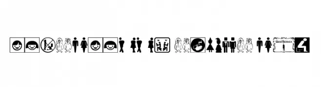
A diverse set of restroom sign icons with traditional and modern designs.
 Herunterladen 78 Downloads@WebFont
 -
( Fonts by Mozyen Studio - Personal-use only. For commercial use please contact owner. )
A bold, handwritten font with a playful and casual style.
![Copalanga Frei Schriftart Herunterladen]() Herunterladen 78 Downloads@WebFont
Herunterladen 78 Downloads@WebFont -
( Fonts by a Max Infeld - XEROGRAPHER FONTS - xerographer.blogspot.com . Personal-use only. For commercial use please contact owner. )
A bold, textured font with a dynamic, brush-like appearance.
![HawtFriend Frei Schriftart Herunterladen]() Herunterladen 78 Downloads@WebFont
Herunterladen 78 Downloads@WebFont -
( Fonts by Bangkit Tri Setiadi - Personal-use only. For commercial use please contact owner. )
A bold, playful font with thick, rounded strokes and a bubbly appearance.
![Urban Rebel Regular Frei Schriftart Herunterladen]() Herunterladen 78 Downloads@WebFont
Herunterladen 78 Downloads@WebFont -
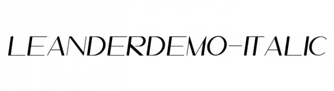
( Fonts by Mystical Type - Candi Erwanto - Personal-use only. For commercial use please contact owner. )
A sleek, modern italic font with geometric precision and dynamic style.
![LeanderDemo-Italic Frei Schriftart Herunterladen]() Herunterladen 78 Downloads@WebFont
Herunterladen 78 Downloads@WebFont -
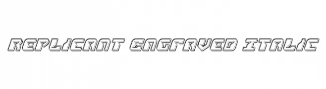
( Iconian Fonts - Daniel Zadorozny - www.iconian.com )
A futuristic, engraved italic font with a bold, three-dimensional look.
![Replicant Engraved Italic Frei Schriftart Herunterladen]() Herunterladen 78 Downloads@WebFont
Herunterladen 78 Downloads@WebFont -
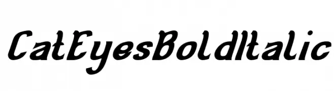
( weknow - Wino S Kadir - www.creativefabrica.com/designer/weknow/ )
A bold, italicized font with dynamic and playful letterforms.
![Cat Eyes Bold Italic Frei Schriftart Herunterladen]() Herunterladen 78 Downloads@WebFont
Herunterladen 78 Downloads@WebFont -
( Fonts by LittleWind Studio - Arvan Fatwa - Personal-use only. For commercial use please contact owner. )
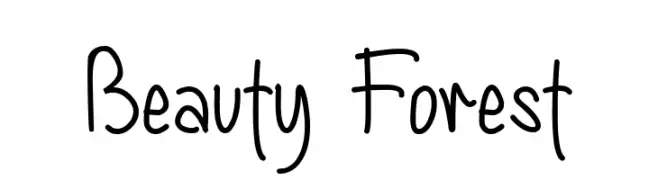
A playful handwritten font with smooth, flowing lines and a casual style.
![Beauty Forest Frei Schriftart Herunterladen]() Herunterladen 78 Downloads@WebFont
Herunterladen 78 Downloads@WebFont -
( Fonts by deFharo - Fernando Haro - Personal-use only. For commercial use please contact owner. )
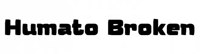
A bold, geometric font with a modern and striking design.
![Humato Broken Frei Schriftart Herunterladen]() Herunterladen 78 Downloads@WebFont
Herunterladen 78 Downloads@WebFont -
( Intellecta Design - Paulo W - new.myfonts.com/foundry/Intellecta_Design/?refby=paulow )
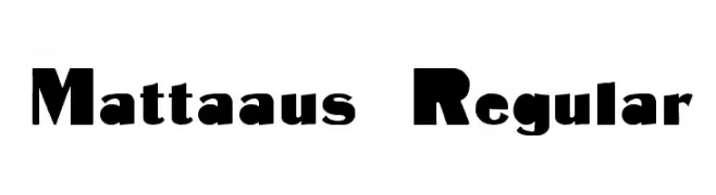
A bold, modern font with geometric and organic elements, perfect for impactful designs.
![Mattaaus Regular Frei Schriftart Herunterladen]() Herunterladen 78 Downloads@WebFont
Herunterladen 78 Downloads@WebFont -
( Fonts by Jipatype - Anupap Jaichumnan - Personal-use only. For commercial use please contact owner. )
A classic, elegant cursive font with a calligraphic style.
![Chanceri Frei Schriftart Herunterladen]() Herunterladen 78 Downloads@WebFont
Herunterladen 78 Downloads@WebFont -
( weknow - Wino S Kadir - www.creativefabrica.com/designer/weknow/ )
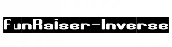
A bold, playful font with rounded, smooth characters and minimal contrast.
![Fun Raiser-Inverse Frei Schriftart Herunterladen]() Herunterladen 78 Downloads@WebFont
Herunterladen 78 Downloads@WebFont -
( Fonts by www.junkohanhero.com - Personal-use only. For commercial use please contact owner. )
A bold, decorative font with a unique outline effect and medium contrast.
![Trolle Frei Schriftart Herunterladen]() Herunterladen 78 Downloads@WebFont
Herunterladen 78 Downloads@WebFont -
( CookPiggy Fontproductions )
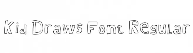
A playful, hand-drawn font with a whimsical, childlike style.
![Kid Draws Font Regular Frei Schriftart Herunterladen]() Herunterladen 78 Downloads@WebFont
Herunterladen 78 Downloads@WebFont -
( Pi's Room - isweb13.infoseek.co.jp/diary/pi_/ )
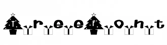
A festive font with Christmas tree-shaped letters and holiday-themed decorations.
![TreeFont Frei Schriftart Herunterladen]() Herunterladen 78 Downloads@WebFont
Herunterladen 78 Downloads@WebFont -
( Fonts by Wagner Salt - Personal-use only. For commercial use please contact owner. )
A bold, geometric font with a retro, stencil-like design.
![Super Mustache Bros Frei Schriftart Herunterladen]() Herunterladen 78 Downloads@WebFont
Herunterladen 78 Downloads@WebFont -
( Fonts by Zulfikar Ali - Personal-use only. For commercial use please contact owner. )
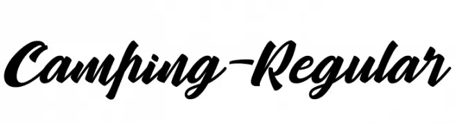
A bold, dynamic script font with fluid, connected letterforms.
![Camping-Regular Frei Schriftart Herunterladen]() Herunterladen 78 Downloads@WebFont
Herunterladen 78 Downloads@WebFont -
( Fonts by Joseph Dawson )
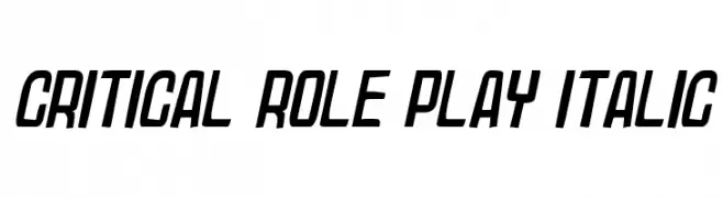
A bold, italic font with a modern, dynamic style and consistent stroke thickness.
![Critical Role Play Italic Frei Schriftart Herunterladen]() Herunterladen 78 Downloads@WebFont
Herunterladen 78 Downloads@WebFont -
( Fortress Tech - www.youtube.com/channel/UCLyHUw5NcyVCILijN5vebwg )
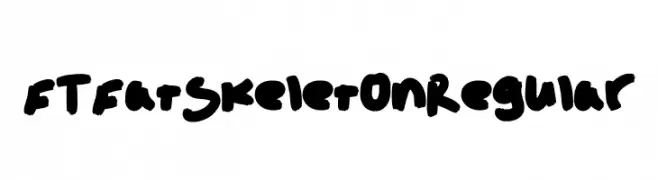
A bold, playful font with thick, rounded strokes and a whimsical, hand-drawn style.
![FT Fat Skeleton Regular Frei Schriftart Herunterladen]() Herunterladen 78 Downloads@WebFont
Herunterladen 78 Downloads@WebFont -
( Fonts by www.chequered.ink - Chequered Ink - Personal-use only. For commercial use please contact owner. )
A bold, angular font with sharp edges and a dynamic, stylized appearance.
![Satire Frei Schriftart Herunterladen]() Herunterladen 78 Downloads@WebFont
Herunterladen 78 Downloads@WebFont -
( London's Letters - www.londonsletters.com/ )
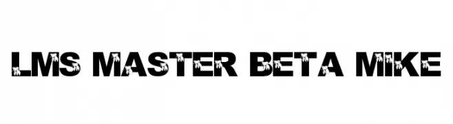
A bold decorative font with integrated fish graphics for a playful touch.
![LMS Master Beta Mike Frei Schriftart Herunterladen]() Herunterladen 78 Downloads@WebFont
Herunterladen 78 Downloads@WebFont -
( Fonts by antipixel - Personal-use only. For commercial use please contact owner. )
Outlined, playful icons with a food and navigation theme.
![Escalope Soft Icons Frei Schriftart Herunterladen]() Herunterladen 78 Downloads@WebFont
Herunterladen 78 Downloads@WebFont -
( Fonts by www.selawetype.com - Personal-use only. FOR DONATION https://www.paypal.me/selawe . For commercial use please contact owner. )
An abstract, artistic font with fragmented, geometric letterforms and dynamic shapes.
![Moonline Frei Schriftart Herunterladen]() Herunterladen 78 Downloads@WebFont
Herunterladen 78 Downloads@WebFont -
( Fonts by Ardana Creative - Personal-use only. For commercial use please contact owner. )
An elegant and sophisticated cursive font with fluid, connected letters.
![Bisqootte Frei Schriftart Herunterladen]() Herunterladen 78 Downloads@WebFont
Herunterladen 78 Downloads@WebFont -
( Fonts by Pete Klassen - Personal-use only. For commercial use please contact owner. )
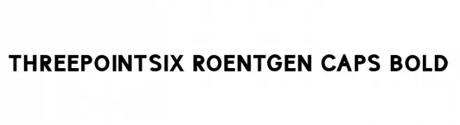
A bold, geometric font with strong, clean lines and consistent spacing.
![ThreePointSix Roentgen Caps Bold Frei Schriftart Herunterladen]() Herunterladen 78 Downloads@WebFont
Herunterladen 78 Downloads@WebFont -
( Fonts by Si Panji )
![Seventeen Winter Italic Frei Schriftart Herunterladen]() Herunterladen 78 Downloads@WebFont
Herunterladen 78 Downloads@WebFont -
( Fonts by Daniel Zadorozny - www.iconian.com )
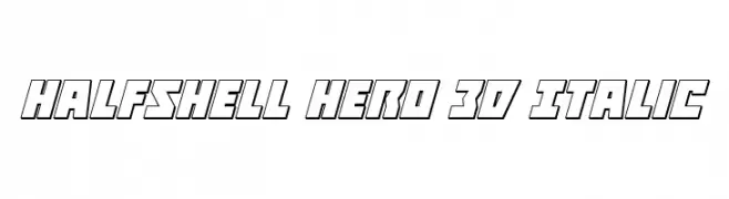
A bold, 3D italic font with a modern, geometric style.
![Halfshell Hero 3D Italic Frei Schriftart Herunterladen]() Herunterladen 78 Downloads@WebFont
Herunterladen 78 Downloads@WebFont -
( Fonts by Vunira Design - Personal-use only. For commercial use please contact owner. )
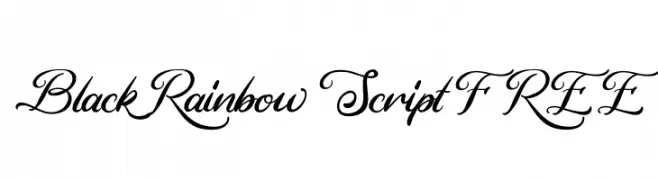
An elegant script font with flowing, ornate letters and medium contrast.
![Black Rainbow Script FREE Frei Schriftart Herunterladen]() Herunterladen 78 Downloads@WebFont
Herunterladen 78 Downloads@WebFont -
( Fonts by Darrell Flood )
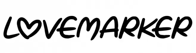
A bold, playful handwritten font with smooth, rounded strokes and a unique heart-shaped 'O'.
![Love Marker Frei Schriftart Herunterladen]() Herunterladen 78 Downloads@WebFont
Herunterladen 78 Downloads@WebFont -
( Fonts by Breh Creative - Vavad Harahap - Personal-use only. For commercial use please contact owner. )
A modern, geometric font with interconnected lines and a bold, artistic style.
![Aklirics Frei Schriftart Herunterladen]() Herunterladen 78 Downloads@WebFont
Herunterladen 78 Downloads@WebFont -
( Fonts by Wino S Kadir - weknow - www.revolge.com/shop/weknow/ - Personal-use only. For commercial use please contact owner. )
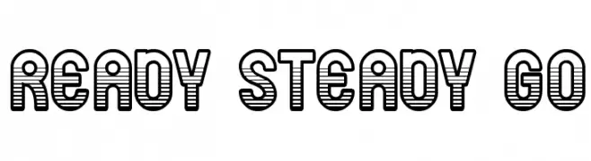
A bold, decorative font with a unique horizontal striped pattern.
![ready steady go Frei Schriftart Herunterladen]() Herunterladen 78 Downloads@WebFont
Herunterladen 78 Downloads@WebFont -
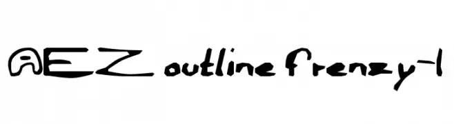
( Fonts by Adult Ramblings - Anastacia E. Zittel - Personal-use only. For commercial use please contact owner. )
A playful, hand-drawn outline font with a bold and whimsical style.
![AEZ outline frenzy-1 Frei Schriftart Herunterladen]() Herunterladen 78 Downloads@WebFont
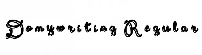
Herunterladen 78 Downloads@WebFont -
( DoMyWriting - domywriting.com/ )
An ornate and decorative font with intricate swirls and high contrast strokes.
![Domywriting Regular Frei Schriftart Herunterladen]() Herunterladen 78 Downloads@WebFont
Herunterladen 78 Downloads@WebFont -
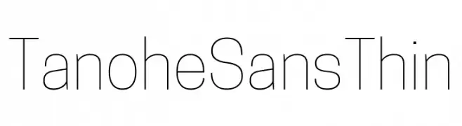
( Fonts by Cooper Hewitt Smithsonian Design Museum )
A thin, minimalist sans-serif font with a clean and modern look.
![Tanohe Sans Thin Frei Schriftart Herunterladen]() Herunterladen 78 Downloads@WebFont
Herunterladen 78 Downloads@WebFont -
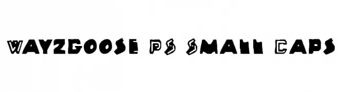
( Art Designs by Sue )
A bold, playful font with a hand-drawn, artistic style.
![Wayzgoose PS Small Caps Frei Schriftart Herunterladen]() Herunterladen 78 Downloads@WebFont
Herunterladen 78 Downloads@WebFont


Welche Schriften sind gerade am populärsten?
Poppins, Roboto, Montserrat, Open Sans und Lato sind wegen ihrer klaren Formen und breiten Einsetzbarkeit sehr gefragt – von Markenauftritt über Landingpages bis hin zu Postern.
Welche Fonts eignen sich für Logos?
Geometrische Sans‑Serifs (z. B. Poppins, Familien im Gotham‑Stil) sind ein häufiger Griff für sauberes, skalierbares Branding. Für eine persönlichere Note bleiben Scripts und Handschrift‑Stile beliebt. Kombinieren Sie einen prägnanten Headline‑Font mit einer neutralen Brotschrift für Wiedererkennung und Harmonie.
Wie oft wird die Top‑Liste aktualisiert?
Regelmäßig – basierend auf realen Downloads und Interaktionen. Schauen Sie öfter vorbei, um aufstrebende Favoriten früh zu entdecken.
💡 Tipp: Seite bookmarken – Trends wechseln schnell, und heutige Top‑Schriften inspirieren morgen vielleicht das Rebranding.