Willkommen bei den Top‑Schriften – hier treffen Beliebtheit und Qualität aufeinander. Das sind die in diesem Jahr am häufigsten heruntergeladenen und genutzten Fonts. Wenn Sie sichere Optionen für Logo, Web oder Social suchen, starten Sie hier.
Jeder Top‑Font überzeugt durch Balance, Lesbarkeit und Vielseitigkeit. Sie finden moderne Sans‑Serifs, elegante Scripts, Vintage‑Serifs und minimalistische Displays.
-
( Fonts by Trim Studio - Deri Kurnia - Personal-use only. For commercial use please contact owner. )
A playful, handwritten-style font with rounded, flowing characters.
 Herunterladen 78 Downloads@WebFont
 -
( Fonts by Maelle.K - Thomas Boucherie )
An ornate, decorative font with vintage flair and intricate detailing.
![POMEROLE Frei Schriftart Herunterladen]() Herunterladen 78 Downloads@WebFont
Herunterladen 78 Downloads@WebFont -
( Fonts by Abo Daniel Studio )
An elegant, decorative font with intricate swirls and monogram-style encasements.
![Austy Monogram Frei Schriftart Herunterladen]() Herunterladen 77 Downloads@WebFont
Herunterladen 77 Downloads@WebFont -
( Noto is a trademark of Google Inc. Noto fonts are open source. All Noto fonts are published under the SIL Open Font License, Version 1.1 )
A bold, extra-condensed serif font with tight spacing and strong visual impact.
![Noto Serif Lao ExtraCondensed Bold Frei Schriftart Herunterladen]() Herunterladen 77 Downloads@WebFont
Herunterladen 77 Downloads@WebFont -
( Fonts by Hendrick Rolandez - www.moinzek.com - Personal-use only. For commercial use please contact owner. )
An elegant, high-contrast serif font with a medium weight and extended italic style.
![Glamor Medium Extended Italic Frei Schriftart Herunterladen]() Herunterladen 77 Downloads@WebFont
Herunterladen 77 Downloads@WebFont -
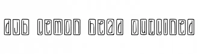
( Fonts by Darcy Baldwin - darcybaldwin.com. Free for personal use only )
A playful, hand-drawn font with outlined characters in a whimsical style.
![DJB Lemon Head Outlined Frei Schriftart Herunterladen]() Herunterladen 77 Downloads@WebFont
Herunterladen 77 Downloads@WebFont -
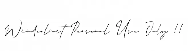
( Fonts by FallenGraphic Studio - Vava Aryanto - Personal-use only. For commercial use please contact owner. )
A flowing, cursive handwritten font with elegant, connected letters.
![Winderlust Personal Use Only !! Frei Schriftart Herunterladen]() Herunterladen 77 Downloads@WebFont
Herunterladen 77 Downloads@WebFont -
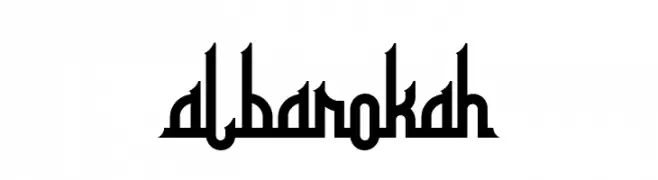
( Fonts by NeutroneLabs - Kapri Prianto - Personal-use only. For commercial use please contact owner. )
A bold, geometric font with high contrast and a modern, edgy style.
![albarokah Frei Schriftart Herunterladen]() Herunterladen 77 Downloads@WebFont
Herunterladen 77 Downloads@WebFont -
( Fonts by Vultype )
Elegant cursive script with a handwritten feel.
![Castende Frei Schriftart Herunterladen]() Herunterladen 77 Downloads@WebFont
Herunterladen 77 Downloads@WebFont -
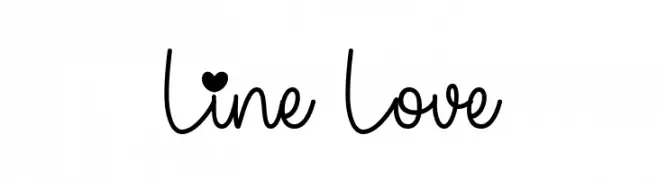
( Fonts by Fillo Graphic )
![Line Love Frei Schriftart Herunterladen]() Herunterladen 77 Downloads@WebFont
Herunterladen 77 Downloads@WebFont -
( Fonts by Kong Font - https://fontkong.com/ - Personal-use only. For commercial use please contact owner. )
A playful, bold font with rounded, bubble-like characters.
![Newcookies Frei Schriftart Herunterladen]() Herunterladen 77 Downloads@WebFont
Herunterladen 77 Downloads@WebFont -
( Fonts by Kateeng Ciu - Personal-use only. For commercial use please contact owner. )
A playful, artistic handwritten font with fluid strokes and dynamic character.
![Anfather Frei Schriftart Herunterladen]() Herunterladen 77 Downloads@WebFont
Herunterladen 77 Downloads@WebFont -
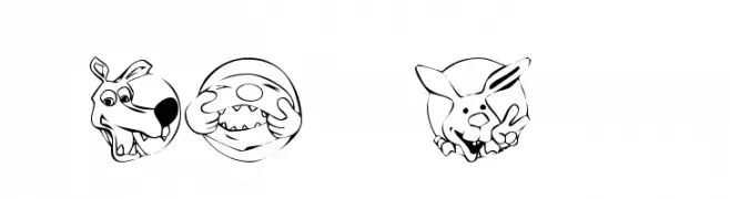
( Fonts by Kat`s Fun Fonts - Personal-use only. For commercial use please contact owner. )
A playful set of cartoon character illustrations in circular frames.
![KR Circle Scraps Frei Schriftart Herunterladen]() Herunterladen 77 Downloads@WebFont
Herunterladen 77 Downloads@WebFont -
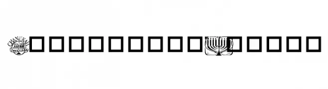
( Dani Foster Herring - dani3d.com/ )
A themed dingbat font with Hanukkah and Jewish festival icons.
![Festival of Lights Frei Schriftart Herunterladen]() Herunterladen 77 Downloads@WebFont
Herunterladen 77 Downloads@WebFont -
( Fonts by Font Bundles )
Playful handwritten font with rounded edges.
![Winter Wonderful Frei Schriftart Herunterladen]() Herunterladen 77 Downloads@WebFont
Herunterladen 77 Downloads@WebFont -
( Fonts by Luxima Creative Studio - Susilo Hidayat - Personal-use only. For commercial use please contact owner. )
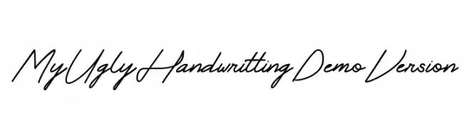
A casual and flowing handwritten script with elegant connections.
![My Ugly Handwritting Demo Version Frei Schriftart Herunterladen]() Herunterladen 77 Downloads@WebFont
Herunterladen 77 Downloads@WebFont -
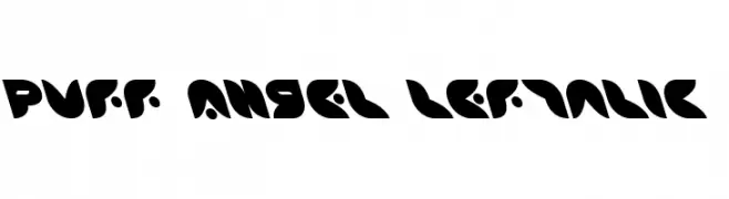
( Iconian Fonts - Daniel Zadorozny - www.iconian.com )
A bold, playful font with rounded, geometric characters and high contrast.
![Puff Angel Leftalic Frei Schriftart Herunterladen]() Herunterladen 77 Downloads@WebFont
Herunterladen 77 Downloads@WebFont -
( Fonts by Noah Type - noahtype.com - Personal-use only. For commercial use please contact owner. )
A tall, narrow font with a modern and elegant design.
![The Orange Demo Frei Schriftart Herunterladen]() Herunterladen 77 Downloads@WebFont
Herunterladen 77 Downloads@WebFont -
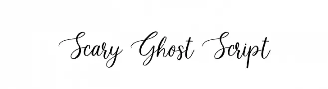
( Fonts by Jimtype Studio - Personal-use only. For commercial use please contact owner. )
A graceful and artistic script font with elegant loops and flourishes.
![Scary Ghost Script Frei Schriftart Herunterladen]() Herunterladen 77 Downloads@WebFont
Herunterladen 77 Downloads@WebFont -
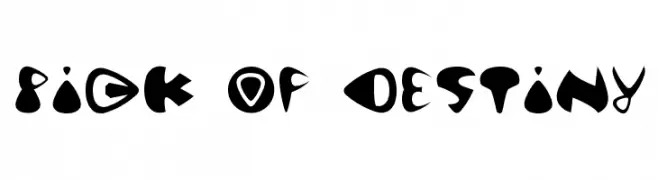
( Fonts by Thoai-Hong Thu - www.thoaihongthu.de - Personal-use only. For commercial use please contact owner. )
A bold, playful font with thick, rounded shapes and artistic flair.
![Pick of Destiny Frei Schriftart Herunterladen]() Herunterladen 77 Downloads@WebFont
Herunterladen 77 Downloads@WebFont -
( Fonts by www.dcoxy.com )
A playful, zombie-themed decorative font with cartoonish characters.
![zombiz Frei Schriftart Herunterladen]() Herunterladen 77 Downloads@WebFont
Herunterladen 77 Downloads@WebFont -
( Fonts by Abdul Basit - Personal-use only. For commercial use please contact owner. )
A playful, hand-drawn font with rounded edges and a casual style.
![The Book Frei Schriftart Herunterladen]() Herunterladen 77 Downloads@WebFont
Herunterladen 77 Downloads@WebFont -
( Fonts by a Max Infeld - XEROGRAPHER FONTS - xerographer.blogspot.com . Personal-use only. For commercial use please contact owner. )
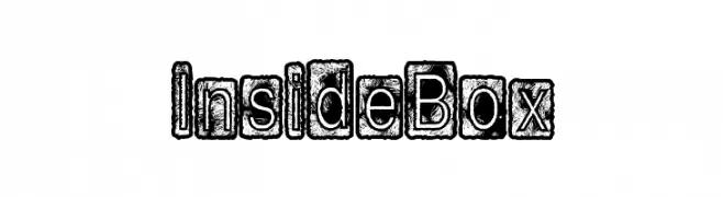
A bold, distressed font with characters enclosed in textured boxes, perfect for vintage and grunge designs.
![InsideBox Frei Schriftart Herunterladen]() Herunterladen 77 Downloads@WebFont
Herunterladen 77 Downloads@WebFont -
( Fonts by www.selawetype.com - Personal-use only. FOR DONATION https://www.paypal.me/selawe . For commercial use please contact owner. )
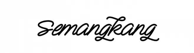
A classic and elegant script font with flowing, interconnected letterforms.
![Semangkang Frei Schriftart Herunterladen]() Herunterladen 77 Downloads@WebFont
Herunterladen 77 Downloads@WebFont -
( Fonts by Balpirick - Personal-use only. For commercial use please contact owner. )
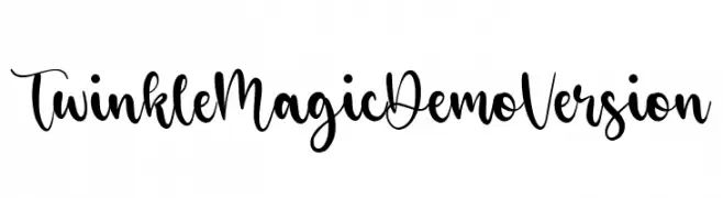
A playful, whimsical script font with a handwritten style.
![Twinkle Magic Demo Version Frei Schriftart Herunterladen]() Herunterladen 77 Downloads@WebFont
Herunterladen 77 Downloads@WebFont -
( Fonts by Zuzulgo Studio - Muhammad Zulfani - Personal-use only. For commercial use please contact owner. )
A lively, handwritten font with fluid strokes and a modern, casual aesthetic.
![Andalan Eug Frei Schriftart Herunterladen]() Herunterladen 77 Downloads@WebFont
Herunterladen 77 Downloads@WebFont -
( Nght's Place - www.crosswinds.net/~nghtmvs/font/fonts1.html )
A decorative font with characters enclosed in heart shapes topped with crosses.
![101! Thru My Heart Frei Schriftart Herunterladen]() Herunterladen 77 Downloads@WebFont
Herunterladen 77 Downloads@WebFont -
( Fonts by NubeFonts - nubefonts.blogspot.com - Personal-use only. For commercial use please contact owner. )
A playful, bold font with rounded edges and a whimsical style.
![Smallfoot Frei Schriftart Herunterladen]() Herunterladen 77 Downloads@WebFont
Herunterladen 77 Downloads@WebFont -
( Fonts by Daniel Zadorozny - www.iconian.com - Personal-use only. For commercial use please contact owner. )
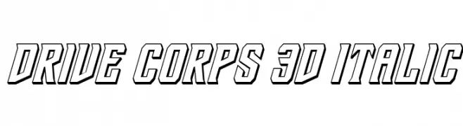
Bold, 3D italic font with a dynamic and futuristic style.
![Drive Corps 3D Italic Frei Schriftart Herunterladen]() Herunterladen 77 Downloads@WebFont
Herunterladen 77 Downloads@WebFont -
( Fonts by DmLetter31 - Dimas Prasetyo - Personal-use only. For commercial use please contact owner. )
A whimsical and decorative font with curly, flowing letterforms.
![Dream Unicorn Frei Schriftart Herunterladen]() Herunterladen 77 Downloads@WebFont
Herunterladen 77 Downloads@WebFont -
( Fonts by CannotIntoSpaceFonts - KineticPlasma Fonts - Personal-use only. For commercial use please contact owner. )
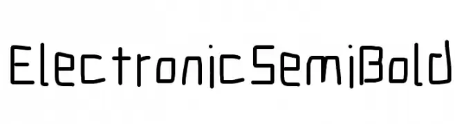
A geometric, digital-inspired font with semi-bold weight and rounded corners.
![Electronic SemiBold Frei Schriftart Herunterladen]() Herunterladen 77 Downloads@WebFont
Herunterladen 77 Downloads@WebFont -
( Iconian Fonts - Daniel Zadorozny - www.iconian.com )
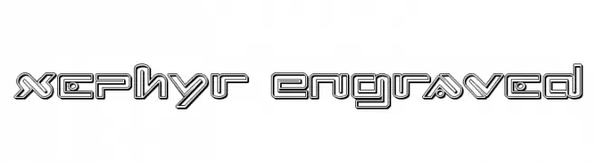
A futuristic, engraved font with a three-dimensional, geometric design.
![Xephyr Engraved Frei Schriftart Herunterladen]() Herunterladen 77 Downloads@WebFont
Herunterladen 77 Downloads@WebFont -
( www.imagex-fonts.com )
A playful, bold font with irregular shapes and a hand-drawn style.
![Lazy Day Frei Schriftart Herunterladen]() Herunterladen 77 Downloads@WebFont
Herunterladen 77 Downloads@WebFont -
( Fonts by Daniel Zadorozny - www.iconian.com - Personal-use only. For commercial use please contact owner. )
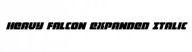
A bold, expanded, and italic font with a futuristic and dynamic style.
![Heavy Falcon Expanded Italic Frei Schriftart Herunterladen]() Herunterladen 77 Downloads@WebFont
Herunterladen 77 Downloads@WebFont -
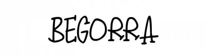
( Darrell Flood )
A playful, hand-drawn font with bold strokes and a whimsical style.
![Begorra Frei Schriftart Herunterladen]() Herunterladen 77 Downloads@WebFont
Herunterladen 77 Downloads@WebFont


Welche Schriften sind gerade am populärsten?
Poppins, Roboto, Montserrat, Open Sans und Lato sind wegen ihrer klaren Formen und breiten Einsetzbarkeit sehr gefragt – von Markenauftritt über Landingpages bis hin zu Postern.
Welche Fonts eignen sich für Logos?
Geometrische Sans‑Serifs (z. B. Poppins, Familien im Gotham‑Stil) sind ein häufiger Griff für sauberes, skalierbares Branding. Für eine persönlichere Note bleiben Scripts und Handschrift‑Stile beliebt. Kombinieren Sie einen prägnanten Headline‑Font mit einer neutralen Brotschrift für Wiedererkennung und Harmonie.
Wie oft wird die Top‑Liste aktualisiert?
Regelmäßig – basierend auf realen Downloads und Interaktionen. Schauen Sie öfter vorbei, um aufstrebende Favoriten früh zu entdecken.
💡 Tipp: Seite bookmarken – Trends wechseln schnell, und heutige Top‑Schriften inspirieren morgen vielleicht das Rebranding.