Willkommen bei den Top‑Schriften – hier treffen Beliebtheit und Qualität aufeinander. Das sind die in diesem Jahr am häufigsten heruntergeladenen und genutzten Fonts. Wenn Sie sichere Optionen für Logo, Web oder Social suchen, starten Sie hier.
Jeder Top‑Font überzeugt durch Balance, Lesbarkeit und Vielseitigkeit. Sie finden moderne Sans‑Serifs, elegante Scripts, Vintage‑Serifs und minimalistische Displays.
-
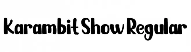
( Fonts by Priogi Rahayu )
A playful, bold font with a hand-drawn, rounded style.
 Herunterladen 471 Downloads@WebFont
 -
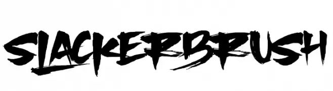
( Fonts by Anang Fibriyanto - www.creativefabrica.com/designer/cornertypestudio/ref/356436/ - Personal-use only. For commercial use please contact owner. )
A bold, brush-style font with dynamic, edgy strokes.
![SlackerBrush Frei Schriftart Herunterladen]() Herunterladen 471 Downloads@WebFont
Herunterladen 471 Downloads@WebFont -
![sa Frei Schriftart Herunterladen]() Herunterladen 471 Downloads@WebFont
Herunterladen 471 Downloads@WebFont -
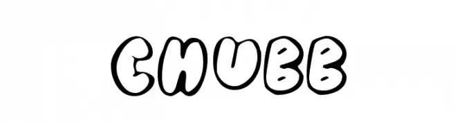
( Fonts by Typearound )
A playful, bold font with thick, rounded, outlined letters.
![Chubb Frei Schriftart Herunterladen]() Herunterladen 471 Downloads@WebFont
Herunterladen 471 Downloads@WebFont -
![Handa Frei Schriftart Herunterladen]() Herunterladen 471 Downloads@WebFont
Herunterladen 471 Downloads@WebFont -
-
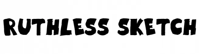
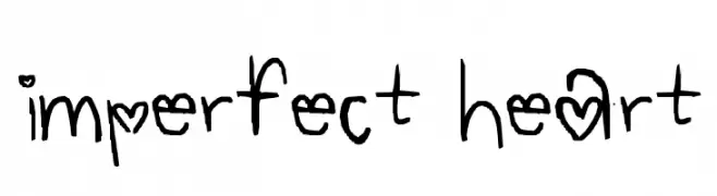
( Fonts by GGBotNet )
A bold, hand-drawn font with a sketch-like, artistic style.
![Ruthless Sketch Frei Schriftart Herunterladen]() Herunterladen 471 Downloads@WebFont
Herunterladen 471 Downloads@WebFont -
![imperfect heart Frei Schriftart Herunterladen]() Herunterladen 471 Downloads@WebFont
Herunterladen 471 Downloads@WebFont -
![5×5 Frei Schriftart Herunterladen]() Herunterladen 471 Downloads@WebFont
Herunterladen 471 Downloads@WebFont -
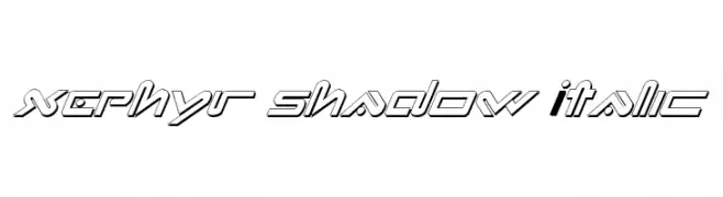
( Fonts by Daniel Zadorozny - www.iconian.com )
A futuristic, italicized font with bold, geometric lines and a shadow effect.
![Xephyr Shadow Italic Frei Schriftart Herunterladen]() Herunterladen 471 Downloads@WebFont
Herunterladen 471 Downloads@WebFont -
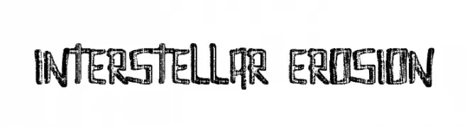
( Fonts by David Kerkhoff - www.hanodedphotography.com )
A rugged, distressed font with a hand-drawn, textured appearance.
![Interstellar Erosion Frei Schriftart Herunterladen]() Herunterladen 471 Downloads@WebFont
Herunterladen 471 Downloads@WebFont


Welche Schriften sind gerade am populärsten?
Poppins, Roboto, Montserrat, Open Sans und Lato sind wegen ihrer klaren Formen und breiten Einsetzbarkeit sehr gefragt – von Markenauftritt über Landingpages bis hin zu Postern.
Welche Fonts eignen sich für Logos?
Geometrische Sans‑Serifs (z. B. Poppins, Familien im Gotham‑Stil) sind ein häufiger Griff für sauberes, skalierbares Branding. Für eine persönlichere Note bleiben Scripts und Handschrift‑Stile beliebt. Kombinieren Sie einen prägnanten Headline‑Font mit einer neutralen Brotschrift für Wiedererkennung und Harmonie.
Wie oft wird die Top‑Liste aktualisiert?
Regelmäßig – basierend auf realen Downloads und Interaktionen. Schauen Sie öfter vorbei, um aufstrebende Favoriten früh zu entdecken.
💡 Tipp: Seite bookmarken – Trends wechseln schnell, und heutige Top‑Schriften inspirieren morgen vielleicht das Rebranding.