Willkommen bei den Top‑Schriften – hier treffen Beliebtheit und Qualität aufeinander. Das sind die in diesem Jahr am häufigsten heruntergeladenen und genutzten Fonts. Wenn Sie sichere Optionen für Logo, Web oder Social suchen, starten Sie hier.
Jeder Top‑Font überzeugt durch Balance, Lesbarkeit und Vielseitigkeit. Sie finden moderne Sans‑Serifs, elegante Scripts, Vintage‑Serifs und minimalistische Displays.
-
( Noto is a trademark of Google Inc. Noto fonts are open source. All Noto fonts are published under the SIL Open Font License, Version 1.1 )
A condensed, thin font with a clean and modern design.
 Herunterladen 74 Downloads@WebFont
 -
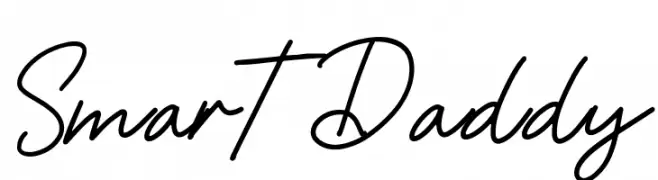
( Fonts by Gagegostyle - Syera Syailendra - Personal-use only. For commercial use please contact owner. )
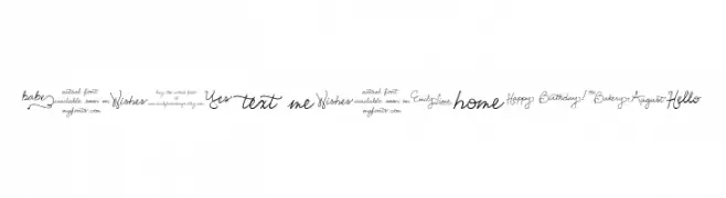
A lively, cursive script font with fluid strokes and a personal touch.
![Smart Daddy Frei Schriftart Herunterladen]() Herunterladen 74 Downloads@WebFont
Herunterladen 74 Downloads@WebFont -
( Misti's Fonts - mistifonts.com/ )
An elegant calligraphic font with ornate uppercase and smooth lowercase letters.
![VampireCalligraphy Frei Schriftart Herunterladen]() Herunterladen 74 Downloads@WebFont
Herunterladen 74 Downloads@WebFont -
( Fonts by Reffan Suseno )
A whimsical, handwritten font with flowing, irregular strokes.
![DropWriten Frei Schriftart Herunterladen]() Herunterladen 74 Downloads@WebFont
Herunterladen 74 Downloads@WebFont -
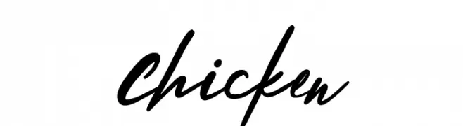
( Fonts by Hyee Gun - Personal-use only. For commercial use please contact owner. )
A lively, cursive handwritten font with smooth, flowing strokes.
![Chicken Frei Schriftart Herunterladen]() Herunterladen 74 Downloads@WebFont
Herunterladen 74 Downloads@WebFont -
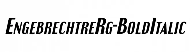
( Typodermic Fonts - Ray Larabie - www.typodermicfonts.com/ )
A bold, italicized font with strong, dynamic strokes and a slanted style.
![EngebrechtreRg-BoldItalic Frei Schriftart Herunterladen]() Herunterladen 74 Downloads@WebFont
Herunterladen 74 Downloads@WebFont -
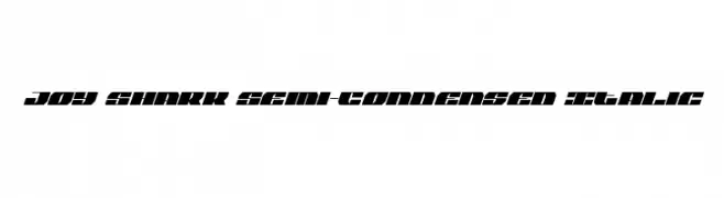
![Joy Shark Semi-Condensed Italic Frei Schriftart Herunterladen]() Herunterladen 74 Downloads@WebFont
Herunterladen 74 Downloads@WebFont -
( Noto is a trademark of Google Inc. Noto fonts are open source. All Noto fonts are published under the SIL Open Font License, Version 1.1 )
A modern, condensed sans-serif font with an extra light weight.
![Noto Sans Sinhala UI Condensed ExtraLight Frei Schriftart Herunterladen]() Herunterladen 74 Downloads@WebFont
Herunterladen 74 Downloads@WebFont -
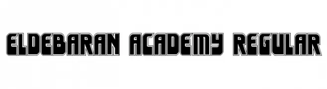
( Fonts by Daniel Zadorozny - www.iconian.com - Free for personal use )
A bold, geometric font with a retro-modern style.
![Eldebaran Academy Regular Frei Schriftart Herunterladen]() Herunterladen 74 Downloads@WebFont
Herunterladen 74 Downloads@WebFont -
( Fonts by David Espinosa [Type Sailor] - www.facebook.com/typesailor - Personal-use only. For commercial use please contact owner. )
A bold, geometric font with a modern and structured aesthetic.
![Hug Femmes Bold Frei Schriftart Herunterladen]() Herunterladen 74 Downloads@WebFont
Herunterladen 74 Downloads@WebFont -
( Fonts101 - www.fonts101.com )
A modern, rounded font with sleek, elongated characters.
![Beam 101 Regular Frei Schriftart Herunterladen]() Herunterladen 74 Downloads@WebFont
Herunterladen 74 Downloads@WebFont -
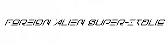
( Fonts by Daniel Zadorozny - www.iconian.com - Personal-use only. For commercial use please contact owner. )
A futuristic, italicized font with sharp angles and a sleek, dynamic style.
![Foreign Alien Super-Italic Frei Schriftart Herunterladen]() Herunterladen 74 Downloads@WebFont
Herunterladen 74 Downloads@WebFont -
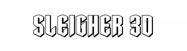
( Fonts by Daniel Zadorozny - www.iconian.com - Personal-use only. For commercial use please contact owner. )
A bold, 3D font with angular, outlined characters for impactful designs.
![Sleigher 3D Frei Schriftart Herunterladen]() Herunterladen 74 Downloads@WebFont
Herunterladen 74 Downloads@WebFont -
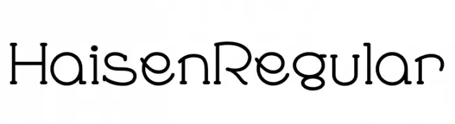
( Fonts by zone108.main.jp - Personal-use only. For commercial use please contact owner. )
A modern, geometric font with rounded shapes and clean lines.
![Haisen Regular Frei Schriftart Herunterladen]() Herunterladen 74 Downloads@WebFont
Herunterladen 74 Downloads@WebFont -
![Agra Italic Frei Schriftart Herunterladen]() Herunterladen 74 Downloads
Herunterladen 74 Downloads -
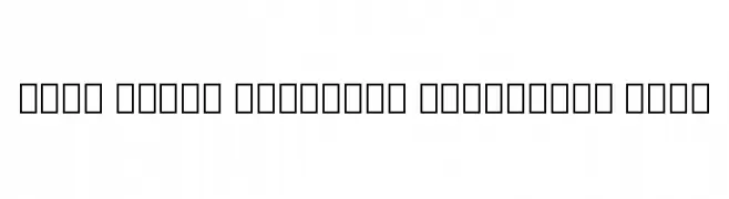
( Noto is a trademark of Google Inc. Noto fonts are open source. All Noto fonts are published under the SIL Open Font License, Version 1.1 )
No valid font glyphs are visible.
![Noto Sans Lao Condensed SemiBold Frei Schriftart Herunterladen]() Herunterladen 74 Downloads@WebFont
Herunterladen 74 Downloads@WebFont -
![Delta Ray Engraved Italic Frei Schriftart Herunterladen]() Herunterladen 74 Downloads@WebFont
Herunterladen 74 Downloads@WebFont -
( Fonts by www.woodcutter.es - woodcutter Manero - Personal-use only. For commercial use please contact owner. )
A pictogram font featuring lumberjack and woodcutting motifs.
![THE WOODCUTTER Frei Schriftart Herunterladen]() Herunterladen 74 Downloads@WebFont
Herunterladen 74 Downloads@WebFont -
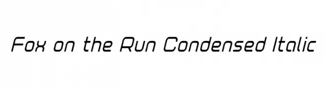
( Iconian Fonts - Daniel Zadorozny - www.iconian.com )
A modern, condensed italic font with a sleek and dynamic style.
![Fox on the Run Condensed Italic Frei Schriftart Herunterladen]() Herunterladen 74 Downloads@WebFont
Herunterladen 74 Downloads@WebFont -
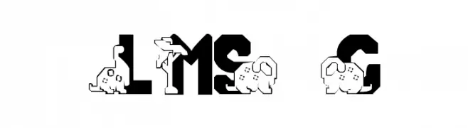
( London's Letters - www.londonsletters.com/ )
A playful, dinosaur-themed decorative font with bold, blocky letters.
![LMS Conradasaur Frei Schriftart Herunterladen]() Herunterladen 74 Downloads@WebFont
Herunterladen 74 Downloads@WebFont -
( Noto is a trademark of Google Inc. Noto fonts are open source. All Noto fonts are published under the SIL Open Font License, Version 1.1 )
A bold serif font with thick strokes and strong presence.
![Noto Serif Sinhala ExtraBold Frei Schriftart Herunterladen]() Herunterladen 74 Downloads@WebFont
Herunterladen 74 Downloads@WebFont -
( Fonts by Balpirick Studio - https://www.creativefabrica.com/designer/balpirick/ref/308299/ - Personal-use only. For commercial use please contact owner. )
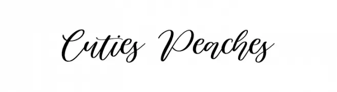
A modern, elegant script font with flowing, interconnected strokes.
![Cuties Peaches Frei Schriftart Herunterladen]() Herunterladen 74 Downloads@WebFont
Herunterladen 74 Downloads@WebFont -
( Fonts by AlifRyanZulfikar - Personal-use only. For commercial use please contact owner. )
A playful, handwritten-style font with a whimsical and energetic appearance.
![Easter Nice - Personal Use Frei Schriftart Herunterladen]() Herunterladen 74 Downloads@WebFont
Herunterladen 74 Downloads@WebFont -
( Fonts by Maulana Creative - Gilang Maulana - Personal-use only. For commercial use please contact owner. )
A graceful, cursive script with a modern twist, perfect for elegant designs.
![Queensytrix Free Regular Frei Schriftart Herunterladen]() Herunterladen 74 Downloads@WebFont
Herunterladen 74 Downloads@WebFont -
( weknow - Wino S Kadir - www.creativefabrica.com/designer/weknow/ )
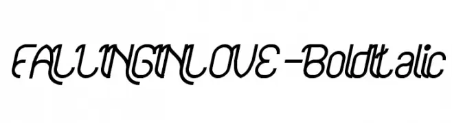
A bold, italic script font with dynamic curves and a modern flair.
![FALLINGINLOVE-BoldItalic Frei Schriftart Herunterladen]() Herunterladen 74 Downloads@WebFont
Herunterladen 74 Downloads@WebFont -
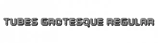
( Fonts by Vladimir Nikolic )
A bold, tubular font with a futuristic, circuit-like design.
![Tubes Grotesque Regular Frei Schriftart Herunterladen]() Herunterladen 74 Downloads@WebFont
Herunterladen 74 Downloads@WebFont -
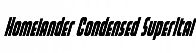
( Fonts by Daniel Zadorozny - www.iconian.com - Personal-use only. For commercial use please contact owner. )
A bold, condensed, and italicized font with a dynamic and modern style.
![Homelander Condensed SuperItal Frei Schriftart Herunterladen]() Herunterladen 74 Downloads@WebFont
Herunterladen 74 Downloads@WebFont -
( Fonts by Emily Lime Design - Emily Conners - Personal-use only. For commercial use please contact owner. )
A whimsical and elegant script font with flowing, cursive letters and decorative flourishes.
![EmilyLimeWords Frei Schriftart Herunterladen]() Herunterladen 74 Downloads@WebFont
Herunterladen 74 Downloads@WebFont -
( FOD - www.geocities.co.jp/siliconvalley/1286/ )
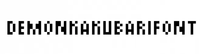
A pixelated, retro-style font with a blocky, digital appearance.
![DemonKakubariFont Frei Schriftart Herunterladen]() Herunterladen 74 Downloads@WebFont
Herunterladen 74 Downloads@WebFont -
( Fonts by Wino S Kadir - weknow - www.revolge.com/shop/weknow/ - Personal-use only. For commercial use please contact owner. )
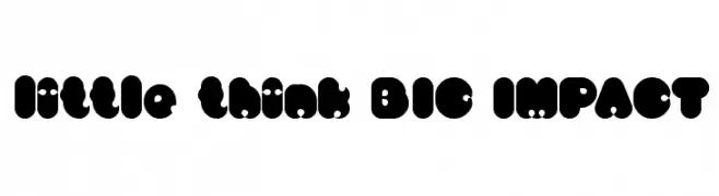
A bold, playful font with rounded, bubble-like characters and unique cut-out details.
![little think BIG IMPACT Frei Schriftart Herunterladen]() Herunterladen 74 Downloads@WebFont
Herunterladen 74 Downloads@WebFont -
( Blambot - www.blambot.com )
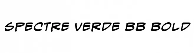
A bold, handwritten-style font with smooth curves and a lively, modern feel.
![Spectre Verde BB Bold Frei Schriftart Herunterladen]() Herunterladen 74 Downloads@WebFont
Herunterladen 74 Downloads@WebFont -
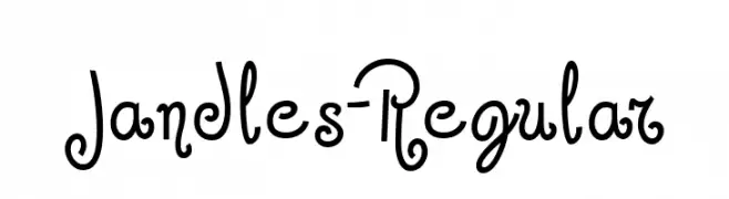
![Jandles-Regular Frei Schriftart Herunterladen]() Herunterladen 74 Downloads@WebFont
Herunterladen 74 Downloads@WebFont -
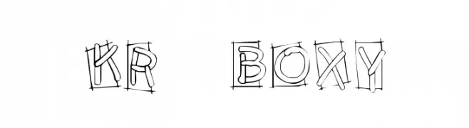
( Fonts by Kat`s Fun Fonts - Personal-use only. For commercial use please contact owner. )
A playful, hand-sketched font with boxed, doodle-like characters.
![KR Boxy Frei Schriftart Herunterladen]() Herunterladen 74 Downloads@WebFont
Herunterladen 74 Downloads@WebFont -
( Peter Olexa - www.dealjumbo.com )
A bold, decorative font with a grunge aesthetic and intricate patterns.
![Jewel Bold Grunge Frei Schriftart Herunterladen]() Herunterladen 74 Downloads@WebFont
Herunterladen 74 Downloads@WebFont -
( Fonts by Em Nazar - Personal-use only. For commercial use please contact owner. )
A bold, modern font with geometric and rounded features.
![Neonix Frei Schriftart Herunterladen]() Herunterladen 74 Downloads@WebFont
Herunterladen 74 Downloads@WebFont


Welche Schriften sind gerade am populärsten?
Poppins, Roboto, Montserrat, Open Sans und Lato sind wegen ihrer klaren Formen und breiten Einsetzbarkeit sehr gefragt – von Markenauftritt über Landingpages bis hin zu Postern.
Welche Fonts eignen sich für Logos?
Geometrische Sans‑Serifs (z. B. Poppins, Familien im Gotham‑Stil) sind ein häufiger Griff für sauberes, skalierbares Branding. Für eine persönlichere Note bleiben Scripts und Handschrift‑Stile beliebt. Kombinieren Sie einen prägnanten Headline‑Font mit einer neutralen Brotschrift für Wiedererkennung und Harmonie.
Wie oft wird die Top‑Liste aktualisiert?
Regelmäßig – basierend auf realen Downloads und Interaktionen. Schauen Sie öfter vorbei, um aufstrebende Favoriten früh zu entdecken.
💡 Tipp: Seite bookmarken – Trends wechseln schnell, und heutige Top‑Schriften inspirieren morgen vielleicht das Rebranding.