Willkommen bei den Top‑Schriften – hier treffen Beliebtheit und Qualität aufeinander. Das sind die in diesem Jahr am häufigsten heruntergeladenen und genutzten Fonts. Wenn Sie sichere Optionen für Logo, Web oder Social suchen, starten Sie hier.
Jeder Top‑Font überzeugt durch Balance, Lesbarkeit und Vielseitigkeit. Sie finden moderne Sans‑Serifs, elegante Scripts, Vintage‑Serifs und minimalistische Displays.
-
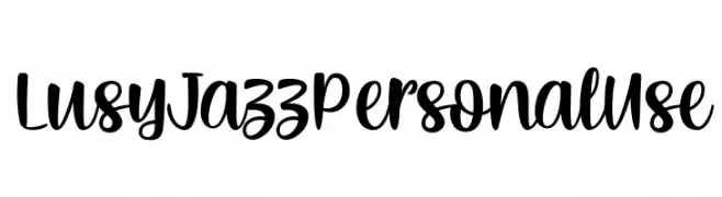
( Fonts by Typhoon Type - Suthi Srisopha - www.typhoontype.net - Personal-use only. For commercial use please contact owner. )
A playful, bold script font with a handwritten feel.
 Herunterladen 468 Downloads@WebFont
 -
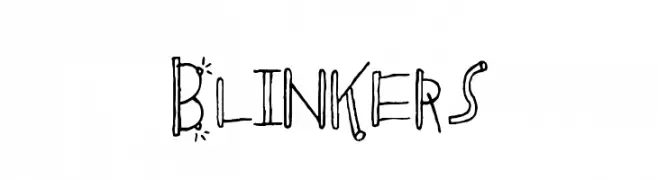
![Blinkers Frei Schriftart Herunterladen]() Herunterladen 468 Downloads@WebFont
Herunterladen 468 Downloads@WebFont -
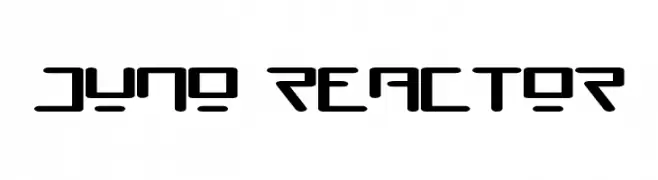
![Juno Reactor Frei Schriftart Herunterladen]() Herunterladen 468 Downloads@WebFont
Herunterladen 468 Downloads@WebFont -
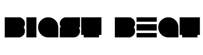
( Fonts by Andrew Hart - dirt2.com )
A bold, geometric font with blocky, angular letterforms for a strong visual impact.
![Blast Beat Frei Schriftart Herunterladen]() Herunterladen 468 Downloads@WebFont
Herunterladen 468 Downloads@WebFont -
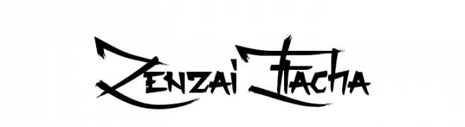
( Fonts by Maelle.K - Thomas Boucherie )
A bold, graffiti-inspired font with sharp angles and dynamic strokes.
![Zenzai Itacha Frei Schriftart Herunterladen]() Herunterladen 468 Downloads@WebFont
Herunterladen 468 Downloads@WebFont -
-
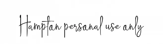
( Andhi Yulianto - creativemarket.com/great19 )
An elegant, flowing script font with thin, delicate strokes and graceful curves.
![Hampton personal use only Frei Schriftart Herunterladen]() Herunterladen 468 Downloads@WebFont
Herunterladen 468 Downloads@WebFont -
![Sorawin Plain Frei Schriftart Herunterladen]() Herunterladen 468 Downloads@WebFont
Herunterladen 468 Downloads@WebFont -
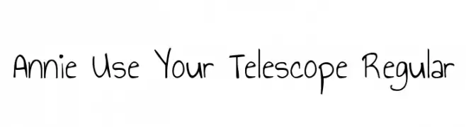
( Copyright (c) 2010, Kimberly Geswein (kimberlygeswein.com) )
A playful, hand-drawn font with a whimsical and informal style.
![Annie Use Your Telescope Regular Frei Schriftart Herunterladen]() Herunterladen 468 Downloads@WebFont
Herunterladen 468 Downloads@WebFont -
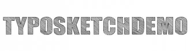
( Fonts by www.studiotypo.com - Personal-use only. For commercial use please contact owner. )
A bold, sketch-style font with diagonal hatching, perfect for creative and decorative projects.
![TYPO SKETCH DEMO Frei Schriftart Herunterladen]() Herunterladen 468 Downloads@WebFont
Herunterladen 468 Downloads@WebFont -
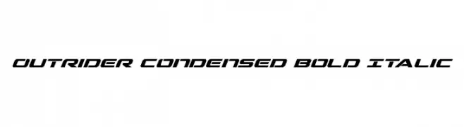
( Fonts by Daniel Zadorozny - www.iconian.com )
A bold, italic, and condensed font with a modern, dynamic style.
![Outrider Condensed Bold Italic Frei Schriftart Herunterladen]() Herunterladen 468 Downloads@WebFont
Herunterladen 468 Downloads@WebFont
Welche Schriften sind gerade am populärsten?
Poppins, Roboto, Montserrat, Open Sans und Lato sind wegen ihrer klaren Formen und breiten Einsetzbarkeit sehr gefragt – von Markenauftritt über Landingpages bis hin zu Postern.
Welche Fonts eignen sich für Logos?
Geometrische Sans‑Serifs (z. B. Poppins, Familien im Gotham‑Stil) sind ein häufiger Griff für sauberes, skalierbares Branding. Für eine persönlichere Note bleiben Scripts und Handschrift‑Stile beliebt. Kombinieren Sie einen prägnanten Headline‑Font mit einer neutralen Brotschrift für Wiedererkennung und Harmonie.
Wie oft wird die Top‑Liste aktualisiert?
Regelmäßig – basierend auf realen Downloads und Interaktionen. Schauen Sie öfter vorbei, um aufstrebende Favoriten früh zu entdecken.
💡 Tipp: Seite bookmarken – Trends wechseln schnell, und heutige Top‑Schriften inspirieren morgen vielleicht das Rebranding.