Willkommen bei den Top‑Schriften – hier treffen Beliebtheit und Qualität aufeinander. Das sind die in diesem Jahr am häufigsten heruntergeladenen und genutzten Fonts. Wenn Sie sichere Optionen für Logo, Web oder Social suchen, starten Sie hier.
Jeder Top‑Font überzeugt durch Balance, Lesbarkeit und Vielseitigkeit. Sie finden moderne Sans‑Serifs, elegante Scripts, Vintage‑Serifs und minimalistische Displays.
-
( Fonts by Bangkit Tri Setiadi )
Bold, angular font with dynamic and energetic style.
 Herunterladen 73 Downloads@WebFont
 -
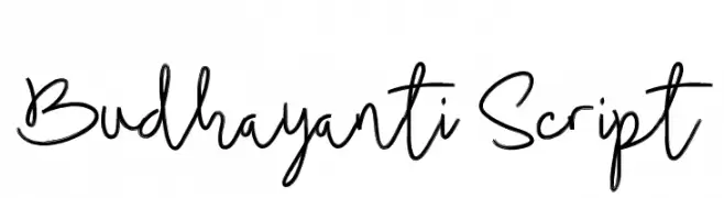
( madeDeduk )
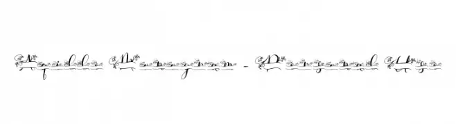
A lively and expressive handwritten font with fluid strokes and elegant flair.
![Budhayanti Script Frei Schriftart Herunterladen]() Herunterladen 73 Downloads@WebFont
Herunterladen 73 Downloads@WebFont -
( Fonts by a Galdino Otten - galdinootten.com . Personal-use only. For commercial use please contact owner. )
A playful, blocky font with a pixelated, digital appearance.
![Silly Aliens Frei Schriftart Herunterladen]() Herunterladen 73 Downloads@WebFont
Herunterladen 73 Downloads@WebFont -
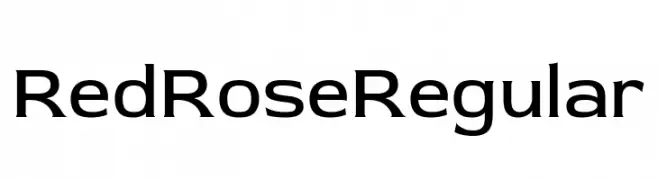
( Fonts by MagicType - Jaikishan Patel - Personal-use only. For commercial use please contact owner. )
A modern sans-serif font with clean lines and balanced proportions.
![Red Rose Regular Frei Schriftart Herunterladen]() Herunterladen 73 Downloads@WebFont
Herunterladen 73 Downloads@WebFont -
( Fonts by Kong Font - fontkong.com - Personal-use only. For commercial use please contact owner. )
A modern, elegant script font with flowing, cursive lines.
![DanettePricilla Frei Schriftart Herunterladen]() Herunterladen 73 Downloads@WebFont
Herunterladen 73 Downloads@WebFont -
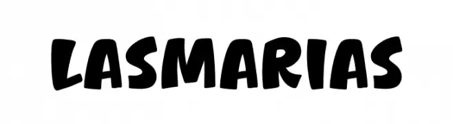
( Fonts by Khurasan )
A bold, playful font with a hand-drawn, cartoon-like style.
![Las Marias Frei Schriftart Herunterladen]() Herunterladen 73 Downloads@WebFont
Herunterladen 73 Downloads@WebFont -
( Fonts by PremiereGraphics )
![australia] Frei Schriftart Herunterladen]() Herunterladen 73 Downloads@WebFont
Herunterladen 73 Downloads@WebFont -
( Fonts by Zanatlija - Personal-use only. For commercial use please contact owner. )
A set of bold, high-contrast safety and warning symbols for clear communication.
![working signs tfb Frei Schriftart Herunterladen]() Herunterladen 73 Downloads@WebFont
Herunterladen 73 Downloads@WebFont -
( Fonts by www.woodcutter.es - woodcutter Manero - Personal-use only. For commercial use please contact owner. )
A versatile collection of owl icons in multiple illustrative styles.
![Owl Frei Schriftart Herunterladen]() Herunterladen 73 Downloads@WebFont
Herunterladen 73 Downloads@WebFont -
( Fonts by Jeremy Edelblut - Personal-use only. For commercial use please contact owner. )
A modern, geometric font with consistent line thickness and high legibility.
![Simple Dandy Frei Schriftart Herunterladen]() Herunterladen 73 Downloads@WebFont
Herunterladen 73 Downloads@WebFont -
( Fonts by Daniel Zadorozny - www.iconian.com - Personal-use only. For commercial use please contact owner. )
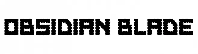
A bold, jagged font with sharp, angular shapes for a rugged look.
![Obsidian Blade Frei Schriftart Herunterladen]() Herunterladen 73 Downloads@WebFont
Herunterladen 73 Downloads@WebFont -
( Fonts by Alexander Pravdin - Personal-use only. For commercial use please contact owner. )
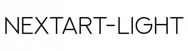
A modern, light, sans-serif font with geometric shapes and low contrast.
![NEXTART-Light Frei Schriftart Herunterladen]() Herunterladen 73 Downloads@WebFont
Herunterladen 73 Downloads@WebFont -
( Iconian Fonts - Daniel Zadorozny - www.iconian.com )
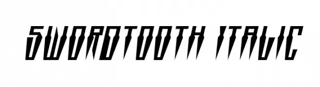
A bold, italicized font with sharp, angular edges and high contrast.
![Swordtooth Italic Frei Schriftart Herunterladen]() Herunterladen 73 Downloads@WebFont
Herunterladen 73 Downloads@WebFont -
( Fonts by Motokiwo - Anton Cahyono - Personal-use only. For commercial use please contact owner. )
A lively and energetic handwritten script font with bold, cursive strokes.
![Billybond Frei Schriftart Herunterladen]() Herunterladen 73 Downloads@WebFont
Herunterladen 73 Downloads@WebFont -
( Fonts by Zetafonts - Personal-use only. For commercial use please contact owner. )
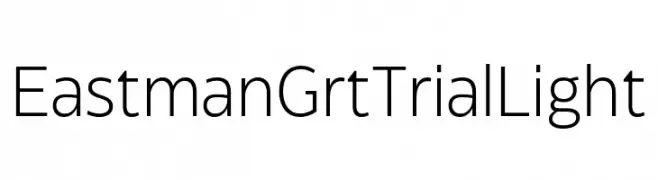
A clean, modern sans-serif font with uniform, geometric letterforms.
![Eastman Grt Trial Light Frei Schriftart Herunterladen]() Herunterladen 73 Downloads@WebFont
Herunterladen 73 Downloads@WebFont -
( Chequered Ink - chequered.ink/ )
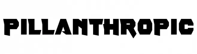
Bold, angular font with a futuristic, geometric style.
![Pill Anthropic Frei Schriftart Herunterladen]() Herunterladen 73 Downloads@WebFont
Herunterladen 73 Downloads@WebFont -
( Personal-use only. For commercial use please contact owner. )
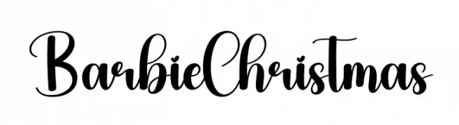
Bold, decorative script with playful swashes and high contrast.
![Barbie Christmas Frei Schriftart Herunterladen]() Herunterladen 73 Downloads@WebFont
Herunterladen 73 Downloads@WebFont -
( Fonts by Wino S Kadir - weknow - www.revolge.com/shop/weknow/ - Personal-use only. For commercial use please contact owner. )
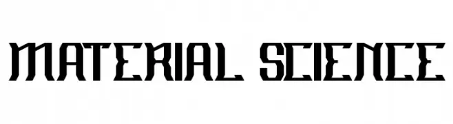
A bold, geometric font with angular, industrial design elements.
![MATERIAL SCIENCE Frei Schriftart Herunterladen]() Herunterladen 73 Downloads@WebFont
Herunterladen 73 Downloads@WebFont -
( Fonts by Maulana Creative - Gilang Maulana - Personal-use only. For commercial use please contact owner. )
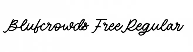
A flowing, cursive script font with a handwritten, elegant style.
![Blufcrowds Free Regular Frei Schriftart Herunterladen]() Herunterladen 73 Downloads@WebFont
Herunterladen 73 Downloads@WebFont -
( Fonts by Alit Design - Alit Suarnegara - Personal-use only. For commercial use please contact owner. )
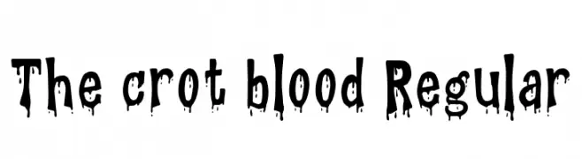
A bold, dripping font with a spooky, horror-themed style.
![The crot blood Regular Frei Schriftart Herunterladen]() Herunterladen 73 Downloads@WebFont
Herunterladen 73 Downloads@WebFont -
( Fonts by Letterena Studios - letterena.com - Personal-use only. For commercial use please contact owner. )
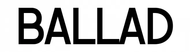
A modern, geometric sans-serif font with clean lines and uniform strokes.
![BALLAD Frei Schriftart Herunterladen]() Herunterladen 73 Downloads@WebFont
Herunterladen 73 Downloads@WebFont -
( Iconian Fonts - Daniel Zadorozny - www.iconian.com )
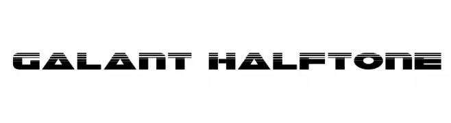
A bold, futuristic font with a halftone effect and dynamic design.
![Galant Halftone Frei Schriftart Herunterladen]() Herunterladen 73 Downloads@WebFont
Herunterladen 73 Downloads@WebFont -
( Typodermic Fonts - Ray Larabie - www.typodermicfonts.com/ )
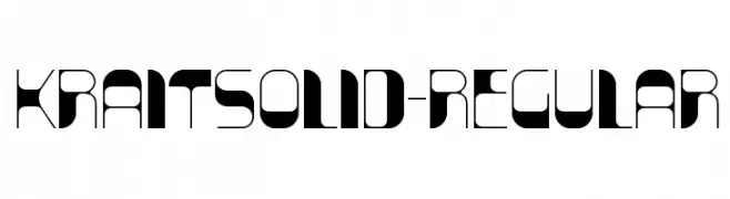
A futuristic, geometric font with high contrast and bold, angular shapes.
![KraitSolid-Regular Frei Schriftart Herunterladen]() Herunterladen 73 Downloads@WebFont
Herunterladen 73 Downloads@WebFont -
( Perry Mason )
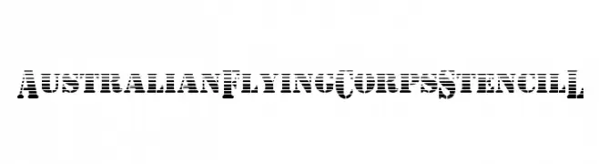
A bold, stencil-style font with horizontal stripes for a rugged, industrial look.
![AustralianFlyingCorpsStencilL Frei Schriftart Herunterladen]() Herunterladen 73 Downloads@WebFont
Herunterladen 73 Downloads@WebFont -
( Fonts by Weape Design )
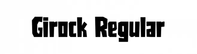
A bold, angular, and geometric font with a strong visual impact.
![Girock Regular Frei Schriftart Herunterladen]() Herunterladen 73 Downloads@WebFont
Herunterladen 73 Downloads@WebFont -
( Fonts by Haksen Studio - Sarwo Edhi Prayitno - Personal-use only. For commercial use please contact owner. )
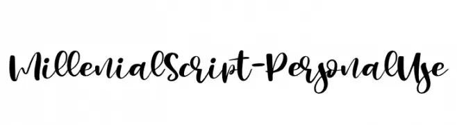
A bold, flowing script font with elegant, connected letters.
![Millenial Script - Personal Use Frei Schriftart Herunterladen]() Herunterladen 73 Downloads@WebFont
Herunterladen 73 Downloads@WebFont -
( Fonts by Kimberly Geswein - Personal-use only. For commercial use please contact owner. )
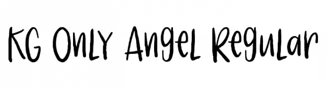
A playful, handwritten font with a casual and dynamic style.
![KG Only Angel Regular Frei Schriftart Herunterladen]() Herunterladen 73 Downloads@WebFont
Herunterladen 73 Downloads@WebFont -
( Fonts by Creaditive Design )
An elegant, decorative font with intricate floral embellishments.
![Aqille Monogram - Personal Use Frei Schriftart Herunterladen]() Herunterladen 73 Downloads@WebFont
Herunterladen 73 Downloads@WebFont -
( Fonts by 4RM Font - Arief rochman - Personal-use only. For commercial use please contact owner. )
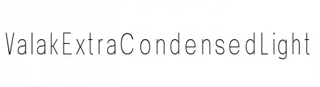
A sleek, extra-condensed, light sans-serif font with a modern aesthetic.
![Valak Extra Condensed Light Frei Schriftart Herunterladen]() Herunterladen 73 Downloads@WebFont
Herunterladen 73 Downloads@WebFont -
( Fonts by The Docallisme - Amry Al Mursalaat - Personal-use only. For commercial use please contact owner. )
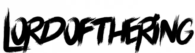
A bold, brushstroke font with a dynamic, hand-painted appearance.
![LORD OF THE RING Frei Schriftart Herunterladen]() Herunterladen 73 Downloads@WebFont
Herunterladen 73 Downloads@WebFont -
( Fonts by 4RM Font - Arief rochman - Personal-use only. For commercial use please contact owner. )
A playful, handwritten font with a casual and friendly style.
![Cuttie Frei Schriftart Herunterladen]() Herunterladen 73 Downloads@WebFont
Herunterladen 73 Downloads@WebFont -
( Fonts by Emanes Dsign - Personal-use only. For commercial use please contact owner. )
A bold, decorative font with playful cursive elements and ornate details.
![Blora Based Frei Schriftart Herunterladen]() Herunterladen 73 Downloads@WebFont
Herunterladen 73 Downloads@WebFont -
![Pointer SuperCondensed Frei Schriftart Herunterladen]() Herunterladen 73 Downloads@WebFont
Herunterladen 73 Downloads@WebFont -
( Iconian Fonts - Daniel Zadorozny - www.iconian.com )
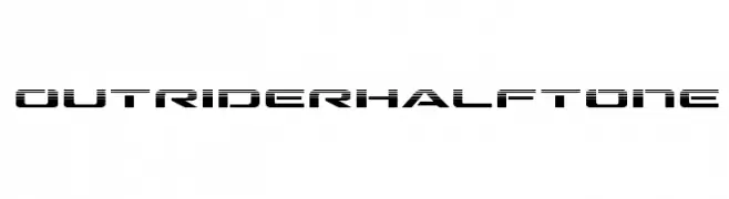
A bold, futuristic font with a halftone effect and geometric style.
![Outrider Halftone Frei Schriftart Herunterladen]() Herunterladen 73 Downloads@WebFont
Herunterladen 73 Downloads@WebFont -
( Fonts by Kong Font - fontkong.com - Personal-use only. For commercial use please contact owner. )
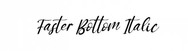
A flowing, elegant script font with an italic slant and artistic curves.
![Faster Bottom Italic Frei Schriftart Herunterladen]() Herunterladen 73 Downloads@WebFont
Herunterladen 73 Downloads@WebFont

![australia] Frei Schriftart Herunterladen](https://d144mzi0q5mijx.cloudfront.net/img/A/U/australia.webp)


Welche Schriften sind gerade am populärsten?
Poppins, Roboto, Montserrat, Open Sans und Lato sind wegen ihrer klaren Formen und breiten Einsetzbarkeit sehr gefragt – von Markenauftritt über Landingpages bis hin zu Postern.
Welche Fonts eignen sich für Logos?
Geometrische Sans‑Serifs (z. B. Poppins, Familien im Gotham‑Stil) sind ein häufiger Griff für sauberes, skalierbares Branding. Für eine persönlichere Note bleiben Scripts und Handschrift‑Stile beliebt. Kombinieren Sie einen prägnanten Headline‑Font mit einer neutralen Brotschrift für Wiedererkennung und Harmonie.
Wie oft wird die Top‑Liste aktualisiert?
Regelmäßig – basierend auf realen Downloads und Interaktionen. Schauen Sie öfter vorbei, um aufstrebende Favoriten früh zu entdecken.
💡 Tipp: Seite bookmarken – Trends wechseln schnell, und heutige Top‑Schriften inspirieren morgen vielleicht das Rebranding.