Willkommen bei den Top‑Schriften – hier treffen Beliebtheit und Qualität aufeinander. Das sind die in diesem Jahr am häufigsten heruntergeladenen und genutzten Fonts. Wenn Sie sichere Optionen für Logo, Web oder Social suchen, starten Sie hier.
Jeder Top‑Font überzeugt durch Balance, Lesbarkeit und Vielseitigkeit. Sie finden moderne Sans‑Serifs, elegante Scripts, Vintage‑Serifs und minimalistische Displays.
-
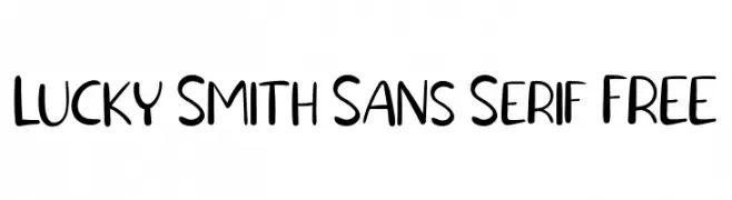
( Fonts by Vunira Design )
A playful, hand-drawn sans-serif font with a modern and friendly appearance.
 Herunterladen 76 Downloads@WebFont
 -
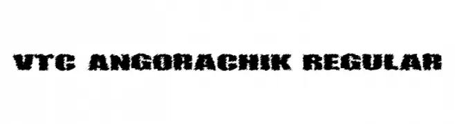
( Fonts by Vigilante Typeface Corporation Larry Yerkes. Personal-use only. For commercial use please contact owner. )
A bold, jagged, and distressed decorative font with a rugged appearance.
![VTC AngoraChik Regular Frei Schriftart Herunterladen]() Herunterladen 76 Downloads@WebFont
Herunterladen 76 Downloads@WebFont -
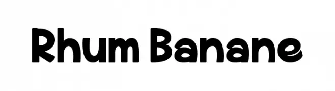
( Fonts by Greg Medina - www.dcoxy.com - Personal-use only. For commercial use please contact owner. )
A bold, playful font with rounded edges and a slightly condensed style.
![Rhum Banane Frei Schriftart Herunterladen]() Herunterladen 76 Downloads@WebFont
Herunterladen 76 Downloads@WebFont -
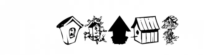
( Fonts by Kat`s Fun Fonts - Personal-use only. For commercial use please contact owner. )
A decorative font with intricate birdhouse illustrations for each character.
![KR Birdhouse Frei Schriftart Herunterladen]() Herunterladen 76 Downloads@WebFont
Herunterladen 76 Downloads@WebFont -
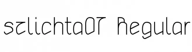
( Fonts by gluk - Personal-use only. For commercial use please contact owner. )
A modern, geometric font with clean lines and rounded edges.
![szlichta07 Regular Frei Schriftart Herunterladen]() Herunterladen 76 Downloads@WebFont
Herunterladen 76 Downloads@WebFont -
( Noto is a trademark of Google Inc. Noto fonts are open source. All Noto fonts are published under the SIL Open Font License, Version 1.1 )
An extra-light, geometric sans-serif with open forms and minimal contrast.
![Noto Sans Khmer ExtraLight Frei Schriftart Herunterladen]() Herunterladen 76 Downloads@WebFont
Herunterladen 76 Downloads@WebFont -
( Fonts by Star Studio - Personal-use only. For commercial use please contact owner. )
An elegant and modern font with high contrast and unique flourishes.
![Fetance Frei Schriftart Herunterladen]() Herunterladen 76 Downloads@WebFont
Herunterladen 76 Downloads@WebFont -
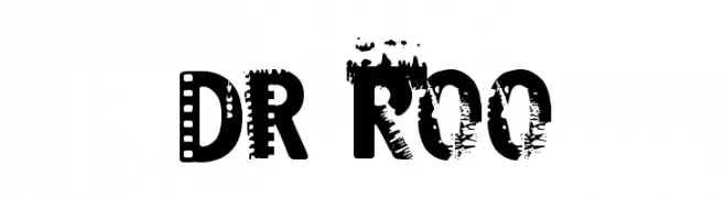
( imagex - www.imagex-fonts.com )
A bold, distressed font with a grunge, film strip aesthetic.
![Dark Room Frei Schriftart Herunterladen]() Herunterladen 76 Downloads@WebFont
Herunterladen 76 Downloads@WebFont -
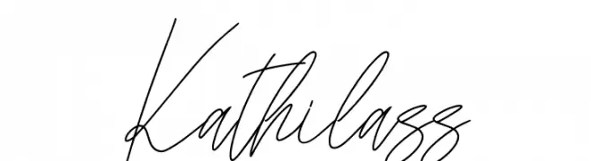
( Fonts by Skiiller Studio )
A fluid and elegant handwritten script with a natural, personal touch.
![Kathilass Frei Schriftart Herunterladen]() Herunterladen 76 Downloads@WebFont
Herunterladen 76 Downloads@WebFont -
( Fonts by www.junkohanhero.com - Personal-use only. For commercial use please contact owner. )
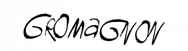
A bold, hand-drawn font with an expressive, graffiti-like style.
![GROmagnon Frei Schriftart Herunterladen]() Herunterladen 76 Downloads@WebFont
Herunterladen 76 Downloads@WebFont -
( Fonts by Iconian Fonts )
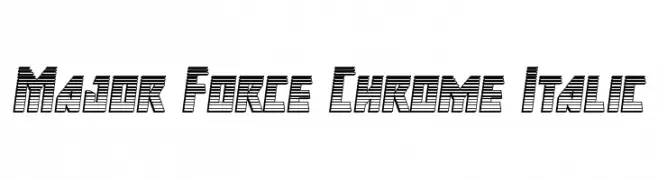
A bold, geometric, and futuristic font with italic slant and three-dimensional effect.
![Major Force Chrome Italic Frei Schriftart Herunterladen]() Herunterladen 76 Downloads@WebFont
Herunterladen 76 Downloads@WebFont -
( Fonts by Manjali Studio - Personal-use only. For commercial use please contact owner. )
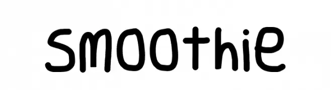
A playful, hand-drawn font with smooth curves and a casual, friendly feel.
![Smoothie Frei Schriftart Herunterladen]() Herunterladen 76 Downloads@WebFont
Herunterladen 76 Downloads@WebFont -
( Noto is a trademark of Google Inc. Noto fonts are open source. All Noto fonts are published under the SIL Open Font License, Version 1.1 )
A clean, extra condensed, and light font ideal for modern designs.
![Noto Sans Sinhala ExtraCondensed Light Frei Schriftart Herunterladen]() Herunterladen 76 Downloads@WebFont
Herunterladen 76 Downloads@WebFont -
( Fonts by Situjuh Nazara - 7ntypes.com - Personal-use only. For commercial use please contact owner. )
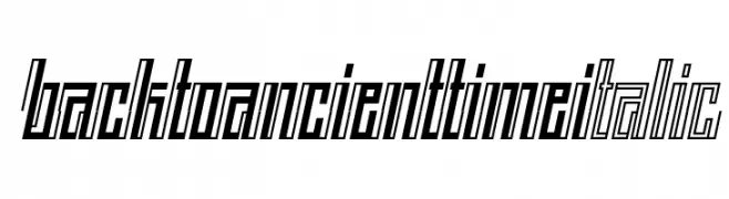
A bold, italicized font with a modern, futuristic design.
![BACK TO ANCIENT TIME Italic Frei Schriftart Herunterladen]() Herunterladen 76 Downloads@WebFont
Herunterladen 76 Downloads@WebFont -
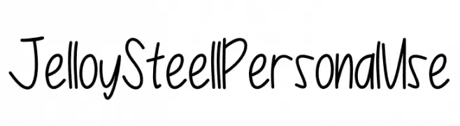
( Fonts by Nuun Creatype - Personal-use only. For commercial use please contact owner. )
A playful, handwritten font with tall, narrow letters and a casual style.
![Jelloy Steell Personal Use Frei Schriftart Herunterladen]() Herunterladen 76 Downloads@WebFont
Herunterladen 76 Downloads@WebFont -
( Eray Feyzi - www.efeyzi.co.uk )
A modern, geometric font with rounded edges and consistent thickness.
![Karabey Frei Schriftart Herunterladen]() Herunterladen 76 Downloads@WebFont
Herunterladen 76 Downloads@WebFont -
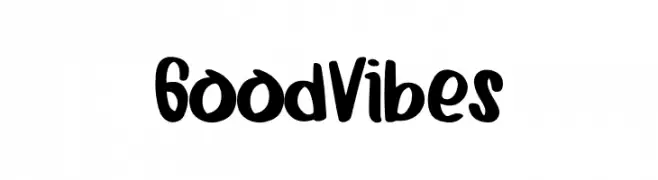
( Fonts by Booga Letter - Fajar Wicaksono - Personal-use only. For commercial use please contact owner. )
A bold, handwritten font with a playful and energetic style.
![Good Vibes Frei Schriftart Herunterladen]() Herunterladen 76 Downloads@WebFont
Herunterladen 76 Downloads@WebFont -
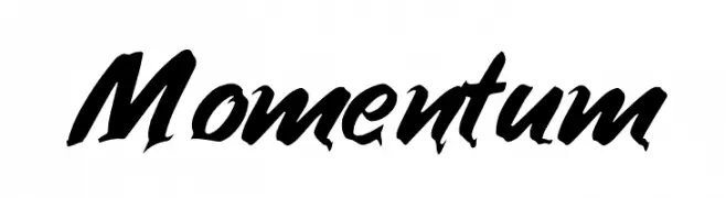
( Fonts by Inermedia Studio - Personal-use only. For commercial use please contact owner. )
A dynamic, brush-style font with bold, expressive strokes and a sense of movement.
![Momentum Frei Schriftart Herunterladen]() Herunterladen 76 Downloads@WebFont
Herunterladen 76 Downloads@WebFont -
( Kalypso Kichu - www.facebook.com/kalypsodesignstudio )
A bold, modern font with geometric elements and high contrast.
![magnet Bold Frei Schriftart Herunterladen]() Herunterladen 76 Downloads@WebFont
Herunterladen 76 Downloads@WebFont -
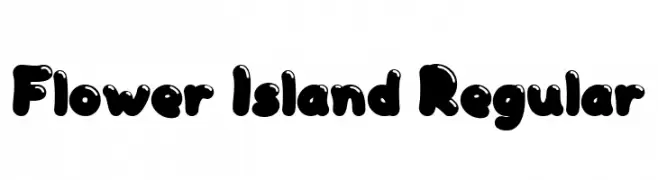
( Fonts by Achmad Yani )
A playful, bold font with rounded, bubble-like characters.
![Flower Island Regular Frei Schriftart Herunterladen]() Herunterladen 76 Downloads@WebFont
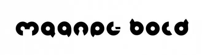
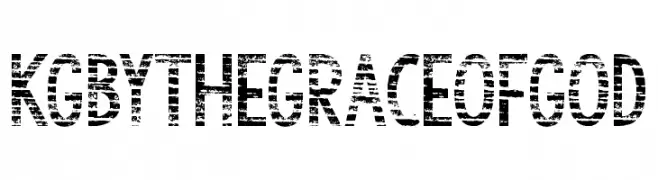
Herunterladen 76 Downloads@WebFont -
![KG By the Grace of God Frei Schriftart Herunterladen]() Herunterladen 76 Downloads@WebFont
Herunterladen 76 Downloads@WebFont -
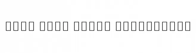
( Noto is a trademark of Google Inc. Noto fonts are open source. All Noto fonts are published under the SIL Open Font License, Version 1.1 )
Semi-bold serif font for Ethiopic scripts.
![Noto Serif Ethiopic SemiBold Frei Schriftart Herunterladen]() Herunterladen 76 Downloads@WebFont
Herunterladen 76 Downloads@WebFont -
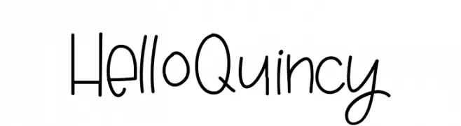
( Fonts by Jen Jones - Personal-use only. For commercial use please contact owner. )
A playful handwritten font with a casual and friendly appearance.
![HelloQuincy Frei Schriftart Herunterladen]() Herunterladen 76 Downloads@WebFont
Herunterladen 76 Downloads@WebFont -
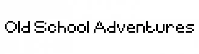
( Fonts by www.chequered.ink - Chequered Ink - Personal-use only. For commercial use please contact owner. )
A retro, pixelated font inspired by early digital and arcade games.
![Old School Adventures Frei Schriftart Herunterladen]() Herunterladen 76 Downloads@WebFont
Herunterladen 76 Downloads@WebFont -
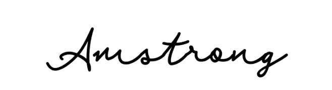
( Fonts by Rudhi Sasmito - Personal-use only. For commercial use please contact owner. )
A fluid and elegant script font with a modern calligraphic style.
![Amstrong Frei Schriftart Herunterladen]() Herunterladen 76 Downloads@WebFont
Herunterladen 76 Downloads@WebFont -
( Fonts by SSI.Scraps - Syukur Setiyadi - Personal-use only. For commercial use please contact owner. )
A decorative script font with star embellishments and elegant, flowing letters.
![Silvester Frei Schriftart Herunterladen]() Herunterladen 76 Downloads@WebFont
Herunterladen 76 Downloads@WebFont -
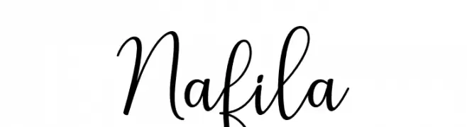
( Fonts by rudistudio - Rizki Wahyudi - Personal-use only. For commercial use please contact owner. )
A cursive script font with elegant, flowing characters and connected letters.
![Nafila Frei Schriftart Herunterladen]() Herunterladen 76 Downloads@WebFont
Herunterladen 76 Downloads@WebFont -
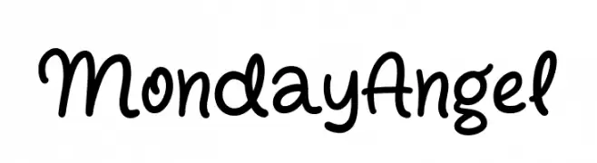
( Fonts by Syaf Rizal - Khurasan - Personal-use only. For commercial use please contact owner. )
A playful, handwritten font with smooth curves and a casual style.
![Monday Angel Frei Schriftart Herunterladen]() Herunterladen 76 Downloads@WebFont
Herunterladen 76 Downloads@WebFont -
( Fonts by Integritype Studio )
A flowing, cursive font with elegant loops and a handwritten style.
![Asmeralka Frei Schriftart Herunterladen]() Herunterladen 76 Downloads@WebFont
Herunterladen 76 Downloads@WebFont -
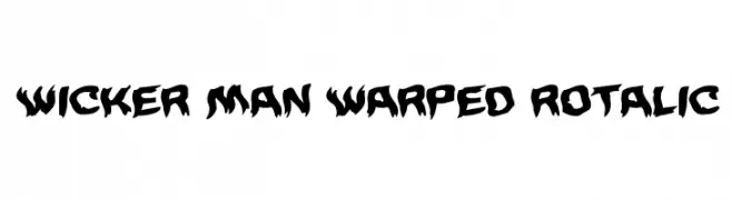
( Iconian Fonts - Daniel Zadorozny - www.iconian.com )
A bold, jagged, and warped font with an edgy, dynamic style.
![Wicker Man Warped Rotalic Frei Schriftart Herunterladen]() Herunterladen 76 Downloads@WebFont
Herunterladen 76 Downloads@WebFont -
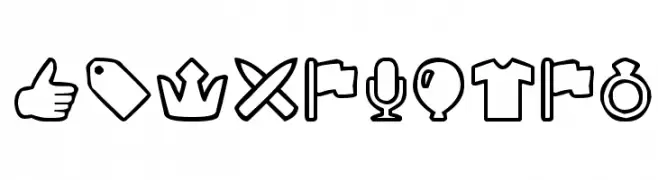
( Woodcutter - woodcutter Manero - www.woodcutter.es )
Bold, outlined icon set with a modern and playful style.
![Outline mix Frei Schriftart Herunterladen]() Herunterladen 76 Downloads@WebFont
Herunterladen 76 Downloads@WebFont -
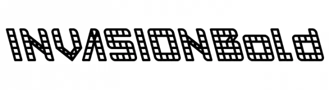
( weknow - Wino S Kadir - www.creativefabrica.com/designer/weknow/ )
A bold, grid-like font with a digital, pixelated aesthetic.
![INVASION Bold Frei Schriftart Herunterladen]() Herunterladen 76 Downloads@WebFont
Herunterladen 76 Downloads@WebFont -
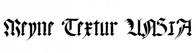
( Fonts by Peter Wiegel - www.peter-wiegel.de - Personal-use only. For commercial use please contact owner. )
A traditional blackletter font with intricate, high-contrast strokes and ornate details.
![Meyne Textur UNZ1A Frei Schriftart Herunterladen]() Herunterladen 76 Downloads@WebFont
Herunterladen 76 Downloads@WebFont -
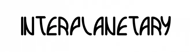
( Fonts by Wino S Kadir - weknow - www.revolge.com/shop/weknow/ - Personal-use only. For commercial use please contact owner. )
A futuristic, geometric font with bold, rounded letterforms.
![interplanetary Frei Schriftart Herunterladen]() Herunterladen 76 Downloads@WebFont
Herunterladen 76 Downloads@WebFont -
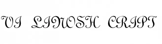
![VI LinosH cript Frei Schriftart Herunterladen]() Herunterladen 76 Downloads
Herunterladen 76 Downloads


Welche Schriften sind gerade am populärsten?
Poppins, Roboto, Montserrat, Open Sans und Lato sind wegen ihrer klaren Formen und breiten Einsetzbarkeit sehr gefragt – von Markenauftritt über Landingpages bis hin zu Postern.
Welche Fonts eignen sich für Logos?
Geometrische Sans‑Serifs (z. B. Poppins, Familien im Gotham‑Stil) sind ein häufiger Griff für sauberes, skalierbares Branding. Für eine persönlichere Note bleiben Scripts und Handschrift‑Stile beliebt. Kombinieren Sie einen prägnanten Headline‑Font mit einer neutralen Brotschrift für Wiedererkennung und Harmonie.
Wie oft wird die Top‑Liste aktualisiert?
Regelmäßig – basierend auf realen Downloads und Interaktionen. Schauen Sie öfter vorbei, um aufstrebende Favoriten früh zu entdecken.
💡 Tipp: Seite bookmarken – Trends wechseln schnell, und heutige Top‑Schriften inspirieren morgen vielleicht das Rebranding.