Willkommen bei den Top‑Schriften – hier treffen Beliebtheit und Qualität aufeinander. Das sind die in diesem Jahr am häufigsten heruntergeladenen und genutzten Fonts. Wenn Sie sichere Optionen für Logo, Web oder Social suchen, starten Sie hier.
Jeder Top‑Font überzeugt durch Balance, Lesbarkeit und Vielseitigkeit. Sie finden moderne Sans‑Serifs, elegante Scripts, Vintage‑Serifs und minimalistische Displays.
-
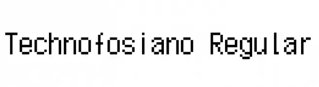
( Fonts by Jayden Marrero - Personal-use only. For commercial use please contact owner. )
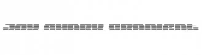
A pixelated, monospaced font with a retro digital style.
 Herunterladen 75 Downloads@WebFont
 -
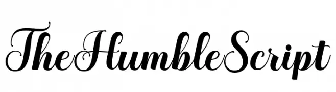
( Fonts by LetterFreshStudio - Rizki Andika - Personal-use only. For commercial use please contact owner. )
An elegant script font with flowing, cursive style and intricate flourishes.
![TheHumbleScript Frei Schriftart Herunterladen]() Herunterladen 75 Downloads@WebFont
Herunterladen 75 Downloads@WebFont -
( Fonts by Wahyu Eka Prasetya - wepfont.com - Personal-use only. For commercial use please contact owner. )
A bold, expressive handwritten font with dynamic strokes and playful character.
![Findagoz Frei Schriftart Herunterladen]() Herunterladen 75 Downloads@WebFont
Herunterladen 75 Downloads@WebFont -
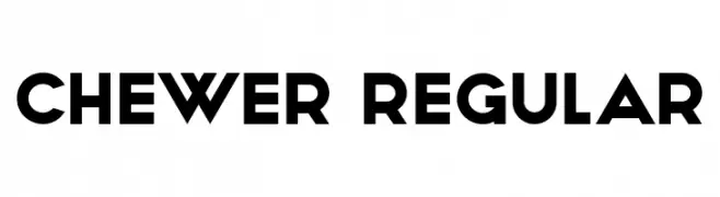
( Fonts by Vladimir Nikolic - www.creativefabrica.com/designer/vladimirnikolic/ - Personal-use only. For commercial use please contact owner. )
A bold, geometric sans-serif font with strong, angular lines and a modern aesthetic.
![Chewer Regular Frei Schriftart Herunterladen]() Herunterladen 75 Downloads@WebFont
Herunterladen 75 Downloads@WebFont -
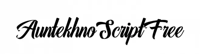
( Fonts by FHFont - Ferry Hadriyan - Personal-use only. For commercial use please contact owner. )
A dynamic and elegant script font with flowing, cursive letterforms.
![AuntekhnoScriptFree Frei Schriftart Herunterladen]() Herunterladen 75 Downloads@WebFont
Herunterladen 75 Downloads@WebFont -
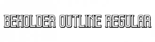
( Vladimir Nikolic - www.coroflot.com/vladimirnikolic )
A bold, outlined font with a modern and geometric style.
![Beholder Outline Regular Frei Schriftart Herunterladen]() Herunterladen 75 Downloads@WebFont
Herunterladen 75 Downloads@WebFont -
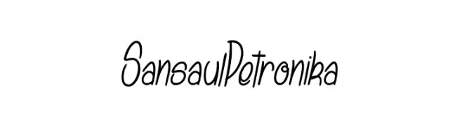
( dcoxy - Greg Medina - www.dcoxy.com/ )
A playful, handwritten font with elongated, slanted letterforms and consistent stroke weight.
![Sansaul Petronika Frei Schriftart Herunterladen]() Herunterladen 75 Downloads@WebFont
Herunterladen 75 Downloads@WebFont -
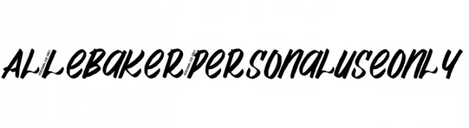
( Fonts by Aluyeah Studio - Personal-use only. For commercial use please contact owner. )
A bold, dynamic script font with a handwritten style.
![Al_LeBaker_PersonalUseOnly Frei Schriftart Herunterladen]() Herunterladen 75 Downloads@WebFont
Herunterladen 75 Downloads@WebFont -
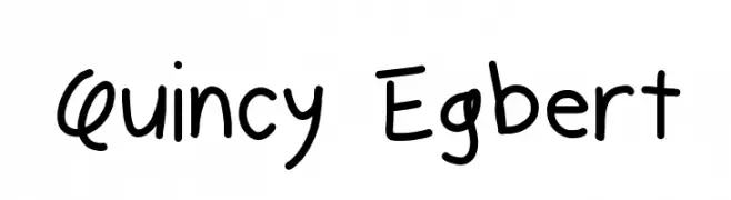
( Fonts by Geronimo Fonts - Personal-use only. For commercial use please contact owner. )
A playful, handwritten font with a casual and friendly style.
![Quincy Egbert Frei Schriftart Herunterladen]() Herunterladen 75 Downloads@WebFont
Herunterladen 75 Downloads@WebFont -
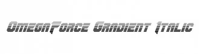
( Fonts by Daniel Zadorozny - www.iconian.com )
A bold, futuristic font with a gradient effect and italicized slant.
![OmegaForce Gradient Italic Frei Schriftart Herunterladen]() Herunterladen 75 Downloads@WebFont
Herunterladen 75 Downloads@WebFont -
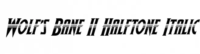
( Fonts by Daniel Zadorozny - www.iconian.com )
A bold, italicized font with a dynamic halftone effect, perfect for modern designs.
![Wolf's Bane II Halftone Italic Frei Schriftart Herunterladen]() Herunterladen 75 Downloads@WebFont
Herunterladen 75 Downloads@WebFont -
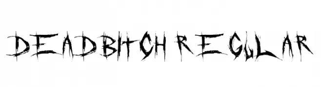
( Fonts by Font Monger - Chris Vile - Personal-use only. For commercial use please contact owner. )
A jagged, distressed font with an edgy, rebellious aesthetic.
![DeadBitch Regular Frei Schriftart Herunterladen]() Herunterladen 75 Downloads@WebFont
Herunterladen 75 Downloads@WebFont -
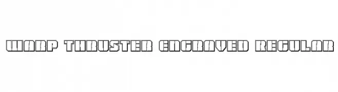
( Iconian Fonts - Daniel Zadorozny - www.iconian.com )
A bold, futuristic font with a three-dimensional engraved effect and geometric shapes.
![Warp Thruster Engraved Regular Frei Schriftart Herunterladen]() Herunterladen 75 Downloads@WebFont
Herunterladen 75 Downloads@WebFont -
![mantrakshar T Frei Schriftart Herunterladen]() Herunterladen 75 Downloads@WebFont
Herunterladen 75 Downloads@WebFont -
( Noto is a trademark of Google Inc. Noto fonts are open source. All Noto fonts are published under the SIL Open Font License, Version 1.1 )
A classic serif typeface with a semi-condensed, extra bold style, perfect for impactful headlines.
![Noto Serif SemiCondensed ExtraBold Frei Schriftart Herunterladen]() Herunterladen 75 Downloads@WebFont
Herunterladen 75 Downloads@WebFont -
( Copyright 2015 The Gwendolyn Project Authors (https://github.com/googlefonts/gwendolyn) )
Ornate, high-contrast script with decorative swashes.
![Gwendolyn Bold Frei Schriftart Herunterladen]() Herunterladen 75 Downloads@WebFont
Herunterladen 75 Downloads@WebFont -
( Fonts by Edric Studio - Personal-use only. For commercial use please contact owner. )
A bold, rounded font with a modern and playful style.
![BigBOBY Demo Rounded Frei Schriftart Herunterladen]() Herunterladen 75 Downloads@WebFont
Herunterladen 75 Downloads@WebFont -
( Fonts by wep - Wahyu Eka Prasetya - Personal-use only. For commercial use please contact owner. )
A bold, hand-painted style font with expressive, irregular strokes.
![Barefoot Frei Schriftart Herunterladen]() Herunterladen 75 Downloads@WebFont
Herunterladen 75 Downloads@WebFont -
![Joy Shark Gradient Frei Schriftart Herunterladen]() Herunterladen 75 Downloads@WebFont
Herunterladen 75 Downloads@WebFont -
( Fonts by Jayde Garrow - GarrowGlitch - http://jaydegarrow.wix.com/jaydefonts. Personal-use only. For commercial use please contact owner. )
A bold, angular font with a geometric and modern style.
![Wrist Tat Frei Schriftart Herunterladen]() Herunterladen 75 Downloads@WebFont
Herunterladen 75 Downloads@WebFont -
( Fonts by Iconian Fonts )
A bold, expanded, and italicized font with a modern, dynamic style.
![Zone Rider Expanded Italic Frei Schriftart Herunterladen]() Herunterladen 75 Downloads@WebFont
Herunterladen 75 Downloads@WebFont -
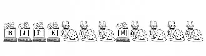
( Blue Jay Font Studio - katzfonts.50megs.com/bj1.html )
A playful font with cat illustrations integrated into each character.
![BJF Kat n Mouse Frei Schriftart Herunterladen]() Herunterladen 75 Downloads@WebFont
Herunterladen 75 Downloads@WebFont -
( Iconian Fonts - Daniel Zadorozny - www.iconian.com )
A bold, italicized font with a gradient effect created by horizontal lines, offering a playful and dynamic style.
![Funny Pages Gradient Italic Frei Schriftart Herunterladen]() Herunterladen 75 Downloads@WebFont
Herunterladen 75 Downloads@WebFont -
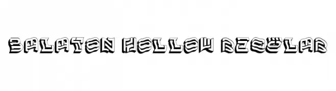
( Fonts by Vladimir Nikolic )
A bold, three-dimensional font with hollow interiors and geometric shapes.
![Balaton Hollow Regular Frei Schriftart Herunterladen]() Herunterladen 75 Downloads@WebFont
Herunterladen 75 Downloads@WebFont -
( Fonts by a Max Infeld - XEROGRAPHER FONTS - xerographer.blogspot.com . Personal-use only. For commercial use please contact owner. )
A bold, graffiti-inspired font with sharp angles and high contrast.
![SuperCut Frei Schriftart Herunterladen]() Herunterladen 75 Downloads@WebFont
Herunterladen 75 Downloads@WebFont -
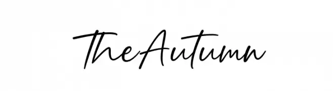
( Fonts by Graphix Line Studio )
A casual, elegant handwritten font with smooth, flowing cursive letters.
![The Autumn Frei Schriftart Herunterladen]() Herunterladen 75 Downloads@WebFont
Herunterladen 75 Downloads@WebFont -
( Zetafonts - www.zetafonts.com )
A modern sans-serif font with smooth curves and balanced structure.
![KabrioAlternate-Book Frei Schriftart Herunterladen]() Herunterladen 75 Downloads@WebFont
Herunterladen 75 Downloads@WebFont -
( Chris Vile - www.chrisvile.com )
A bold, italic font with sharp angles and a modern, dynamic style.
![Just Die Already Black Italic Frei Schriftart Herunterladen]() Herunterladen 75 Downloads@WebFont
Herunterladen 75 Downloads@WebFont -
![Kaylon Halftone Frei Schriftart Herunterladen]() Herunterladen 75 Downloads@WebFont
Herunterladen 75 Downloads@WebFont -
( Fonts by YOFonts - Yasuhiro Yamaoka - yoworks.com - Personal-use only. For commercial use please contact owner. )
A geometric, modular font with angular, boxy letterforms and a futuristic style.
![Mod Quad S Ligh Frei Schriftart Herunterladen]() Herunterladen 75 Downloads@WebFont
Herunterladen 75 Downloads@WebFont -
( Arterfak Project - Ahmad Ramzi Fahruddin - creativemarket.com/Arterfak )
A whimsical and decorative serif font with playful curls and loops.
![Beguyur Frei Schriftart Herunterladen]() Herunterladen 75 Downloads@WebFont
Herunterladen 75 Downloads@WebFont -
( Fonts by YOFonts - Yasuhiro Yamaoka - yoworks.com - Personal-use only. For commercial use please contact owner. )
A modern, circular font with a geometric and minimalistic design.
![Mod Circle S Frei Schriftart Herunterladen]() Herunterladen 75 Downloads@WebFont
Herunterladen 75 Downloads@WebFont -
( Fonts by www.chequered.ink - Chequered Ink - Personal-use only. For commercial use please contact owner. )
A bold, modern font with strong, uniform strokes and geometric precision.
![Horticulture Frei Schriftart Herunterladen]() Herunterladen 75 Downloads@WebFont
Herunterladen 75 Downloads@WebFont -
( Fonts by Sugiharto Art Studio )
A bold, geometric font with a futuristic and modern design.
![coventry Frei Schriftart Herunterladen]() Herunterladen 75 Downloads@WebFont
Herunterladen 75 Downloads@WebFont -
( Fonts by Situjuh Nazara - 7ntypes.com - Personal-use only. For commercial use please contact owner. )
A playful, bold handwritten font with smooth curves and rounded strokes.
![Minkem Frei Schriftart Herunterladen]() Herunterladen 75 Downloads@WebFont
Herunterladen 75 Downloads@WebFont


Welche Schriften sind gerade am populärsten?
Poppins, Roboto, Montserrat, Open Sans und Lato sind wegen ihrer klaren Formen und breiten Einsetzbarkeit sehr gefragt – von Markenauftritt über Landingpages bis hin zu Postern.
Welche Fonts eignen sich für Logos?
Geometrische Sans‑Serifs (z. B. Poppins, Familien im Gotham‑Stil) sind ein häufiger Griff für sauberes, skalierbares Branding. Für eine persönlichere Note bleiben Scripts und Handschrift‑Stile beliebt. Kombinieren Sie einen prägnanten Headline‑Font mit einer neutralen Brotschrift für Wiedererkennung und Harmonie.
Wie oft wird die Top‑Liste aktualisiert?
Regelmäßig – basierend auf realen Downloads und Interaktionen. Schauen Sie öfter vorbei, um aufstrebende Favoriten früh zu entdecken.
💡 Tipp: Seite bookmarken – Trends wechseln schnell, und heutige Top‑Schriften inspirieren morgen vielleicht das Rebranding.