Willkommen bei den Top‑Schriften – hier treffen Beliebtheit und Qualität aufeinander. Das sind die in diesem Jahr am häufigsten heruntergeladenen und genutzten Fonts. Wenn Sie sichere Optionen für Logo, Web oder Social suchen, starten Sie hier.
Jeder Top‑Font überzeugt durch Balance, Lesbarkeit und Vielseitigkeit. Sie finden moderne Sans‑Serifs, elegante Scripts, Vintage‑Serifs und minimalistische Displays.
-
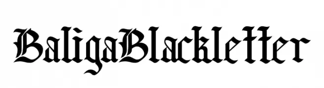
( Fonts by Faras Dina - Personal-use only. For commercial use please contact owner. )
A bold, ornate blackletter font with high contrast and intricate details.
 Herunterladen 73 Downloads@WebFont
 -
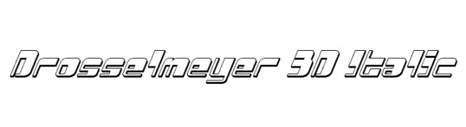
( Iconian Fonts - Daniel Zadorozny - www.iconian.com )
A bold, 3D italic font with a futuristic and dynamic style.
![Drosselmeyer 3D Italic Frei Schriftart Herunterladen]() Herunterladen 73 Downloads@WebFont
Herunterladen 73 Downloads@WebFont -
( Fonts by Pentagonistudio )
A modern, decorative outline font with playful and structured forms.
![Gayo Wine Outline Demo Regular Frei Schriftart Herunterladen]() Herunterladen 73 Downloads@WebFont
Herunterladen 73 Downloads@WebFont -
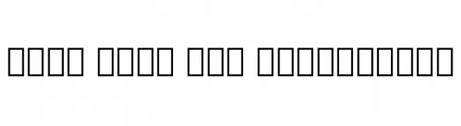
( Noto is a trademark of Google Inc. Noto fonts are open source. All Noto fonts are published under the SIL Open Font License, Version 1.1 )
Glyph placeholders are shown instead of actual characters.
![Noto Sans Lao ExtraLight Frei Schriftart Herunterladen]() Herunterladen 73 Downloads@WebFont
Herunterladen 73 Downloads@WebFont -
( Fonts by YonType Studio - Muhammad Yoni - Personal-use only. For commercial use please contact owner. )
A bold, decorative serif font with intricate swirls and embellishments.
![Bughia Frei Schriftart Herunterladen]() Herunterladen 73 Downloads@WebFont
Herunterladen 73 Downloads@WebFont -
( Fonts by sRB-Powers - Personal-use only. For commercial use please contact owner. )
A bold, condensed font with a modern and dynamic style.
![Side Winder [sRB] Frei Schriftart Herunterladen]() Herunterladen 73 Downloads@WebFont
Herunterladen 73 Downloads@WebFont -
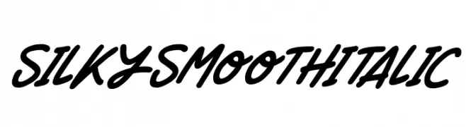
( Fonts by Darrell Flood )
A bold, italic, and fluid cursive font with a modern, handwritten style.
![Silky Smooth Italic Frei Schriftart Herunterladen]() Herunterladen 73 Downloads@WebFont
Herunterladen 73 Downloads@WebFont -
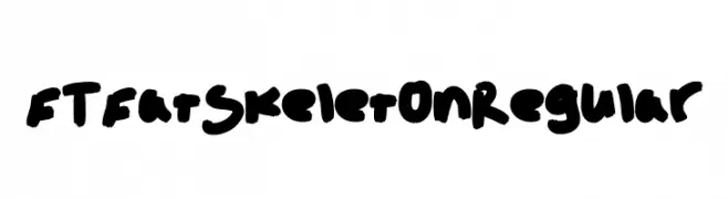
( Fortress Tech - www.youtube.com/channel/UCLyHUw5NcyVCILijN5vebwg )
A bold, playful font with thick, rounded strokes and a whimsical, hand-drawn style.
![FT Fat Skeleton Regular Frei Schriftart Herunterladen]() Herunterladen 73 Downloads@WebFont
Herunterladen 73 Downloads@WebFont -
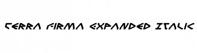
( Iconian Fonts - Daniel Zadorozny - www.iconian.com )
A bold, futuristic font with angular, geometric letterforms and an italic slant.
![Terra Firma Expanded Italic Frei Schriftart Herunterladen]() Herunterladen 73 Downloads@WebFont
Herunterladen 73 Downloads@WebFont -
( Fonts by tomchalky.com - Personal-use only. For commercial use please contact owner. )
A bold, hand-drawn font with an acrylic paint style.
![TCAcrylicHandThick-Regular Frei Schriftart Herunterladen]() Herunterladen 73 Downloads@WebFont
Herunterladen 73 Downloads@WebFont -
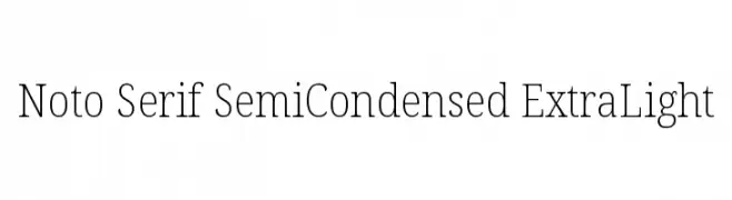
( Noto is a trademark of Google Inc. Noto fonts are open source. All Noto fonts are published under the SIL Open Font License, Version 1.1 )
A classic serif font with a semi-condensed, extra light style, offering elegance and readability.
![Noto Serif SemiCondensed ExtraLight Frei Schriftart Herunterladen]() Herunterladen 73 Downloads@WebFont
Herunterladen 73 Downloads@WebFont -
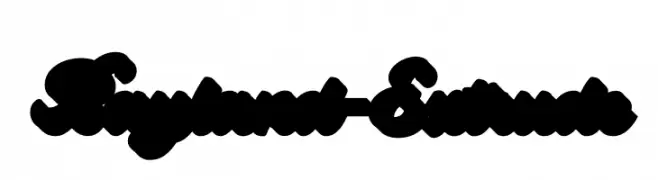
( Fonts by Letterhend Studio - Hendry Juanda - Personal-use only. For commercial use please contact owner. )
A bold, extruded script font with a playful and dynamic style.
![Bayland-Extrude Frei Schriftart Herunterladen]() Herunterladen 73 Downloads@WebFont
Herunterladen 73 Downloads@WebFont -
( Fonts by Stefani Letter - Stefani Tri Rosa - Personal-use only. For commercial use please contact owner. )
A playful and elegant script font with a handwritten style.
![Thankmom - personal use Frei Schriftart Herunterladen]() Herunterladen 73 Downloads@WebFont
Herunterladen 73 Downloads@WebFont -
( Iconian Fonts - Daniel Zadorozny - www.iconian.com )
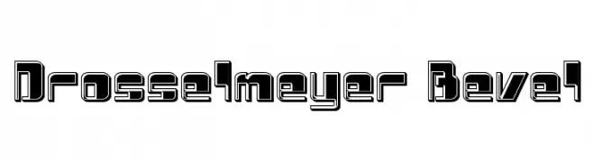
A bold, geometric font with a beveled, three-dimensional effect.
![Drosselmeyer Bevel Frei Schriftart Herunterladen]() Herunterladen 73 Downloads@WebFont
Herunterladen 73 Downloads@WebFont -
( Fonts by tomchalky.com - Personal-use only. For commercial use please contact owner. )
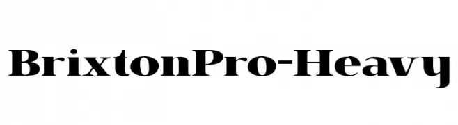
A bold serif font with high contrast and strong, elegant serifs.
![BrixtonPro-Heavy Frei Schriftart Herunterladen]() Herunterladen 73 Downloads@WebFont
Herunterladen 73 Downloads@WebFont -
( Fonts by Iconian Fonts )
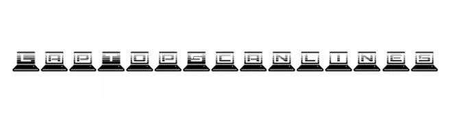
A tech-inspired font with characters integrated into laptop icons and a scanline effect.
![LapTop Scanlines Frei Schriftart Herunterladen]() Herunterladen 73 Downloads@WebFont
Herunterladen 73 Downloads@WebFont -
( Fonts by Wino S Kadir - weknow - www.revolge.com/shop/weknow/ - Personal-use only. For commercial use please contact owner. )
A bold, geometric font with rounded shapes and a modern, playful style.
![snowmask Frei Schriftart Herunterladen]() Herunterladen 73 Downloads@WebFont
Herunterladen 73 Downloads@WebFont -
( Fonts by Syaf Rizal - Khurasan - Personal-use only. For commercial use please contact owner. )
A bold, playful script font with a dynamic, handwritten style.
![Cake Mania Frei Schriftart Herunterladen]() Herunterladen 73 Downloads@WebFont
Herunterladen 73 Downloads@WebFont -
( Fonts by Vladimir Nikolic - https://www.creativefabrica.com/product/educated-deers/ref/144265/ - Personal-use only. For commercial use please contact owner. )
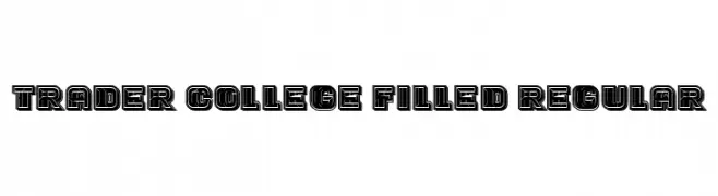
A bold, collegiate-style font with a filled, outlined appearance.
![Trader College Filled Regular Frei Schriftart Herunterladen]() Herunterladen 73 Downloads@WebFont
Herunterladen 73 Downloads@WebFont -
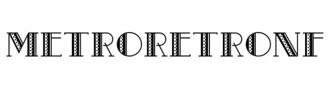
( Fonts by Nick Curtis - Personal-use only. For commercial use please contact owner. )
A bold, decorative font with retro patterns and intricate detailing.
![MetroRetroNF Frei Schriftart Herunterladen]() Herunterladen 73 Downloads@WebFont
Herunterladen 73 Downloads@WebFont -
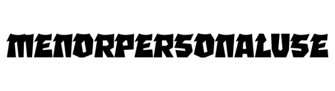
( Fonts by twinletter )
A bold, angular font with sharp edges and a dynamic geometric style.
![MENOR Personal Use Frei Schriftart Herunterladen]() Herunterladen 73 Downloads@WebFont
Herunterladen 73 Downloads@WebFont -
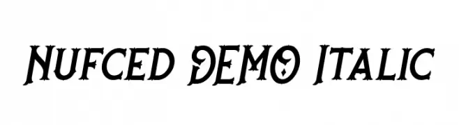
( Twicolabs Fontdation - Fahrizal Tawakkal - fontdation.com )
A bold, italic serif font with high contrast and decorative elements.
![Nufced DEMO Italic Frei Schriftart Herunterladen]() Herunterladen 73 Downloads@WebFont
Herunterladen 73 Downloads@WebFont -
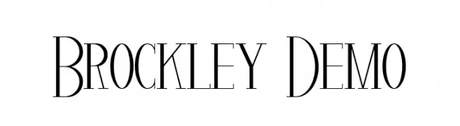
( Fonts by Edric Studio - Personal-use only. For commercial use please contact owner. )
An elegant, high-contrast font with tall, narrow letterforms.
![Brockley Demo Frei Schriftart Herunterladen]() Herunterladen 73 Downloads@WebFont
Herunterladen 73 Downloads@WebFont -
( Fonts by Wino S Kadir - weknow - www.revolge.com/shop/weknow/ - Personal-use only. For commercial use please contact owner. )
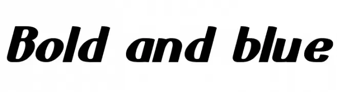
A bold, slanted font with rounded characters and consistent stroke width.
![Bold and blue Frei Schriftart Herunterladen]() Herunterladen 73 Downloads@WebFont
Herunterladen 73 Downloads@WebFont -
( Fonts by CannotIntoSpaceFonts - KineticPlasma Fonts - Personal-use only. For commercial use please contact owner. )
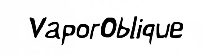
A bold, oblique font with a dynamic and energetic style.
![Vapor Oblique Frei Schriftart Herunterladen]() Herunterladen 73 Downloads@WebFont
Herunterladen 73 Downloads@WebFont -
( DJB Fonts - Darcy Baldwin - darcybaldwin.com )
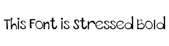
A playful, bold font with a hand-drawn, whimsical style.
![This Font is Stressed Bold Frei Schriftart Herunterladen]() Herunterladen 73 Downloads@WebFont
Herunterladen 73 Downloads@WebFont -
( Iconian Fonts - Daniel Zadorozny - www.iconian.com )
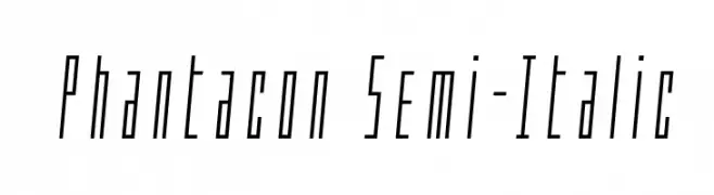
A sleek, semi-italic font with a modern, elongated design.
![Phantacon Semi-Italic Frei Schriftart Herunterladen]() Herunterladen 73 Downloads@WebFont
Herunterladen 73 Downloads@WebFont -
( ADT )
A bold, angular font with a geometric and edgy style.
![LaFabienne Frei Schriftart Herunterladen]() Herunterladen 73 Downloads@WebFont
Herunterladen 73 Downloads@WebFont -
( Fonts by Haslinda Adnan - Personal-use only. For commercial use please contact owner. )
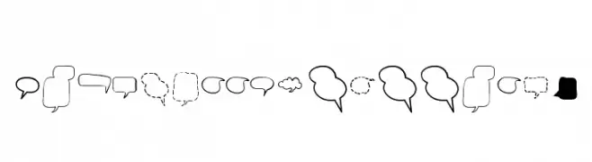
Hand-drawn comic speech and thought bubble dingbats.
![Alin Speech Bubbles 2 Frei Schriftart Herunterladen]() Herunterladen 73 Downloads@WebFont
Herunterladen 73 Downloads@WebFont -
( Fonts by imagex - Personal-use only. For commercial use please contact owner. )
A bold, brush-style font with an energetic and artistic flair.
![Direct du Gauche Frei Schriftart Herunterladen]() Herunterladen 73 Downloads@WebFont
Herunterladen 73 Downloads@WebFont -
( Fonts by CrazeCo.com.au )
A bold, graffiti-inspired font with dynamic and expressive characters.
![SIKZ TM Frei Schriftart Herunterladen]() Herunterladen 73 Downloads@WebFont
Herunterladen 73 Downloads@WebFont -
( Fonts by Michael Muranaka - muraknockout.com - Personal-use only. For commercial use please contact owner. )
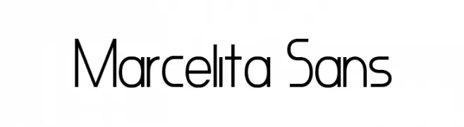
A modern, geometric sans-serif font with clean lines and balanced spacing.
![Marcelita Sans Frei Schriftart Herunterladen]() Herunterladen 73 Downloads@WebFont
Herunterladen 73 Downloads@WebFont -
( Fonts by Stefani Letter - Stefani Tri Rosa - Personal-use only. For commercial use please contact owner. )
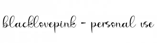
A decorative, cursive font with elegant loops and dynamic contrast.
![blacklovepink - personal use Frei Schriftart Herunterladen]() Herunterladen 73 Downloads@WebFont
Herunterladen 73 Downloads@WebFont -
( Fonts by Studio Typo - Personal-use only. For commercial use please contact owner. )
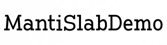
A bold slab serif font with a classic yet modern appeal.
![Manti Slab Demo Frei Schriftart Herunterladen]() Herunterladen 73 Downloads@WebFont
Herunterladen 73 Downloads@WebFont -
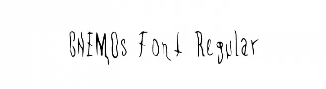
( CHEMOsFont - www.instagram.com/cruces_ivan/ )
A whimsical, hand-drawn font with irregular, wavy strokes and a playful style.
![CHEMOs Font Regular Frei Schriftart Herunterladen]() Herunterladen 73 Downloads@WebFont
Herunterladen 73 Downloads@WebFont


![Side Winder [sRB] Frei Schriftart Herunterladen](https://d144mzi0q5mijx.cloudfront.net/img/S/I/Side-Winder-sRB.webp)


Welche Schriften sind gerade am populärsten?
Poppins, Roboto, Montserrat, Open Sans und Lato sind wegen ihrer klaren Formen und breiten Einsetzbarkeit sehr gefragt – von Markenauftritt über Landingpages bis hin zu Postern.
Welche Fonts eignen sich für Logos?
Geometrische Sans‑Serifs (z. B. Poppins, Familien im Gotham‑Stil) sind ein häufiger Griff für sauberes, skalierbares Branding. Für eine persönlichere Note bleiben Scripts und Handschrift‑Stile beliebt. Kombinieren Sie einen prägnanten Headline‑Font mit einer neutralen Brotschrift für Wiedererkennung und Harmonie.
Wie oft wird die Top‑Liste aktualisiert?
Regelmäßig – basierend auf realen Downloads und Interaktionen. Schauen Sie öfter vorbei, um aufstrebende Favoriten früh zu entdecken.
💡 Tipp: Seite bookmarken – Trends wechseln schnell, und heutige Top‑Schriften inspirieren morgen vielleicht das Rebranding.