Willkommen bei den Top‑Schriften – hier treffen Beliebtheit und Qualität aufeinander. Das sind die in diesem Jahr am häufigsten heruntergeladenen und genutzten Fonts. Wenn Sie sichere Optionen für Logo, Web oder Social suchen, starten Sie hier.
Jeder Top‑Font überzeugt durch Balance, Lesbarkeit und Vielseitigkeit. Sie finden moderne Sans‑Serifs, elegante Scripts, Vintage‑Serifs und minimalistische Displays.
-
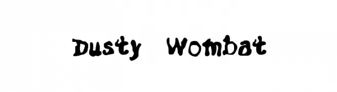
( Dry Heaves - www.drybohnz.com/ )
A bold, playful font with a hand-drawn, whimsical style.
 Herunterladen 73 Downloads@WebFont
 -
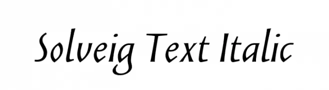
( Fonts by Looseleaf Fonts - Personal-use only. For commercial use please contact owner. )
An elegant italic font with smooth, flowing lines and a dynamic slant.
![Solveig Text Italic Frei Schriftart Herunterladen]() Herunterladen 73 Downloads@WebFont
Herunterladen 73 Downloads@WebFont -
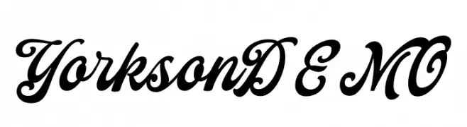
( Fonts by Letterhend Studio - Hendry Juanda - Personal-use only. For commercial use please contact owner. )
A bold, flowing script font with elegant cursive letterforms and high contrast.
![YorksonDEMO Frei Schriftart Herunterladen]() Herunterladen 73 Downloads@WebFont
Herunterladen 73 Downloads@WebFont -
( Fonts by Wahyu Rahmawan - Personal-use only. For commercial use please contact owner. )
A modern, geometric font with semi-rounded edges and consistent weight.
![Leo SemiRounded Light Frei Schriftart Herunterladen]() Herunterladen 73 Downloads@WebFont
Herunterladen 73 Downloads@WebFont -
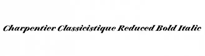
( Fonts by ingoFonts - Ingo Zimmermann - Personal-use only. For commercial use please contact owner. )
A bold, italic serif font with elegant curves and pronounced serifs.
![Charpentier Classicistique Reduced Bold Italic Frei Schriftart Herunterladen]() Herunterladen 73 Downloads@WebFont
Herunterladen 73 Downloads@WebFont -
( Fonts by Vladimir Nikolic - www.creativefabrica.com/designer/vladimirnikolic/ - Personal-use only. For commercial use please contact owner. )
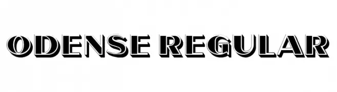
A bold, three-dimensional font with strong shadow effects and a vintage-inspired style.
![Odense Regular Frei Schriftart Herunterladen]() Herunterladen 73 Downloads@WebFont
Herunterladen 73 Downloads@WebFont -
( Fonts by D&K Project - Degi Kurniawan - Personal-use only. For commercial use please contact owner. )
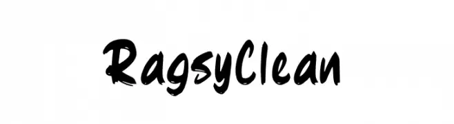
A bold, dynamic handwritten font with a brush-like texture.
![Ragsy Clean Frei Schriftart Herunterladen]() Herunterladen 73 Downloads@WebFont
Herunterladen 73 Downloads@WebFont -
( Sean Noonan - www.sean-noonan.com )
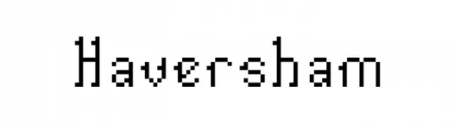
A pixelated, retro-style font with a digital, grid-like appearance.
![Haversham Frei Schriftart Herunterladen]() Herunterladen 73 Downloads@WebFont
Herunterladen 73 Downloads@WebFont -
( Fonts by Kat`s Fun Fonts - Personal-use only. For commercial use please contact owner. )
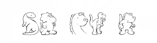
A whimsical font with dinosaur illustrations for each character.
![KR Nicky's Dinos Frei Schriftart Herunterladen]() Herunterladen 73 Downloads@WebFont
Herunterladen 73 Downloads@WebFont -
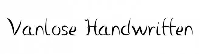
( Martin Sørensen )
A playful handwritten font with a dynamic and artistic style.
![Vanlose Handwritten Frei Schriftart Herunterladen]() Herunterladen 73 Downloads@WebFont
Herunterladen 73 Downloads@WebFont -
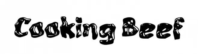
( Fonts by wep )
A bold, playful font with a melting, dripping effect.
![Cooking Beef Frei Schriftart Herunterladen]() Herunterladen 73 Downloads@WebFont
Herunterladen 73 Downloads@WebFont -
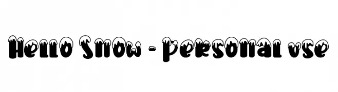
( Fonts by Stefani Letter - Stefani Tri Rosa - Personal-use only. For commercial use please contact owner. )
A bold, snow-capped decorative font perfect for festive designs.
![Hello Snow - Personal use Frei Schriftart Herunterladen]() Herunterladen 73 Downloads@WebFont
Herunterladen 73 Downloads@WebFont -
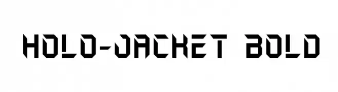
( Fonts by Iconian Fonts )
A bold, futuristic font with sharp, angular edges and a geometric design.
![Holo-Jacket Bold Frei Schriftart Herunterladen]() Herunterladen 73 Downloads@WebFont
Herunterladen 73 Downloads@WebFont -
( Vladimir Nikolic - www.coroflot.com/vladimirnikolic )
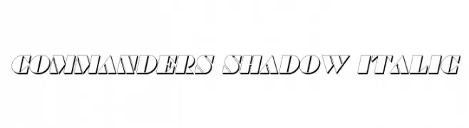
Bold, italicized font with a shadow effect for a dynamic, three-dimensional look.
![Commanders Shadow Italic Frei Schriftart Herunterladen]() Herunterladen 73 Downloads@WebFont
Herunterladen 73 Downloads@WebFont -
( Dry Heaves - www.drybohnz.com/ )
A bold, hand-drawn font with a playful and artistic style.
![HABBAKUK Frei Schriftart Herunterladen]() Herunterladen 73 Downloads@WebFont
Herunterladen 73 Downloads@WebFont -
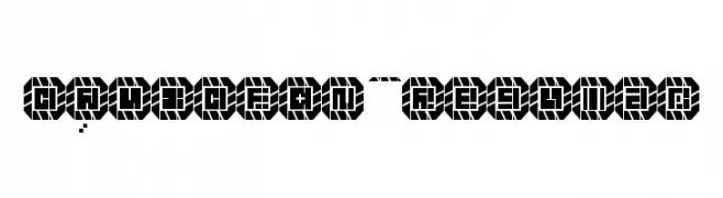
( Ideasvov )
A bold, geometric font with a modern, digital aesthetic.
![DAVIDFON Regular Frei Schriftart Herunterladen]() Herunterladen 73 Downloads@WebFont
Herunterladen 73 Downloads@WebFont -
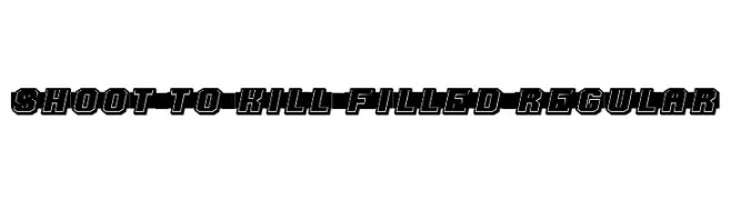
( Fonts by Vladimir Nikolic - https://www.creativefabrica.com/product/educated-deers/ref/144265/ - Personal-use only. For commercial use please contact owner. )
A bold, dynamic font with a three-dimensional effect and strong visual impact.
![Shoot to Kill Filled Regular Frei Schriftart Herunterladen]() Herunterladen 73 Downloads@WebFont
Herunterladen 73 Downloads@WebFont -
![BirdFace Frei Schriftart Herunterladen]() Herunterladen 73 Downloads@WebFont
Herunterladen 73 Downloads@WebFont -
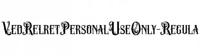
( Fonts by ilhamtaro - Personal-use only. For commercial use please contact owner. )
An ornate and decorative font with intricate swirls and embellishments.
![VedRelretPersonalUseOnly-Regula Frei Schriftart Herunterladen]() Herunterladen 73 Downloads@WebFont
Herunterladen 73 Downloads@WebFont -
( Fonts by vilogsign - Nur Kholis - Personal-use only. For commercial use please contact owner. )
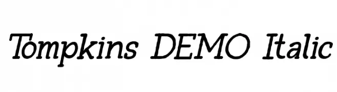
A classic italic font with moderate contrast and elegant slant.
![Tompkins DEMO Italic Frei Schriftart Herunterladen]() Herunterladen 73 Downloads@WebFont
Herunterladen 73 Downloads@WebFont -
( Fonts by Wino S Kadir - weknow - www.revolge.com/shop/weknow/ - Personal-use only. For commercial use please contact owner. )
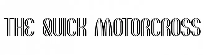
A bold, art deco-inspired font with dynamic, multi-line characters.
![the quick motorcross Frei Schriftart Herunterladen]() Herunterladen 73 Downloads@WebFont
Herunterladen 73 Downloads@WebFont -
( Iconian Fonts - Daniel Zadorozny - www.iconian.com )
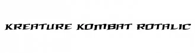
A bold, angular, and slanted font with a modern, aggressive style.
![Kreature Kombat Rotalic Frei Schriftart Herunterladen]() Herunterladen 73 Downloads@WebFont
Herunterladen 73 Downloads@WebFont -
( Iconian Fonts - Daniel Zadorozny - www.iconian.com )
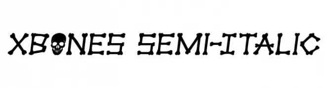
A playful, bone-themed font with a semi-italic style, perfect for spooky designs.
![xBONES Semi-Italic Frei Schriftart Herunterladen]() Herunterladen 73 Downloads@WebFont
Herunterladen 73 Downloads@WebFont -
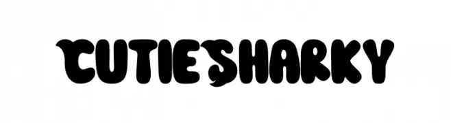
( Fonts by Hoperative )
A playful, bold font with rounded, bubbly characters.
![Cutie Sharky Frei Schriftart Herunterladen]() Herunterladen 73 Downloads@WebFont
Herunterladen 73 Downloads@WebFont -
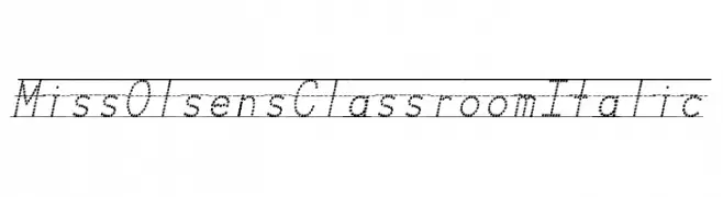
( Fonts by ofthefay - Personal-use only. For commercial use please contact owner. )
A dotted, italic font ideal for handwriting practice and educational use.
![Miss Olsen's Classroom Italic Frei Schriftart Herunterladen]() Herunterladen 73 Downloads@WebFont
Herunterladen 73 Downloads@WebFont -
( Fonts by Arutype Studio - Personal-use only. For commercial use please contact owner. )
A charming and elegant script font with fluid, graceful strokes.
![Lovely Coffee Frei Schriftart Herunterladen]() Herunterladen 73 Downloads@WebFont
Herunterladen 73 Downloads@WebFont -
( Fonts by Mabhal Studio - Abdullah - Personal-use only. For commercial use please contact owner. )
A lively and expressive handwritten font with dynamic strokes.
![Sachyma [Demo] Frei Schriftart Herunterladen]() Herunterladen 73 Downloads@WebFont
Herunterladen 73 Downloads@WebFont -
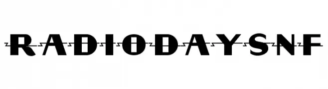
( Fonts by Nick Curtis - Personal-use only. For commercial use please contact owner. )
A bold, geometric font with uniform strokes and strong visual impact.
![RadioDaysNF Frei Schriftart Herunterladen]() Herunterladen 73 Downloads@WebFont
Herunterladen 73 Downloads@WebFont -
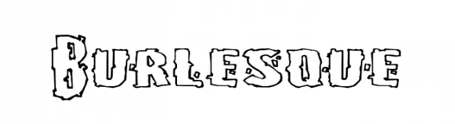
( Fonts by Pizzadude - Personal-use only. For commercial use please contact owner. )
A bold, decorative font with rugged, hand-drawn outlines.
![Burlesque Frei Schriftart Herunterladen]() Herunterladen 73 Downloads@WebFont
Herunterladen 73 Downloads@WebFont -
( Noto is a trademark of Google Inc. Noto fonts are open source. All Noto fonts are published under the SIL Open Font License, Version 1.1 )
A modern, semi-condensed, semi-bold font ideal for clear and readable text.
![Noto Sans Khmer UI SemiCondensed SemiBold Frei Schriftart Herunterladen]() Herunterladen 73 Downloads@WebFont
Herunterladen 73 Downloads@WebFont -
( Fonts by Billy Argel Fonts - www.billyargel.com - Personal-use only. For commercial use please contact owner. )
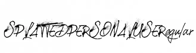
A dynamic, expressive handwritten font with fluid strokes and a raw, artistic texture.
![SPLATTED PERSONAL USE Regular Frei Schriftart Herunterladen]() Herunterladen 73 Downloads@WebFont
Herunterladen 73 Downloads@WebFont -
( weknow - Wino S Kadir - www.creativefabrica.com/designer/weknow/ )
A modern, minimalist font with geometric, continuous lines and rounded edges.
![karitza-Light Frei Schriftart Herunterladen]() Herunterladen 73 Downloads@WebFont
Herunterladen 73 Downloads@WebFont -
( Fonts by Faqih Fawaji )
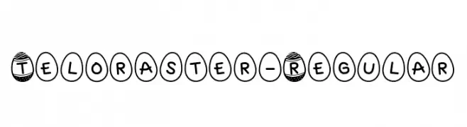
A playful, egg-shaped decorative font with bold, rounded characters.
![Teloraster-Regular Frei Schriftart Herunterladen]() Herunterladen 73 Downloads@WebFont
Herunterladen 73 Downloads@WebFont -
( Fonts by Daniel Zadorozny - www.iconian.com - Personal-use only. For commercial use please contact owner. )
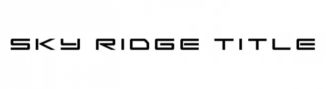
A futuristic, geometric font with angular, structured letterforms.
![Sky Ridge Title Frei Schriftart Herunterladen]() Herunterladen 73 Downloads@WebFont
Herunterladen 73 Downloads@WebFont -
( Fonts by a Max Infeld - XEROGRAPHER FONTS - xerographer.blogspot.com . Personal-use only. For commercial use please contact owner. )
An artistic, script-like font with decorative flourishes and dynamic strokes.
![PenWar Frei Schriftart Herunterladen]() Herunterladen 73 Downloads@WebFont
Herunterladen 73 Downloads@WebFont


![Sachyma [Demo] Frei Schriftart Herunterladen](https://d144mzi0q5mijx.cloudfront.net/img/S/A/Sachyma-Demo.webp)


Welche Schriften sind gerade am populärsten?
Poppins, Roboto, Montserrat, Open Sans und Lato sind wegen ihrer klaren Formen und breiten Einsetzbarkeit sehr gefragt – von Markenauftritt über Landingpages bis hin zu Postern.
Welche Fonts eignen sich für Logos?
Geometrische Sans‑Serifs (z. B. Poppins, Familien im Gotham‑Stil) sind ein häufiger Griff für sauberes, skalierbares Branding. Für eine persönlichere Note bleiben Scripts und Handschrift‑Stile beliebt. Kombinieren Sie einen prägnanten Headline‑Font mit einer neutralen Brotschrift für Wiedererkennung und Harmonie.
Wie oft wird die Top‑Liste aktualisiert?
Regelmäßig – basierend auf realen Downloads und Interaktionen. Schauen Sie öfter vorbei, um aufstrebende Favoriten früh zu entdecken.
💡 Tipp: Seite bookmarken – Trends wechseln schnell, und heutige Top‑Schriften inspirieren morgen vielleicht das Rebranding.