Willkommen bei den Top‑Schriften – hier treffen Beliebtheit und Qualität aufeinander. Das sind die in diesem Jahr am häufigsten heruntergeladenen und genutzten Fonts. Wenn Sie sichere Optionen für Logo, Web oder Social suchen, starten Sie hier.
Jeder Top‑Font überzeugt durch Balance, Lesbarkeit und Vielseitigkeit. Sie finden moderne Sans‑Serifs, elegante Scripts, Vintage‑Serifs und minimalistische Displays.
-
( Fonts by Kong Font - Personal-use only. For commercial use please contact owner. )
A bold, angular font with a modern, geometric style.
 Herunterladen 75 Downloads@WebFont
 -
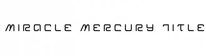
( Iconian Fonts - Daniel Zadorozny - www.iconian.com )
A modern, geometric font with a futuristic and sleek design.
![Miracle Mercury Title Frei Schriftart Herunterladen]() Herunterladen 75 Downloads@WebFont
Herunterladen 75 Downloads@WebFont -
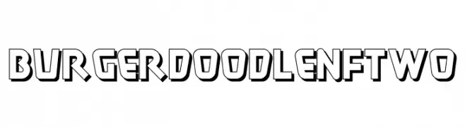
( Fonts by Nick Curtis - Personal-use only. For commercial use please contact owner. )
A bold, playful font with a 3D effect and geometric style.
![Burger Doodle NF Two Frei Schriftart Herunterladen]() Herunterladen 75 Downloads@WebFont
Herunterladen 75 Downloads@WebFont -
( Fonts by Fie Clarke - bonezdesignz.com - check the website before use the fonts! Personal-use only. )
A geometric, angular font with bold, abstract forms for a modern, edgy look.
![Harsh Black Frei Schriftart Herunterladen]() Herunterladen 75 Downloads@WebFont
Herunterladen 75 Downloads@WebFont -
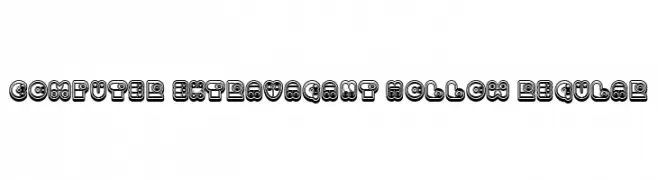
( Fonts by Vladimir Nikolic )
A bold, decorative font with hollow, layered outlines and a whimsical style.
![Computer Extravagant Hollow Regular Frei Schriftart Herunterladen]() Herunterladen 75 Downloads@WebFont
Herunterladen 75 Downloads@WebFont -
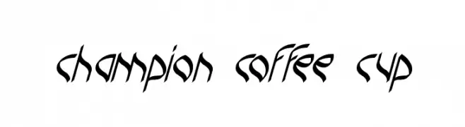
( Fonts by Wino S Kadir - weknow - www.revolge.com/shop/weknow/ - Personal-use only. For commercial use please contact owner. )
A dynamic, angular font with a modern calligraphic style.
![champion coffee cup Frei Schriftart Herunterladen]() Herunterladen 75 Downloads@WebFont
Herunterladen 75 Downloads@WebFont -
( Noto is a trademark of Google Inc. Noto fonts are open source. All Noto fonts are published under the SIL Open Font License, Version 1.1 )
Glyph placeholders are shown instead of actual characters.
![Noto Sans Lao ExtraLight Frei Schriftart Herunterladen]() Herunterladen 75 Downloads@WebFont
Herunterladen 75 Downloads@WebFont -
( Fonts by Allouse Studio - Personal-use only. For commercial use please contact owner. )
A whimsical handwritten font with elegant, flowing cursive letterforms.
![Heartcraft Demo Frei Schriftart Herunterladen]() Herunterladen 75 Downloads@WebFont
Herunterladen 75 Downloads@WebFont -
( Fonts by Cs - Personal-use only. For commercial use please contact owner. )
A futuristic, geometric font with sharp angles and a sleek design.
![Velekom Frei Schriftart Herunterladen]() Herunterladen 75 Downloads@WebFont
Herunterladen 75 Downloads@WebFont -
( Fonts by www.junkohanhero.com - Personal-use only. For commercial use please contact owner. )
A bold, hand-drawn font with a shadow effect and sketch-like texture.
![Last living souls Shadow Frei Schriftart Herunterladen]() Herunterladen 75 Downloads@WebFont
Herunterladen 75 Downloads@WebFont -
( Fonts by Vunira Design - Personal-use only. For commercial use please contact owner. )
A modern, elegant script font with flowing, handwritten style and high contrast.
![SweetServe FREE Frei Schriftart Herunterladen]() Herunterladen 75 Downloads@WebFont
Herunterladen 75 Downloads@WebFont -
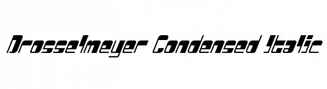
( Iconian Fonts - Daniel Zadorozny - www.iconian.com )
A bold, condensed, and italicized font with a modern and dynamic style.
![Drosselmeyer Condensed Italic Frei Schriftart Herunterladen]() Herunterladen 75 Downloads@WebFont
Herunterladen 75 Downloads@WebFont -
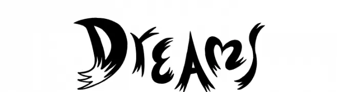
( imagex - www.imagex-fonts.com )
A dynamic, energetic font with bold, sweeping strokes and jagged edges.
![Dreams Frei Schriftart Herunterladen]() Herunterladen 75 Downloads@WebFont
Herunterladen 75 Downloads@WebFont -
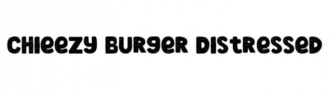
( Fonts by Arterfak Project )
A bold, distressed font with a playful and vintage feel.
![Chieezy Burger Distressed Frei Schriftart Herunterladen]() Herunterladen 75 Downloads@WebFont
Herunterladen 75 Downloads@WebFont -
( Fonts by sRB-Powers - Personal-use only. For commercial use please contact owner. )
A bold, condensed font with a modern and dynamic style.
![Side Winder [sRB] Frei Schriftart Herunterladen]() Herunterladen 75 Downloads@WebFont
Herunterladen 75 Downloads@WebFont -
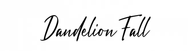
( Fonts by Graphue - Personal-use only. For commercial use please contact owner. )
A lively handwritten font with dynamic strokes and a casual, expressive style.
![Dandelion Fall Frei Schriftart Herunterladen]() Herunterladen 75 Downloads@WebFont
Herunterladen 75 Downloads@WebFont -
( Fonts by www.junkohanhero.com - Personal-use only. For commercial use please contact owner. )
A rugged, hand-drawn font with a distressed, organic look.
![Last living souls Frei Schriftart Herunterladen]() Herunterladen 75 Downloads@WebFont
Herunterladen 75 Downloads@WebFont -
( Iconian Fonts - Daniel Zadorozny - www.iconian.com )
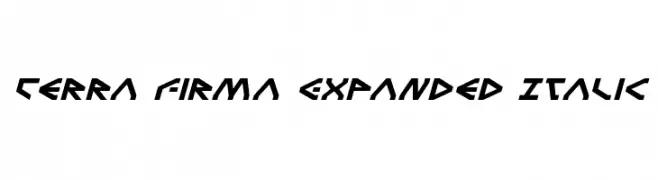
A bold, futuristic font with angular, geometric letterforms and an italic slant.
![Terra Firma Expanded Italic Frei Schriftart Herunterladen]() Herunterladen 75 Downloads@WebFont
Herunterladen 75 Downloads@WebFont -
( Fonts by Wino S Kadir - weknow - www.revolge.com/shop/weknow/ - Personal-use only. For commercial use please contact owner. )
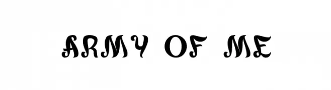
A bold, decorative font with playful circular embellishments and vintage flair.
![army of me Frei Schriftart Herunterladen]() Herunterladen 75 Downloads@WebFont
Herunterladen 75 Downloads@WebFont -
( Fonts by Stefani Letter - Stefani Tri Rosa - Personal-use only. For commercial use please contact owner. )
A playful and elegant script font with a handwritten style.
![Thankmom - personal use Frei Schriftart Herunterladen]() Herunterladen 75 Downloads@WebFont
Herunterladen 75 Downloads@WebFont -
( Fonts by lyanatha - Ana Natalia - Personal-use only. For commercial use please contact owner. )
A graceful, handwritten font with a flowing, cursive style.
![Registand Frei Schriftart Herunterladen]() Herunterladen 75 Downloads@WebFont
Herunterladen 75 Downloads@WebFont -
( Jeff Bensch - jbensch.deviantart.com )
A tall, narrow, and modern geometric font with a sleek appearance.
![BUS STOP Frei Schriftart Herunterladen]() Herunterladen 75 Downloads@WebFont
Herunterladen 75 Downloads@WebFont -
( Fonts by Iconian Fonts )
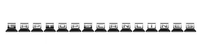
A tech-inspired font with characters integrated into laptop icons and a scanline effect.
![LapTop Scanlines Frei Schriftart Herunterladen]() Herunterladen 75 Downloads@WebFont
Herunterladen 75 Downloads@WebFont -
( Fonts by Wino S Kadir - weknow - www.revolge.com/shop/weknow/ - Personal-use only. For commercial use please contact owner. )
A bold, geometric font with rounded shapes and a modern, playful style.
![snowmask Frei Schriftart Herunterladen]() Herunterladen 75 Downloads@WebFont
Herunterladen 75 Downloads@WebFont -
( Fonts by Bolt Cutter - www.boltcutterdesign.com - Personal-use only. For commercial use please contact owner. )
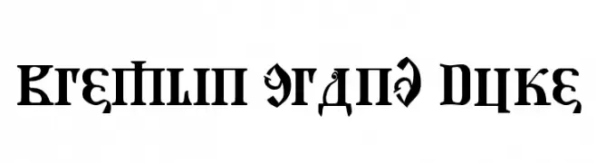
A bold, decorative font with intricate details and a grand appearance.
![Kremlin Grand Duke Frei Schriftart Herunterladen]() Herunterladen 75 Downloads@WebFont
Herunterladen 75 Downloads@WebFont -
( Fonts by ingoFonts - Ingo Zimmermann - Personal-use only. For commercial use please contact owner. )
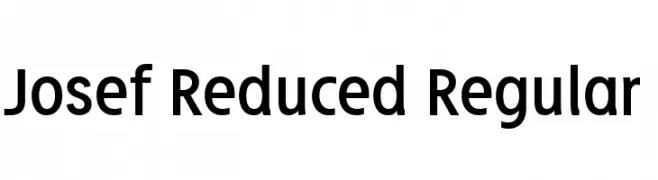
A modern, geometric sans-serif typeface with uniform stroke width and excellent readability.
![Josef Reduced Regular Frei Schriftart Herunterladen]() Herunterladen 75 Downloads@WebFont
Herunterladen 75 Downloads@WebFont -
( Fonts by Syaf Rizal - Khurasan - Personal-use only. For commercial use please contact owner. )
A bold, playful script font with a dynamic, handwritten style.
![Cake Mania Frei Schriftart Herunterladen]() Herunterladen 75 Downloads@WebFont
Herunterladen 75 Downloads@WebFont -
( Fonts by Vladimir Nikolic - https://www.creativefabrica.com/product/educated-deers/ref/144265/ - Personal-use only. For commercial use please contact owner. )
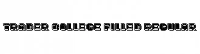
A bold, collegiate-style font with a filled, outlined appearance.
![Trader College Filled Regular Frei Schriftart Herunterladen]() Herunterladen 75 Downloads@WebFont
Herunterladen 75 Downloads@WebFont -
( Fonts by wep - Wahyu Eka Prasetya - Personal-use only. For commercial use please contact owner. )
A bold, distressed font with a grungy, worn appearance.
![Dersik Frei Schriftart Herunterladen]() Herunterladen 75 Downloads@WebFont
Herunterladen 75 Downloads@WebFont -
( GeelynEdits - plus.google.com/u/0/108461348931992643310/ )
Hand-drawn, textured heart shapes in a repeating pattern.
![Hearty_Geelyn_Edits_Natural_Pencil Frei Schriftart Herunterladen]() Herunterladen 75 Downloads@WebFont
Herunterladen 75 Downloads@WebFont -
( Fonts by Nick Curtis - Personal-use only. For commercial use please contact owner. )
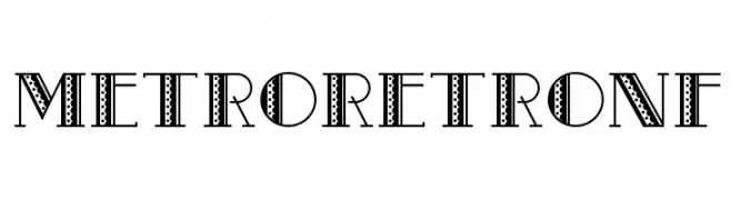
A bold, decorative font with retro patterns and intricate detailing.
![MetroRetroNF Frei Schriftart Herunterladen]() Herunterladen 75 Downloads@WebFont
Herunterladen 75 Downloads@WebFont -
( Noto is a trademark of Google Inc. Noto fonts are open source. All Noto fonts are published under the SIL Open Font License, Version 1.1 )
A modern, extra condensed, and extra light font with tight spacing and thin strokes.
![Noto Serif Ethiopic ExtraCondensed ExtraLight Frei Schriftart Herunterladen]() Herunterladen 75 Downloads@WebFont
Herunterladen 75 Downloads@WebFont -
( Fonts by Edric Studio - Personal-use only. For commercial use please contact owner. )
An elegant, high-contrast script font with a classic calligraphic style.
![Brookville Demo Frei Schriftart Herunterladen]() Herunterladen 75 Downloads@WebFont
Herunterladen 75 Downloads@WebFont -
( Fonts by Thor Christopher Arisland - Personal-use only. For commercial use please contact owner. )
A bold, geometric font with a modern and futuristic aesthetic.
![Anderson Frei Schriftart Herunterladen]() Herunterladen 75 Downloads@WebFont
Herunterladen 75 Downloads@WebFont -
( AARRGGHH! )
A bold, decorative font with a unique striped pattern and modern geometric style.
![Pep O Mint Normal Frei Schriftart Herunterladen]() Herunterladen 75 Downloads@WebFont
Herunterladen 75 Downloads@WebFont


![Side Winder [sRB] Frei Schriftart Herunterladen](https://d144mzi0q5mijx.cloudfront.net/img/S/I/Side-Winder-sRB.webp)


Welche Schriften sind gerade am populärsten?
Poppins, Roboto, Montserrat, Open Sans und Lato sind wegen ihrer klaren Formen und breiten Einsetzbarkeit sehr gefragt – von Markenauftritt über Landingpages bis hin zu Postern.
Welche Fonts eignen sich für Logos?
Geometrische Sans‑Serifs (z. B. Poppins, Familien im Gotham‑Stil) sind ein häufiger Griff für sauberes, skalierbares Branding. Für eine persönlichere Note bleiben Scripts und Handschrift‑Stile beliebt. Kombinieren Sie einen prägnanten Headline‑Font mit einer neutralen Brotschrift für Wiedererkennung und Harmonie.
Wie oft wird die Top‑Liste aktualisiert?
Regelmäßig – basierend auf realen Downloads und Interaktionen. Schauen Sie öfter vorbei, um aufstrebende Favoriten früh zu entdecken.
💡 Tipp: Seite bookmarken – Trends wechseln schnell, und heutige Top‑Schriften inspirieren morgen vielleicht das Rebranding.