Willkommen bei den Top‑Schriften – hier treffen Beliebtheit und Qualität aufeinander. Das sind die in diesem Jahr am häufigsten heruntergeladenen und genutzten Fonts. Wenn Sie sichere Optionen für Logo, Web oder Social suchen, starten Sie hier.
Jeder Top‑Font überzeugt durch Balance, Lesbarkeit und Vielseitigkeit. Sie finden moderne Sans‑Serifs, elegante Scripts, Vintage‑Serifs und minimalistische Displays.
-
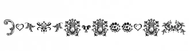
( Lauren Thompson - www.nymfont.com/ )
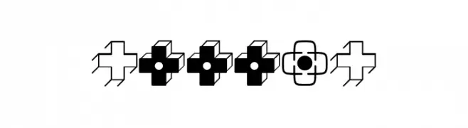
Ornate decorative dingbats with floral and vintage motifs.
 Herunterladen 75 Downloads@WebFont
 -
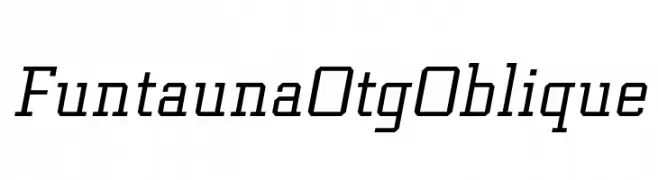
( Personal-use only. For commercial use please contact owner. )
A modern, oblique font with a geometric and dynamic style.
![Funtauna Otg Oblique Frei Schriftart Herunterladen]() Herunterladen 75 Downloads@WebFont
Herunterladen 75 Downloads@WebFont -
( Fonts by Ryul Davidson - Personal-use only. For commercial use please contact owner. )
A bold, italicized sans-serif font with a modern and dynamic style.
![Along Sans s2 BlackItalic Frei Schriftart Herunterladen]() Herunterladen 75 Downloads@WebFont
Herunterladen 75 Downloads@WebFont -
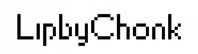
( Hazel Abbiati - diamondidiocy.tumblr.com )
A pixelated, blocky font inspired by retro digital displays.
![LipbyChonk Frei Schriftart Herunterladen]() Herunterladen 75 Downloads@WebFont
Herunterladen 75 Downloads@WebFont -
( Iconian Fonts - Daniel Zadorozny - www.iconian.com )
A bold, condensed, and italic font with a futuristic, angular design.
![Pulsar Class Solid Condensed Italic Frei Schriftart Herunterladen]() Herunterladen 75 Downloads@WebFont
Herunterladen 75 Downloads@WebFont -
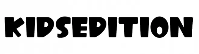
( Fonts by Kong Font )
A playful, bold typeface with rounded edges, ideal for children's projects.
![Kids Edition Frei Schriftart Herunterladen]() Herunterladen 75 Downloads@WebFont
Herunterladen 75 Downloads@WebFont -
( Fonts by Vladimir Nikolic )
A decorative pattern of geometric shapes with modern and abstract elements.
![Traverser Regular Frei Schriftart Herunterladen]() Herunterladen 75 Downloads@WebFont
Herunterladen 75 Downloads@WebFont -
( Fonts by Situjuh Nazara - 7ntypes.com - Personal-use only. For commercial use please contact owner. )
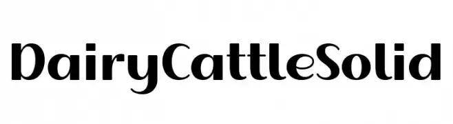
A bold, modern font with strong, slightly condensed characters and rounded edges.
![Dairy Cattle Solid Frei Schriftart Herunterladen]() Herunterladen 75 Downloads@WebFont
Herunterladen 75 Downloads@WebFont -
( Fonts by Letterpedia - Axel Alessandro Satriawan - Personal-use only. For commercial use please contact owner. )
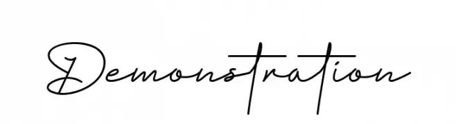
A cursive, handwritten-style font with elegant, flowing strokes.
![Demonstration Frei Schriftart Herunterladen]() Herunterladen 75 Downloads@WebFont
Herunterladen 75 Downloads@WebFont -
( Fonts by Makashi - Maqsum Kamil - Personal-use only. For commercial use please contact owner. )
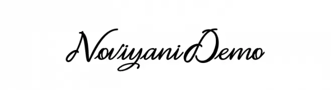
An elegant, flowing cursive font with ornate uppercase and graceful lowercase letters.
![Noviyani_Demo Frei Schriftart Herunterladen]() Herunterladen 75 Downloads@WebFont
Herunterladen 75 Downloads@WebFont -
( Fonts by benoitsjoholm.blogspot.com - Benoit Sjoholm - Personal-use only. For commercial use please contact owner. )
A bold, modern take on traditional blackletter with high contrast and unique flourishes.
![Nallo Frei Schriftart Herunterladen]() Herunterladen 75 Downloads@WebFont
Herunterladen 75 Downloads@WebFont -
( Fonts by Septiandika Pratama - Personal-use only. For commercial use please contact owner. )
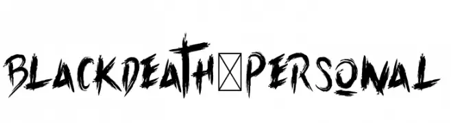
A bold, jagged, and aggressive font with a hand-drawn, brush-like appearance.
![Blackdeath-Personal Frei Schriftart Herunterladen]() Herunterladen 75 Downloads@WebFont
Herunterladen 75 Downloads@WebFont -
( Fonts by wep - Wahyu Eka Prasetya - Personal-use only. For commercial use please contact owner. )
A playful, handwritten font with smooth curves and a lively style.
![a Autoyes Closely Frei Schriftart Herunterladen]() Herunterladen 75 Downloads@WebFont
Herunterladen 75 Downloads@WebFont -
( Fonts by Syaf Rizal - Khurasan - Personal-use only. For commercial use please contact owner. )
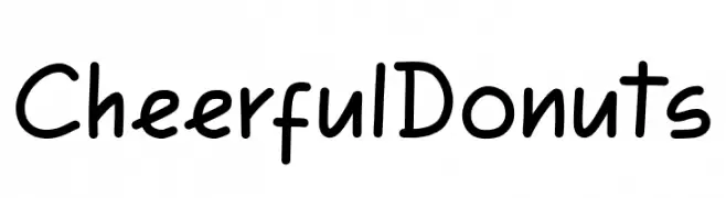
A playful and friendly font with rounded, smooth letters and consistent stroke thickness.
![Cheerful Donuts Frei Schriftart Herunterladen]() Herunterladen 75 Downloads@WebFont
Herunterladen 75 Downloads@WebFont -
( Fonts by FallenGraphic Studio - Vava Aryanto - Personal-use only. For commercial use please contact owner. )
A graceful and elegant script font with flowing, interconnected letters.
![Mallaba Frei Schriftart Herunterladen]() Herunterladen 75 Downloads@WebFont
Herunterladen 75 Downloads@WebFont -
( Fonts by Hamzah Muhamad Ihsan - Typesthetic Studio - Personal-use only. For commercial use please contact owner. )
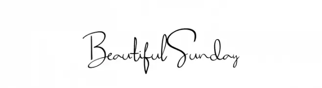
A playful, handwritten font with a whimsical and dynamic style.
![Beautiful Sunday Frei Schriftart Herunterladen]() Herunterladen 75 Downloads@WebFont
Herunterladen 75 Downloads@WebFont -
( Iconian Fonts - Daniel Zadorozny - www.iconian.com )
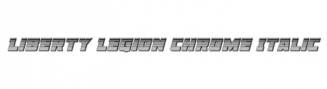
A bold, chrome-like italic font with a futuristic and layered design.
![Liberty Legion Chrome Italic Frei Schriftart Herunterladen]() Herunterladen 75 Downloads@WebFont
Herunterladen 75 Downloads@WebFont -
( Iconian Fonts - Daniel Zadorozny - www.iconian.com )
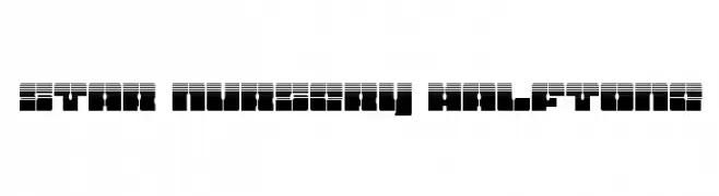
A modern, italicized font with a gradient line effect for a dynamic look.
![Star Nursery Gradient Italic Frei Schriftart Herunterladen]() Herunterladen 75 Downloads@WebFont
Herunterladen 75 Downloads@WebFont -
( Vinay Suresh - www.behance.net/v9v9v9 )
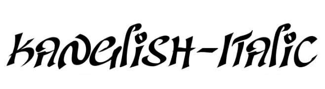
A bold, italic script font with dynamic strokes and sharp edges.
![Kanglish-Italic Frei Schriftart Herunterladen]() Herunterladen 75 Downloads@WebFont
Herunterladen 75 Downloads@WebFont -
( Fonts by Cadson Demak )
A modern, thin sans-serif font with a geometric and minimalist design.
![Kanit-Thin Frei Schriftart Herunterladen]() Herunterladen 75 Downloads@WebFont
Herunterladen 75 Downloads@WebFont -
( Fonts by Holitter Studios - Personal-use only. For commercial use please contact owner. )
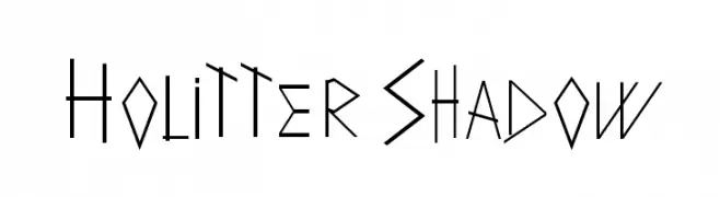
A modern, angular font with a unique shadow effect for a 3D appearance.
![Holitter Shadow Frei Schriftart Herunterladen]() Herunterladen 75 Downloads@WebFont
Herunterladen 75 Downloads@WebFont -
( Iconian Fonts - Daniel Zadorozny - www.iconian.com )
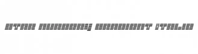
A bold, halftone-patterned font with a modern, geometric style.
![Star Nursery Halftone Frei Schriftart Herunterladen]() Herunterladen 75 Downloads@WebFont
Herunterladen 75 Downloads@WebFont -
( Fonts by deFharo - Fernando Haro - Personal-use only. For commercial use please contact owner. )
A bold, boxed font with tall, narrow characters and a modern, impactful style.
![TheBlackBox Frei Schriftart Herunterladen]() Herunterladen 75 Downloads@WebFont
Herunterladen 75 Downloads@WebFont -
( Jariya - artd2304-jariya.blogspot.com/ )
A playful and quirky font with a handcrafted feel and varying stroke widths.
![CRU-Jariya Frei Schriftart Herunterladen]() Herunterladen 75 Downloads@WebFont
Herunterladen 75 Downloads@WebFont -
( Fonts by Hendrick Rolandez - Personal-use only. For commercial use please contact owner. )
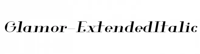
An elegant, high-contrast extended italic font with a classic and sophisticated style.
![Glamor-ExtendedItalic Frei Schriftart Herunterladen]() Herunterladen 75 Downloads@WebFont
Herunterladen 75 Downloads@WebFont -
( Noto is a trademark of Google Inc. Noto fonts are open source. All Noto fonts are published under the SIL Open Font License, Version 1.1 )
A modern, condensed sans-serif font with medium weight, offering clarity and space efficiency.
![Noto Sans Devanagari Condensed Medium Frei Schriftart Herunterladen]() Herunterladen 75 Downloads@WebFont
Herunterladen 75 Downloads@WebFont -
( Noto is a trademark of Google Inc. Noto fonts are open source. All Noto fonts are published under the SIL Open Font License, Version 1.1 )
Invalid font image.
![Noto Serif Ethiopic ExtraBold Frei Schriftart Herunterladen]() Herunterladen 75 Downloads@WebFont
Herunterladen 75 Downloads@WebFont -
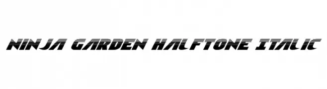
( Iconian Fonts - Daniel Zadorozny - www.iconian.com )
A bold, italicized font with a halftone effect and dynamic, energetic style.
![Ninja Garden Halftone Italic Frei Schriftart Herunterladen]() Herunterladen 75 Downloads@WebFont
Herunterladen 75 Downloads@WebFont -
( Fonts by Hendrick Rolandez - Personal-use only. For commercial use please contact owner. )
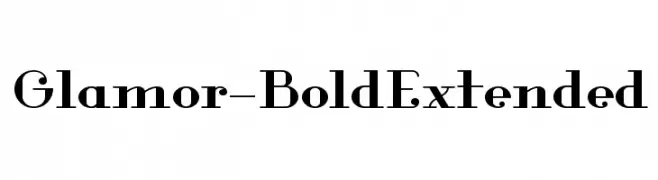
A bold, extended serif font with high contrast and elegant details.
![Glamor-BoldExtended Frei Schriftart Herunterladen]() Herunterladen 75 Downloads@WebFont
Herunterladen 75 Downloads@WebFont -
( Fonts by Yoga Letter )
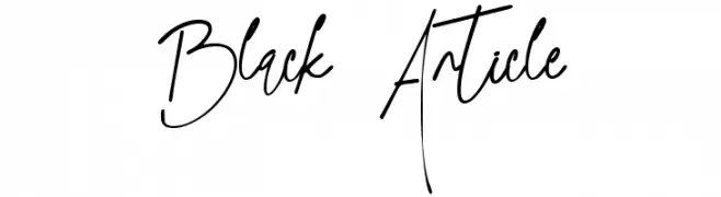
Expressive handwritten script with tall, narrow, and irregular strokes.
![Black Article Frei Schriftart Herunterladen]() Herunterladen 75 Downloads@WebFont
Herunterladen 75 Downloads@WebFont -
( Fonts by DmLetter31 - Dimas Prasetyo - Personal-use only. For commercial use please contact owner. )
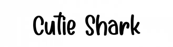
A playful, handwritten font with smooth, rounded edges and a casual style.
![Cutie Shark Frei Schriftart Herunterladen]() Herunterladen 75 Downloads@WebFont
Herunterladen 75 Downloads@WebFont -
( Fonts by Zeenesia Studio - Doni Purwoko - Personal-use only. For commercial use please contact owner. )
A playful, handwritten font with bold, rounded characters.
![Reds Aglonema Frei Schriftart Herunterladen]() Herunterladen 75 Downloads@WebFont
Herunterladen 75 Downloads@WebFont -
( Xerographer Fonts - Max Infeld - xerographer.blogspot.com )
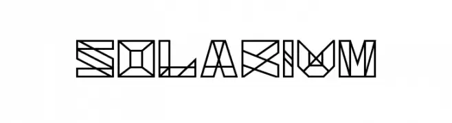
A geometric and angular font with a futuristic and abstract design.
![Solarium Frei Schriftart Herunterladen]() Herunterladen 75 Downloads@WebFont
Herunterladen 75 Downloads@WebFont -
( Etherbrian - www.etherbrian.com/ )
A geometric and abstract font with angular, fragmented letterforms and a futuristic aesthetic.
![Zhed Frei Schriftart Herunterladen]() Herunterladen 75 Downloads@WebFont
Herunterladen 75 Downloads@WebFont -
( Fonts by NJ Studio )
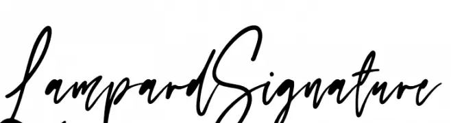
Handwritten cursive script with a casual elegance.
![Lampard Signature Frei Schriftart Herunterladen]() Herunterladen 75 Downloads@WebFont
Herunterladen 75 Downloads@WebFont


Welche Schriften sind gerade am populärsten?
Poppins, Roboto, Montserrat, Open Sans und Lato sind wegen ihrer klaren Formen und breiten Einsetzbarkeit sehr gefragt – von Markenauftritt über Landingpages bis hin zu Postern.
Welche Fonts eignen sich für Logos?
Geometrische Sans‑Serifs (z. B. Poppins, Familien im Gotham‑Stil) sind ein häufiger Griff für sauberes, skalierbares Branding. Für eine persönlichere Note bleiben Scripts und Handschrift‑Stile beliebt. Kombinieren Sie einen prägnanten Headline‑Font mit einer neutralen Brotschrift für Wiedererkennung und Harmonie.
Wie oft wird die Top‑Liste aktualisiert?
Regelmäßig – basierend auf realen Downloads und Interaktionen. Schauen Sie öfter vorbei, um aufstrebende Favoriten früh zu entdecken.
💡 Tipp: Seite bookmarken – Trends wechseln schnell, und heutige Top‑Schriften inspirieren morgen vielleicht das Rebranding.