Willkommen bei den Top‑Schriften – hier treffen Beliebtheit und Qualität aufeinander. Das sind die in diesem Jahr am häufigsten heruntergeladenen und genutzten Fonts. Wenn Sie sichere Optionen für Logo, Web oder Social suchen, starten Sie hier.
Jeder Top‑Font überzeugt durch Balance, Lesbarkeit und Vielseitigkeit. Sie finden moderne Sans‑Serifs, elegante Scripts, Vintage‑Serifs und minimalistische Displays.
-
( Xerographer Fonts - Max Infeld - xerographer.blogspot.com )
A geometric and angular font with a futuristic and abstract design.
 Herunterladen 74 Downloads@WebFont
 -
( Etherbrian - www.etherbrian.com/ )
A geometric and abstract font with angular, fragmented letterforms and a futuristic aesthetic.
![Zhed Frei Schriftart Herunterladen]() Herunterladen 74 Downloads@WebFont
Herunterladen 74 Downloads@WebFont -
( Fonts by Mixi Ignacio - Personal-use only. For commercial use please contact owner. )
A geometric, futuristic font with sharp angles and a minimalist style.
![Tribo Light Regular Frei Schriftart Herunterladen]() Herunterladen 74 Downloads@WebFont
Herunterladen 74 Downloads@WebFont -
( Fonts by NJ Studio )
Handwritten cursive script with a casual elegance.
![Lampard Signature Frei Schriftart Herunterladen]() Herunterladen 74 Downloads@WebFont
Herunterladen 74 Downloads@WebFont -
( Fonts by Situjuh Nazara - 7ntypes.com - Personal-use only. For commercial use please contact owner. )
A playful, rounded font with bold, smooth curves and a friendly appearance.
![Gelar Frei Schriftart Herunterladen]() Herunterladen 74 Downloads@WebFont
Herunterladen 74 Downloads@WebFont -
( Fonts by Beautypes - Bhakti Al Akbar Pasaribu - Personal-use only. For commercial use please contact owner. )
A playful and elegant script font with decorative swirls and loops.
![Samutin Frei Schriftart Herunterladen]() Herunterladen 74 Downloads@WebFont
Herunterladen 74 Downloads@WebFont -
( Iconian Fonts - Daniel Zadorozny - www.iconian.com )
A bold, geometric, condensed italic font with a futuristic style.
![Star Nursery Condensed Italic Frei Schriftart Herunterladen]() Herunterladen 74 Downloads@WebFont
Herunterladen 74 Downloads@WebFont -
( Fonts by Vladimir Nikolic - www.creativefabrica.com/designer/vladimirnikolic/ - Personal-use only. For commercial use please contact owner. )
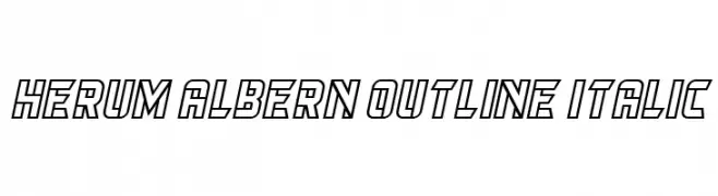
A bold, outlined, italic font with a modern and dynamic style.
![Herum Albern Outline Italic Frei Schriftart Herunterladen]() Herunterladen 74 Downloads@WebFont
Herunterladen 74 Downloads@WebFont -
( Fonts by Almarkhatype - Abdul Malik Wisnu - Personal-use only. For commercial use please contact owner. )
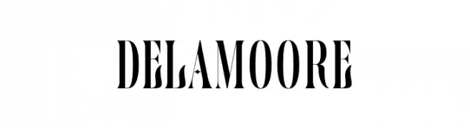
A high-contrast, elegant serif font with dramatic strokes and sharp serifs.
![Delamoore Frei Schriftart Herunterladen]() Herunterladen 74 Downloads@WebFont
Herunterladen 74 Downloads@WebFont -
( Fonts by Iconian Fonts - Daniel Zadorozny - Personal-use only. For commercial use please contact owner. )
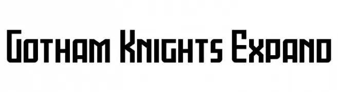
A bold, geometric font with a modern, tech-inspired design.
![Gotham Knights Expand Frei Schriftart Herunterladen]() Herunterladen 74 Downloads@WebFont
Herunterladen 74 Downloads@WebFont -
( Fonts by Vunira Design - Personal-use only. For commercial use please contact owner. )
A dynamic, cursive font with elegant, sweeping strokes and a modern calligraphic style.
![AdisoneFREE Frei Schriftart Herunterladen]() Herunterladen 74 Downloads@WebFont
Herunterladen 74 Downloads@WebFont -
( weknow - Wino S Kadir - www.creativefabrica.com/designer/weknow/ )
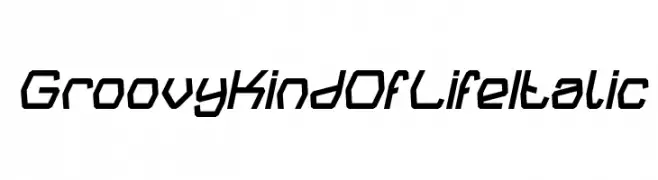
A bold, angular, and slightly italicized font with a modern, futuristic style.
![Groovy Kind Of Life Italic Frei Schriftart Herunterladen]() Herunterladen 74 Downloads@WebFont
Herunterladen 74 Downloads@WebFont -
( Fonts by Syaf Rizal - Khurasan - Personal-use only. For commercial use please contact owner. )
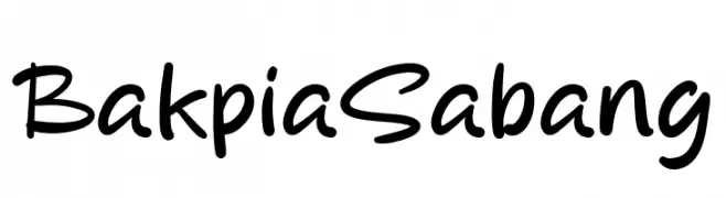
A playful, casual handwritten font with smooth, rounded edges.
![Bakpia Sabang Frei Schriftart Herunterladen]() Herunterladen 74 Downloads@WebFont
Herunterladen 74 Downloads@WebFont -
( Fonts by Cumberland Fontworks )
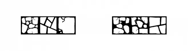
Stone-patterned decorative font with mosaic-like characters.
![Flagstones Frei Schriftart Herunterladen]() Herunterladen 74 Downloads@WebFont
Herunterladen 74 Downloads@WebFont -
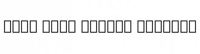
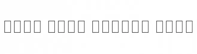
( Noto is a trademark of Google Inc. Noto fonts are open source. All Noto fonts are published under the SIL Open Font License, Version 1.1 )
Glyphs are displayed as empty squares due to unsupported characters.
![Noto Sans Lycian Regular Frei Schriftart Herunterladen]() Herunterladen 74 Downloads@WebFont
Herunterladen 74 Downloads@WebFont -
( Fonts by Figuree Studio - Icep Fadhil - Personal-use only. For commercial use please contact owner. )
A modern, elegant script font with flowing, cursive letters and a sophisticated style.
![Gabrietha Demo Frei Schriftart Herunterladen]() Herunterladen 74 Downloads@WebFont
Herunterladen 74 Downloads@WebFont -
( Fonts by Garisman Studio - Risman Ginarwan - Personal-use only. For commercial use please contact owner. )
A playful, narrow font with a hand-drawn, artistic style.
![Ecriture Frei Schriftart Herunterladen]() Herunterladen 74 Downloads@WebFont
Herunterladen 74 Downloads@WebFont -
( Fonts by Mans Greback - www.mansgreback.com - Personal-use only. For commercial use please contact owner. )
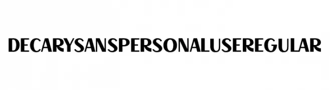
A bold, modern font with high contrast and a strong presence.
![Decary Sans PERSONAL USE Regular Frei Schriftart Herunterladen]() Herunterladen 74 Downloads@WebFont
Herunterladen 74 Downloads@WebFont -
( Fonts by Jimtype Studio )
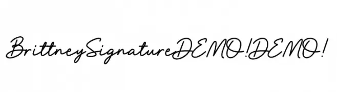
A casual and elegant handwritten font with smooth, flowing lines.
![Brittney Signature DEMO! DEMO! Frei Schriftart Herunterladen]() Herunterladen 74 Downloads@WebFont
Herunterladen 74 Downloads@WebFont -
( Fonts by Zetafonts - Personal-use only. For commercial use please contact owner. )
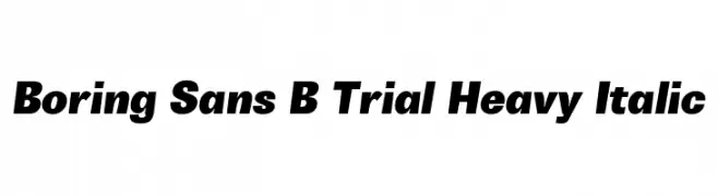
A bold, heavy, and italic sans-serif font with a strong presence.
![Boring Sans B Trial Heavy Italic Frei Schriftart Herunterladen]() Herunterladen 74 Downloads@WebFont
Herunterladen 74 Downloads@WebFont -
( Fonts by myname5749 - Personal-use only. For commercial use please contact owner. )
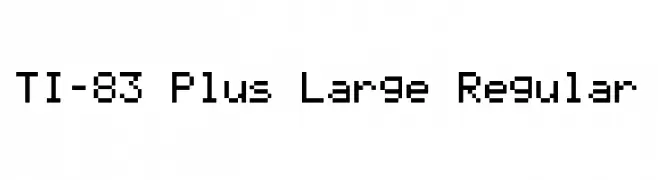
A pixelated, monospaced font with a retro digital aesthetic.
![TI-83 Plus Large Regular Frei Schriftart Herunterladen]() Herunterladen 74 Downloads@WebFont
Herunterladen 74 Downloads@WebFont -
( Fonts by ndiscovered - Personal-use only. For commercial use please contact owner. )
A clean, modern font with elegant proportions and consistent stroke width.
![ArimaMadurai-Light Frei Schriftart Herunterladen]() Herunterladen 74 Downloads@WebFont
Herunterladen 74 Downloads@WebFont -
( Noto is a trademark of Google Inc. Noto fonts are open source. All Noto fonts are published under the SIL Open Font License, Version 1.1 )
A thin, modern font with clean lines and balanced spacing.
![Noto Sans Arabic Thin Frei Schriftart Herunterladen]() Herunterladen 74 Downloads@WebFont
Herunterladen 74 Downloads@WebFont -
( Fonts by Makashi - Maqsum Kamil - Personal-use only. For commercial use please contact owner. )
A playful, rounded font with a hand-drawn appearance.
![Aurelin Frei Schriftart Herunterladen]() Herunterladen 74 Downloads@WebFont
Herunterladen 74 Downloads@WebFont -
( Fonts by Typefactoryco )
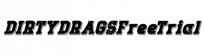
A bold, distressed font with a vintage, textured style.
![DIRTY DRAGS Free Trial Frei Schriftart Herunterladen]() Herunterladen 74 Downloads@WebFont
Herunterladen 74 Downloads@WebFont -
( Fonts by Octotype | Thomas Boucherie )
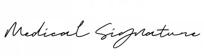
A cursive, handwritten font with a signature-like elegance.
![Medical Signature Frei Schriftart Herunterladen]() Herunterladen 74 Downloads@WebFont
Herunterladen 74 Downloads@WebFont -
( Fonts by Perrine Pipereau )
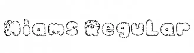
Whimsical, cartoonish decorative font.
![Miams Regular Frei Schriftart Herunterladen]() Herunterladen 74 Downloads@WebFont
Herunterladen 74 Downloads@WebFont -
( Fonts by Graphix Line Studio - Personal-use only. For commercial use please contact owner. )
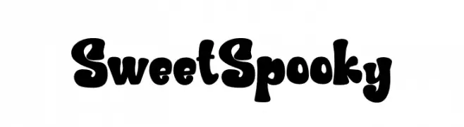
A playful, bold font with rounded edges and a whimsical style.
![Sweet Spooky Frei Schriftart Herunterladen]() Herunterladen 74 Downloads@WebFont
Herunterladen 74 Downloads@WebFont -
( Fonts by Alfin Ridhowi - Personal-use only. For commercial use please contact owner. )
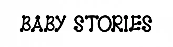
A playful, bold font with rounded characters and dot embellishments.
![BABY STORIES Frei Schriftart Herunterladen]() Herunterladen 74 Downloads@WebFont
Herunterladen 74 Downloads@WebFont -
( Fonts by benoitsjoholm.blogspot.com - Benoit Sjoholm - Personal-use only. For commercial use please contact owner. )
A modern, rounded font with a sleek and minimalist design.
![Genikas Frei Schriftart Herunterladen]() Herunterladen 74 Downloads@WebFont
Herunterladen 74 Downloads@WebFont -
( Iconian Fonts - Daniel Zadorozny - www.iconian.com )
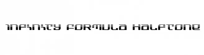
A futuristic font with a halftone pattern and geometric design.
![Infinity Formula Halftone Frei Schriftart Herunterladen]() Herunterladen 74 Downloads@WebFont
Herunterladen 74 Downloads@WebFont -
![VHARI HINGLISH Frei Schriftart Herunterladen]() Herunterladen 74 Downloads@WebFont
Herunterladen 74 Downloads@WebFont -
( Fonts by Jolicia Type Foundry - Personal-use only. For commercial use please contact owner. )
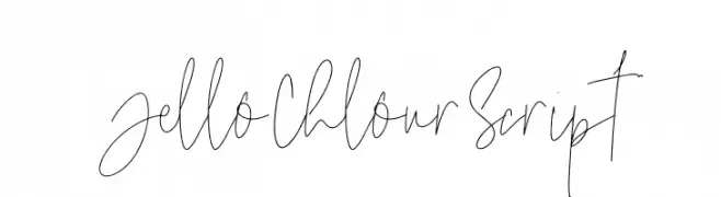
A playful, casual handwritten script with thin, flowing lines.
![Jello Chlour Script Frei Schriftart Herunterladen]() Herunterladen 74 Downloads@WebFont
Herunterladen 74 Downloads@WebFont -
( Fonts by Zeenesia Studio - Doni Purwoko - Personal-use only. For commercial use please contact owner. )
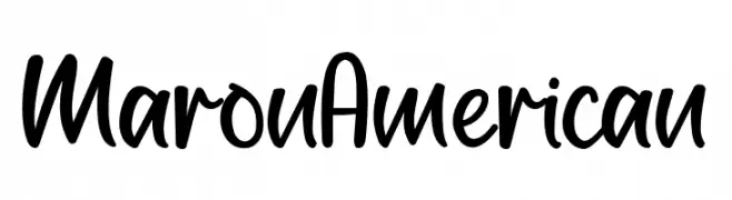
A bold, playful handwritten script font with a friendly and energetic style.
![Maron American Frei Schriftart Herunterladen]() Herunterladen 74 Downloads@WebFont
Herunterladen 74 Downloads@WebFont -
( 3 Halves Design - Ken Baird - www.3halvesdesign.com )
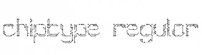
A decorative, tech-inspired font with circuit-like patterns.
![Chiptype Regular Frei Schriftart Herunterladen]() Herunterladen 74 Downloads@WebFont
Herunterladen 74 Downloads@WebFont


Welche Schriften sind gerade am populärsten?
Poppins, Roboto, Montserrat, Open Sans und Lato sind wegen ihrer klaren Formen und breiten Einsetzbarkeit sehr gefragt – von Markenauftritt über Landingpages bis hin zu Postern.
Welche Fonts eignen sich für Logos?
Geometrische Sans‑Serifs (z. B. Poppins, Familien im Gotham‑Stil) sind ein häufiger Griff für sauberes, skalierbares Branding. Für eine persönlichere Note bleiben Scripts und Handschrift‑Stile beliebt. Kombinieren Sie einen prägnanten Headline‑Font mit einer neutralen Brotschrift für Wiedererkennung und Harmonie.
Wie oft wird die Top‑Liste aktualisiert?
Regelmäßig – basierend auf realen Downloads und Interaktionen. Schauen Sie öfter vorbei, um aufstrebende Favoriten früh zu entdecken.
💡 Tipp: Seite bookmarken – Trends wechseln schnell, und heutige Top‑Schriften inspirieren morgen vielleicht das Rebranding.