Willkommen bei den Top‑Schriften – hier treffen Beliebtheit und Qualität aufeinander. Das sind die in diesem Jahr am häufigsten heruntergeladenen und genutzten Fonts. Wenn Sie sichere Optionen für Logo, Web oder Social suchen, starten Sie hier.
Jeder Top‑Font überzeugt durch Balance, Lesbarkeit und Vielseitigkeit. Sie finden moderne Sans‑Serifs, elegante Scripts, Vintage‑Serifs und minimalistische Displays.
-
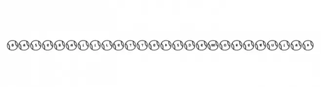
( Fonts by Brittney Murphy Design )
A decorative font with characters inside baseball-themed circles, ideal for sports designs.
 Herunterladen 72 Downloads@WebFont
 -
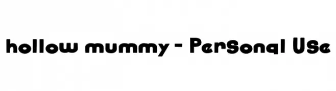
( Fonts by Attype Studio - Fadli Ramadhan Iskandar - Personal-use only. For commercial use please contact owner. )
A bold, rounded font with a playful and retro vibe.
![hollow mummy - Personal Use Frei Schriftart Herunterladen]() Herunterladen 72 Downloads@WebFont
Herunterladen 72 Downloads@WebFont -
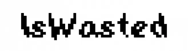
( Hazel Abbiati - diamondidiocy.tumblr.com )
A bold, pixelated font with a retro digital style.
![IsWasted Frei Schriftart Herunterladen]() Herunterladen 72 Downloads@WebFont
Herunterladen 72 Downloads@WebFont -
( weknow - Wino S Kadir - www.creativefabrica.com/designer/weknow/ )
A bold, italic, and playful font with a dynamic and fluid style.
![Enjoy The Time Bold Italic Frei Schriftart Herunterladen]() Herunterladen 72 Downloads@WebFont
Herunterladen 72 Downloads@WebFont -
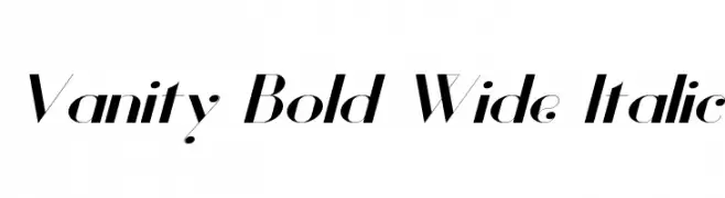
( Fonts by Hendrick Rolandez - Personal-use only. For commercial use please contact owner. )
A bold, wide, and italic font with high contrast and elegant curves.
![Vanity Bold Wide Italic Frei Schriftart Herunterladen]() Herunterladen 72 Downloads@WebFont
Herunterladen 72 Downloads@WebFont -
( Fonts by Craft Supply Co - Personal-use only. For commercial use please contact owner. )
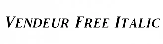
An elegant italic serif font with smooth curves and sharp serifs.
![Vendeur Free Italic Frei Schriftart Herunterladen]() Herunterladen 72 Downloads@WebFont
Herunterladen 72 Downloads@WebFont -
( Fonts by Kat`s Fun Fonts - Personal-use only. For commercial use please contact owner. )
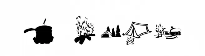
A decorative font with camping-themed icons for each character.
![KR Camping Frei Schriftart Herunterladen]() Herunterladen 72 Downloads@WebFont
Herunterladen 72 Downloads@WebFont -
( Fonts by Iconian Fonts - Daniel Zadorozny - Personal-use only. For commercial use please contact owner. )
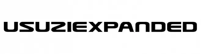
A bold, modern font with a futuristic and geometric design.
![Usuzi Expanded Frei Schriftart Herunterladen]() Herunterladen 72 Downloads@WebFont
Herunterladen 72 Downloads@WebFont -
( Lauren Thompson - www.nymfont.com/ )
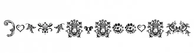
Ornate decorative dingbats with floral and vintage motifs.
![Dingleberries Frei Schriftart Herunterladen]() Herunterladen 72 Downloads@WebFont
Herunterladen 72 Downloads@WebFont -
( Vladimir Nikolic - www.coroflot.com/vladimirnikolic )
A decorative font inspired by astrological symbols with intricate lines and curves.
![Horoscopicus Regular Frei Schriftart Herunterladen]() Herunterladen 72 Downloads@WebFont
Herunterladen 72 Downloads@WebFont -
( Fonts by Khurasan )
A bold, playful font with a hand-drawn, rounded style.
![Kopiku Frei Schriftart Herunterladen]() Herunterladen 72 Downloads@WebFont
Herunterladen 72 Downloads@WebFont -
( Iconian Fonts - Daniel Zadorozny - www.iconian.com )
A bold, italicized font with a futuristic halftone effect and dynamic design.
![Pulsar Class Solid Halftone Italic Frei Schriftart Herunterladen]() Herunterladen 72 Downloads@WebFont
Herunterladen 72 Downloads@WebFont -
( work-it.it - www.work-it.it )
A sleek, modern font with geometric and futuristic elements.
![Ecliptic Light Frei Schriftart Herunterladen]() Herunterladen 72 Downloads@WebFont
Herunterladen 72 Downloads@WebFont -
( Fonts by Subectype & Orenari - Rangga Subekti & Ari - Personal-use only. For commercial use please contact owner. )
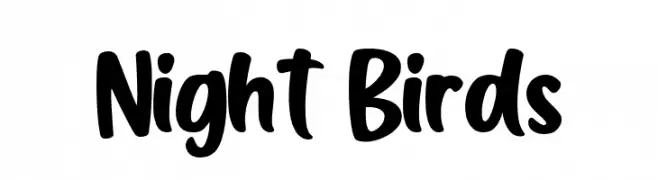
A bold, playful handwritten font with rounded, smooth letterforms.
![Night Birds Frei Schriftart Herunterladen]() Herunterladen 72 Downloads@WebFont
Herunterladen 72 Downloads@WebFont -
( Grant Hasbrouck - www.granthasbrouck.com )
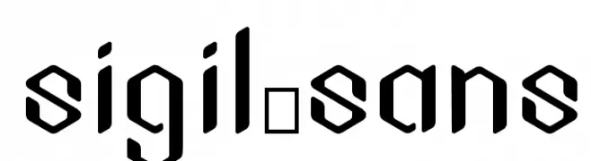
A modern, angular font with geometric shapes and a futuristic style.
![Sigil_Sans Frei Schriftart Herunterladen]() Herunterladen 72 Downloads@WebFont
Herunterladen 72 Downloads@WebFont -
( Iconian Fonts - Daniel Zadorozny - www.iconian.com )
A dynamic, flowing script font with bold strokes and an elegant italic slant.
![First Order Plain Italic Frei Schriftart Herunterladen]() Herunterladen 72 Downloads@WebFont
Herunterladen 72 Downloads@WebFont -
( Fonts by Kong Font )
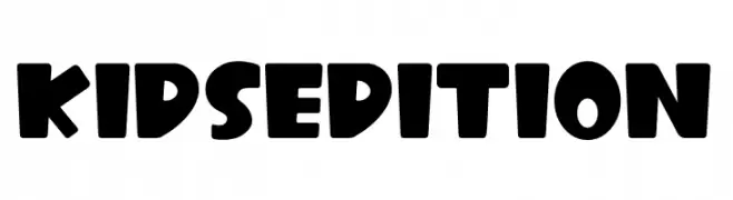
A playful, bold typeface with rounded edges, ideal for children's projects.
![Kids Edition Frei Schriftart Herunterladen]() Herunterladen 72 Downloads@WebFont
Herunterladen 72 Downloads@WebFont -
( Fonts by Vladimir Nikolic )
A decorative pattern of geometric shapes with modern and abstract elements.
![Traverser Regular Frei Schriftart Herunterladen]() Herunterladen 72 Downloads@WebFont
Herunterladen 72 Downloads@WebFont -
( Fonts by Colative Studio - Personal-use only. For commercial use please contact owner. )
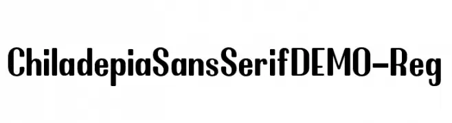
A bold, modern sans-serif font with a strong and clean appearance.
![ChiladepiaSansSerifDEMO-Reg Frei Schriftart Herunterladen]() Herunterladen 72 Downloads@WebFont
Herunterladen 72 Downloads@WebFont -
( Fonts by Hamzah Muhamad Ihsan - Typesthetic Studio - Personal-use only. For commercial use please contact owner. )
A cursive, signature-style font with elegant, flowing lines.
![Onesty Signature Frei Schriftart Herunterladen]() Herunterladen 72 Downloads@WebFont
Herunterladen 72 Downloads@WebFont -
( Fonts by Letterpedia - Axel Alessandro Satriawan - Personal-use only. For commercial use please contact owner. )
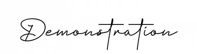
A cursive, handwritten-style font with elegant, flowing strokes.
![Demonstration Frei Schriftart Herunterladen]() Herunterladen 72 Downloads@WebFont
Herunterladen 72 Downloads@WebFont -
( Vladimir Nikolic - www.coroflot.com/vladimirnikolic )
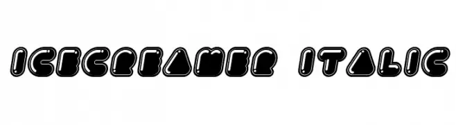
A playful, bubble-like font with bold outlines and a whimsical style.
![Icecreamer Italic Frei Schriftart Herunterladen]() Herunterladen 72 Downloads@WebFont
Herunterladen 72 Downloads@WebFont -
( Fonts by wep - Wahyu Eka Prasetya - Personal-use only. For commercial use please contact owner. )
A playful, handwritten font with smooth curves and a lively style.
![a Autoyes Closely Frei Schriftart Herunterladen]() Herunterladen 72 Downloads@WebFont
Herunterladen 72 Downloads@WebFont -
( Fonts by Vladimir Nikolic - www.creativefabrica.com/designer/vladimirnikolic/ - Personal-use only. For commercial use please contact owner. )
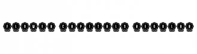
A decorative font with characters encased in floral designs, ideal for whimsical projects.
![Flower Capitals Regular Frei Schriftart Herunterladen]() Herunterladen 72 Downloads@WebFont
Herunterladen 72 Downloads@WebFont -
( Fonts by Hamzah Muhamad Ihsan - Typesthetic Studio - Personal-use only. For commercial use please contact owner. )
A playful, handwritten font with a whimsical and dynamic style.
![Beautiful Sunday Frei Schriftart Herunterladen]() Herunterladen 72 Downloads@WebFont
Herunterladen 72 Downloads@WebFont -
( Iconian Fonts - Daniel Zadorozny - www.iconian.com )
A bold, chrome-like italic font with a futuristic and layered design.
![Liberty Legion Chrome Italic Frei Schriftart Herunterladen]() Herunterladen 72 Downloads@WebFont
Herunterladen 72 Downloads@WebFont -
( Iconian Fonts - Daniel Zadorozny - www.iconian.com )
A modern, italicized font with a gradient line effect for a dynamic look.
![Star Nursery Gradient Italic Frei Schriftart Herunterladen]() Herunterladen 72 Downloads@WebFont
Herunterladen 72 Downloads@WebFont -
( Fonts by Joko Setiono - Personal-use only. For commercial use please contact owner. )
A bold, angular font with a futuristic and geometric style.
![attupats Frei Schriftart Herunterladen]() Herunterladen 72 Downloads@WebFont
Herunterladen 72 Downloads@WebFont -
( Fonts by Md Shohail Bhuian - Personal-use only. For commercial use please contact owner. )
A playful, handwritten font with tall, narrow letters and consistent stroke thickness.
![Our Goal Frei Schriftart Herunterladen]() Herunterladen 72 Downloads@WebFont
Herunterladen 72 Downloads@WebFont -
( Fonts by Roni Studio - Muhammad Zamroni - Personal-use only. For commercial use please contact owner. )
A bold, distressed font with a rugged, textured style.
![MAROON Frei Schriftart Herunterladen]() Herunterladen 72 Downloads@WebFont
Herunterladen 72 Downloads@WebFont -
( Iconian Fonts - Daniel Zadorozny - www.iconian.com )
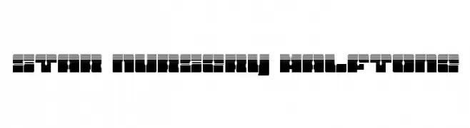
A bold, halftone-patterned font with a modern, geometric style.
![Star Nursery Halftone Frei Schriftart Herunterladen]() Herunterladen 72 Downloads@WebFont
Herunterladen 72 Downloads@WebFont -
( Fonts by Hendrick Rolandez - Personal-use only. For commercial use please contact owner. )
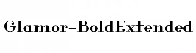
A bold, extended serif font with high contrast and elegant details.
![Glamor-BoldExtended Frei Schriftart Herunterladen]() Herunterladen 72 Downloads@WebFont
Herunterladen 72 Downloads@WebFont -
( Fonts by Kong Font - https://fontkong.com/ - Personal-use only. For commercial use please contact owner. )
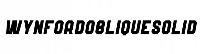
A bold, oblique font with angular, solid letterforms for dynamic designs.
![Wynford Oblique Solid Frei Schriftart Herunterladen]() Herunterladen 72 Downloads@WebFont
Herunterladen 72 Downloads@WebFont -
( Fonts by skillyasstudio.com - Ahmad Faizin - Personal-use only. For commercial use please contact owner. )
A cursive, handwritten font with elegant, flowing strokes.
![Juliyeta Frei Schriftart Herunterladen]() Herunterladen 72 Downloads@WebFont
Herunterladen 72 Downloads@WebFont -
( Fonts by DmLetter31 - Dimas Prasetyo - Personal-use only. For commercial use please contact owner. )
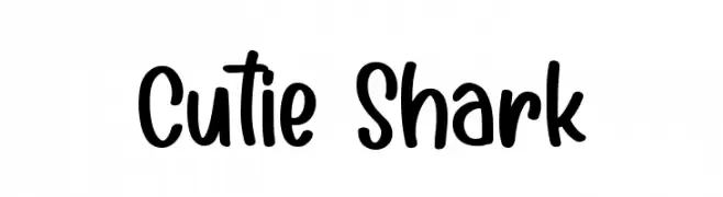
A playful, handwritten font with smooth, rounded edges and a casual style.
![Cutie Shark Frei Schriftart Herunterladen]() Herunterladen 72 Downloads@WebFont
Herunterladen 72 Downloads@WebFont


Welche Schriften sind gerade am populärsten?
Poppins, Roboto, Montserrat, Open Sans und Lato sind wegen ihrer klaren Formen und breiten Einsetzbarkeit sehr gefragt – von Markenauftritt über Landingpages bis hin zu Postern.
Welche Fonts eignen sich für Logos?
Geometrische Sans‑Serifs (z. B. Poppins, Familien im Gotham‑Stil) sind ein häufiger Griff für sauberes, skalierbares Branding. Für eine persönlichere Note bleiben Scripts und Handschrift‑Stile beliebt. Kombinieren Sie einen prägnanten Headline‑Font mit einer neutralen Brotschrift für Wiedererkennung und Harmonie.
Wie oft wird die Top‑Liste aktualisiert?
Regelmäßig – basierend auf realen Downloads und Interaktionen. Schauen Sie öfter vorbei, um aufstrebende Favoriten früh zu entdecken.
💡 Tipp: Seite bookmarken – Trends wechseln schnell, und heutige Top‑Schriften inspirieren morgen vielleicht das Rebranding.