Willkommen bei den Top‑Schriften – hier treffen Beliebtheit und Qualität aufeinander. Das sind die in diesem Jahr am häufigsten heruntergeladenen und genutzten Fonts. Wenn Sie sichere Optionen für Logo, Web oder Social suchen, starten Sie hier.
Jeder Top‑Font überzeugt durch Balance, Lesbarkeit und Vielseitigkeit. Sie finden moderne Sans‑Serifs, elegante Scripts, Vintage‑Serifs und minimalistische Displays.
-
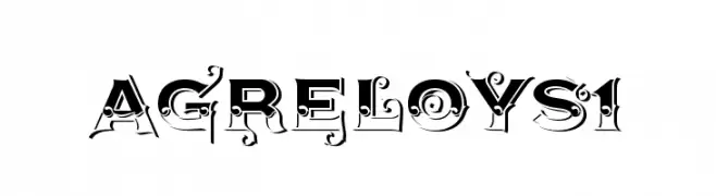
( Fonts by gluk - Grzegorz l - Personal-use only. For commercial use please contact owner. )
A bold, decorative font with intricate flourishes and high contrast.
 Herunterladen 74 Downloads@WebFont
 -
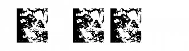
( Fonts by bob istheowl http://luc.devroye.org/bobistheowl.html )
Elaborate, pictorial font with fantasy illustrations forming each character.
![FrazettaBats Test1 Frei Schriftart Herunterladen]() Herunterladen 74 Downloads@WebFont
Herunterladen 74 Downloads@WebFont -
( Fonts by Kat`s Fun Fonts - Personal-use only. For commercial use please contact owner. )
A whimsical and decorative font with playful curls and swirls, perfect for children's themes.
![KR Scrappin Babies Frei Schriftart Herunterladen]() Herunterladen 74 Downloads@WebFont
Herunterladen 74 Downloads@WebFont -
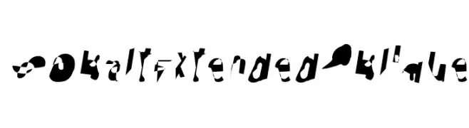
( Fonts by CannotIntoSpaceFonts - KineticPlasma Fonts - Personal-use only. For commercial use please contact owner. )
A bold, abstract font with dynamic, fragmented characters and high contrast.
![Cobalt Extended Oblique Frei Schriftart Herunterladen]() Herunterladen 74 Downloads@WebFont
Herunterladen 74 Downloads@WebFont -
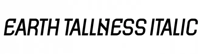
( Fonts by Vladimir Nikolic - www.creativefabrica.com/designer/vladimirnikolic/ - Personal-use only. For commercial use please contact owner. )
A modern, italic font with tall, narrow characters and a dynamic style.
![Earth Tallness Italic Frei Schriftart Herunterladen]() Herunterladen 74 Downloads@WebFont
Herunterladen 74 Downloads@WebFont -
( Fonts by Rainbow Graphicx - Personal-use only. For commercial use please contact owner. )
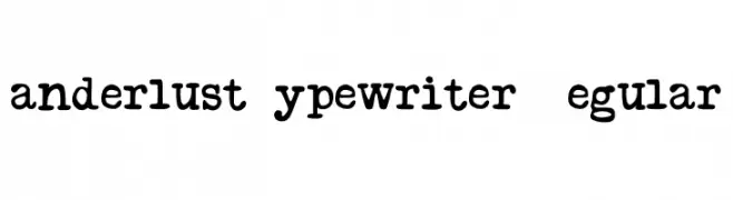
A vintage typewriter-style font with a warm, nostalgic feel.
![Wanderlust Typewriter D Regular Frei Schriftart Herunterladen]() Herunterladen 74 Downloads@WebFont
Herunterladen 74 Downloads@WebFont -
( TracerTong - Paul Reid - tracertong.co.uk )
A bold, geometric inline font with a futuristic and industrial style.
![USPF Liberty Inline Frei Schriftart Herunterladen]() Herunterladen 74 Downloads@WebFont
Herunterladen 74 Downloads@WebFont -
( Fonts by douglas vitkauskas - Personal-use only. For commercial use please contact owner. )
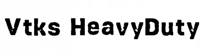
A bold, distressed font with a rugged, industrial style.
![Vtks HeavyDuty Frei Schriftart Herunterladen]() Herunterladen 74 Downloads@WebFont
Herunterladen 74 Downloads@WebFont -
( Noto is a trademark of Google Inc. Noto fonts are open source. All Noto fonts are published under the SIL Open Font License, Version 1.1 )
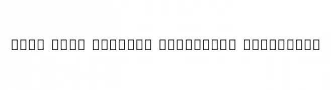
A modern, bold, and condensed font with excellent readability.
![Noto Sans Sinhala Condensed ExtraBold Frei Schriftart Herunterladen]() Herunterladen 74 Downloads@WebFont
Herunterladen 74 Downloads@WebFont -
( Fonts by Kong Font - Personal-use only. For commercial use please contact owner. )
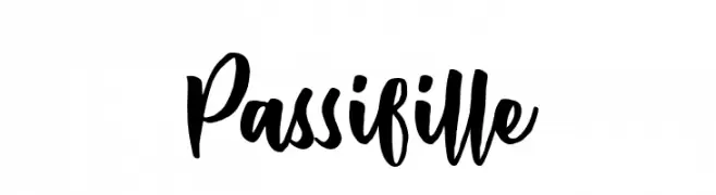
A bold, expressive handwritten font with dynamic strokes and a playful style.
![Passifille Frei Schriftart Herunterladen]() Herunterladen 74 Downloads@WebFont
Herunterladen 74 Downloads@WebFont -
( Fonts by www.junkohanhero.com - Personal-use only. For commercial use please contact owner. )
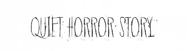
A haunting, distressed font with tall, narrow letterforms and a scratchy texture.
![Quiet Horror Story Frei Schriftart Herunterladen]() Herunterladen 74 Downloads@WebFont
Herunterladen 74 Downloads@WebFont -
( Fonts by Iconian Fonts )
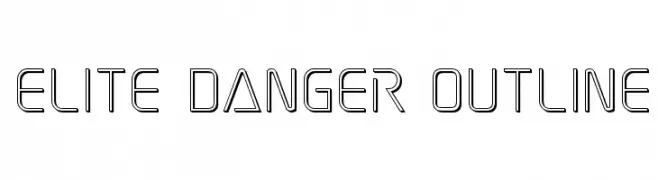
A modern, geometric outline font with a futuristic aesthetic.
![Elite Danger Outline Frei Schriftart Herunterladen]() Herunterladen 74 Downloads@WebFont
Herunterladen 74 Downloads@WebFont -
( Fonts by weknow - Wino S Kadir - Personal-use only. For commercial use please contact owner. )
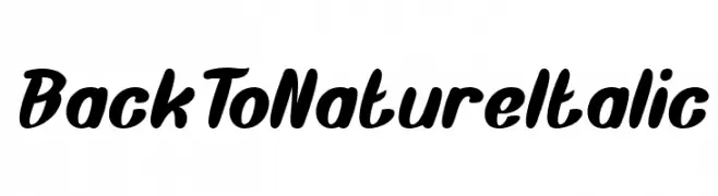
A bold, italicized script font with smooth, rounded characters.
![Back To Nature Italic Frei Schriftart Herunterladen]() Herunterladen 74 Downloads@WebFont
Herunterladen 74 Downloads@WebFont -
( Fonts by Kong Font - Personal-use only. For commercial use please contact owner. )
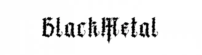
A gothic, black metal-inspired font with sharp, jagged characters.
![Black Metal Frei Schriftart Herunterladen]() Herunterladen 74 Downloads@WebFont
Herunterladen 74 Downloads@WebFont -
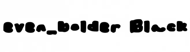
( Brain Fonts - twitter.com/brothacheese )
A bold, rounded font with a playful and robust appearance.
![even_bolder Black Frei Schriftart Herunterladen]() Herunterladen 74 Downloads@WebFont
Herunterladen 74 Downloads@WebFont -
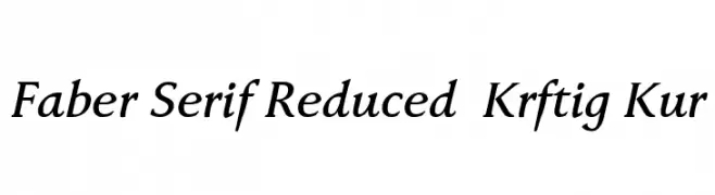
( Fonts by ingoFonts - Ingo Zimmermann - Personal-use only. For commercial use please contact owner. )
A classic serif font with elegant italics and moderate contrast.
![Faber Serif Reduced 66 Kräftig Kur Frei Schriftart Herunterladen]() Herunterladen 74 Downloads@WebFont
Herunterladen 74 Downloads@WebFont -
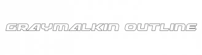
( Iconian Fonts - Daniel Zadorozny - www.iconian.com )
A bold, geometric outline font with a futuristic and modern style.
![Graymalkin Outline Frei Schriftart Herunterladen]() Herunterladen 74 Downloads@WebFont
Herunterladen 74 Downloads@WebFont -
( Floodfonts - www.floodfonts.com )
A bold, gothic-style font with sharp angles and thick strokes, ideal for dramatic headlines.
![Multikultur ExtraBold Frei Schriftart Herunterladen]() Herunterladen 74 Downloads@WebFont
Herunterladen 74 Downloads@WebFont -
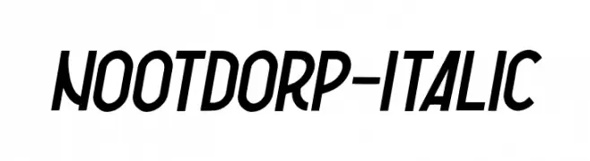
( Fonts by Garisman Studio - Risman Ginarwan - Personal-use only. For commercial use please contact owner. )
A bold, italic font with a dynamic and energetic style.
![Nootdorp-Italic Frei Schriftart Herunterladen]() Herunterladen 74 Downloads@WebFont
Herunterladen 74 Downloads@WebFont -
( Fonts by Motokiwo - Anton Cahyono - Personal-use only. For commercial use please contact owner. )
A modern, sleek font with tall, narrow characters and high contrast strokes.
![Modric Frei Schriftart Herunterladen]() Herunterladen 74 Downloads@WebFont
Herunterladen 74 Downloads@WebFont -
( Fonts by douglas vitkauskas - Personal-use only. For commercial use please contact owner. )
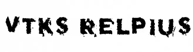
A distressed, grungy font with rough, irregular edges for an edgy look.
![Vtks Relpius Frei Schriftart Herunterladen]() Herunterladen 74 Downloads@WebFont
Herunterladen 74 Downloads@WebFont -
( Fonts by Edric Studio - Personal-use only. For commercial use please contact owner. )
A dynamic and flowing script font with elegant, cursive letterforms.
![Greatest Show Demo Frei Schriftart Herunterladen]() Herunterladen 74 Downloads@WebFont
Herunterladen 74 Downloads@WebFont -
( Fonts by Faqih Fawaji - Personal-use only. For commercial use please contact owner. )
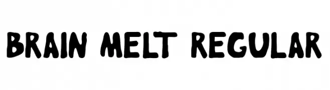
A bold, playful font with a hand-drawn, melted appearance.
![Brain Melt regular Frei Schriftart Herunterladen]() Herunterladen 74 Downloads@WebFont
Herunterladen 74 Downloads@WebFont -
( Fonts by weknow - Wino S Kadir - Personal-use only. For commercial use please contact owner. )
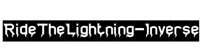
A bold, angular font with sharp, lightning-inspired serifs, perfect for dynamic and energetic designs.
![Ride The Lightning-Inverse Frei Schriftart Herunterladen]() Herunterladen 74 Downloads@WebFont
Herunterladen 74 Downloads@WebFont -
( Fonts by Chequered Ink )
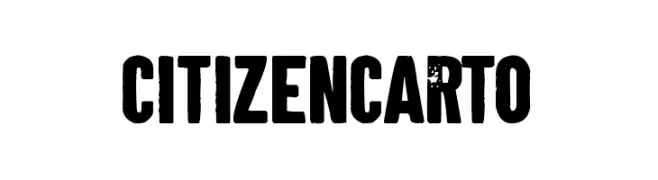
A bold, distressed font with a vintage, rugged appearance.
![Citizen Carto Frei Schriftart Herunterladen]() Herunterladen 74 Downloads@WebFont
Herunterladen 74 Downloads@WebFont -
( Fonts by Maulana Creative )
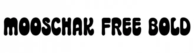
A bold, playful font with rounded, bubbly characters and a whimsical style.
![Mooschak Free Bold Frei Schriftart Herunterladen]() Herunterladen 74 Downloads@WebFont
Herunterladen 74 Downloads@WebFont -
( Fonts by Linecreative - ARI JUANDA - Personal-use only. For commercial use please contact owner. )
A bold, blocky font with strong, angular characters ideal for impactful designs.
![Phyco Frei Schriftart Herunterladen]() Herunterladen 74 Downloads@WebFont
Herunterladen 74 Downloads@WebFont -
( Fonts by Mozatype - Personal-use only. For commercial use please contact owner. )
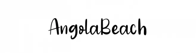
A playful, casual handwritten font with smooth, flowing curves.
![Angola Beach Frei Schriftart Herunterladen]() Herunterladen 74 Downloads@WebFont
Herunterladen 74 Downloads@WebFont -
( Woodcutter - woodcutter Manero - www.woodcutter.es )
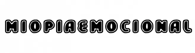
A bold, playful font with rounded edges and a bubble-like appearance.
![Miopia Emocional Frei Schriftart Herunterladen]() Herunterladen 74 Downloads@WebFont
Herunterladen 74 Downloads@WebFont -
( Fonts by kokostd - Haris Anggar - Personal-use only. For commercial use please contact owner. )
A bold, angular, and geometric font with a futuristic style.
![Rosewell Frei Schriftart Herunterladen]() Herunterladen 74 Downloads@WebFont
Herunterladen 74 Downloads@WebFont -
( Iconian Fonts - Daniel Zadorozny - www.iconian.com )
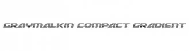
A futuristic, gradient-style font with a compact and dynamic design.
![Graymalkin Compact Gradient Frei Schriftart Herunterladen]() Herunterladen 74 Downloads@WebFont
Herunterladen 74 Downloads@WebFont -
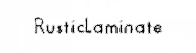
( Brian McFeely )
A rustic, hand-drawn font with a textured, vintage appearance.
![Rustic Laminate Frei Schriftart Herunterladen]() Herunterladen 74 Downloads@WebFont
Herunterladen 74 Downloads@WebFont -
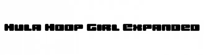
( Fonts by Daniel Zadorozny - www.iconian.com - Personal-use only. For commercial use please contact owner. )
A bold, rounded font with a playful and energetic style.
![Hula Hoop Girl Expanded Frei Schriftart Herunterladen]() Herunterladen 74 Downloads@WebFont
Herunterladen 74 Downloads@WebFont -
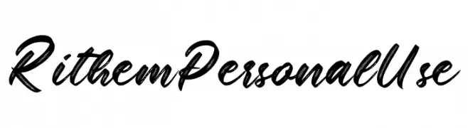
( Fonts by Din Studio - Donis Miftahudin - Personal-use only. For commercial use please contact owner. )
A dynamic script font with fluid, brush-like strokes and a handcrafted feel.
![Rithem Personal Use Frei Schriftart Herunterladen]() Herunterladen 74 Downloads@WebFont
Herunterladen 74 Downloads@WebFont -
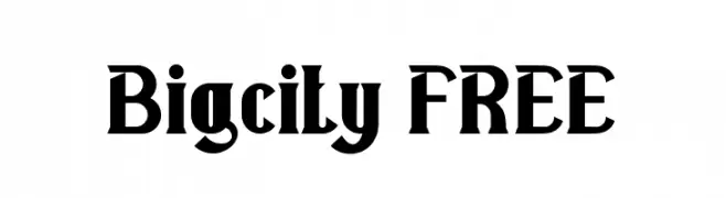
( Fonts by Vunira Design - Personal-use only. For commercial use please contact owner. )
A bold, angular serif font with a modern vintage flair.
![Bigcity FREE Frei Schriftart Herunterladen]() Herunterladen 74 Downloads@WebFont
Herunterladen 74 Downloads@WebFont


Welche Schriften sind gerade am populärsten?
Poppins, Roboto, Montserrat, Open Sans und Lato sind wegen ihrer klaren Formen und breiten Einsetzbarkeit sehr gefragt – von Markenauftritt über Landingpages bis hin zu Postern.
Welche Fonts eignen sich für Logos?
Geometrische Sans‑Serifs (z. B. Poppins, Familien im Gotham‑Stil) sind ein häufiger Griff für sauberes, skalierbares Branding. Für eine persönlichere Note bleiben Scripts und Handschrift‑Stile beliebt. Kombinieren Sie einen prägnanten Headline‑Font mit einer neutralen Brotschrift für Wiedererkennung und Harmonie.
Wie oft wird die Top‑Liste aktualisiert?
Regelmäßig – basierend auf realen Downloads und Interaktionen. Schauen Sie öfter vorbei, um aufstrebende Favoriten früh zu entdecken.
💡 Tipp: Seite bookmarken – Trends wechseln schnell, und heutige Top‑Schriften inspirieren morgen vielleicht das Rebranding.