Willkommen bei den Top‑Schriften – hier treffen Beliebtheit und Qualität aufeinander. Das sind die in diesem Jahr am häufigsten heruntergeladenen und genutzten Fonts. Wenn Sie sichere Optionen für Logo, Web oder Social suchen, starten Sie hier.
Jeder Top‑Font überzeugt durch Balance, Lesbarkeit und Vielseitigkeit. Sie finden moderne Sans‑Serifs, elegante Scripts, Vintage‑Serifs und minimalistische Displays.
-
( www.peax-webdesign.com )
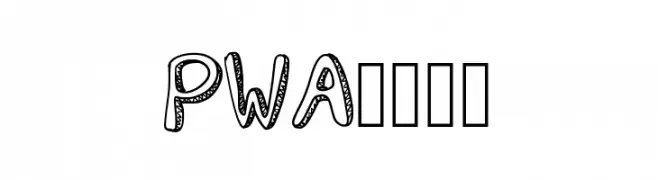
A playful, decorative font with bold, outlined letters and intricate dot patterns.
 Herunterladen 74 Downloads@WebFont
 -
( Fonts by Vladimir Nikolic )
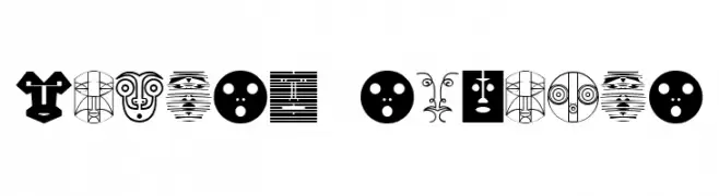
An abstract, decorative font with intricate geometric designs.
![Munari Regular Frei Schriftart Herunterladen]() Herunterladen 74 Downloads@WebFont
Herunterladen 74 Downloads@WebFont -
( Fonts by Glyphstyle - Dimas Ardhi - Personal-use only. For commercial use please contact owner. )
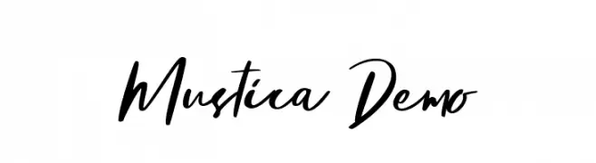
A dynamic, handwritten-style font with fluid strokes and a modern, artistic flair.
![Mustica Demo Frei Schriftart Herunterladen]() Herunterladen 74 Downloads@WebFont
Herunterladen 74 Downloads@WebFont -
( Fonts by Letterhend Studio - Hendry Juanda - Personal-use only. For commercial use please contact owner. )
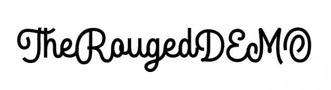
A playful, handwritten-style font with smooth curves and a whimsical charm.
![TheRougedDEMO Frei Schriftart Herunterladen]() Herunterladen 74 Downloads@WebFont
Herunterladen 74 Downloads@WebFont -
( Fonts by Omaikraf Studio - Omaikraf - Personal-use only. For commercial use please contact owner. )
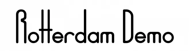
A modern, geometric font with tall, narrow uppercase letters and balanced lowercase characters.
![Rotterdam Demo Frei Schriftart Herunterladen]() Herunterladen 74 Downloads@WebFont
Herunterladen 74 Downloads@WebFont -
( Fonts by Looseleaf Fonts - Personal-use only. For commercial use please contact owner. )
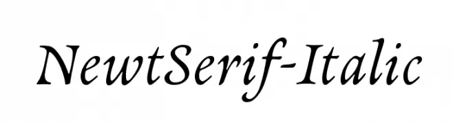
An elegant serif font with a classic italic slant and refined details.
![NewtSerif-Italic Frei Schriftart Herunterladen]() Herunterladen 74 Downloads@WebFont
Herunterladen 74 Downloads@WebFont -
( Fonts by Typodermic Fonts - Raymond Larabie - Personal-use only. For commercial use please contact owner. )
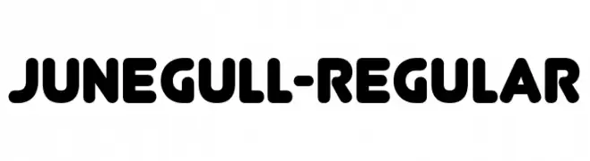
A bold, rounded font with smooth curves and uniform strokes.
![Junegull-Regular Frei Schriftart Herunterladen]() Herunterladen 74 Downloads@WebFont
Herunterladen 74 Downloads@WebFont -
( Fonts by Adevio Studio - Personal-use only. For commercial use please contact owner. )
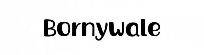
A playful, bold font with rounded edges and a modern, approachable style.
![Bornywale Frei Schriftart Herunterladen]() Herunterladen 74 Downloads@WebFont
Herunterladen 74 Downloads@WebFont -
( Carl Krull - www.carlkrull.dk )
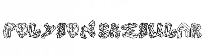
A geometric, polygonal font with a modern and artistic style.
![Polygons Regular Frei Schriftart Herunterladen]() Herunterladen 74 Downloads@WebFont
Herunterladen 74 Downloads@WebFont -
( CROLrene )
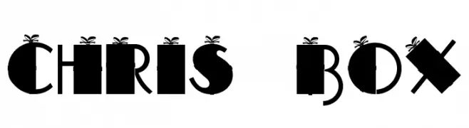
A festive, gift box-themed font with bold, geometric characters and ribbon accents.
![CHRIS BOX Frei Schriftart Herunterladen]() Herunterladen 74 Downloads@WebFont
Herunterladen 74 Downloads@WebFont -
( Iconian Fonts - Daniel Zadorozny - www.iconian.com )
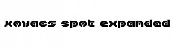
A bold, geometric font with a futuristic and modern aesthetic.
![Kovacs Spot Expanded Frei Schriftart Herunterladen]() Herunterladen 74 Downloads@WebFont
Herunterladen 74 Downloads@WebFont -
( Fonts by Creatype Studio )
A delicate, cursive handwritten font with flowing lines and elegant strokes.
![Anastasya Regular Frei Schriftart Herunterladen]() Herunterladen 74 Downloads@WebFont
Herunterladen 74 Downloads@WebFont -
( Fonts by Sayed Musnazi )
A flowing, cursive script font with elegant, interconnected characters.
![Exchange Frei Schriftart Herunterladen]() Herunterladen 74 Downloads@WebFont
Herunterladen 74 Downloads@WebFont -
( weknow - Wino S Kadir - www.creativefabrica.com/designer/weknow/ )
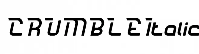
A bold, italicized font with a modern, dynamic style and sharp angles.
![CRUMBLE Italic Frei Schriftart Herunterladen]() Herunterladen 74 Downloads@WebFont
Herunterladen 74 Downloads@WebFont -
( Fonts by Wino S Kadir - weknow - www.revolge.com/shop/weknow/ - Personal-use only. For commercial use please contact owner. )
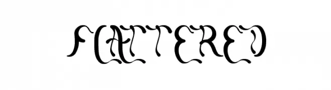
A decorative and whimsical serif font with elaborate curves and swirls.
![flattered Frei Schriftart Herunterladen]() Herunterladen 74 Downloads@WebFont
Herunterladen 74 Downloads@WebFont -
( Fonts by Gartype Studio - Gartype Studio - Personal-use only. For commercial use please contact owner. )
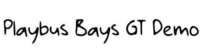
A playful, handwritten font with bold, rounded characters and a whimsical style.
![Playbus Bays GT Demo Frei Schriftart Herunterladen]() Herunterladen 74 Downloads@WebFont
Herunterladen 74 Downloads@WebFont -
( weknow - Wino S Kadir - www.creativefabrica.com/designer/weknow/ )
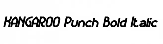
A bold, italic font with a dynamic and modern style.
![KANGAROO Punch Bold Italic Frei Schriftart Herunterladen]() Herunterladen 74 Downloads@WebFont
Herunterladen 74 Downloads@WebFont -
( Dry Heaves - www.drybohnz.com/ )
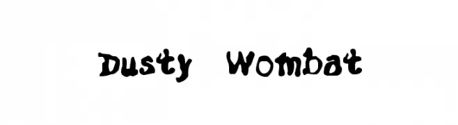
A bold, playful font with a hand-drawn, whimsical style.
![Dusty Wombat Frei Schriftart Herunterladen]() Herunterladen 74 Downloads@WebFont
Herunterladen 74 Downloads@WebFont -
( Fonts by Letterative Studio )
A playful, casual handwritten font with dynamic strokes and lively character.
![Girlmind Frei Schriftart Herunterladen]() Herunterladen 74 Downloads@WebFont
Herunterladen 74 Downloads@WebFont -
( Fonts by Vladimir Nikolic - https://www.creativefabrica.com/product/educated-deers/ref/144265/ - Personal-use only. For commercial use please contact owner. )
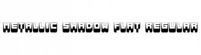
A bold, 3D font with a metallic shadow effect, perfect for impactful designs.
![Metallic Shadow Flat Regular Frei Schriftart Herunterladen]() Herunterladen 74 Downloads@WebFont
Herunterladen 74 Downloads@WebFont -
( Fonts by Kong Font - Personal-use only. For commercial use please contact owner. )
A playful, handwritten font with a whimsical and charming style.
![Babyface Frei Schriftart Herunterladen]() Herunterladen 74 Downloads@WebFont
Herunterladen 74 Downloads@WebFont -
( Fonts by Vladimir Nikolic - www.creativefabrica.com/designer/vladimirnikolic/ - Personal-use only. For commercial use please contact owner. )
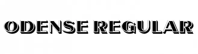
A bold, three-dimensional font with strong shadow effects and a vintage-inspired style.
![Odense Regular Frei Schriftart Herunterladen]() Herunterladen 74 Downloads@WebFont
Herunterladen 74 Downloads@WebFont -
( Fonts by D&K Project - Degi Kurniawan - Personal-use only. For commercial use please contact owner. )
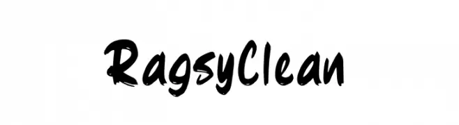
A bold, dynamic handwritten font with a brush-like texture.
![Ragsy Clean Frei Schriftart Herunterladen]() Herunterladen 74 Downloads@WebFont
Herunterladen 74 Downloads@WebFont -
( Sean Noonan - www.sean-noonan.com )
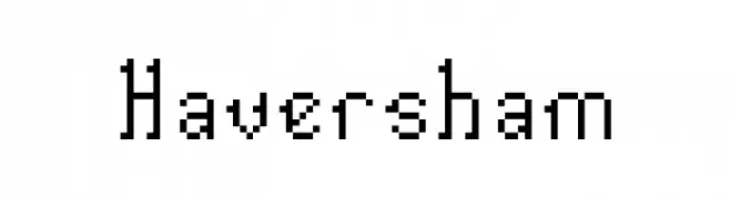
A pixelated, retro-style font with a digital, grid-like appearance.
![Haversham Frei Schriftart Herunterladen]() Herunterladen 74 Downloads@WebFont
Herunterladen 74 Downloads@WebFont -
( BRIDGEco - bridgeco.jp/ )
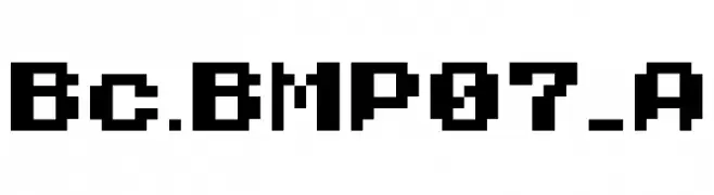
A bold, pixelated font with a retro digital style.
![Bc.BMP07_A Frei Schriftart Herunterladen]() Herunterladen 74 Downloads@WebFont
Herunterladen 74 Downloads@WebFont -
( Fonts by Haksen Studio - Sarwo Edhi Prayitno - Personal-use only. For commercial use please contact owner. )
A lively, expressive handwritten font with fluid, dynamic strokes.
![Different - Personal Use Frei Schriftart Herunterladen]() Herunterladen 74 Downloads@WebFont
Herunterladen 74 Downloads@WebFont -
( Fonts by www.woodcutter.es - woodcutter Manero - Personal-use only. For commercial use please contact owner. )
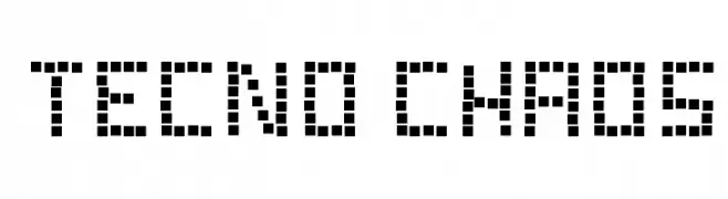
A pixelated, retro-style font with a blocky, geometric design.
![Tecno Chaos Frei Schriftart Herunterladen]() Herunterladen 74 Downloads@WebFont
Herunterladen 74 Downloads@WebFont -
( Fonts by Pen Culture - Revo Farisky - Personal-use only. For commercial use please contact owner. )
A dynamic and elegant script font with fluid, connected letterforms.
![Thailand Frei Schriftart Herunterladen]() Herunterladen 74 Downloads@WebFont
Herunterladen 74 Downloads@WebFont -
( Fonts by Iconian Fonts )
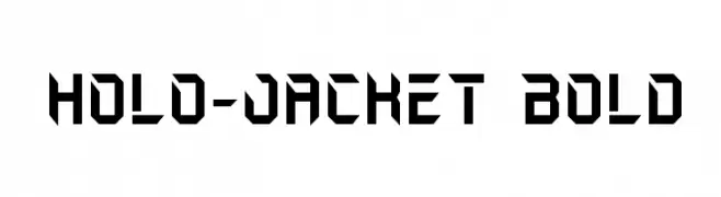
A bold, futuristic font with sharp, angular edges and a geometric design.
![Holo-Jacket Bold Frei Schriftart Herunterladen]() Herunterladen 74 Downloads@WebFont
Herunterladen 74 Downloads@WebFont -
( Vladimir Nikolic - www.coroflot.com/vladimirnikolic )
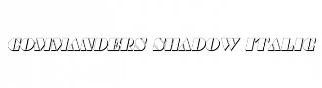
Bold, italicized font with a shadow effect for a dynamic, three-dimensional look.
![Commanders Shadow Italic Frei Schriftart Herunterladen]() Herunterladen 74 Downloads@WebFont
Herunterladen 74 Downloads@WebFont -
( Fonts by Iconian Fonts )
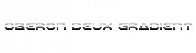
A futuristic, geometric font with a striped, gradient-like design.
![Oberon Deux Gradient Frei Schriftart Herunterladen]() Herunterladen 74 Downloads@WebFont
Herunterladen 74 Downloads@WebFont -
( Fonts by ilhamtaro - Personal-use only. For commercial use please contact owner. )
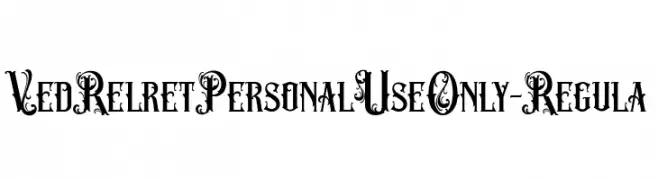
An ornate and decorative font with intricate swirls and embellishments.
![VedRelretPersonalUseOnly-Regula Frei Schriftart Herunterladen]() Herunterladen 74 Downloads@WebFont
Herunterladen 74 Downloads@WebFont -
( Iconian Fonts - Daniel Zadorozny - www.iconian.com )
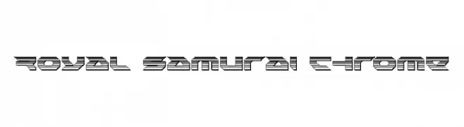
A bold, futuristic font with a 3D layered line effect.
![Royal Samurai Chrome Frei Schriftart Herunterladen]() Herunterladen 74 Downloads@WebFont
Herunterladen 74 Downloads@WebFont -
( Fonts by Edric Studio - Personal-use only. For commercial use please contact owner. )
A bold, geometric font with blocky, angular letterforms.
![FORNEVER DEMO Frei Schriftart Herunterladen]() Herunterladen 74 Downloads@WebFont
Herunterladen 74 Downloads@WebFont -
( Iconian Fonts - Daniel Zadorozny - www.iconian.com )
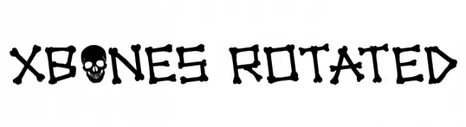
A playful, bone-themed font perfect for spooky designs.
![xBONES Rotated Frei Schriftart Herunterladen]() Herunterladen 74 Downloads@WebFont
Herunterladen 74 Downloads@WebFont


Welche Schriften sind gerade am populärsten?
Poppins, Roboto, Montserrat, Open Sans und Lato sind wegen ihrer klaren Formen und breiten Einsetzbarkeit sehr gefragt – von Markenauftritt über Landingpages bis hin zu Postern.
Welche Fonts eignen sich für Logos?
Geometrische Sans‑Serifs (z. B. Poppins, Familien im Gotham‑Stil) sind ein häufiger Griff für sauberes, skalierbares Branding. Für eine persönlichere Note bleiben Scripts und Handschrift‑Stile beliebt. Kombinieren Sie einen prägnanten Headline‑Font mit einer neutralen Brotschrift für Wiedererkennung und Harmonie.
Wie oft wird die Top‑Liste aktualisiert?
Regelmäßig – basierend auf realen Downloads und Interaktionen. Schauen Sie öfter vorbei, um aufstrebende Favoriten früh zu entdecken.
💡 Tipp: Seite bookmarken – Trends wechseln schnell, und heutige Top‑Schriften inspirieren morgen vielleicht das Rebranding.