Willkommen bei den Top‑Schriften – hier treffen Beliebtheit und Qualität aufeinander. Das sind die in diesem Jahr am häufigsten heruntergeladenen und genutzten Fonts. Wenn Sie sichere Optionen für Logo, Web oder Social suchen, starten Sie hier.
Jeder Top‑Font überzeugt durch Balance, Lesbarkeit und Vielseitigkeit. Sie finden moderne Sans‑Serifs, elegante Scripts, Vintage‑Serifs und minimalistische Displays.
-
( David Lindecrantz - lindecrantz.com/ )
A bold, pixelated font inspired by retro digital displays.
 Herunterladen 73 Downloads@WebFont
 -
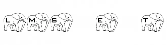
( London's Letters - www.londonsletters.com/ )
A decorative font with characters integrated into elephant motifs.
![LMS Elephant Tattoo Frei Schriftart Herunterladen]() Herunterladen 73 Downloads@WebFont
Herunterladen 73 Downloads@WebFont -
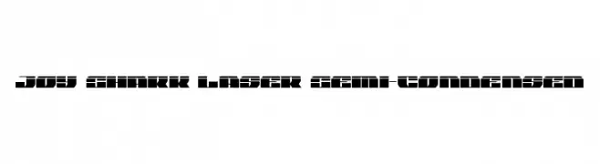
![Joy Shark Laser Semi-Condensed Frei Schriftart Herunterladen]() Herunterladen 73 Downloads@WebFont
Herunterladen 73 Downloads@WebFont -
( Fonts by Ditya Ananto )
A bold, circular font with geometric lines and a modern art deco flair.
![Bombastis Frei Schriftart Herunterladen]() Herunterladen 73 Downloads@WebFont
Herunterladen 73 Downloads@WebFont -
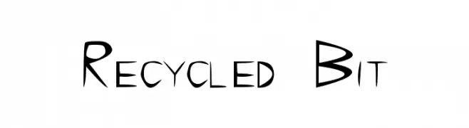
( AlnelExtreme - Alnel Vincent Alico - www.alnelextreme.webs.com )
A playful, hand-drawn font with irregular strokes and a quirky style.
![Recycled Bit Frei Schriftart Herunterladen]() Herunterladen 73 Downloads@WebFont
Herunterladen 73 Downloads@WebFont -
( Fonts by Aqeela Studio - Muhammad Nasir - Personal-use only. For commercial use please contact owner. )
A whimsical, decorative font with heart embellishments and flowing script.
![Agatha Frei Schriftart Herunterladen]() Herunterladen 73 Downloads@WebFont
Herunterladen 73 Downloads@WebFont -
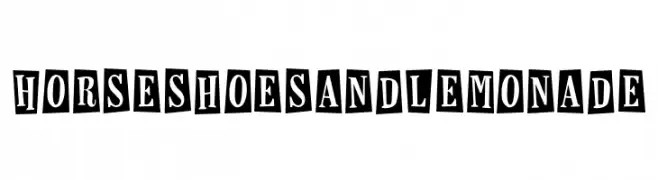
![Horseshoes and Lemonade Frei Schriftart Herunterladen]() Herunterladen 73 Downloads@WebFont
Herunterladen 73 Downloads@WebFont -
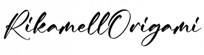
( Fonts by Integritype Studio )
![Rikamell Origami Frei Schriftart Herunterladen]() Herunterladen 73 Downloads@WebFont
Herunterladen 73 Downloads@WebFont -
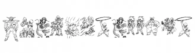
( Fonts by Zanatlija - Personal-use only. For commercial use please contact owner. )
A decorative display font made of detailed character illustrations.
![Dragon ball tfb Frei Schriftart Herunterladen]() Herunterladen 73 Downloads@WebFont
Herunterladen 73 Downloads@WebFont -
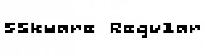
( Fonts by Winter Design Studio - winty5.wixsite.com/noahtheawesome/ - Personal-use only. For commercial use please contact owner. )
A bold, pixelated font with a geometric, digital aesthetic.
![5Skware Regular Frei Schriftart Herunterladen]() Herunterladen 73 Downloads@WebFont
Herunterladen 73 Downloads@WebFont -
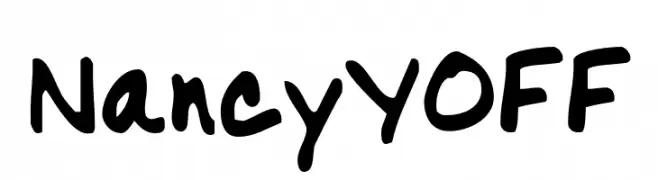
( Fonts by Your Own Font - Ellinor Rapp - Personal-use only. For commercial use please contact owner. )
A bold, handwritten font with a playful and casual style.
![NancyYOFF Frei Schriftart Herunterladen]() Herunterladen 73 Downloads@WebFont
Herunterladen 73 Downloads@WebFont -
( weknow - Wino S Kadir - www.creativefabrica.com/designer/weknow/ )
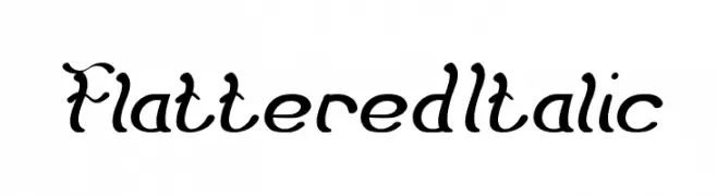
A whimsical, cursive font with elegant curves and decorative flourishes.
![Flattered Italic Frei Schriftart Herunterladen]() Herunterladen 73 Downloads@WebFont
Herunterladen 73 Downloads@WebFont -
( Fonts by Linafis Studio - Ahmad Fashihullisan - Personal-use only. For commercial use please contact owner. )
A playful, handwritten font with bold, rounded characters.
![CRUNCHY STICK Frei Schriftart Herunterladen]() Herunterladen 73 Downloads@WebFont
Herunterladen 73 Downloads@WebFont -
( Joorgemoron@gmail.com )
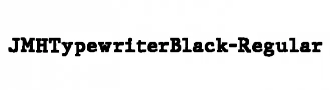
A bold, monospaced typewriter-style font with a vintage feel.
![JMHTypewriterBlack-Regular Frei Schriftart Herunterladen]() Herunterladen 73 Downloads@WebFont
Herunterladen 73 Downloads@WebFont -
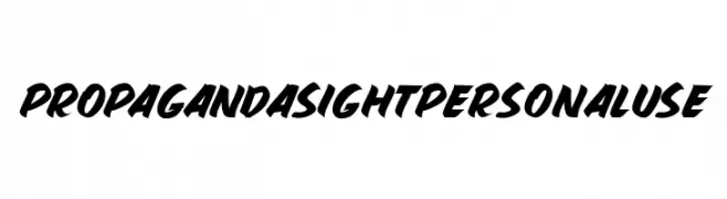
![PROPAGANDA SIGHT PERSONAL USE Frei Schriftart Herunterladen]() Herunterladen 73 Downloads@WebFont
Herunterladen 73 Downloads@WebFont -
( Fonts by Arterfak Project - Ahmad Ramzi Fahruddin - Personal-use only. For commercial use please contact owner. )
A bold, vintage-inspired font with sharp edges and a strong presence.
![Hermona Frei Schriftart Herunterladen]() Herunterladen 73 Downloads@WebFont
Herunterladen 73 Downloads@WebFont -
( Fonts by Zetafonts - Personal-use only. For commercial use please contact owner. )
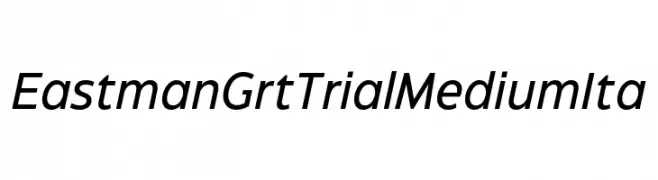
A modern, italic sans-serif font with clean lines and balanced proportions.
![Eastman Grt Trial Medium Ita Frei Schriftart Herunterladen]() Herunterladen 73 Downloads@WebFont
Herunterladen 73 Downloads@WebFont -
( Fonts by Rvandtype - Randi Irvan - Personal-use only. For commercial use please contact owner. )
A playful handwritten font with a friendly and casual style.
![HolidayFunday Frei Schriftart Herunterladen]() Herunterladen 73 Downloads@WebFont
Herunterladen 73 Downloads@WebFont -
( Zetafonts - www.zetafonts.com )
A bold, italic font with rounded edges and a dynamic style.
![KabrioAbarth-ExtraBoldItalic Frei Schriftart Herunterladen]() Herunterladen 73 Downloads@WebFont
Herunterladen 73 Downloads@WebFont -
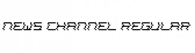
( Het Lettertype Van Duitsland - William Hallworth-Cook )
A pixelated, retro-style font with a digital display aesthetic.
![News Channel Regular Frei Schriftart Herunterladen]() Herunterladen 73 Downloads@WebFont
Herunterladen 73 Downloads@WebFont -
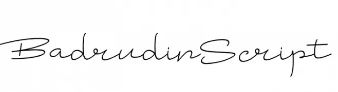
( Fonts by Joko Triwijayanto )
A modern script font with elegant, flowing lines and high contrast.
![Badrudin Script Frei Schriftart Herunterladen]() Herunterladen 73 Downloads@WebFont
Herunterladen 73 Downloads@WebFont -
![Notalot25 Regular Frei Schriftart Herunterladen]() Herunterladen 73 Downloads@WebFont
Herunterladen 73 Downloads@WebFont -
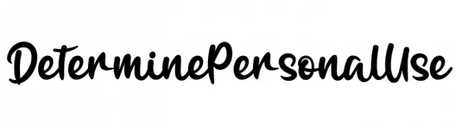
( Fonts by twinletter - Rozikan - Personal-use only. For commercial use please contact owner. )
A bold, flowing script font with elegant and dynamic strokes.
![Determine Personal Use Frei Schriftart Herunterladen]() Herunterladen 73 Downloads@WebFont
Herunterladen 73 Downloads@WebFont -
( Fonts by Erik Studio - Personal-use only. For commercial use please contact owner. )
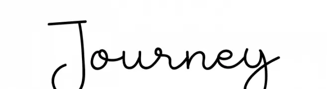
A playful, casual handwritten font with smooth, flowing lines and a whimsical touch.
![Journey Frei Schriftart Herunterladen]() Herunterladen 73 Downloads@WebFont
Herunterladen 73 Downloads@WebFont -
( Fonts by DmLetter31 - Dimas Prasetyo - Personal-use only. For commercial use please contact owner. )
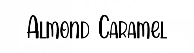
A playful, whimsical font with tall, narrow letters and rounded edges.
![Almond Caramel Frei Schriftart Herunterladen]() Herunterladen 73 Downloads@WebFont
Herunterladen 73 Downloads@WebFont -
( Fonts by MJB Letters - Muhammad Mujibulloh - Personal-use only. For commercial use please contact owner. )
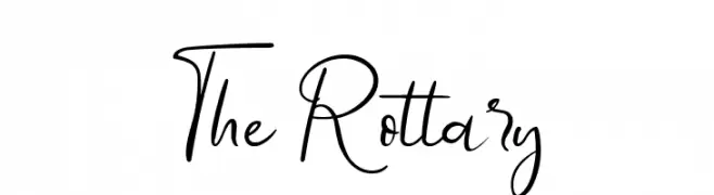
A cursive, handwritten-style font with elegant loops and fluid strokes.
![The Rottary Frei Schriftart Herunterladen]() Herunterladen 73 Downloads@WebFont
Herunterladen 73 Downloads@WebFont -
( Fonts by GGBot - www.ggbot.net - Personal-use only. For commercial use please contact owner. )
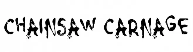
A rugged, distressed font with a chaotic, edgy appearance.
![Chainsaw Carnage Frei Schriftart Herunterladen]() Herunterladen 73 Downloads@WebFont
Herunterladen 73 Downloads@WebFont -
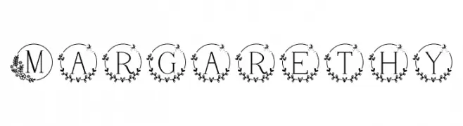
( Fonts by Letterayu )
A decorative font with uppercase letters in floral-adorned circles, ideal for elegant designs.
![Margarethy Frei Schriftart Herunterladen]() Herunterladen 73 Downloads@WebFont
Herunterladen 73 Downloads@WebFont -
( Fonts by Daniel Zadorozny - www.iconian.com - Personal-use only. For commercial use please contact owner. )
A bold, geometric font with sharp angles and a futuristic feel.
![Emerald Beacon Title Frei Schriftart Herunterladen]() Herunterladen 73 Downloads@WebFont
Herunterladen 73 Downloads@WebFont -
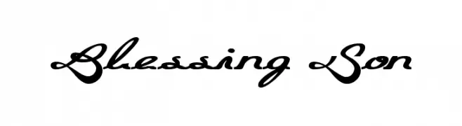
( Fonts by Wino S Kadir - weknow - www.revolge.com/shop/weknow/ - Personal-use only. For commercial use please contact owner. )
An elegant, flowing script font with interconnected cursive lines and artistic flourishes.
![Blessing Son Frei Schriftart Herunterladen]() Herunterladen 73 Downloads@WebFont
Herunterladen 73 Downloads@WebFont -
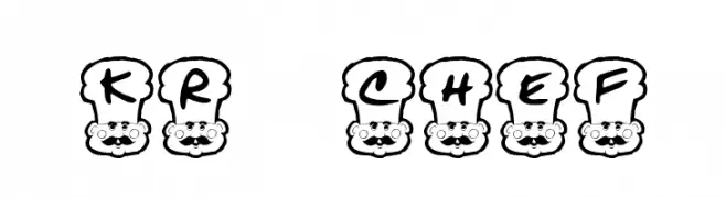
( Fonts by Kat`s Fun Fonts - Personal-use only. For commercial use please contact owner. )
A whimsical font with letters inside cartoon chef hats, perfect for playful designs.
![KR Chef Frei Schriftart Herunterladen]() Herunterladen 73 Downloads@WebFont
Herunterladen 73 Downloads@WebFont -
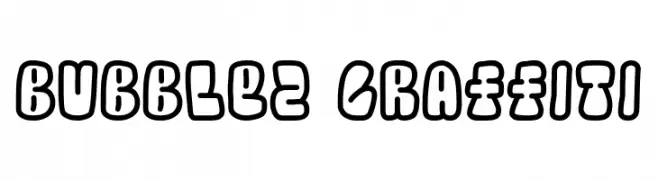
( Fonts by GGBot - www.ggbot.net - Personal-use only. For commercial use please contact owner. )
A bold, playful graffiti-style font with thick, rounded outlines and a bubbly appearance.
![Bubblez Graffiti Frei Schriftart Herunterladen]() Herunterladen 73 Downloads@WebFont
Herunterladen 73 Downloads@WebFont -
( Fonts by Mooniak - Personal-use only. For commercial use please contact owner. )
A modern, geometric sans-serif font with a clean and minimalistic design.
![PostNoBillsColombo Light Frei Schriftart Herunterladen]() Herunterladen 73 Downloads@WebFont
Herunterladen 73 Downloads@WebFont -
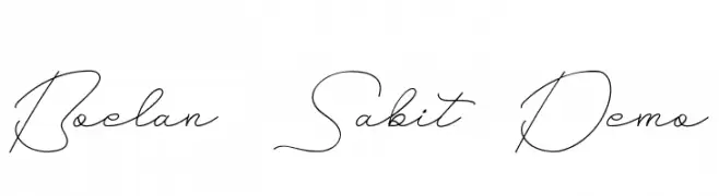
( Fonts by NihStudio )
A flowing, cursive script font with a refined and elegant style.
![Boelan Sabit Demo Frei Schriftart Herunterladen]() Herunterladen 73 Downloads@WebFont
Herunterladen 73 Downloads@WebFont -
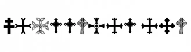
( Fonts by Zanatlija - Personal-use only. For commercial use please contact owner. )
A decorative collection of diverse cross symbols with intricate designs.
![crossbats tfb Frei Schriftart Herunterladen]() Herunterladen 73 Downloads@WebFont
Herunterladen 73 Downloads@WebFont


Welche Schriften sind gerade am populärsten?
Poppins, Roboto, Montserrat, Open Sans und Lato sind wegen ihrer klaren Formen und breiten Einsetzbarkeit sehr gefragt – von Markenauftritt über Landingpages bis hin zu Postern.
Welche Fonts eignen sich für Logos?
Geometrische Sans‑Serifs (z. B. Poppins, Familien im Gotham‑Stil) sind ein häufiger Griff für sauberes, skalierbares Branding. Für eine persönlichere Note bleiben Scripts und Handschrift‑Stile beliebt. Kombinieren Sie einen prägnanten Headline‑Font mit einer neutralen Brotschrift für Wiedererkennung und Harmonie.
Wie oft wird die Top‑Liste aktualisiert?
Regelmäßig – basierend auf realen Downloads und Interaktionen. Schauen Sie öfter vorbei, um aufstrebende Favoriten früh zu entdecken.
💡 Tipp: Seite bookmarken – Trends wechseln schnell, und heutige Top‑Schriften inspirieren morgen vielleicht das Rebranding.