Willkommen bei den Top‑Schriften – hier treffen Beliebtheit und Qualität aufeinander. Das sind die in diesem Jahr am häufigsten heruntergeladenen und genutzten Fonts. Wenn Sie sichere Optionen für Logo, Web oder Social suchen, starten Sie hier.
Jeder Top‑Font überzeugt durch Balance, Lesbarkeit und Vielseitigkeit. Sie finden moderne Sans‑Serifs, elegante Scripts, Vintage‑Serifs und minimalistische Displays.
-
( Fonts by Almarkhatype - Abdul Malik Wisnu - Personal-use only. For commercial use please contact owner. )
An elegant, flowing script font with smooth, cursive letterforms.
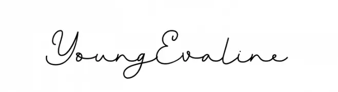 Herunterladen 63 Downloads@WebFont
 -
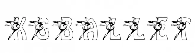
( Katz Fontz - katzfonts.50megs.com/kg.html )
A decorative font combining letters with ballet dancer illustrations.
![KGBALLET Frei Schriftart Herunterladen]() Herunterladen 63 Downloads@WebFont
Herunterladen 63 Downloads@WebFont -
( Fonts by Scratchones )
A decorative font with leaf and flower motifs, perfect for nature-themed designs.
![Leaves Flower Frei Schriftart Herunterladen]() Herunterladen 63 Downloads@WebFont
Herunterladen 63 Downloads@WebFont -
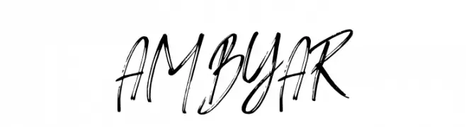
( Fonts by Haksen Studio - Sarwo Edhi Prayitno - Personal-use only. For commercial use please contact owner. )
A dynamic, expressive handwritten font with fluid, cursive strokes.
![AMBYAR Frei Schriftart Herunterladen]() Herunterladen 63 Downloads@WebFont
Herunterladen 63 Downloads@WebFont -
( Fonts by Saffatin co - Personal-use only. For commercial use please contact owner. )
A modern, light sans-serif font with clean lines and excellent readability.
![VistolSans-Light Frei Schriftart Herunterladen]() Herunterladen 63 Downloads@WebFont
Herunterladen 63 Downloads@WebFont -
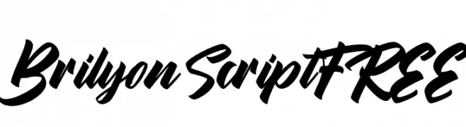
( Fonts by Vunira Design - Personal-use only. For commercial use please contact owner. )
A bold, dynamic script font with fluid, connected letterforms and a modern, elegant style.
![BrilyonScriptFREE Frei Schriftart Herunterladen]() Herunterladen 63 Downloads@WebFont
Herunterladen 63 Downloads@WebFont -
( London's Letters - www.londonsletters.com/ )
A decorative font with bold numerals and detailed horse illustrations.
![LMS Starlight Frei Schriftart Herunterladen]() Herunterladen 63 Downloads@WebFont
Herunterladen 63 Downloads@WebFont -
( Fonts by Yumna Family - yumna Type - Personal-use only. For commercial use please contact owner. )
A modern, elegant cursive font with a handwritten style.
![Saphire Personal Use Frei Schriftart Herunterladen]() Herunterladen 63 Downloads@WebFont
Herunterladen 63 Downloads@WebFont -
( Fonts by Looseleaf Fonts - Personal-use only. For commercial use please contact owner. )
A classic serif font with elegant strokes and refined details.
![Walleye Frei Schriftart Herunterladen]() Herunterladen 63 Downloads@WebFont
Herunterladen 63 Downloads@WebFont -
( Fonts by Woodcutter )
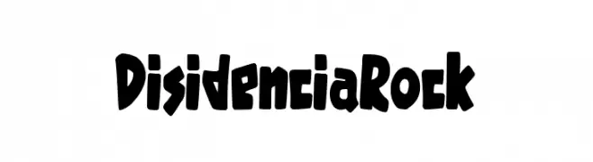
A bold, edgy font with a graffiti-inspired, rebellious style.
![Disidencia Rock Frei Schriftart Herunterladen]() Herunterladen 63 Downloads@WebFont
Herunterladen 63 Downloads@WebFont -
( Fonts by Typographer Mediengestaltung - Personal-use only. For commercial use please contact owner. )
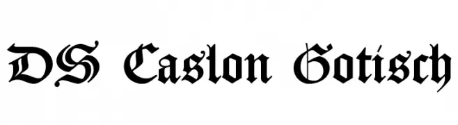
A bold, gothic blackletter font with intricate, angular letterforms.
![DS Caslon Gotisch Frei Schriftart Herunterladen]() Herunterladen 63 Downloads@WebFont
Herunterladen 63 Downloads@WebFont -
( Noto is a trademark of Google Inc. Noto fonts are open source. All Noto fonts are published under the SIL Open Font License, Version 1.1 )
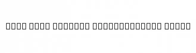
No valid font visible; only placeholder glyphs are shown.
![Noto Sans Myanmar SemiCondensed Black Frei Schriftart Herunterladen]() Herunterladen 63 Downloads@WebFont
Herunterladen 63 Downloads@WebFont -
( Fonts by Maulana Creative - Gilang Maulana - Personal-use only. For commercial use please contact owner. )
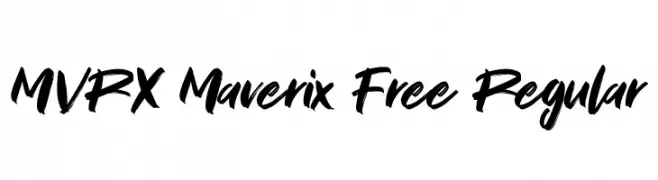
A bold, brush-style script font with dynamic, handwritten strokes.
![MVRX Maverix Free Regular Frei Schriftart Herunterladen]() Herunterladen 63 Downloads@WebFont
Herunterladen 63 Downloads@WebFont -
( BBco. - www.etsy.com/shop/ClairDeLunePixelArt )
An elegant, condensed font with tall, slender characters and delicate curves.
![PerleDeRosee-Condensed Frei Schriftart Herunterladen]() Herunterladen 63 Downloads@WebFont
Herunterladen 63 Downloads@WebFont -
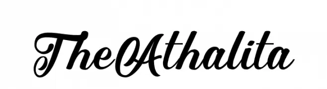
( Fonts by Muh. Taufiq Hidayatullah - Personal-use only. For commercial use please contact owner. )
A stylish and elegant script typeface with a flowing, cursive design.
![TheAthalita Frei Schriftart Herunterladen]() Herunterladen 63 Downloads@WebFont
Herunterladen 63 Downloads@WebFont -
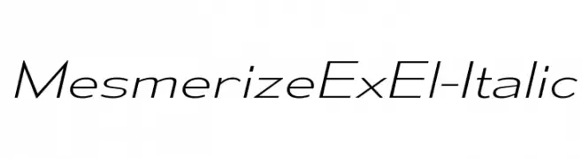
( Typodermic Fonts - Ray Larabie - www.typodermicfonts.com/ )
A sleek, modern italic font with elongated characters and minimal contrast.
![MesmerizeExEl-Italic Frei Schriftart Herunterladen]() Herunterladen 63 Downloads@WebFont
Herunterladen 63 Downloads@WebFont -
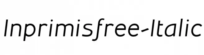
( Savio Bellini - www.bellinistudio.eu )
A modern, italic font with clean lines and a dynamic slant.
![Inprimisfree-Italic Frei Schriftart Herunterladen]() Herunterladen 63 Downloads@WebFont
Herunterladen 63 Downloads@WebFont -
( Noto is a trademark of Google Inc. Noto fonts are open source. All Noto fonts are published under the SIL Open Font License, Version 1.1 )
A classic serif font with semi-condensed, semi-bold, and italic characteristics.
![Noto Serif SemiCondensed SemiBold Italic Frei Schriftart Herunterladen]() Herunterladen 63 Downloads@WebFont
Herunterladen 63 Downloads@WebFont -
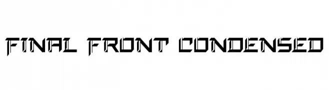
( Fonts by Daniel Zadorozny - www.iconian.com - Personal-use only. For commercial use please contact owner. )
A bold, geometric font with sharp angles and a futuristic style.
![Final Front Condensed Frei Schriftart Herunterladen]() Herunterladen 63 Downloads@WebFont
Herunterladen 63 Downloads@WebFont -
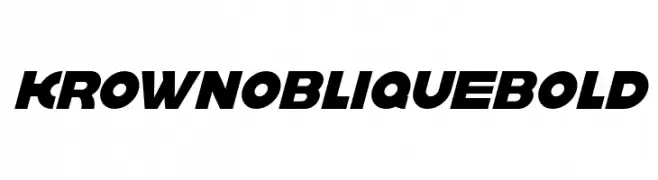
( Fonts by Sigit Nur Wicaksono - Personal-use only. For commercial use please contact owner. )
A bold, oblique font with a modern, dynamic style and tight character spacing.
![krown oblique Bold Frei Schriftart Herunterladen]() Herunterladen 63 Downloads@WebFont
Herunterladen 63 Downloads@WebFont -
( Fonts by www.junkohanhero.com - Personal-use only. For commercial use please contact owner. )
A whimsical, hand-drawn font with wobbly, irregular lines.
![Strawobbly Frei Schriftart Herunterladen]() Herunterladen 63 Downloads@WebFont
Herunterladen 63 Downloads@WebFont -
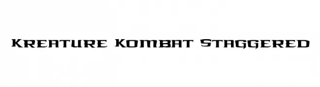
( Iconian Fonts - Daniel Zadorozny - www.iconian.com )
Bold, angular font with a staggered, aggressive style.
![Kreature Kombat Staggered Frei Schriftart Herunterladen]() Herunterladen 63 Downloads@WebFont
Herunterladen 63 Downloads@WebFont -
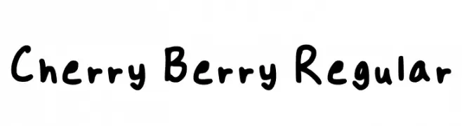
( Fonts by cherry7 - Personal-use only. For commercial use please contact owner. )
A playful handwritten font with rounded, irregular characters.
![Cherry Berry Regular Frei Schriftart Herunterladen]() Herunterladen 63 Downloads@WebFont
Herunterladen 63 Downloads@WebFont -
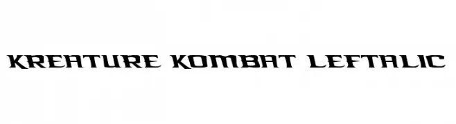
( Iconian Fonts - Daniel Zadorozny - www.iconian.com )
A bold, angular font with a dynamic, aggressive style.
![Kreature Kombat Leftalic Frei Schriftart Herunterladen]() Herunterladen 63 Downloads@WebFont
Herunterladen 63 Downloads@WebFont -
( IviLand - Iván Coello )
A monospaced font designed for clear and structured fraction representation.
![Fractionss AZERTY Regular Frei Schriftart Herunterladen]() Herunterladen 63 Downloads@WebFont
Herunterladen 63 Downloads@WebFont -
( Fonts by vroz studio - Personal-use only. For commercial use please contact owner. )
A dynamic, cursive handwritten font with fluid strokes and connected letters.
![AUSTIN Frei Schriftart Herunterladen]() Herunterladen 63 Downloads@WebFont
Herunterladen 63 Downloads@WebFont -
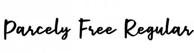
( Fonts by Craft Supply Co - Personal-use only. For commercial use please contact owner. )
A bold, expressive handwritten font with fluid, interconnected strokes.
![Parcely Free Regular Frei Schriftart Herunterladen]() Herunterladen 63 Downloads@WebFont
Herunterladen 63 Downloads@WebFont -
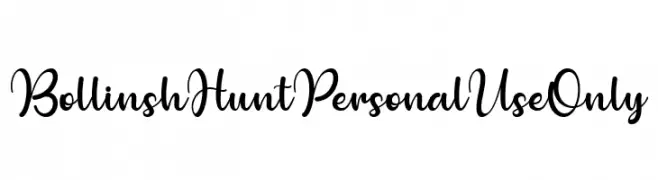
( Fonts by Ditoollis Project - Muhammad Faizal Said - Personal-use only. For commercial use please contact owner. )
A flowing, cursive font with elegant, sweeping strokes and a handwritten appearance.
![Bollinsh Hunt Personal Use Only Frei Schriftart Herunterladen]() Herunterladen 63 Downloads@WebFont
Herunterladen 63 Downloads@WebFont -
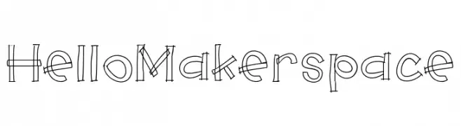
( Jen Jones - www.jenjonesfonts.com )
A playful, hand-drawn font with a sketch-like, double-line design.
![HelloMakerspace Frei Schriftart Herunterladen]() Herunterladen 63 Downloads@WebFont
Herunterladen 63 Downloads@WebFont -
( Fonts by Hanzel Space - Personal-use only. For commercial use please contact owner. )
A bold, flowing script font with elegant curves and high contrast.
![Sinethar Frei Schriftart Herunterladen]() Herunterladen 63 Downloads@WebFont
Herunterladen 63 Downloads@WebFont -
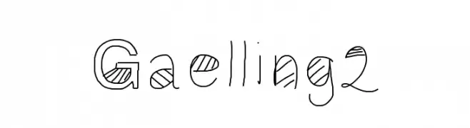
( Gaelleing )
A playful, geometric, and hand-drawn font with bold outlines and textured interiors.
![Gaelling2 Frei Schriftart Herunterladen]() Herunterladen 63 Downloads@WebFont
Herunterladen 63 Downloads@WebFont -
( Iconian Fonts - Daniel Zadorozny - www.iconian.com )
A bold, futuristic font with geometric, outlined characters.
![Command Override Academy Frei Schriftart Herunterladen]() Herunterladen 63 Downloads@WebFont
Herunterladen 63 Downloads@WebFont -
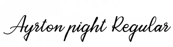
( Fonts by Attract Studio - Personal-use only. For commercial use please contact owner. )
A cursive script font with elegant, flowing strokes and interconnected letters.
![Ayrton pight Regular Frei Schriftart Herunterladen]() Herunterladen 63 Downloads@WebFont
Herunterladen 63 Downloads@WebFont -
( Fonts by Mr.Soon Design - Personal-use only. For commercial use please contact owner. )
A bold, playful font with skull and crossbones motifs integrated into each character.
![Skull Night Frei Schriftart Herunterladen]() Herunterladen 63 Downloads@WebFont
Herunterladen 63 Downloads@WebFont -
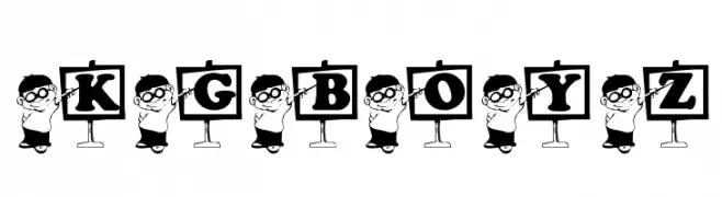
( Katz Fontz - katzfonts.50megs.com/kg.html )
A playful, cartoon-style font with letters held by whimsical characters.
![KG_BOYZ Frei Schriftart Herunterladen]() Herunterladen 63 Downloads@WebFont
Herunterladen 63 Downloads@WebFont


Welche Schriften sind gerade am populärsten?
Poppins, Roboto, Montserrat, Open Sans und Lato sind wegen ihrer klaren Formen und breiten Einsetzbarkeit sehr gefragt – von Markenauftritt über Landingpages bis hin zu Postern.
Welche Fonts eignen sich für Logos?
Geometrische Sans‑Serifs (z. B. Poppins, Familien im Gotham‑Stil) sind ein häufiger Griff für sauberes, skalierbares Branding. Für eine persönlichere Note bleiben Scripts und Handschrift‑Stile beliebt. Kombinieren Sie einen prägnanten Headline‑Font mit einer neutralen Brotschrift für Wiedererkennung und Harmonie.
Wie oft wird die Top‑Liste aktualisiert?
Regelmäßig – basierend auf realen Downloads und Interaktionen. Schauen Sie öfter vorbei, um aufstrebende Favoriten früh zu entdecken.
💡 Tipp: Seite bookmarken – Trends wechseln schnell, und heutige Top‑Schriften inspirieren morgen vielleicht das Rebranding.