Willkommen bei den Top‑Schriften – hier treffen Beliebtheit und Qualität aufeinander. Das sind die in diesem Jahr am häufigsten heruntergeladenen und genutzten Fonts. Wenn Sie sichere Optionen für Logo, Web oder Social suchen, starten Sie hier.
Jeder Top‑Font überzeugt durch Balance, Lesbarkeit und Vielseitigkeit. Sie finden moderne Sans‑Serifs, elegante Scripts, Vintage‑Serifs und minimalistische Displays.
-
( Fonts by Letterative Studio )
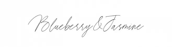
A graceful, cursive font with thin, flowing strokes and elegant connections.
 Herunterladen 70 Downloads@WebFont
 -
( گالری فانت فارسی پژوهش آريانا - only compatible with Farsi and Arabic )
A bold, playful font with whimsical curves and a modern aesthetic.
![Oqhaab Frei Schriftart Herunterladen]() Herunterladen 70 Downloads@WebFont
Herunterladen 70 Downloads@WebFont -
( Fonts by Allouse Studio - Personal-use only. For commercial use please contact owner. )
A charming script font with elegant, flowing lines and smooth curves.
![Ancukaseyo Demo Version Frei Schriftart Herunterladen]() Herunterladen 70 Downloads@WebFont
Herunterladen 70 Downloads@WebFont -
( Noto is a trademark of Google Inc. Noto fonts are open source. All Noto fonts are published under the SIL Open Font License, Version 1.1 )
Bold, extra-condensed serif font for Ethiopic script.
![Noto Serif Ethiopic ExtraCondensed Bold Frei Schriftart Herunterladen]() Herunterladen 70 Downloads@WebFont
Herunterladen 70 Downloads@WebFont -
( Fonts by Knackpack Studio - www.knackpack.studio - Personal-use only. For commercial use please contact owner. )
A bold, expressive handwritten font with dynamic curves.
![RISKERA Frei Schriftart Herunterladen]() Herunterladen 70 Downloads@WebFont
Herunterladen 70 Downloads@WebFont -
( Fonts by Creative Lab - Creative LAB - Personal-use only. For commercial use please contact owner. )
An elegant script font with flowing, cursive letterforms and sophisticated swashes.
![MaisaraScript Frei Schriftart Herunterladen]() Herunterladen 70 Downloads@WebFont
Herunterladen 70 Downloads@WebFont -
( Fonts by Darrell Flood - Personal-use only. For commercial use please contact owner. )
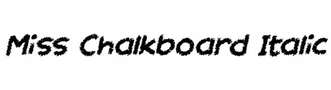
A playful, chalk-like font with bold, textured characters and a dynamic italic slant.
![Miss Chalkboard Italic Frei Schriftart Herunterladen]() Herunterladen 70 Downloads@WebFont
Herunterladen 70 Downloads@WebFont -
( Fonts by Figuree Studio - Icep Fadhil - Personal-use only. For commercial use please contact owner. )
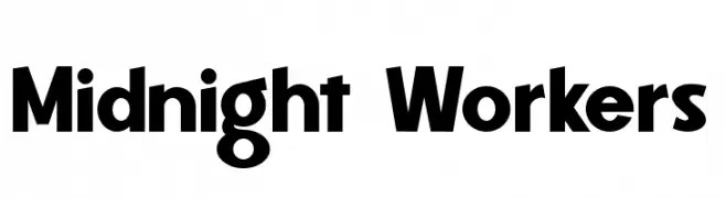
A bold, geometric font with a modern and assertive style.
![Midnight Workers Frei Schriftart Herunterladen]() Herunterladen 70 Downloads@WebFont
Herunterladen 70 Downloads@WebFont -
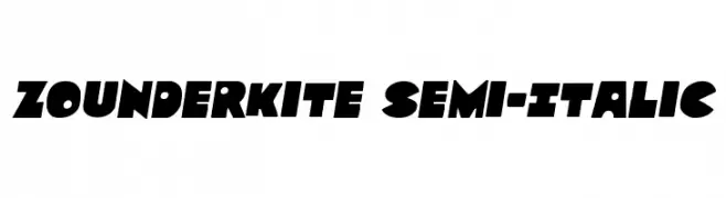
( Fonts by Iconian Fonts )
A bold, geometric font with angular, semi-italic characters.
![Zounderkite Semi-Italic Frei Schriftart Herunterladen]() Herunterladen 70 Downloads@WebFont
Herunterladen 70 Downloads@WebFont -
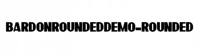
( Fonts by Sabrcreative - Personal-use only. For commercial use please contact owner. )
A bold, rounded font with a modern and approachable style.
![BardonRoundedDemo-Rounded Frei Schriftart Herunterladen]() Herunterladen 70 Downloads@WebFont
Herunterladen 70 Downloads@WebFont -
( Fonts by SSI.Scraps - Syukur Setiyadi - Personal-use only. For commercial use please contact owner. )
A playful, handwritten font with rounded edges and a bold style.
![Singo Frei Schriftart Herunterladen]() Herunterladen 70 Downloads@WebFont
Herunterladen 70 Downloads@WebFont -
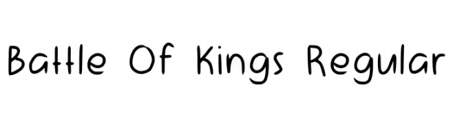
( Fonts by Aisyah - Nur Aisyah Amalia - Personal-use only. For commercial use please contact owner. )
A playful, handwritten font with smooth, rounded strokes and a casual style.
![Battle Of Kings Regular Frei Schriftart Herunterladen]() Herunterladen 70 Downloads@WebFont
Herunterladen 70 Downloads@WebFont -
( Fonts by MJB Letters - Muhammad Mujibulloh - Personal-use only. For commercial use please contact owner. )
A whimsical, handwritten font with a playful and elegant style.
![Ballimore Frei Schriftart Herunterladen]() Herunterladen 70 Downloads@WebFont
Herunterladen 70 Downloads@WebFont -
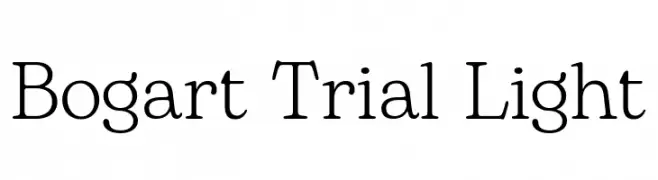
( Fonts by Zetafonts - Personal-use only. For commercial use please contact owner. )
A classic serif font with elegant, refined letterforms and a light weight.
![Bogart Trial Light Frei Schriftart Herunterladen]() Herunterladen 70 Downloads@WebFont
Herunterladen 70 Downloads@WebFont -
( Fonts by selawetype - Personal-use only. For commercial use please contact owner. )
A playful handwritten font with smooth, flowing curves and a casual style.
![Mooncake Frei Schriftart Herunterladen]() Herunterladen 70 Downloads@WebFont
Herunterladen 70 Downloads@WebFont -
( Fonts by FactoryType - Wahyu Rahmawan - Personal-use only. For commercial use please contact owner. )
A modern, narrow font with sleek, uniform characters.
![TonyTony Demo Frei Schriftart Herunterladen]() Herunterladen 70 Downloads@WebFont
Herunterladen 70 Downloads@WebFont -
( Fonts by scratchones )
A lively and expressive script font with fluid, dynamic strokes and a handwritten quality.
![Pink Cream Frei Schriftart Herunterladen]() Herunterladen 70 Downloads@WebFont
Herunterladen 70 Downloads@WebFont -
( Fonts by Faqih Fawaji - Personal-use only. For commercial use please contact owner. )
A bold, geometric font with a grunge texture and industrial style.
![Adine grunge Frei Schriftart Herunterladen]() Herunterladen 70 Downloads@WebFont
Herunterladen 70 Downloads@WebFont -
( Marcus Burnette - www.mburnette.com )
A playful, whimsical font with curly, hand-drawn letterforms.
![MBFunScript Frei Schriftart Herunterladen]() Herunterladen 70 Downloads@WebFont
Herunterladen 70 Downloads@WebFont -
( Noto is a trademark of Google Inc. Noto fonts are open source. All Noto fonts are published under the SIL Open Font License, Version 1.1 )
A modern, extra-condensed sans-serif font with a light weight and excellent readability.
![Noto Sans Tamil ExtraCondensed Light Frei Schriftart Herunterladen]() Herunterladen 70 Downloads@WebFont
Herunterladen 70 Downloads@WebFont -
( Iconian Fonts - Daniel Zadorozny - www.iconian.com )
A modern, geometric font with a futuristic and sleek design.
![Miracle Mercury Title Frei Schriftart Herunterladen]() Herunterladen 70 Downloads@WebFont
Herunterladen 70 Downloads@WebFont -
( Twicolabs Fontdation - Fahrizal Tawakkal - fontdation.com )
A lively and elegant script font with bold, flowing letterforms.
![KiteScript Frei Schriftart Herunterladen]() Herunterladen 70 Downloads@WebFont
Herunterladen 70 Downloads@WebFont -
( Fonts by Letterhend Studio - Hendry Juanda - Personal-use only. For commercial use please contact owner. )
A cursive, handwritten font with a fluid and elegant style.
![MantarayDEMO Frei Schriftart Herunterladen]() Herunterladen 70 Downloads@WebFont
Herunterladen 70 Downloads@WebFont -
( Fonts by Kat`s Fun Fonts - Personal-use only. For commercial use please contact owner. )
A playful, comic-style display font with a hand-drawn appearance.
![KR Driverz Frei Schriftart Herunterladen]() Herunterladen 70 Downloads@WebFont
Herunterladen 70 Downloads@WebFont -
( Fonts by Sherleen Christie Soetanto - Personal-use only. For commercial use please contact owner. )
A decorative font with intricate cloud-like embellishments on each character.
![Megamendung Regular Frei Schriftart Herunterladen]() Herunterladen 70 Downloads@WebFont
Herunterladen 70 Downloads@WebFont -
( Fonts by weknow - Wino S Kadir - Personal-use only. For commercial use please contact owner. )
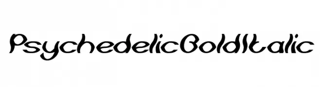
A bold, italicized font with a psychedelic, swirling design.
![Psychedelic Bold Italic Frei Schriftart Herunterladen]() Herunterladen 70 Downloads@WebFont
Herunterladen 70 Downloads@WebFont -
( Iconian Fonts - Daniel Zadorozny - www.iconian.com )
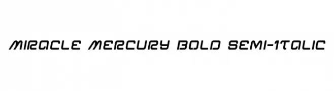
A bold, semi-italic font with a modern, geometric design.
![Miracle Mercury Bold Semi-Italic Frei Schriftart Herunterladen]() Herunterladen 70 Downloads@WebFont
Herunterladen 70 Downloads@WebFont -
( Fonts by Alit Design )
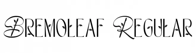
An elegant, nature-inspired font with decorative leaf accents.
![Bremoleaf Regular Frei Schriftart Herunterladen]() Herunterladen 70 Downloads@WebFont
Herunterladen 70 Downloads@WebFont -
( Fonts by Wino S Kadir - weknow - www.revolge.com/shop/weknow/ - Personal-use only. For commercial use please contact owner. )
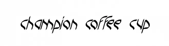
A dynamic, angular font with a modern calligraphic style.
![champion coffee cup Frei Schriftart Herunterladen]() Herunterladen 70 Downloads@WebFont
Herunterladen 70 Downloads@WebFont -
( Fonts by DumadiStyle - Toni Dzulham - Personal-use only. For commercial use please contact owner. )
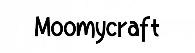
A playful, whimsical font with a hand-drawn, quirky style.
![Moomycraft Frei Schriftart Herunterladen]() Herunterladen 70 Downloads@WebFont
Herunterladen 70 Downloads@WebFont -
( Fonts by Pentagonistudio )
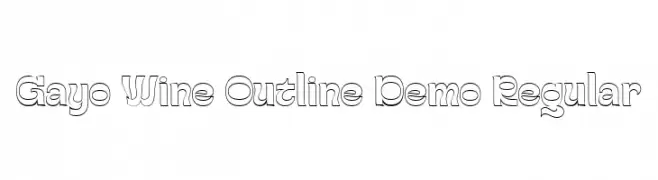
A modern, decorative outline font with playful and structured forms.
![Gayo Wine Outline Demo Regular Frei Schriftart Herunterladen]() Herunterladen 70 Downloads@WebFont
Herunterladen 70 Downloads@WebFont -
( Fonts by www.junkohanhero.com - Personal-use only. For commercial use please contact owner. )
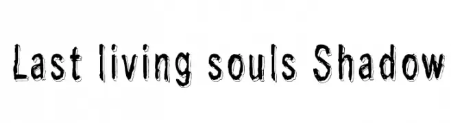
A bold, hand-drawn font with a shadow effect and sketch-like texture.
![Last living souls Shadow Frei Schriftart Herunterladen]() Herunterladen 70 Downloads@WebFont
Herunterladen 70 Downloads@WebFont -
( Iconian Fonts - Daniel Zadorozny - www.iconian.com )
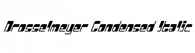
A bold, condensed, and italicized font with a modern and dynamic style.
![Drosselmeyer Condensed Italic Frei Schriftart Herunterladen]() Herunterladen 70 Downloads@WebFont
Herunterladen 70 Downloads@WebFont -
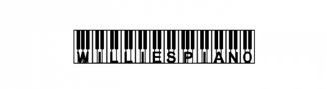
( Dingfontbats )
A decorative font featuring characters embedded in piano key designs.
![WilliesPiano Frei Schriftart Herunterladen]() Herunterladen 70 Downloads@WebFont
Herunterladen 70 Downloads@WebFont -
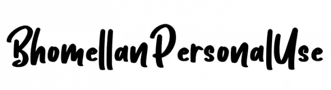
( Fonts by Ditatype - Personal-use only. For commercial use please contact owner. )
A bold, handwritten font with a playful and energetic style.
![Bhomellan Personal Use Frei Schriftart Herunterladen]() Herunterladen 70 Downloads@WebFont
Herunterladen 70 Downloads@WebFont


Welche Schriften sind gerade am populärsten?
Poppins, Roboto, Montserrat, Open Sans und Lato sind wegen ihrer klaren Formen und breiten Einsetzbarkeit sehr gefragt – von Markenauftritt über Landingpages bis hin zu Postern.
Welche Fonts eignen sich für Logos?
Geometrische Sans‑Serifs (z. B. Poppins, Familien im Gotham‑Stil) sind ein häufiger Griff für sauberes, skalierbares Branding. Für eine persönlichere Note bleiben Scripts und Handschrift‑Stile beliebt. Kombinieren Sie einen prägnanten Headline‑Font mit einer neutralen Brotschrift für Wiedererkennung und Harmonie.
Wie oft wird die Top‑Liste aktualisiert?
Regelmäßig – basierend auf realen Downloads und Interaktionen. Schauen Sie öfter vorbei, um aufstrebende Favoriten früh zu entdecken.
💡 Tipp: Seite bookmarken – Trends wechseln schnell, und heutige Top‑Schriften inspirieren morgen vielleicht das Rebranding.