Willkommen bei den Top‑Schriften – hier treffen Beliebtheit und Qualität aufeinander. Das sind die in diesem Jahr am häufigsten heruntergeladenen und genutzten Fonts. Wenn Sie sichere Optionen für Logo, Web oder Social suchen, starten Sie hier.
Jeder Top‑Font überzeugt durch Balance, Lesbarkeit und Vielseitigkeit. Sie finden moderne Sans‑Serifs, elegante Scripts, Vintage‑Serifs und minimalistische Displays.
-
( Fonts by Kong Font - Personal-use only. For commercial use please contact owner. )
An elegant, flowing script font with ornate uppercase and smooth lowercase letters.
 Herunterladen 60 Downloads@WebFont
 -
( Alternika )
A gothic, medieval-style font with sharp, elongated strokes and intricate detailing.
![Tate Divine Frei Schriftart Herunterladen]() Herunterladen 60 Downloads@WebFont
Herunterladen 60 Downloads@WebFont -
( Iconian Fonts - Daniel Zadorozny - www.iconian.com )
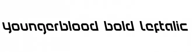
A bold, left-slanted font with a modern and edgy design.
![Youngerblood Bold Leftalic Frei Schriftart Herunterladen]() Herunterladen 60 Downloads@WebFont
Herunterladen 60 Downloads@WebFont -
( Jaime Rangel Castro )
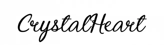
An elegant cursive script font with flowing, interconnected strokes.
![Crystal Heart Frei Schriftart Herunterladen]() Herunterladen 60 Downloads@WebFont
Herunterladen 60 Downloads@WebFont -
( Fonts by Fikry )
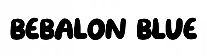
A playful, balloon-like font with bold, rounded characters.
![Bebalon Blue Frei Schriftart Herunterladen]() Herunterladen 60 Downloads@WebFont
Herunterladen 60 Downloads@WebFont -
( Fonts by Mans Greback - Personal-use only. For commercial use please contact owner. )
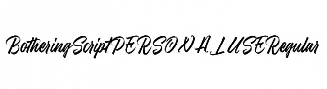
A bold, flowing script font with elegant, cursive letterforms and medium contrast.
![Bothering Script PERSONAL USE Regular Frei Schriftart Herunterladen]() Herunterladen 60 Downloads@WebFont
Herunterladen 60 Downloads@WebFont -
( Jaz - www.geocities.com/athens/pantheon/5812/carrollfont/ )
A whimsical dingbat font with imaginative symbols inspired by Lewis Carroll.
![LewisCarrollDings Frei Schriftart Herunterladen]() Herunterladen 60 Downloads@WebFont
Herunterladen 60 Downloads@WebFont -
( Out Of Step Font Company - outofstepfontco.com )
A bold, 3D font with a vintage sports theme and shadow effect.
![Batter Up 3D Frei Schriftart Herunterladen]() Herunterladen 60 Downloads@WebFont
Herunterladen 60 Downloads@WebFont -
( Fonts by Vigilante Typeface Corporation Larry Yerkes. Personal-use only. For commercial use please contact owner. )
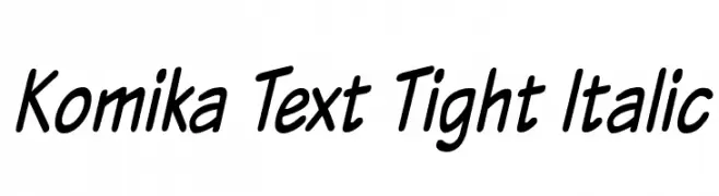
A playful, handwritten italic font with bold, rounded characters.
![Komika Text Tight Italic Frei Schriftart Herunterladen]() Herunterladen 60 Downloads@WebFont
Herunterladen 60 Downloads@WebFont -
( Fonts by Kat`s Fun Fonts - Personal-use only. For commercial use please contact owner. )
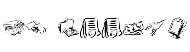
A collection of office-themed icons with a hand-drawn, sketch-like style.
![KR Office Frei Schriftart Herunterladen]() Herunterladen 60 Downloads@WebFont
Herunterladen 60 Downloads@WebFont -
( Iconian Fonts - Daniel Zadorozny - www.iconian.com )
Bold, 3D italic font with sharp angles and outlined characters.
![Ninja Garden 3D Italic Frei Schriftart Herunterladen]() Herunterladen 60 Downloads@WebFont
Herunterladen 60 Downloads@WebFont -
( Fonts by The Docallisme )
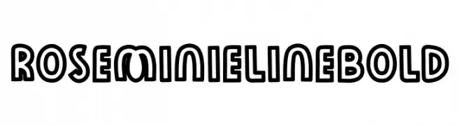
A bold, outlined font with a playful and three-dimensional appearance.
![Rose Minie LineBold Frei Schriftart Herunterladen]() Herunterladen 60 Downloads@WebFont
Herunterladen 60 Downloads@WebFont -
( Fonts by Perspectype Studio - Personal-use only. For commercial use please contact owner. )
An elegant, italic script font with a calligraphic style.
![Rottasicity Italic Frei Schriftart Herunterladen]() Herunterladen 60 Downloads@WebFont
Herunterladen 60 Downloads@WebFont -
( Fonts by alphArtype - Agung Rohmat - Personal-use only. For commercial use please contact owner. )
A bold, dynamic handwritten font with flowing strokes and playful bounce.
![Catarina Free Frei Schriftart Herunterladen]() Herunterladen 60 Downloads@WebFont
Herunterladen 60 Downloads@WebFont -
( Fonts by Ibram Syah - Personal-use only. For commercial use please contact owner. )
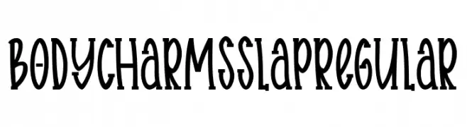
A whimsical, narrow font with a playful, hand-drawn style.
![Body charms slap Regular Frei Schriftart Herunterladen]() Herunterladen 60 Downloads@WebFont
Herunterladen 60 Downloads@WebFont -
( Fonts by Wino S Kadir - weknow - www.revolge.com/shop/weknow/ - Personal-use only. For commercial use please contact owner. )
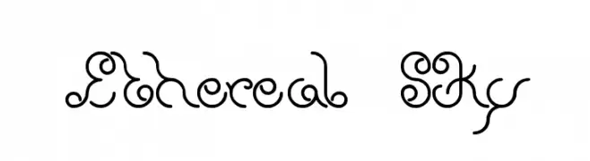
A whimsical and artistic font with flowing curves and elegant swirls.
![Ethereal Sky Frei Schriftart Herunterladen]() Herunterladen 60 Downloads@WebFont
Herunterladen 60 Downloads@WebFont -
( Fonts by FallenGraphic Studio - Vava Aryanto - Personal-use only. For commercial use please contact owner. )
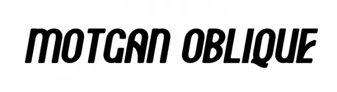
A bold, slanted font with thick strokes and rounded edges, exuding energy and modernity.
![Motgan Oblique Frei Schriftart Herunterladen]() Herunterladen 60 Downloads@WebFont
Herunterladen 60 Downloads@WebFont -
( Fonts by Hanaksara Studio - Darul Qutni Hakiki - Personal-use only. For commercial use please contact owner. )
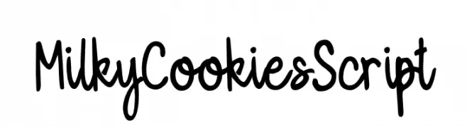
A playful, handwritten script font with a casual and friendly style.
![MilkyCookiesScript Frei Schriftart Herunterladen]() Herunterladen 60 Downloads@WebFont
Herunterladen 60 Downloads@WebFont -
( Amit Kumar )
A bold, angular font with sharp, geometric elements and high contrast.
![Teer Frei Schriftart Herunterladen]() Herunterladen 60 Downloads@WebFont
Herunterladen 60 Downloads@WebFont -
( Character )
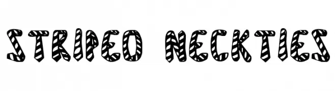
A bold, playful font with diagonal stripes and rounded characters.
![Striped Neckties Frei Schriftart Herunterladen]() Herunterladen 60 Downloads@WebFont
Herunterladen 60 Downloads@WebFont -
( Fonts by Vigilante Typeface Corporation Larry Yerkes. Personal-use only. For commercial use please contact owner. )
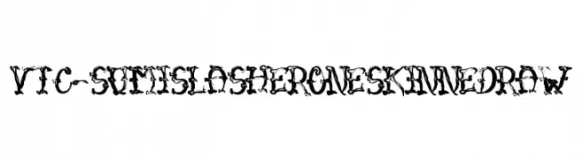
A bold, chaotic, and decorative font with an ink-splatter aesthetic.
![VTC-SumiSlasherOneSkinnedRaw Frei Schriftart Herunterladen]() Herunterladen 60 Downloads@WebFont
Herunterladen 60 Downloads@WebFont -
( Fonts by Muhammad Wahyudin - Personal-use only. For commercial use please contact owner. )
A playful, handwritten font with dynamic strokes and a whimsical style.
![Monaghan Frei Schriftart Herunterladen]() Herunterladen 60 Downloads@WebFont
Herunterladen 60 Downloads@WebFont -
( weknow - Wino S Kadir - www.creativefabrica.com/designer/weknow/ )
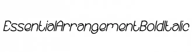
A modern, bold, and italicized font with consistent stroke thickness and a sleek design.
![Essential Arrangement Bold Italic Frei Schriftart Herunterladen]() Herunterladen 60 Downloads@WebFont
Herunterladen 60 Downloads@WebFont -
( Fonts by Ikiiko Type )
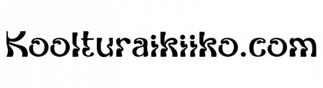
A modern, decorative font with artistic curves and bold strokes.
![Kooltura ikiiko.com Frei Schriftart Herunterladen]() Herunterladen 60 Downloads@WebFont
Herunterladen 60 Downloads@WebFont -
( Fonts by LyonsType - Daniel Lyons - Personal-use only. For commercial use please contact owner. )
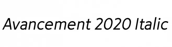
A modern, italic sans-serif font with clean lines and a dynamic slant.
![Avancement 2020 Italic Frei Schriftart Herunterladen]() Herunterladen 60 Downloads@WebFont
Herunterladen 60 Downloads@WebFont -
( Fonts by Vunira Design - Personal-use only. For commercial use please contact owner. )
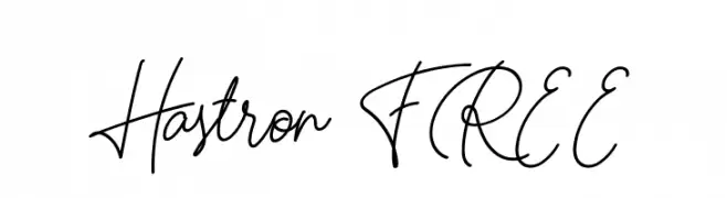
A flowing, cursive script font with elegant, continuous strokes.
![Hastron FREE Frei Schriftart Herunterladen]() Herunterladen 60 Downloads@WebFont
Herunterladen 60 Downloads@WebFont -
( Fonts by Kylie Morris - Personal-use only. For commercial use please contact owner. )
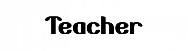
A bold, rounded font with a playful and friendly style.
![Teacher Frei Schriftart Herunterladen]() Herunterladen 60 Downloads@WebFont
Herunterladen 60 Downloads@WebFont -
( Iconian Fonts - Daniel Zadorozny - www.iconian.com )
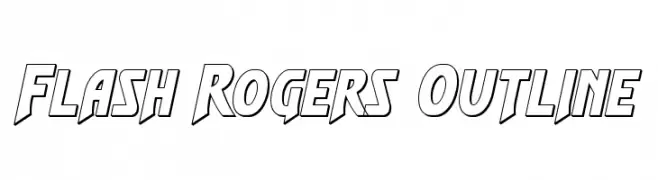
A bold, dynamic outline font with a comic book style and angular, geometric shapes.
![Flash Rogers Outline Frei Schriftart Herunterladen]() Herunterladen 60 Downloads@WebFont
Herunterladen 60 Downloads@WebFont -
( Nicolas Coronado - draconiansolo.wordpress.com/ )
A pixelated, retro font with a classic 8-bit digital style.
![DraconianPixelsRegular Frei Schriftart Herunterladen]() Herunterladen 60 Downloads@WebFont
Herunterladen 60 Downloads@WebFont -
( Fonts by Royaltype )
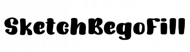
A bold, playful font with rounded, hand-drawn characters.
![SketchBegoFill Frei Schriftart Herunterladen]() Herunterladen 60 Downloads@WebFont
Herunterladen 60 Downloads@WebFont -
( Fonts by Get Studio - Hermansyah , - Personal-use only. For commercial use please contact owner. )
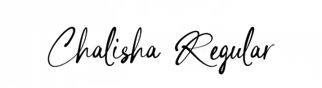
An elegant, flowing script font with a natural handwriting style.
![Chalisha Regular Frei Schriftart Herunterladen]() Herunterladen 60 Downloads@WebFont
Herunterladen 60 Downloads@WebFont -
( Fonts by Vladimir Nikolic - https://www.creativefabrica.com/product/educated-deers/ref/144265/ - Personal-use only. For commercial use please contact owner. )
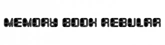
A bold, geometric font with a futuristic, interconnected design.
![Memory Book Regular Frei Schriftart Herunterladen]() Herunterladen 60 Downloads@WebFont
Herunterladen 60 Downloads@WebFont -
( Fonts by Kat`s Fun Fonts - Personal-use only. For commercial use please contact owner. )
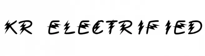
An electrifying font with bold, jagged edges resembling lightning bolts.
![KR Electrified Frei Schriftart Herunterladen]() Herunterladen 60 Downloads@WebFont
Herunterladen 60 Downloads@WebFont -
( Fonts by Masa Aska Sanurumi )
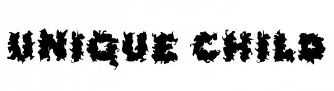
A bold, chaotic decorative font with jagged, swirling shapes.
![Unique Child Frei Schriftart Herunterladen]() Herunterladen 60 Downloads@WebFont
Herunterladen 60 Downloads@WebFont -
( Fonts by Daniel Zadorozny - www.iconian.com - Personal-use only. For commercial use please contact owner. )
A bold, angular, and condensed font with a futuristic and dynamic style.
![Robo-Clone Condensed Frei Schriftart Herunterladen]() Herunterladen 60 Downloads@WebFont
Herunterladen 60 Downloads@WebFont


Welche Schriften sind gerade am populärsten?
Poppins, Roboto, Montserrat, Open Sans und Lato sind wegen ihrer klaren Formen und breiten Einsetzbarkeit sehr gefragt – von Markenauftritt über Landingpages bis hin zu Postern.
Welche Fonts eignen sich für Logos?
Geometrische Sans‑Serifs (z. B. Poppins, Familien im Gotham‑Stil) sind ein häufiger Griff für sauberes, skalierbares Branding. Für eine persönlichere Note bleiben Scripts und Handschrift‑Stile beliebt. Kombinieren Sie einen prägnanten Headline‑Font mit einer neutralen Brotschrift für Wiedererkennung und Harmonie.
Wie oft wird die Top‑Liste aktualisiert?
Regelmäßig – basierend auf realen Downloads und Interaktionen. Schauen Sie öfter vorbei, um aufstrebende Favoriten früh zu entdecken.
💡 Tipp: Seite bookmarken – Trends wechseln schnell, und heutige Top‑Schriften inspirieren morgen vielleicht das Rebranding.