Willkommen bei den Top‑Schriften – hier treffen Beliebtheit und Qualität aufeinander. Das sind die in diesem Jahr am häufigsten heruntergeladenen und genutzten Fonts. Wenn Sie sichere Optionen für Logo, Web oder Social suchen, starten Sie hier.
Jeder Top‑Font überzeugt durch Balance, Lesbarkeit und Vielseitigkeit. Sie finden moderne Sans‑Serifs, elegante Scripts, Vintage‑Serifs und minimalistische Displays.
-
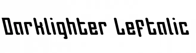
( Iconian Fonts - Daniel Zadorozny - www.iconian.com )
A bold, modern font with a leftward slant and geometric design.
 Herunterladen 70 Downloads@WebFont
 -
( Noto is a trademark of Google Inc. Noto fonts are open source. All Noto fonts are published under the SIL Open Font License, Version 1.1 )
The font is not displaying properly, showing placeholder boxes.
![Noto Serif Khmer ExtraCondensed Light Frei Schriftart Herunterladen]() Herunterladen 70 Downloads@WebFont
Herunterladen 70 Downloads@WebFont -
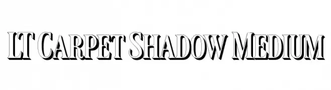
( Fonts by LyonsType - Daniel Lyons - Personal-use only. For commercial use please contact owner. )
A bold serif font with a 3D shadow effect, perfect for impactful headlines.
![LT Carpet Shadow Medium Frei Schriftart Herunterladen]() Herunterladen 70 Downloads@WebFont
Herunterladen 70 Downloads@WebFont -
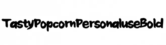
( Fonts by Cornertype Studio - Anang Fibriyanto - Personal-use only. For commercial use please contact owner. )
A bold, playful font with a hand-drawn, whimsical style.
![Tasty Popcorn Personal use Bold Frei Schriftart Herunterladen]() Herunterladen 70 Downloads@WebFont
Herunterladen 70 Downloads@WebFont -
( typelinestudio - Yadhie Setiawan - creativemarket.com/typeline )
A modern-retro font with elongated, flowing letterforms and playful loops.
![quickland Frei Schriftart Herunterladen]() Herunterladen 70 Downloads@WebFont
Herunterladen 70 Downloads@WebFont -
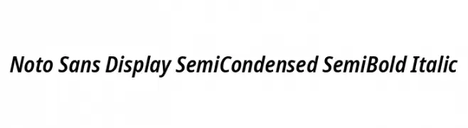
( Noto is a trademark of Google Inc. Noto fonts are open source. All Noto fonts are published under the SIL Open Font License, Version 1.1 )
A modern, semi-condensed sans-serif font with semi-bold weight and italic style.
![Noto Sans Display SemiCondensed SemiBold Italic Frei Schriftart Herunterladen]() Herunterladen 70 Downloads@WebFont
Herunterladen 70 Downloads@WebFont -
( Fonts by Vladimir Nikolic - www.creativefabrica.com/designer/vladimirnikolic/ - Personal-use only. For commercial use please contact owner. )
A bold, 3D italic font with strong geometric shapes and a modern look.
![Almery Italic Frei Schriftart Herunterladen]() Herunterladen 70 Downloads@WebFont
Herunterladen 70 Downloads@WebFont -
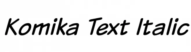
( Fonts by Vigilante Typeface Corporation Larry Yerkes. Personal-use only. For commercial use please contact owner. )
A playful, handwritten font with a bold, slanted style.
![Komika Text Italic Frei Schriftart Herunterladen]() Herunterladen 70 Downloads@WebFont
Herunterladen 70 Downloads@WebFont -
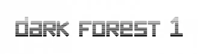
( Fonts by Greg Medina - www.dcoxy.com - Personal-use only. For commercial use please contact owner. )
A futuristic, striped font with a geometric and digital aesthetic.
![dark forest 1 Frei Schriftart Herunterladen]() Herunterladen 70 Downloads@WebFont
Herunterladen 70 Downloads@WebFont -
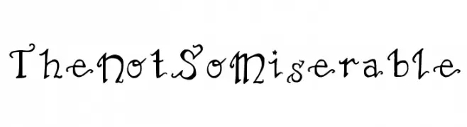
( The Not So Miserable - www.thenotsomiserable.co.uk )
A whimsical and decorative font with playful curls and flourishes.
![TheNotSoMiserable Frei Schriftart Herunterladen]() Herunterladen 70 Downloads@WebFont
Herunterladen 70 Downloads@WebFont -
( Noto is a trademark of Google Inc. Noto fonts are open source. All Noto fonts are published under the SIL Open Font License, Version 1.1 )
A condensed, extra bold typeface with a modern and impactful design.
![Noto Sans Tamil Condensed ExtraBold Frei Schriftart Herunterladen]() Herunterladen 70 Downloads@WebFont
Herunterladen 70 Downloads@WebFont -
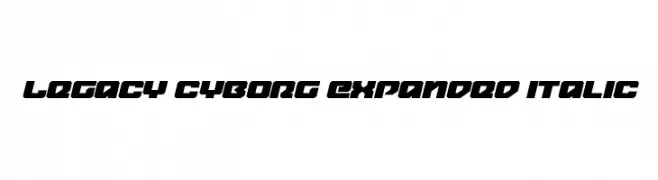
( Fonts by Daniel Zadorozny - www.iconian.com - Personal-use only. For commercial use please contact owner. )
A bold, expanded, and italicized font with a futuristic and geometric style.
![Legacy Cyborg Expanded Italic Frei Schriftart Herunterladen]() Herunterladen 70 Downloads@WebFont
Herunterladen 70 Downloads@WebFont -
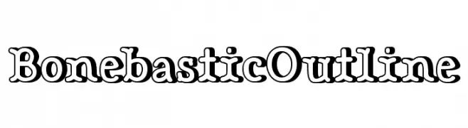
( Fonts by www.studiotypo.com - Personal-use only. For commercial use please contact owner. )
A bold, outlined font with a playful and engaging style.
![Bonebastic Outline Frei Schriftart Herunterladen]() Herunterladen 70 Downloads@WebFont
Herunterladen 70 Downloads@WebFont -
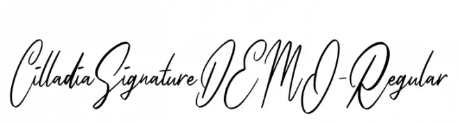
( Fonts by Colative Studio - Personal-use only. For commercial use please contact owner. )
An elegant cursive script font with fluid, handwritten strokes.
![CilladiaSignatureDEMO-Regular Frei Schriftart Herunterladen]() Herunterladen 70 Downloads@WebFont
Herunterladen 70 Downloads@WebFont -
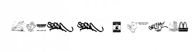
( The Wondermaker - Fabien Delage - www.wmkart.com )
Urban, graffiti-inspired dingbat font with city and fast food motifs.
![This Is My Town 3 Frei Schriftart Herunterladen]() Herunterladen 70 Downloads@WebFont
Herunterladen 70 Downloads@WebFont -
( Noto is a trademark of Google Inc. Noto fonts are open source. All Noto fonts are published under the SIL Open Font License, Version 1.1 )
A semi-condensed font supporting the Ethiopic script, balancing traditional and modern aesthetics.
![Noto Serif Ethiopic SemiCondensed Frei Schriftart Herunterladen]() Herunterladen 70 Downloads@WebFont
Herunterladen 70 Downloads@WebFont -
![Stray Cat SuperOblique Frei Schriftart Herunterladen]() Herunterladen 70 Downloads@WebFont
Herunterladen 70 Downloads@WebFont -
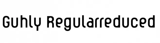
( Fonts by ingoFonts - Ingo Zimmermann - Personal-use only. For commercial use please contact owner. )
A modern, geometric sans-serif font with a slightly condensed and uniform appearance.
![Guhly-Regularreduced Frei Schriftart Herunterladen]() Herunterladen 70 Downloads@WebFont
Herunterladen 70 Downloads@WebFont -
( Jariya - artd2304-jariya.blogspot.com/ )
A bold, playful font with whimsical character shapes and a modern decorative style.
![CRU-Jariya-Bold Frei Schriftart Herunterladen]() Herunterladen 70 Downloads@WebFont
Herunterladen 70 Downloads@WebFont -
( Fonts by Vladimir Nikolic )
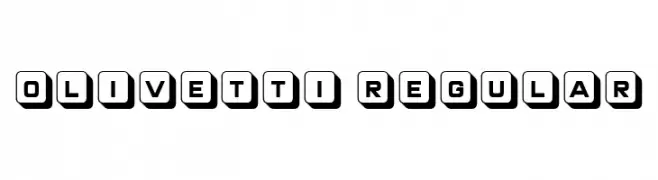
A bold, geometric font with characters in rounded squares, evoking vintage typewriter keys.
![Olivetti Regular Frei Schriftart Herunterladen]() Herunterladen 70 Downloads@WebFont
Herunterladen 70 Downloads@WebFont -
( Ouripedes Gallene )
![Personalidades 1 Frei Schriftart Herunterladen]() Herunterladen 70 Downloads@WebFont
Herunterladen 70 Downloads@WebFont -
( Fonts by Mr.Soon Design )
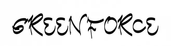
A bold, dynamic font with a handwritten, calligraphic style.
![Green Force Frei Schriftart Herunterladen]() Herunterladen 70 Downloads@WebFont
Herunterladen 70 Downloads@WebFont -
( Fonts by Daniel Zadorozny - www.iconian.com - Personal-use only. For commercial use please contact owner. )
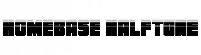
A bold, geometric font with a halftone effect, ideal for retro or tech-inspired designs.
![Homebase Halftone Frei Schriftart Herunterladen]() Herunterladen 70 Downloads@WebFont
Herunterladen 70 Downloads@WebFont -
( Fonts by Edric Studio - Personal-use only. For commercial use please contact owner. )
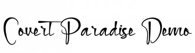
A dynamic and expressive script font with fluid, organic strokes.
![Covert Paradise Demo Frei Schriftart Herunterladen]() Herunterladen 70 Downloads@WebFont
Herunterladen 70 Downloads@WebFont -
( weknow - Wino S Kadir - www.creativefabrica.com/designer/weknow/ )
A playful, hollow, bubble-like font with a whimsical and modern style.
![Enjoy The Time-Hollow Frei Schriftart Herunterladen]() Herunterladen 70 Downloads@WebFont
Herunterladen 70 Downloads@WebFont -
( Fonts by Vladimir Nikolic )
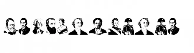
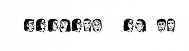
Expressive, hand-drawn portraits form each character in this decorative font.
![Women Heads Regular Frei Schriftart Herunterladen]() Herunterladen 70 Downloads@WebFont
Herunterladen 70 Downloads@WebFont -
( Fonts by Vladimir Nikolic - www.creativefabrica.com/designer/vladimirnikolic/ - Personal-use only. For commercial use please contact owner. )
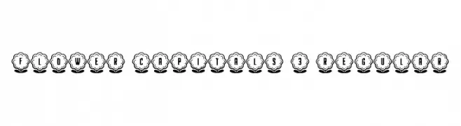
A decorative font with characters enclosed in floral designs, offering a whimsical and artistic style.
![Flower Capitals 3 Regular Frei Schriftart Herunterladen]() Herunterladen 70 Downloads@WebFont
Herunterladen 70 Downloads@WebFont -
( Fonts by Amarlettering - Takiy - Amarlettering - Takiy - Personal-use only. For commercial use please contact owner. )
An elegant script font with flowing, cursive lines and a refined appearance.
![bellisa Frei Schriftart Herunterladen]() Herunterladen 70 Downloads@WebFont
Herunterladen 70 Downloads@WebFont -
( Fonts by Kong Font - Personal-use only. For commercial use please contact owner. )
A whimsical, cursive script font with elegant, flowing lines.
![ZahraLovely Frei Schriftart Herunterladen]() Herunterladen 70 Downloads@WebFont
Herunterladen 70 Downloads@WebFont -
( Gregoryfonts - www.geocities.com/soho/coffeehouse/9609/fonts/fonts.html )
A playful, hand-drawn style with dynamic strokes and whimsical character.
![Clickclickclick Frei Schriftart Herunterladen]() Herunterladen 70 Downloads@WebFont
Herunterladen 70 Downloads@WebFont -
( Iconian Fonts - Daniel Zadorozny - www.iconian.com )
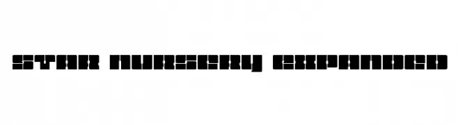
A bold, geometric font with futuristic and decorative elements.
![Star Nursery Expanded Frei Schriftart Herunterladen]() Herunterladen 70 Downloads@WebFont
Herunterladen 70 Downloads@WebFont -
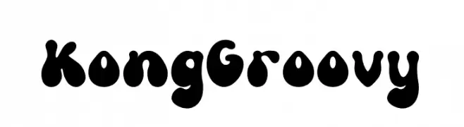
( Fonts by Kong Font )
A bold, playful font with rounded, bulbous letterforms and a retro vibe.
![Kong Groovy Frei Schriftart Herunterladen]() Herunterladen 70 Downloads@WebFont
Herunterladen 70 Downloads@WebFont -
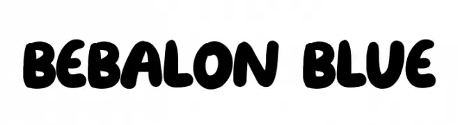
( Fonts by Fikry )
A playful, balloon-like font with bold, rounded characters.
![Bebalon Blue Frei Schriftart Herunterladen]() Herunterladen 70 Downloads@WebFont
Herunterladen 70 Downloads@WebFont -
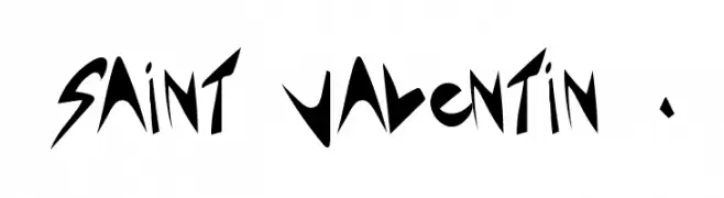
( Léa Morand - alealaplage.weebly.com/ )
A bold, angular font with sharp, geometric lines and a dynamic style.
![Saint Valentin 1.3 Frei Schriftart Herunterladen]() Herunterladen 70 Downloads@WebFont
Herunterladen 70 Downloads@WebFont -
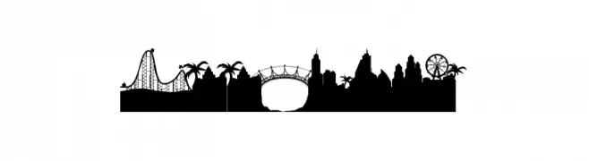
( Qkila - Quentin Aquila - www.creativefabrica.com/designer/qkila/ )
Cityscape silhouette font with detailed urban and landmark elements.
![Good Life Frei Schriftart Herunterladen]() Herunterladen 70 Downloads@WebFont
Herunterladen 70 Downloads@WebFont


Welche Schriften sind gerade am populärsten?
Poppins, Roboto, Montserrat, Open Sans und Lato sind wegen ihrer klaren Formen und breiten Einsetzbarkeit sehr gefragt – von Markenauftritt über Landingpages bis hin zu Postern.
Welche Fonts eignen sich für Logos?
Geometrische Sans‑Serifs (z. B. Poppins, Familien im Gotham‑Stil) sind ein häufiger Griff für sauberes, skalierbares Branding. Für eine persönlichere Note bleiben Scripts und Handschrift‑Stile beliebt. Kombinieren Sie einen prägnanten Headline‑Font mit einer neutralen Brotschrift für Wiedererkennung und Harmonie.
Wie oft wird die Top‑Liste aktualisiert?
Regelmäßig – basierend auf realen Downloads und Interaktionen. Schauen Sie öfter vorbei, um aufstrebende Favoriten früh zu entdecken.
💡 Tipp: Seite bookmarken – Trends wechseln schnell, und heutige Top‑Schriften inspirieren morgen vielleicht das Rebranding.