Willkommen bei den Top‑Schriften – hier treffen Beliebtheit und Qualität aufeinander. Das sind die in diesem Jahr am häufigsten heruntergeladenen und genutzten Fonts. Wenn Sie sichere Optionen für Logo, Web oder Social suchen, starten Sie hier.
Jeder Top‑Font überzeugt durch Balance, Lesbarkeit und Vielseitigkeit. Sie finden moderne Sans‑Serifs, elegante Scripts, Vintage‑Serifs und minimalistische Displays.
-
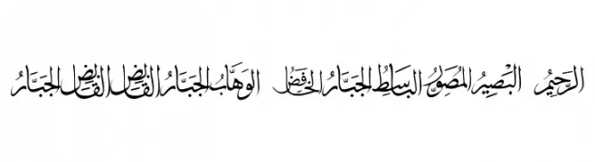
( Fonts by elharrak - elharrak fonts - Personal-use only. For commercial use please contact owner. )
A traditional Arabic script with elegant, flowing calligraphic strokes.
 Herunterladen 70 Downloads@WebFont
 -
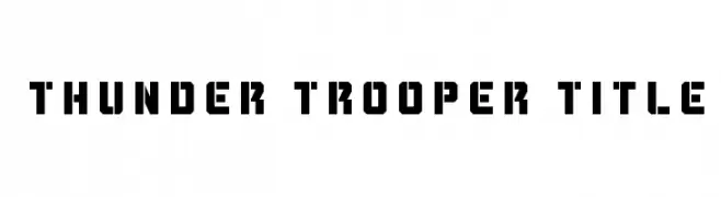
( Iconian Fonts - Daniel Zadorozny - www.iconian.com )
A bold, geometric font with a futuristic and industrial style.
![Thunder Trooper Title Frei Schriftart Herunterladen]() Herunterladen 70 Downloads@WebFont
Herunterladen 70 Downloads@WebFont -
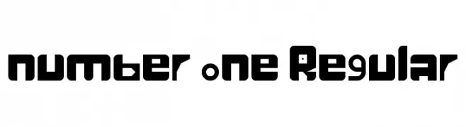
( mr eel )
A bold, geometric font with a futuristic and digital aesthetic.
![number one Regular Frei Schriftart Herunterladen]() Herunterladen 70 Downloads@WebFont
Herunterladen 70 Downloads@WebFont -
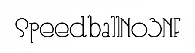
( Fonts by Nick Curtis - Personal-use only. For commercial use please contact owner. )
A playful yet elegant font with art deco influences and thin, elongated strokes.
![SpeedballNo3NF Frei Schriftart Herunterladen]() Herunterladen 70 Downloads@WebFont
Herunterladen 70 Downloads@WebFont -
( Fonts by Letter Jos - Personal-use only. For commercial use please contact owner. )
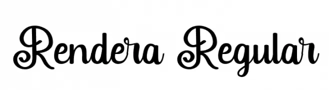
A playful, decorative font with elegant curls and loops.
![Rendera Regular Frei Schriftart Herunterladen]() Herunterladen 70 Downloads@WebFont
Herunterladen 70 Downloads@WebFont -
( Fonts by Luluk Surotul - Personal-use only. For commercial use please contact owner. )
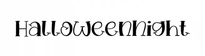
A playful, whimsical font with bold, irregular shapes, perfect for festive designs.
![Halloween Night Frei Schriftart Herunterladen]() Herunterladen 70 Downloads@WebFont
Herunterladen 70 Downloads@WebFont -
( Fonts by imagex - Personal-use only. For commercial use please contact owner. )
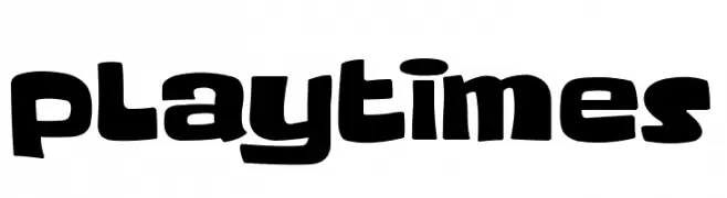
A playful, bold font with rounded, chunky characters and a hand-drawn feel.
![Playtimes Frei Schriftart Herunterladen]() Herunterladen 70 Downloads@WebFont
Herunterladen 70 Downloads@WebFont -
( Fonts by Darrell Flood - Personal-use only. For commercial use please contact owner. )
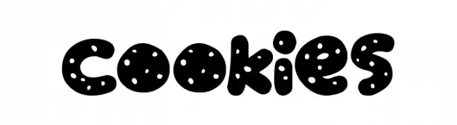
A playful, cookie-inspired font with bold, rounded characters and a dotted pattern.
![Cookies Frei Schriftart Herunterladen]() Herunterladen 70 Downloads@WebFont
Herunterladen 70 Downloads@WebFont -
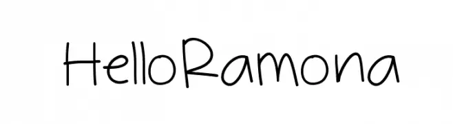
( Jen Jones - www.jenjonesfonts.com )
A playful, handwritten font with a casual and friendly style.
![HelloRamona Frei Schriftart Herunterladen]() Herunterladen 70 Downloads@WebFont
Herunterladen 70 Downloads@WebFont -
( Fonts by Pidco Art - Hindro Cholis - Personal-use only. For commercial use please contact owner. )
A playful, bold font with rounded edges and a uniform stroke, perfect for fun projects.
![Baby Dollar Frei Schriftart Herunterladen]() Herunterladen 70 Downloads@WebFont
Herunterladen 70 Downloads@WebFont -
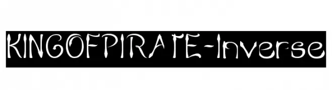
( weknow - Wino S Kadir - www.creativefabrica.com/designer/weknow/ )
A whimsical, pirate-themed font with exaggerated curves and sharp edges.
![KING OF PIRATE-Inverse Frei Schriftart Herunterladen]() Herunterladen 70 Downloads@WebFont
Herunterladen 70 Downloads@WebFont -
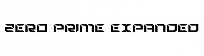
( Fonts by Daniel Zadorozny - www.iconian.com - Personal-use only. For commercial use please contact owner. )
A bold, futuristic font with sharp, angular edges and geometric shapes.
![Zero Prime Expanded Frei Schriftart Herunterladen]() Herunterladen 70 Downloads@WebFont
Herunterladen 70 Downloads@WebFont -
( Fonts by Hanzel Space - Personal-use only. For commercial use please contact owner. )
A bold, flowing script font with a dynamic, handwritten style.
![Ballerick Frei Schriftart Herunterladen]() Herunterladen 70 Downloads@WebFont
Herunterladen 70 Downloads@WebFont -
( Fonts by www.junkohanhero.com - Personal-use only. For commercial use please contact owner. )
A bold, flame-inspired decorative font with dynamic, jagged edges.
![Pyromaani Frei Schriftart Herunterladen]() Herunterladen 70 Downloads@WebFont
Herunterladen 70 Downloads@WebFont -
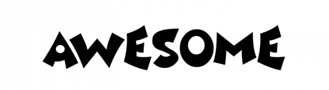
( Fonts by Darrell Flood - Personal-use only. For commercial use please contact owner. )
A playful and bold font with exaggerated curves and whimsical shapes.
![Awesome Frei Schriftart Herunterladen]() Herunterladen 70 Downloads@WebFont
Herunterladen 70 Downloads@WebFont -
( Typodermic Fonts - Ray Larabie - www.typodermicfonts.com/ )
A sleek, italicized font with a modern and elegant style.
![MixolydianTitlingEl-Italic Frei Schriftart Herunterladen]() Herunterladen 70 Downloads@WebFont
Herunterladen 70 Downloads@WebFont -
( Fonts by Ivan Gladkikh )
An ornate decorative font with floral embellishments, ideal for vintage and artistic designs.
![TT Ramillas Initials Trl Md Frei Schriftart Herunterladen]() Herunterladen 70 Downloads@WebFont
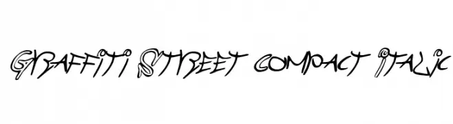
Herunterladen 70 Downloads@WebFont -
![Graffiti Street Compact Italic Frei Schriftart Herunterladen]() Herunterladen 70 Downloads@WebFont
Herunterladen 70 Downloads@WebFont -
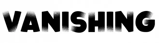
( Fonts by imagex - Personal-use only. For commercial use please contact owner. )
A bold, halftone-effect font with a dynamic, vanishing style.
![Vanishing Frei Schriftart Herunterladen]() Herunterladen 70 Downloads@WebFont
Herunterladen 70 Downloads@WebFont -
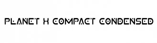
( Iconian Fonts - Daniel Zadorozny - www.iconian.com )
A futuristic, geometric font with rounded edges and a compact, bold style.
![Planet X Compact Condensed Frei Schriftart Herunterladen]() Herunterladen 70 Downloads@WebFont
Herunterladen 70 Downloads@WebFont -
( London's Letters - www.londonsletters.com/ )
A decorative font with sandcastle-themed letters, perfect for playful and creative designs.
![LMS Sand Castle Dream House Frei Schriftart Herunterladen]() Herunterladen 70 Downloads@WebFont
Herunterladen 70 Downloads@WebFont -
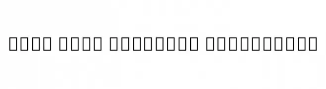
( Noto is a trademark of Google Inc. Noto fonts are open source. All Noto fonts are published under the SIL Open Font License, Version 1.1 )
A clean, extra light font for Cherokee script with modern appeal.
![Noto Sans Cherokee ExtraLight Frei Schriftart Herunterladen]() Herunterladen 70 Downloads@WebFont
Herunterladen 70 Downloads@WebFont -
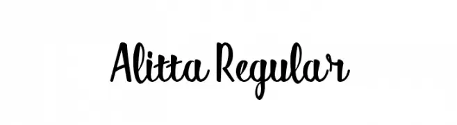
( Fonts by Omotu Studio - Ibnu Utomo - Personal-use only. For commercial use please contact owner. )
A playful, handwritten font with bold uppercase and cursive lowercase letters.
![Alitta Regular Frei Schriftart Herunterladen]() Herunterladen 70 Downloads@WebFont
Herunterladen 70 Downloads@WebFont -
( Fonts by Rochart Studio - Rochadi Sudarma - Personal-use only. For commercial use please contact owner. )
A dynamic and expressive handwritten font with fluid strokes and a lively appearance.
![Hysteria Frei Schriftart Herunterladen]() Herunterladen 70 Downloads@WebFont
Herunterladen 70 Downloads@WebFont -
( Fonts by www.selawetype.com - Personal-use only. FOR DONATION https://www.paypal.me/selawe . For commercial use please contact owner. )
A bold, brushstroke-style font with a textured, hand-painted appearance.
![Cerobong Regular Frei Schriftart Herunterladen]() Herunterladen 70 Downloads@WebFont
Herunterladen 70 Downloads@WebFont -
( Fonts by Kat`s Fun Fonts - Personal-use only. For commercial use please contact owner. )
A decorative collection of St. Patrick's Day-themed graphics.
![KR Irish Kat 5 Frei Schriftart Herunterladen]() Herunterladen 70 Downloads@WebFont
Herunterladen 70 Downloads@WebFont -
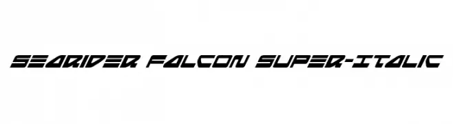
( Iconian Fonts - Daniel Zadorozny - www.iconian.com )
A bold, italic, and futuristic font with sharp, angular lines and high contrast.
![Searider Falcon Super-Italic Frei Schriftart Herunterladen]() Herunterladen 70 Downloads@WebFont
Herunterladen 70 Downloads@WebFont -
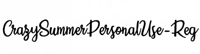
( Fonts by Billy Argel Fonts - www.billyargel.com - Personal-use only. For commercial use please contact owner. )
A playful and energetic script font with a hand-drawn aesthetic.
![CrazySummerPersonalUse-Reg Frei Schriftart Herunterladen]() Herunterladen 70 Downloads@WebFont
Herunterladen 70 Downloads@WebFont -
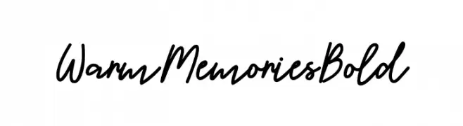
( Fonts by Mr. Typeman )
A lively, flowing script font with a warm, handwritten style.
![WarmMemoriesBold Frei Schriftart Herunterladen]() Herunterladen 70 Downloads@WebFont
Herunterladen 70 Downloads@WebFont -
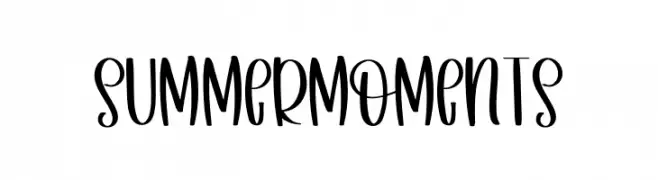
( Fonts by Inermedia Studio - Personal-use only. For commercial use please contact owner. )
A playful, handwritten-style font with tall, narrow letters and smooth, rounded edges.
![Summer Moments Frei Schriftart Herunterladen]() Herunterladen 70 Downloads@WebFont
Herunterladen 70 Downloads@WebFont -
( Fonts by Maelle.K - Thomas Boucherie )
Hand-drawn dingbat font with toy car-themed illustrations.
![toy kars Frei Schriftart Herunterladen]() Herunterladen 70 Downloads@WebFont
Herunterladen 70 Downloads@WebFont -
( Fonts by weknow - Wino S Kadir - Personal-use only. For commercial use please contact owner. )
A bold, futuristic font with geometric and angular design elements.
![FUTURISM Bold Frei Schriftart Herunterladen]() Herunterladen 70 Downloads@WebFont
Herunterladen 70 Downloads@WebFont -
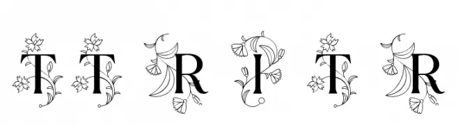
( Fonts by Ivan Gladkikh )
An elegant serif font with intricate floral embellishments.
![TT Ramillas Initials Trl Rg Frei Schriftart Herunterladen]() Herunterladen 70 Downloads@WebFont
Herunterladen 70 Downloads@WebFont -
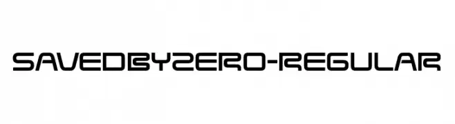
( Fonts by Raymond Larabie - Personal-use only. For commercial use please contact owner. )
A modern, geometric font with a futuristic and sleek design.
![SavedByZero-Regular Frei Schriftart Herunterladen]() Herunterladen 70 Downloads@WebFont
Herunterladen 70 Downloads@WebFont -
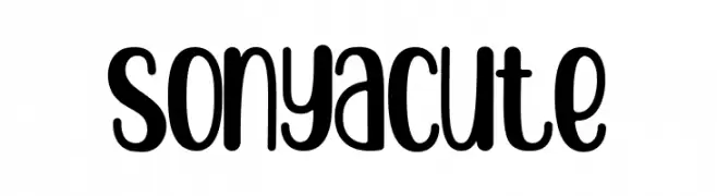
( Fonts by StringLabs - stringlabscreative.com - Personal-use only. For commercial use please contact owner. )
A playful, rounded font with bold, uniform strokes and a whimsical style.
![sonya cute Frei Schriftart Herunterladen]() Herunterladen 70 Downloads@WebFont
Herunterladen 70 Downloads@WebFont


Welche Schriften sind gerade am populärsten?
Poppins, Roboto, Montserrat, Open Sans und Lato sind wegen ihrer klaren Formen und breiten Einsetzbarkeit sehr gefragt – von Markenauftritt über Landingpages bis hin zu Postern.
Welche Fonts eignen sich für Logos?
Geometrische Sans‑Serifs (z. B. Poppins, Familien im Gotham‑Stil) sind ein häufiger Griff für sauberes, skalierbares Branding. Für eine persönlichere Note bleiben Scripts und Handschrift‑Stile beliebt. Kombinieren Sie einen prägnanten Headline‑Font mit einer neutralen Brotschrift für Wiedererkennung und Harmonie.
Wie oft wird die Top‑Liste aktualisiert?
Regelmäßig – basierend auf realen Downloads und Interaktionen. Schauen Sie öfter vorbei, um aufstrebende Favoriten früh zu entdecken.
💡 Tipp: Seite bookmarken – Trends wechseln schnell, und heutige Top‑Schriften inspirieren morgen vielleicht das Rebranding.