Willkommen bei den Top‑Schriften – hier treffen Beliebtheit und Qualität aufeinander. Das sind die in diesem Jahr am häufigsten heruntergeladenen und genutzten Fonts. Wenn Sie sichere Optionen für Logo, Web oder Social suchen, starten Sie hier.
Jeder Top‑Font überzeugt durch Balance, Lesbarkeit und Vielseitigkeit. Sie finden moderne Sans‑Serifs, elegante Scripts, Vintage‑Serifs und minimalistische Displays.
-
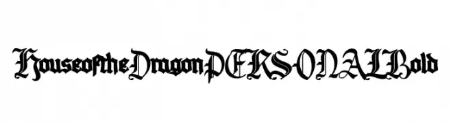
( Fonts by Mans Greback - Personal-use only. For commercial use please contact owner. )
A bold, medieval-inspired font with intricate, dramatic styling.
 Herunterladen 70 Downloads@WebFont
 -
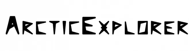
( Ittype )
A bold, angular font with a geometric and adventurous style.
![ArcticExplorer Frei Schriftart Herunterladen]() Herunterladen 70 Downloads@WebFont
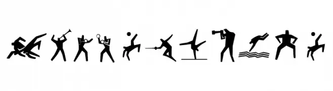
Herunterladen 70 Downloads@WebFont -
![Sport 4 Ever Frei Schriftart Herunterladen]() Herunterladen 70 Downloads@WebFont
Herunterladen 70 Downloads@WebFont -
( Fonts by Delip Nugraha - Personal-use only. For commercial use please contact owner. )
A bold, modern font with sharp angles and smooth curves, ideal for impactful designs.
![Jetfast Frei Schriftart Herunterladen]() Herunterladen 70 Downloads@WebFont
Herunterladen 70 Downloads@WebFont -
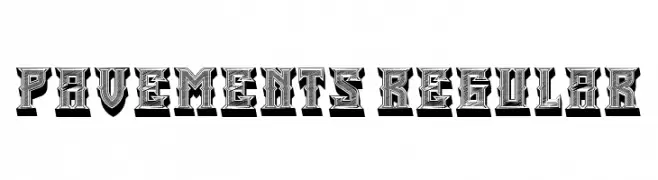
( Fonts by Vladimir Nikolic - Personal-use only. For commercial use please contact owner. )
A bold, decorative font with a three-dimensional, detailed design.
![Pavements Regular Frei Schriftart Herunterladen]() Herunterladen 70 Downloads@WebFont
Herunterladen 70 Downloads@WebFont -
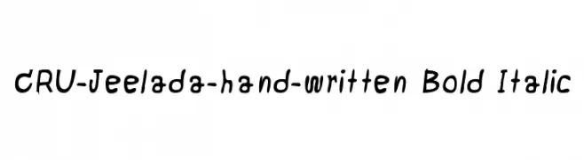
( CRU-Jeelada )
A bold, italic, hand-drawn font with a playful and informal style.
![CRU-Jeelada-hand-written Bold Italic Frei Schriftart Herunterladen]() Herunterladen 70 Downloads@WebFont
Herunterladen 70 Downloads@WebFont -
( Noto is a trademark of Google Inc. Noto fonts are open source. All Noto fonts are published under the SIL Open Font License, Version 1.1 )
A bold, extra-condensed sans-serif font ideal for headlines.
![Noto Sans Arabic UI ExtraCondensed ExtraBold Frei Schriftart Herunterladen]() Herunterladen 70 Downloads@WebFont
Herunterladen 70 Downloads@WebFont -
( Fonts by Daniel Zadorozny - www.iconian.com - Personal-use only. For commercial use please contact owner. )
A bold, left-leaning font with sharp angles and a modern, dynamic style.
![Night Traveler Leftalic Frei Schriftart Herunterladen]() Herunterladen 70 Downloads@WebFont
Herunterladen 70 Downloads@WebFont -
( Fonts by AminMario - Amin Mario - Personal-use only. For commercial use please contact owner. )
An elegant, flowing script font with a handwritten style.
![melisa Frei Schriftart Herunterladen]() Herunterladen 70 Downloads@WebFont
Herunterladen 70 Downloads@WebFont -
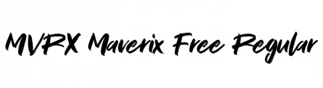
( Fonts by Maulana Creative - Gilang Maulana - Personal-use only. For commercial use please contact owner. )
A bold, brush-style script font with dynamic, handwritten strokes.
![MVRX Maverix Free Regular Frei Schriftart Herunterladen]() Herunterladen 70 Downloads@WebFont
Herunterladen 70 Downloads@WebFont -
( Fonts by FontsandFashion.com )
A bold, geometric font with a modern and dynamic design.
![PEACOCK DEMO normal Frei Schriftart Herunterladen]() Herunterladen 70 Downloads@WebFont
Herunterladen 70 Downloads@WebFont -
( Fonts by Khurasan™ )
Playful, bold font with rounded edges.
![August Shining Frei Schriftart Herunterladen]() Herunterladen 70 Downloads@WebFont
Herunterladen 70 Downloads@WebFont -
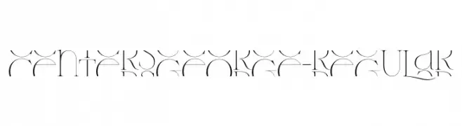
( Fonts by 177studio - Personal-use only. For commercial use please contact owner. )
A decorative and artistic font with intricate curves and flourishes.
![CentersGeorge-Regular Frei Schriftart Herunterladen]() Herunterladen 70 Downloads@WebFont
Herunterladen 70 Downloads@WebFont -
( Fonts by Allouse Studio - Personal-use only. For commercial use please contact owner. )
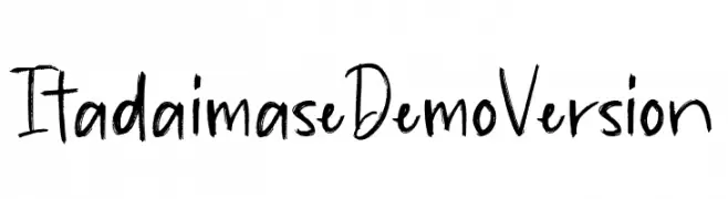
A casual, handwritten font with a playful and energetic style.
![Itadaimase Demo Version Frei Schriftart Herunterladen]() Herunterladen 70 Downloads@WebFont
Herunterladen 70 Downloads@WebFont -
( Fonts by Sigit Nur Wicaksono - Personal-use only. For commercial use please contact owner. )
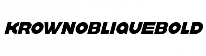
A bold, oblique font with a modern, dynamic style and tight character spacing.
![krown oblique Bold Frei Schriftart Herunterladen]() Herunterladen 70 Downloads@WebFont
Herunterladen 70 Downloads@WebFont -
( Iconian Fonts - Daniel Zadorozny - www.iconian.com )
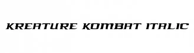
A bold, italic font with sharp, angular edges and a futuristic style.
![Kreature Kombat Italic Frei Schriftart Herunterladen]() Herunterladen 70 Downloads@WebFont
Herunterladen 70 Downloads@WebFont -
( Fonts by Billy Argel Fonts - www.billyargel.com - Personal-use only. For commercial use please contact owner. )
A bold, flowing script font with dynamic curves and high contrast.
![Dontchastop Personal Use Frei Schriftart Herunterladen]() Herunterladen 70 Downloads@WebFont
Herunterladen 70 Downloads@WebFont -
( Fonts by Etik Fatimah )
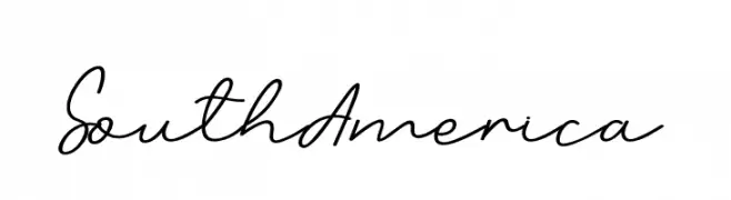
Handwritten cursive script font.
![South America Frei Schriftart Herunterladen]() Herunterladen 70 Downloads@WebFont
Herunterladen 70 Downloads@WebFont -
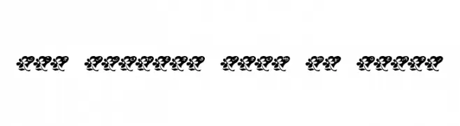
( LeChefRene - members.aol.com/lcrfonts/ )
A decorative font with characters inside heart shapes with floral accents.
![LCR Flowers From My Heart Frei Schriftart Herunterladen]() Herunterladen 70 Downloads@WebFont
Herunterladen 70 Downloads@WebFont -
( Fonts by Nick Curtis - Personal-use only. For commercial use please contact owner. )
A bold, angular font with a futuristic and artistic design.
![FortuneCookieNF Frei Schriftart Herunterladen]() Herunterladen 70 Downloads@WebFont
Herunterladen 70 Downloads@WebFont -
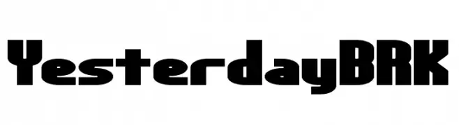
( Fonts by Ænigma Fonts - Personal-use only. For commercial use please contact owner. )
A bold, geometric font with a modern and impactful design.
![Yesterday BRK Frei Schriftart Herunterladen]() Herunterladen 70 Downloads@WebFont
Herunterladen 70 Downloads@WebFont -
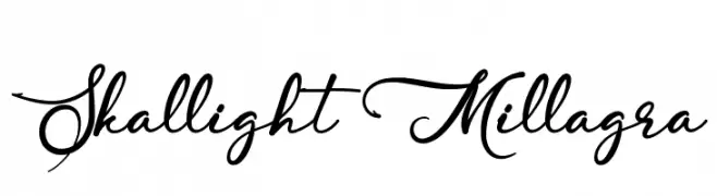
( Fonts by Kotak Kuning Studio - kotakkuning.com - Personal-use only. For commercial use please contact owner. )
An elegant and flowing script font with graceful swashes and artistic letterforms.
![Skallight Millagra Frei Schriftart Herunterladen]() Herunterladen 70 Downloads@WebFont
Herunterladen 70 Downloads@WebFont -
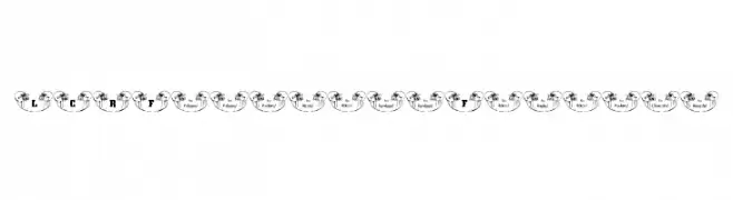
( LeChefRene - members.aol.com/lcrfonts/ )
A decorative font featuring football helmet-themed characters, perfect for sports designs.
![LCR Football Fanatic Frei Schriftart Herunterladen]() Herunterladen 70 Downloads@WebFont
Herunterladen 70 Downloads@WebFont -
( Fonts by Kris Holmes and Charles Bigelow - Personal-use only. For commercial use please contact owner. )
A modern, italic typeface with clean lines and balanced proportions.
![Go Medium Italic Frei Schriftart Herunterladen]() Herunterladen 70 Downloads@WebFont
Herunterladen 70 Downloads@WebFont -
( Fonts by twinletter - Rozikan - Personal-use only. For commercial use please contact owner. )
A playful, handwritten font with a whimsical and elegant style.
![Sunflower Spring Personal Use Frei Schriftart Herunterladen]() Herunterladen 70 Downloads@WebFont
Herunterladen 70 Downloads@WebFont -
( Iconian Fonts - Daniel Zadorozny - www.iconian.com )
A bold, futuristic font with a halftone effect and italic slant.
![Royal Samurai Halftone Italic Frei Schriftart Herunterladen]() Herunterladen 70 Downloads@WebFont
Herunterladen 70 Downloads@WebFont -
( Muhammad Akbar - creativemarket.com/sinfa )
A graceful script font with flowing, interconnected letters and ornate details.
![the kastle Frei Schriftart Herunterladen]() Herunterladen 70 Downloads@WebFont
Herunterladen 70 Downloads@WebFont -
( Fonts by Ditoollis Project - Muhammad Faizal Said - Personal-use only. For commercial use please contact owner. )
A flowing, cursive font with elegant, sweeping strokes and a handwritten appearance.
![Bollinsh Hunt Personal Use Only Frei Schriftart Herunterladen]() Herunterladen 70 Downloads@WebFont
Herunterladen 70 Downloads@WebFont -
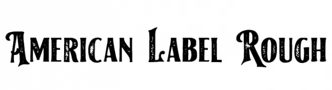
( Fonts by Holisfonts.com - Holis Fonts - Personal-use only. For commercial use please contact owner. )
A bold, decorative font with a vintage, distressed look and ornate serifs.
![American Label Rough Frei Schriftart Herunterladen]() Herunterladen 70 Downloads@WebFont
Herunterladen 70 Downloads@WebFont -
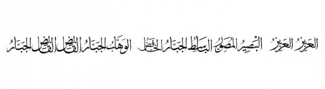
( Fonts by elharrak - elharrak fonts - Personal-use only. For commercial use please contact owner. )
An elegant and traditional Arabic script with intricate design and dynamic contrast.
![allah names 99 Frei Schriftart Herunterladen]() Herunterladen 70 Downloads@WebFont
Herunterladen 70 Downloads@WebFont -
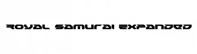
( Iconian Fonts - Daniel Zadorozny - www.iconian.com )
A bold, futuristic font with sharp, angular edges and a geometric style.
![Royal Samurai Expanded Frei Schriftart Herunterladen]() Herunterladen 70 Downloads@WebFont
Herunterladen 70 Downloads@WebFont -
( Fonts by Hanzel Space - Personal-use only. For commercial use please contact owner. )
A bold, flowing script font with elegant curves and high contrast.
![Sinethar Frei Schriftart Herunterladen]() Herunterladen 70 Downloads@WebFont
Herunterladen 70 Downloads@WebFont -
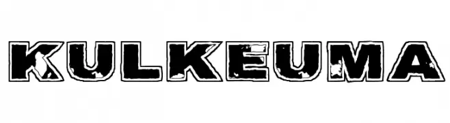
( Fonts by www.junkohanhero.com - Personal-use only. For commercial use please contact owner. )
A bold, distressed font with a rugged, vintage appearance.
![Kulkeuma Frei Schriftart Herunterladen]() Herunterladen 70 Downloads@WebFont
Herunterladen 70 Downloads@WebFont -
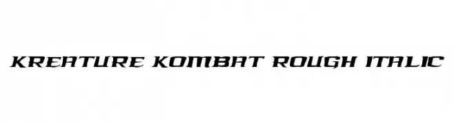
( Iconian Fonts - Daniel Zadorozny - www.iconian.com )
A bold, angular, and italicized font with a rough texture for dynamic impact.
![Kreature Kombat Rough Italic Frei Schriftart Herunterladen]() Herunterladen 70 Downloads@WebFont
Herunterladen 70 Downloads@WebFont -
( Fonts by Faqih Fawaji - Personal-use only. For commercial use please contact owner. )
A flowing, cursive font with elegant, connected letters.
![Forever Frei Schriftart Herunterladen]() Herunterladen 70 Downloads@WebFont
Herunterladen 70 Downloads@WebFont


Welche Schriften sind gerade am populärsten?
Poppins, Roboto, Montserrat, Open Sans und Lato sind wegen ihrer klaren Formen und breiten Einsetzbarkeit sehr gefragt – von Markenauftritt über Landingpages bis hin zu Postern.
Welche Fonts eignen sich für Logos?
Geometrische Sans‑Serifs (z. B. Poppins, Familien im Gotham‑Stil) sind ein häufiger Griff für sauberes, skalierbares Branding. Für eine persönlichere Note bleiben Scripts und Handschrift‑Stile beliebt. Kombinieren Sie einen prägnanten Headline‑Font mit einer neutralen Brotschrift für Wiedererkennung und Harmonie.
Wie oft wird die Top‑Liste aktualisiert?
Regelmäßig – basierend auf realen Downloads und Interaktionen. Schauen Sie öfter vorbei, um aufstrebende Favoriten früh zu entdecken.
💡 Tipp: Seite bookmarken – Trends wechseln schnell, und heutige Top‑Schriften inspirieren morgen vielleicht das Rebranding.