Willkommen bei den Top‑Schriften – hier treffen Beliebtheit und Qualität aufeinander. Das sind die in diesem Jahr am häufigsten heruntergeladenen und genutzten Fonts. Wenn Sie sichere Optionen für Logo, Web oder Social suchen, starten Sie hier.
Jeder Top‑Font überzeugt durch Balance, Lesbarkeit und Vielseitigkeit. Sie finden moderne Sans‑Serifs, elegante Scripts, Vintage‑Serifs und minimalistische Displays.
-
( Fonts by Fikry Alif - Fikryal studio - https://www.creativefabrica.com/designer/mfikryalif/ref/222304/ - Personal-use only. For commercial use please contact owner. )
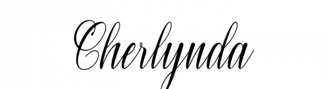
An elegant script font with flowing, cursive letters and refined swashes.
 Herunterladen 59 Downloads@WebFont
 -
( Fonts by Prioritype Co - Prio Nurokhim Aji - Personal-use only. For commercial use please contact owner. )
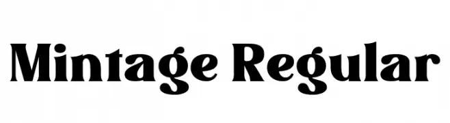
A bold, vintage-inspired font with thick strokes and a modern touch.
![Mintage Regular Frei Schriftart Herunterladen]() Herunterladen 59 Downloads@WebFont
Herunterladen 59 Downloads@WebFont -
( Iconian Fonts - Daniel Zadorozny - www.iconian.com )
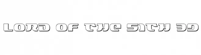
A bold, futuristic 3D font with a modern, tech-inspired design.
![Lord of the Sith 3D Frei Schriftart Herunterladen]() Herunterladen 59 Downloads@WebFont
Herunterladen 59 Downloads@WebFont -
( Fonts by Kong Font - fontkong.com - Personal-use only. For commercial use please contact owner. )
An elegant, flowing script font with cursive strokes and decorative flair.
![Danette Pricilla Frei Schriftart Herunterladen]() Herunterladen 59 Downloads@WebFont
Herunterladen 59 Downloads@WebFont -
( Jorge Sans Alsina - newlifetypeface.wordpress.com/ )
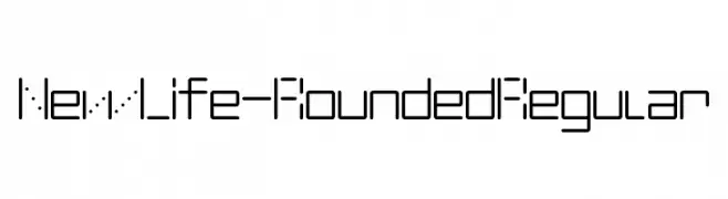
A modern, geometric font with rounded edges and a digital aesthetic.
![NewLife-Rounded Regular Frei Schriftart Herunterladen]() Herunterladen 59 Downloads@WebFont
Herunterladen 59 Downloads@WebFont -
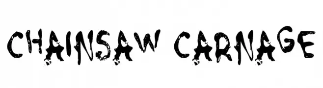
( Fonts by GGBot - www.ggbot.net - Personal-use only. For commercial use please contact owner. )
A rugged, distressed font with a chaotic, edgy appearance.
![Chainsaw Carnage Frei Schriftart Herunterladen]() Herunterladen 59 Downloads@WebFont
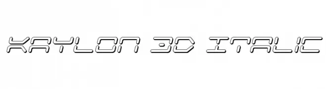
Herunterladen 59 Downloads@WebFont -
![Kaylon 3D Italic Frei Schriftart Herunterladen]() Herunterladen 59 Downloads@WebFont
Herunterladen 59 Downloads@WebFont -
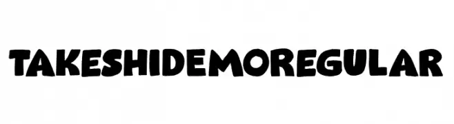
( Fonts by Hanoded - David Kerkhoff - Personal-use only. For commercial use please contact owner. )
A bold, rounded font with a playful and dynamic style.
![Takeshi DEMO Regular Frei Schriftart Herunterladen]() Herunterladen 59 Downloads@WebFont
Herunterladen 59 Downloads@WebFont -
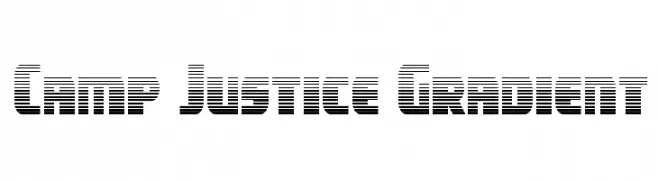
( Iconian Fonts - Daniel Zadorozny - www.iconian.com )
A bold, geometric font with a unique horizontal striped pattern.
![Camp Justice Gradient Frei Schriftart Herunterladen]() Herunterladen 59 Downloads@WebFont
Herunterladen 59 Downloads@WebFont -
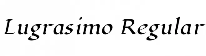
( Copyright 2023 The Lugrasimo Project Authors (https://github.com/docrepair-fonts/lugrasimo-fonts). )
A calligraphic, italic script with elegant, sweeping forms.
![Lugrasimo Regular Frei Schriftart Herunterladen]() Herunterladen 59 Downloads@WebFont
Herunterladen 59 Downloads@WebFont -
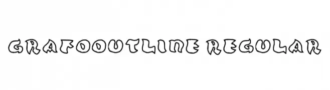
( Fonts by JoGrafik )
A playful, hand-drawn outline font with a whimsical and dynamic style.
![Grafooutline Regular Frei Schriftart Herunterladen]() Herunterladen 59 Downloads@WebFont
Herunterladen 59 Downloads@WebFont -
( Noto is a trademark of Google Inc. Noto fonts are open source. All Noto fonts are published under the SIL Open Font License, Version 1.1 )
No valid font glyphs are visible.
![Noto Serif Lao SemiCondensed Light Frei Schriftart Herunterladen]() Herunterladen 59 Downloads@WebFont
Herunterladen 59 Downloads@WebFont -
( Bolt Cutter Design - www.boltcutterdesign.net/index.html )
An ornate Blackletter font with intricate, gothic-inspired designs.
![VladTepesII [Vlads Dad] Frei Schriftart Herunterladen]() Herunterladen 59 Downloads@WebFont
Herunterladen 59 Downloads@WebFont -
( Josen Tan - www.roblox.com )
A bold, geometric font with a modern and striking appearance.
![xxjjoosengx33xx 2 Bold Frei Schriftart Herunterladen]() Herunterladen 59 Downloads@WebFont
Herunterladen 59 Downloads@WebFont -
( Fonts by Situjuh Nazara - 7ntypes.com - Personal-use only. For commercial use please contact owner. )
A playful, rounded font with a hand-drawn, whimsical style.
![Clowny Frei Schriftart Herunterladen]() Herunterladen 59 Downloads@WebFont
Herunterladen 59 Downloads@WebFont -
( Fonts by Indro Tanwijoyo - Personal-use only. For commercial use please contact owner. )
A dynamic, brush-style font with sharp, angular strokes and a handcrafted feel.
![Almour! Frei Schriftart Herunterladen]() Herunterladen 59 Downloads@WebFont
Herunterladen 59 Downloads@WebFont -
( Fonts by UI Creative - Personal-use only. For commercial use please contact owner. )
A modern serif font with bold, clean lines and a slightly condensed style.
![Gerovape Frei Schriftart Herunterladen]() Herunterladen 59 Downloads@WebFont
Herunterladen 59 Downloads@WebFont -
( Fonts by LetterStock - Guguh Gumantoro - Personal-use only. For commercial use please contact owner. )
A bold, dynamic script font with a handwritten, energetic style.
![Buckles Frei Schriftart Herunterladen]() Herunterladen 59 Downloads@WebFont
Herunterladen 59 Downloads@WebFont -
( Fonts by Creatype Studio - Rian Rahardi - Personal-use only. For commercial use please contact owner. )
A lively and fluid handwritten font with a dynamic cursive style.
![Twister Frei Schriftart Herunterladen]() Herunterladen 59 Downloads@WebFont
Herunterladen 59 Downloads@WebFont -
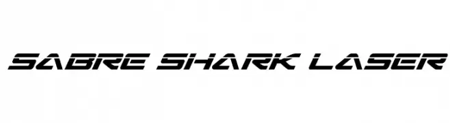
( Fonts by Daniel Zadorozny - www.iconian.com - Personal-use only. For commercial use please contact owner. )
A futuristic, angular font with sharp edges and a slanted design.
![Sabre Shark Laser Frei Schriftart Herunterladen]() Herunterladen 59 Downloads@WebFont
Herunterladen 59 Downloads@WebFont -
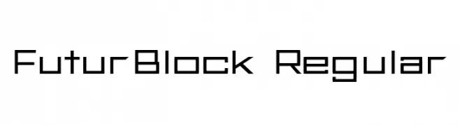
( Fonts by Cameron Bensimon - Personal-use only. For commercial use please contact owner. )
A geometric, modern font with a clean and structured appearance.
![FuturBlock Regular Frei Schriftart Herunterladen]() Herunterladen 59 Downloads@WebFont
Herunterladen 59 Downloads@WebFont -
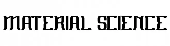
( Fonts by Wino S Kadir - weknow - www.revolge.com/shop/weknow/ - Personal-use only. For commercial use please contact owner. )
A bold, geometric font with angular, industrial design elements.
![MATERIAL SCIENCE Frei Schriftart Herunterladen]() Herunterladen 59 Downloads@WebFont
Herunterladen 59 Downloads@WebFont -
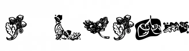
( Fonts by Kat`s Fun Fonts - Personal-use only. For commercial use please contact owner. )
Decorative autumn-themed dingbat font with foliage and acorn motifs.
![KR Oaken Frei Schriftart Herunterladen]() Herunterladen 59 Downloads@WebFont
Herunterladen 59 Downloads@WebFont -
( Fonts by Mans Greback - Personal-use only. For commercial use please contact owner. )
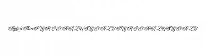
An ornate and elegant script font with intricate swirls and flourishes.
![Myteri Thin PERSONAL USE ONLY PERSONAL USE ONLY Frei Schriftart Herunterladen]() Herunterladen 59 Downloads@WebFont
Herunterladen 59 Downloads@WebFont -
( Fonts by VitaminRGB - Personal-use only. For commercial use please contact owner. )
A playful, handwritten font with bold, rounded uppercase and flowing lowercase letters.
![Street Dreams Frei Schriftart Herunterladen]() Herunterladen 59 Downloads@WebFont
Herunterladen 59 Downloads@WebFont -
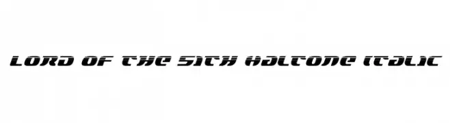
( Iconian Fonts - Daniel Zadorozny - www.iconian.com )
A bold, italicized font with a futuristic and dynamic design.
![Lord of the Sith Haltone Italic Frei Schriftart Herunterladen]() Herunterladen 59 Downloads@WebFont
Herunterladen 59 Downloads@WebFont -
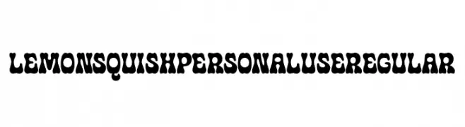
( Fonts by Mans Greback - www.mansgreback.com - Personal-use only. For commercial use please contact owner. )
A playful, bold font with a squishy, organic design.
![Lemon Squish PERSONAL USE Regular Frei Schriftart Herunterladen]() Herunterladen 59 Downloads@WebFont
Herunterladen 59 Downloads@WebFont -
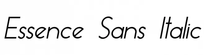
( Fonts by skomii - Personal-use only. For commercial use please contact owner. )
A sleek, modern sans-serif font with an elegant italic slant.
![Essence Sans Italic Frei Schriftart Herunterladen]() Herunterladen 59 Downloads@WebFont
Herunterladen 59 Downloads@WebFont -
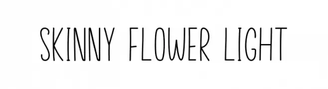
( Fonts by Manjali Studio - Personal-use only. For commercial use please contact owner. )
A tall, slender, and playful handwritten font with a modern touch.
![Skinny Flower Light Frei Schriftart Herunterladen]() Herunterladen 59 Downloads@WebFont
Herunterladen 59 Downloads@WebFont -
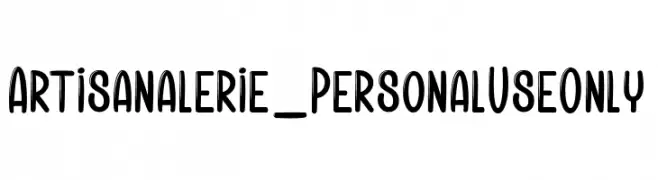
( Fonts by dcoxy - Greg Medina - Personal-use only. For commercial use please contact owner. )
A bold, playful font with rounded edges and a modern, approachable style.
![Artisanalerie_PersonalUseOnly Frei Schriftart Herunterladen]() Herunterladen 59 Downloads@WebFont
Herunterladen 59 Downloads@WebFont -
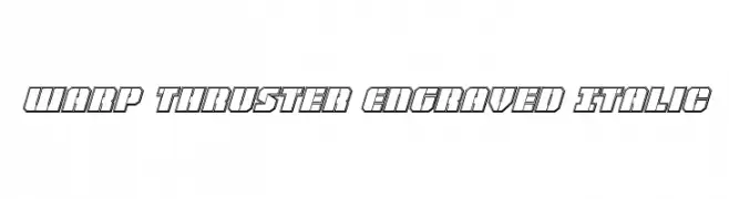
( Iconian Fonts - Daniel Zadorozny - www.iconian.com )
A futuristic, angular font with outlined characters and an italic style.
![Warp Thruster Engraved Italic Frei Schriftart Herunterladen]() Herunterladen 59 Downloads@WebFont
Herunterladen 59 Downloads@WebFont -
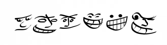
( Boogie Jack - formerly at www.boogiejack.com/fonts.html )
Cartoonish font made of expressive smiling faces.
![Smiles Frei Schriftart Herunterladen]() Herunterladen 59 Downloads@WebFont
Herunterladen 59 Downloads@WebFont -
( Fonts by Woodcutter )
A bold, playful font with exaggerated, rounded forms and a whimsical style.
![Calypso Soundsystem Frei Schriftart Herunterladen]() Herunterladen 59 Downloads@WebFont
Herunterladen 59 Downloads@WebFont -
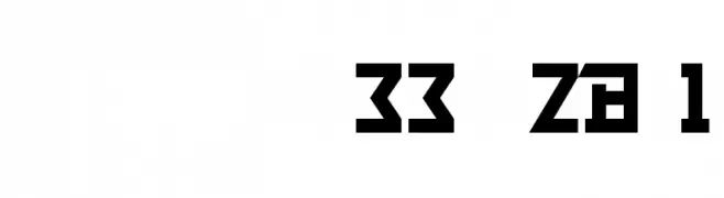
![NumberpileReversed-Regular Frei Schriftart Herunterladen]() Herunterladen 59 Downloads@WebFont
Herunterladen 59 Downloads@WebFont -
( Fonts by Kong Font - https://fontkong.com/ - Personal-use only. For commercial use please contact owner. )
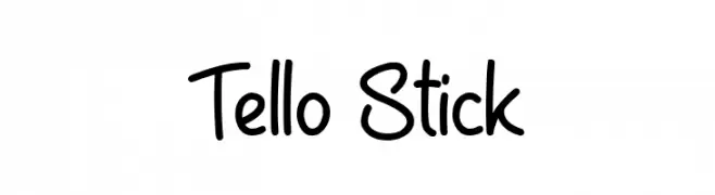
A playful handwritten font with smooth, flowing curves and a casual feel.
![Tello Stick Frei Schriftart Herunterladen]() Herunterladen 59 Downloads@WebFont
Herunterladen 59 Downloads@WebFont

![VladTepesII [Vlads Dad] Frei Schriftart Herunterladen](https://d144mzi0q5mijx.cloudfront.net/img/V/L/VladTepesII-Vlads-Dad.webp)


Welche Schriften sind gerade am populärsten?
Poppins, Roboto, Montserrat, Open Sans und Lato sind wegen ihrer klaren Formen und breiten Einsetzbarkeit sehr gefragt – von Markenauftritt über Landingpages bis hin zu Postern.
Welche Fonts eignen sich für Logos?
Geometrische Sans‑Serifs (z. B. Poppins, Familien im Gotham‑Stil) sind ein häufiger Griff für sauberes, skalierbares Branding. Für eine persönlichere Note bleiben Scripts und Handschrift‑Stile beliebt. Kombinieren Sie einen prägnanten Headline‑Font mit einer neutralen Brotschrift für Wiedererkennung und Harmonie.
Wie oft wird die Top‑Liste aktualisiert?
Regelmäßig – basierend auf realen Downloads und Interaktionen. Schauen Sie öfter vorbei, um aufstrebende Favoriten früh zu entdecken.
💡 Tipp: Seite bookmarken – Trends wechseln schnell, und heutige Top‑Schriften inspirieren morgen vielleicht das Rebranding.