Willkommen bei den Top‑Schriften – hier treffen Beliebtheit und Qualität aufeinander. Das sind die in diesem Jahr am häufigsten heruntergeladenen und genutzten Fonts. Wenn Sie sichere Optionen für Logo, Web oder Social suchen, starten Sie hier.
Jeder Top‑Font überzeugt durch Balance, Lesbarkeit und Vielseitigkeit. Sie finden moderne Sans‑Serifs, elegante Scripts, Vintage‑Serifs und minimalistische Displays.
-
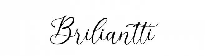
( Fonts by Ketikata Studio - Fuad Hasan - Personal-use only. For commercial use please contact owner. )
A sophisticated script font with elegant, flowing characters and calligraphic style.
 Herunterladen 67 Downloads@WebFont
 -
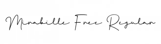
( Fonts by Maulana Creative - Gilang Maulana - Personal-use only. For commercial use please contact owner. )
A graceful, handwritten script font with elegant, flowing lines.
![Mirabille Free Regular Frei Schriftart Herunterladen]() Herunterladen 67 Downloads@WebFont
Herunterladen 67 Downloads@WebFont -
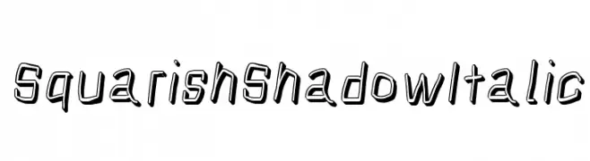
( Fonts by CannotIntoSpaceFonts - KineticPlasma Fonts - Personal-use only. For commercial use please contact owner. )
A bold, italicized font with a shadow effect and geometric style.
![Squarish Shadow Italic Frei Schriftart Herunterladen]() Herunterladen 67 Downloads@WebFont
Herunterladen 67 Downloads@WebFont -
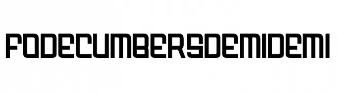
( Fonts by zamjump - Ahmad Zamzami - Personal-use only. For commercial use please contact owner. )
A bold, geometric font with uniform stroke widths and a modern aesthetic.
![FODECUMBERS DEMI DEMI Frei Schriftart Herunterladen]() Herunterladen 67 Downloads@WebFont
Herunterladen 67 Downloads@WebFont -
( Fonts by Jadatype )
A bold, geometric font with a modern, industrial aesthetic and wide character spacing.
![Socilo Frei Schriftart Herunterladen]() Herunterladen 67 Downloads@WebFont
Herunterladen 67 Downloads@WebFont -
( Noto is a trademark of Google Inc. Noto fonts are open source. All Noto fonts are published under the SIL Open Font License, Version 1.1 )
A clean, modern, semi-condensed font with uniform strokes and balanced appearance.
![Noto Sans Ethiopic SemiCondensed Frei Schriftart Herunterladen]() Herunterladen 67 Downloads@WebFont
Herunterladen 67 Downloads@WebFont -
( Fonts by StringLabs - stringlabscreative.com - Personal-use only. For commercial use please contact owner. )
A dynamic and elegant handwritten cursive font.
![Sellviny Frei Schriftart Herunterladen]() Herunterladen 67 Downloads@WebFont
Herunterladen 67 Downloads@WebFont -
( Fonts by Daniel Zadorozny - www.iconian.com - Personal-use only. For commercial use please contact owner. )
A bold, italic font with a geometric and dynamic style.
![Rockledge Italic Frei Schriftart Herunterladen]() Herunterladen 67 Downloads@WebFont
Herunterladen 67 Downloads@WebFont -
( Fonts by Daniel Zadorozny - www.iconian.com - Personal-use only. For commercial use please contact owner. )
A bold, geometric font with a unique halftone effect, perfect for modern and edgy designs.
![Turtle Mode Halftone Frei Schriftart Herunterladen]() Herunterladen 67 Downloads@WebFont
Herunterladen 67 Downloads@WebFont -
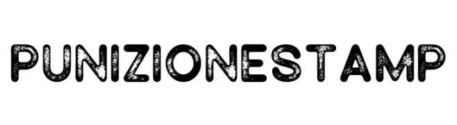
( Fonts by Akhmad Reza Fauzi )
A bold, distressed font with a vintage, textured appearance.
![Punizione Stamp Frei Schriftart Herunterladen]() Herunterladen 67 Downloads@WebFont
Herunterladen 67 Downloads@WebFont -
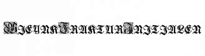
( Fonts by Typographer Mediengestaltung - Personal-use only. For commercial use please contact owner. )
An ornate Blackletter font with intricate flourishes and a vintage Gothic style.
![Wieynk Fraktur Initialen Frei Schriftart Herunterladen]() Herunterladen 67 Downloads@WebFont
Herunterladen 67 Downloads@WebFont -
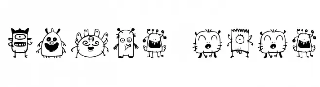
( Fonts by Greg Medina - www.dcoxy.com - Personal-use only. For commercial use please contact owner. )
A whimsical collection of playful, cartoonish alien characters with unique designs.
![space dude Frei Schriftart Herunterladen]() Herunterladen 67 Downloads@WebFont
Herunterladen 67 Downloads@WebFont -
( Anthony Robinson - www.redbubble.com/people/anfa/portfolio )
An edgy, jagged font with a dripping, grungy aesthetic.
![Slasha Frei Schriftart Herunterladen]() Herunterladen 67 Downloads@WebFont
Herunterladen 67 Downloads@WebFont -
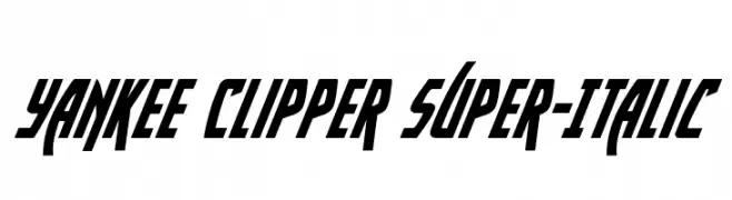
( Iconian Fonts - Daniel Zadorozny - www.iconian.com )
A bold, italicized font with sharp angles and a dynamic slant.
![Yankee Clipper Super-Italic Frei Schriftart Herunterladen]() Herunterladen 67 Downloads@WebFont
Herunterladen 67 Downloads@WebFont -
( Fonts by Mans Greback - Personal-use only. For commercial use please contact owner. )
A bold, italic script font with a dynamic and flowing style.
![Querino Script Italic PERSONAL USE Frei Schriftart Herunterladen]() Herunterladen 67 Downloads@WebFont
Herunterladen 67 Downloads@WebFont -
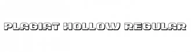
( Fonts by Vladimir Nikolic - https://www.creativefabrica.com/product/educated-deers/ref/144265/ - Personal-use only. For commercial use please contact owner. )
A bold, hollow font with geometric and angular design, featuring thick outlines.
![Plagiat Hollow Regular Frei Schriftart Herunterladen]() Herunterladen 67 Downloads@WebFont
Herunterladen 67 Downloads@WebFont -
( Fonts by Kong Font - https://fontkong.com/ - Personal-use only. For commercial use please contact owner. )
A playful, bold font with rounded edges and whimsical cutouts.
![Boogie worth Three Frei Schriftart Herunterladen]() Herunterladen 67 Downloads@WebFont
Herunterladen 67 Downloads@WebFont -
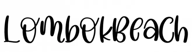
( Fonts by Perspectype Studio - Personal-use only. For commercial use please contact owner. )
A playful, bold script font with lively curves and smooth connections.
![Lombok Beach Frei Schriftart Herunterladen]() Herunterladen 67 Downloads@WebFont
Herunterladen 67 Downloads@WebFont -
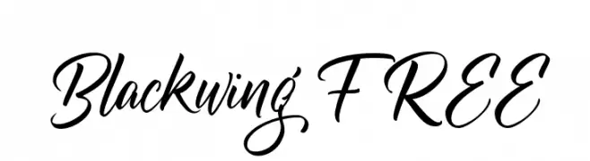
( Fonts by Vunira Design - Personal-use only. For commercial use please contact owner. )
A sophisticated script font with fluid, cursive strokes and elegant flourishes.
![Blackwing FREE Frei Schriftart Herunterladen]() Herunterladen 67 Downloads@WebFont
Herunterladen 67 Downloads@WebFont -
( Jacqueline Bantad - www.twitter.com/jacquelinejedi )
A whimsical, playful font with elongated ascenders and descenders.
![ZeaMaysEverta Frei Schriftart Herunterladen]() Herunterladen 67 Downloads@WebFont
Herunterladen 67 Downloads@WebFont -
( Fonts by Typographer Mediengestaltung - Personal-use only. For commercial use please contact owner. )
A traditional blackletter font with intricate detailing and a medieval aesthetic.
![Wieynk Fraktur Frei Schriftart Herunterladen]() Herunterladen 67 Downloads@WebFont
Herunterladen 67 Downloads@WebFont -
( Fonts by Letterative Studio - Personal-use only. For commercial use please contact owner. )
A bold, expressive handwritten font with a lively, cursive style.
![Daily Feather Frei Schriftart Herunterladen]() Herunterladen 67 Downloads@WebFont
Herunterladen 67 Downloads@WebFont -
( Fonts by Kat`s Fun Fonts - Personal-use only. For commercial use please contact owner. )
A floral-themed decorative dingbat set with diverse flower and plant icons.
![KR Blossoms 1 Frei Schriftart Herunterladen]() Herunterladen 67 Downloads@WebFont
Herunterladen 67 Downloads@WebFont -
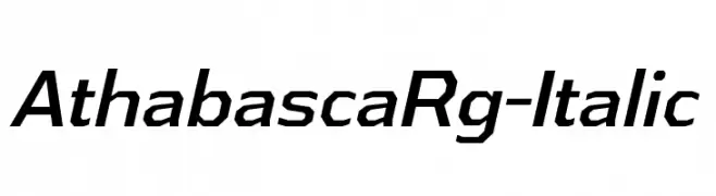
( Typodermic Fonts - Ray Larabie - www.typodermicfonts.com/ )
A modern italic font with geometric structure and dynamic slant.
![AthabascaRg-Italic Frei Schriftart Herunterladen]() Herunterladen 67 Downloads@WebFont
Herunterladen 67 Downloads@WebFont -
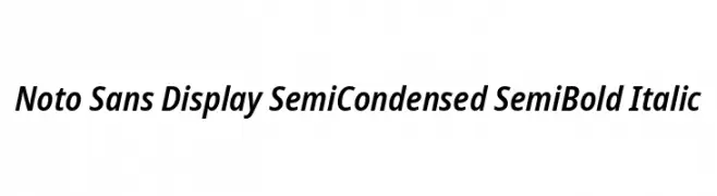
( Noto is a trademark of Google Inc. Noto fonts are open source. All Noto fonts are published under the SIL Open Font License, Version 1.1 )
A modern, semi-condensed sans-serif font with semi-bold weight and italic style.
![Noto Sans Display SemiCondensed SemiBold Italic Frei Schriftart Herunterladen]() Herunterladen 67 Downloads@WebFont
Herunterladen 67 Downloads@WebFont -
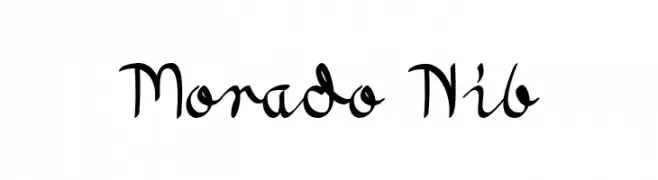
( Fonts by Peter Wiegel - www.peter-wiegel.de - Personal-use only. For commercial use please contact owner. )
A fluid and elegant script font with a modern calligraphic style.
![Morado Nib Frei Schriftart Herunterladen]() Herunterladen 67 Downloads@WebFont
Herunterladen 67 Downloads@WebFont -
( Fonts by Daniel Zadorozny - www.iconian.com - Personal-use only. For commercial use please contact owner. )
A bold, italicized font with a futuristic and angular design.
![Yamagachi 2050 Super-Italic Frei Schriftart Herunterladen]() Herunterladen 67 Downloads@WebFont
Herunterladen 67 Downloads@WebFont -
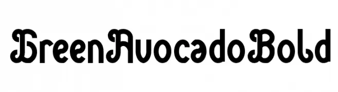
( weknow - Wino S Kadir - www.creativefabrica.com/designer/weknow/ )
A bold, playful, and decorative font with interconnected, rounded characters.
![Green Avocado Bold Frei Schriftart Herunterladen]() Herunterladen 67 Downloads@WebFont
Herunterladen 67 Downloads@WebFont -
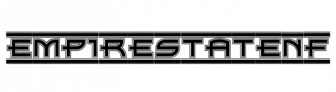
( Fonts by Nick Curtis - Personal-use only. For commercial use please contact owner. )
A bold, geometric font with an architectural, three-dimensional style.
![EmpireStateNF Frei Schriftart Herunterladen]() Herunterladen 67 Downloads@WebFont
Herunterladen 67 Downloads@WebFont -
( Fonts by benoitsjoholm.blogspot.com - Benoit Sjoholm - Personal-use only. For commercial use please contact owner. )
A bold, geometric font with a modern and edgy style.
![Yatis black Frei Schriftart Herunterladen]() Herunterladen 67 Downloads@WebFont
Herunterladen 67 Downloads@WebFont -
( Darrell Flood )
A bold, geometric font with a modern, futuristic style.
![Machine Madness Frei Schriftart Herunterladen]() Herunterladen 67 Downloads@WebFont
Herunterladen 67 Downloads@WebFont -
( Fonts by Typodermic Fonts - Raymond Larabie - Personal-use only. For commercial use please contact owner. )
A bold, vintage-inspired font with a modern twist, perfect for impactful designs.
![Duality-Regular Frei Schriftart Herunterladen]() Herunterladen 67 Downloads@WebFont
Herunterladen 67 Downloads@WebFont -
( weknow - Wino S Kadir - www.creativefabrica.com/designer/weknow/ )
A playful and decorative font with rounded edges and intricate curves.
![Green Avocado-Light Frei Schriftart Herunterladen]() Herunterladen 67 Downloads@WebFont
Herunterladen 67 Downloads@WebFont -
( Fonts by Daniel Zadorozny - www.iconian.com - Personal-use only. For commercial use please contact owner. )
Bold, geometric font with a semi-italic slant and strong visual impact.
![Homebase Semi-Italic Frei Schriftart Herunterladen]() Herunterladen 67 Downloads@WebFont
Herunterladen 67 Downloads@WebFont -
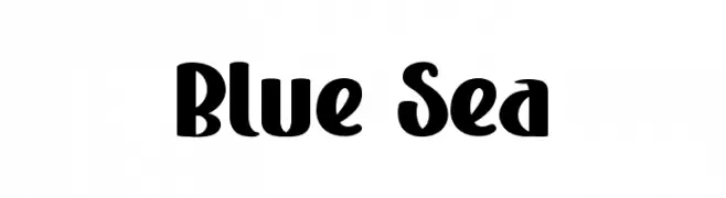
( Fonts by FreshtypeINK )
A bold, playful font with a modern and decorative style.
![Blue Sea Frei Schriftart Herunterladen]() Herunterladen 67 Downloads@WebFont
Herunterladen 67 Downloads@WebFont


Welche Schriften sind gerade am populärsten?
Poppins, Roboto, Montserrat, Open Sans und Lato sind wegen ihrer klaren Formen und breiten Einsetzbarkeit sehr gefragt – von Markenauftritt über Landingpages bis hin zu Postern.
Welche Fonts eignen sich für Logos?
Geometrische Sans‑Serifs (z. B. Poppins, Familien im Gotham‑Stil) sind ein häufiger Griff für sauberes, skalierbares Branding. Für eine persönlichere Note bleiben Scripts und Handschrift‑Stile beliebt. Kombinieren Sie einen prägnanten Headline‑Font mit einer neutralen Brotschrift für Wiedererkennung und Harmonie.
Wie oft wird die Top‑Liste aktualisiert?
Regelmäßig – basierend auf realen Downloads und Interaktionen. Schauen Sie öfter vorbei, um aufstrebende Favoriten früh zu entdecken.
💡 Tipp: Seite bookmarken – Trends wechseln schnell, und heutige Top‑Schriften inspirieren morgen vielleicht das Rebranding.