Willkommen bei den Top‑Schriften – hier treffen Beliebtheit und Qualität aufeinander. Das sind die in diesem Jahr am häufigsten heruntergeladenen und genutzten Fonts. Wenn Sie sichere Optionen für Logo, Web oder Social suchen, starten Sie hier.
Jeder Top‑Font überzeugt durch Balance, Lesbarkeit und Vielseitigkeit. Sie finden moderne Sans‑Serifs, elegante Scripts, Vintage‑Serifs und minimalistische Displays.
-
( Fonts by FallenGraphic Studio - Vava Aryanto - Personal-use only. For commercial use please contact owner. )
A graceful and elegant script font with flowing, interconnected letters.
 Herunterladen 67 Downloads@WebFont
 -
( Fonts by VampStudio - Personal-use only. For commercial use please contact owner. )
A charming and elegant script font with fluid, connected letterforms.
![Alexana Frei Schriftart Herunterladen]() Herunterladen 67 Downloads@WebFont
Herunterladen 67 Downloads@WebFont -
( weknow - Wino S Kadir - www.creativefabrica.com/designer/weknow/ )
A playful, hollow, bubble-like font with a whimsical and modern style.
![Enjoy The Time-Hollow Frei Schriftart Herunterladen]() Herunterladen 67 Downloads@WebFont
Herunterladen 67 Downloads@WebFont -
( Misti's Fonts - mistifonts.com/ )
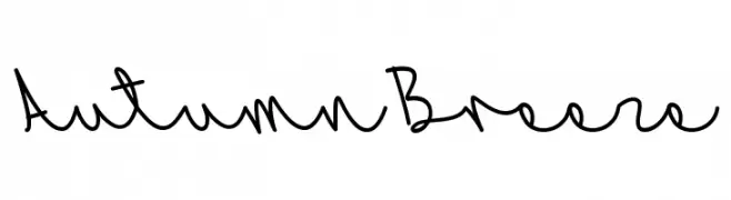
A playful, casual handwritten font with smooth, flowing curves.
![AutumnBreeze Frei Schriftart Herunterladen]() Herunterladen 67 Downloads@WebFont
Herunterladen 67 Downloads@WebFont -
( Fonts by Daniel Zadorozny - www.iconian.com - Personal-use only. For commercial use please contact owner. )
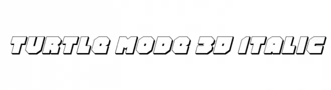
A bold, 3D italic font with a geometric, shadowed design.
![Turtle Mode 3D Italic Frei Schriftart Herunterladen]() Herunterladen 67 Downloads@WebFont
Herunterladen 67 Downloads@WebFont -
( Xerographer Fonts - Max Infeld - xerographer.blogspot.com )
A whimsical, hand-drawn font with tall, narrow characters and a playful style.
![Scrapbuckets Frei Schriftart Herunterladen]() Herunterladen 67 Downloads@WebFont
Herunterladen 67 Downloads@WebFont -
( Fonts by Cikareotype Studio )
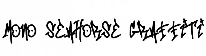
A bold, graffiti-inspired font with dynamic, hand-drawn characters.
![Mono Seahorse Graffiti Frei Schriftart Herunterladen]() Herunterladen 67 Downloads@WebFont
Herunterladen 67 Downloads@WebFont -
( Fonts by Font People - Personal-use only. For commercial use please contact owner. )
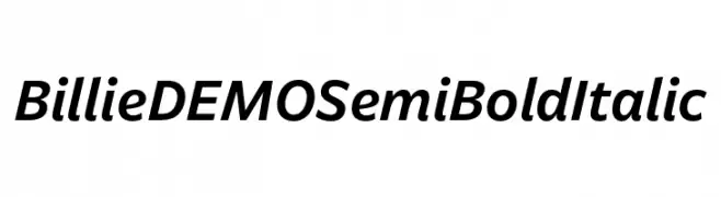
A modern, semi-bold italic font with medium contrast and dynamic style.
![Billie DEMO SemiBold Italic Frei Schriftart Herunterladen]() Herunterladen 67 Downloads@WebFont
Herunterladen 67 Downloads@WebFont -
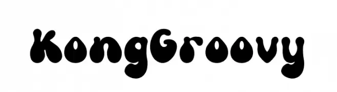
( Fonts by Kong Font )
A bold, playful font with rounded, bulbous letterforms and a retro vibe.
![Kong Groovy Frei Schriftart Herunterladen]() Herunterladen 67 Downloads@WebFont
Herunterladen 67 Downloads@WebFont -
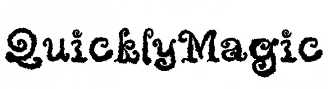
( Fonts by Masa Aska Sanurumi )
A whimsical, decorative font with curly embellishments and bold strokes.
![Quickly Magic Frei Schriftart Herunterladen]() Herunterladen 67 Downloads@WebFont
Herunterladen 67 Downloads@WebFont -
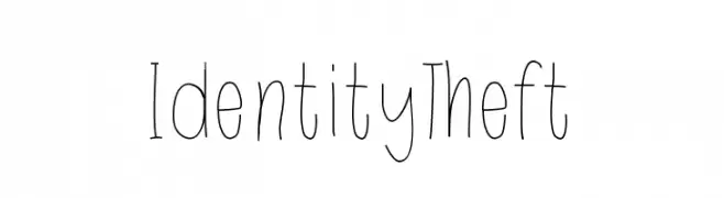
( Fonts by Katelyn Dancer )
Playful handwritten font with tall, narrow letters.
![IdentityTheft Frei Schriftart Herunterladen]() Herunterladen 67 Downloads@WebFont
Herunterladen 67 Downloads@WebFont -
( Fonts by Letterafa Studio - Ahmad Afandi - Personal-use only. For commercial use please contact owner. )
A playful and whimsical script font with a hand-drawn, cursive style.
![Thanks Mom - Personal Use Frei Schriftart Herunterladen]() Herunterladen 67 Downloads@WebFont
Herunterladen 67 Downloads@WebFont -
( imagex - www.imagex-fonts.com )
A bold, decorative font with a strong, geometric style and thick outlines.
![Maximum Strength Frei Schriftart Herunterladen]() Herunterladen 67 Downloads@WebFont
Herunterladen 67 Downloads@WebFont -
( Renny Murray - www.rennysniche.com )
A playful, decorative font with characters enclosed in basket designs.
![RMBaskbn Frei Schriftart Herunterladen]() Herunterladen 67 Downloads@WebFont
Herunterladen 67 Downloads@WebFont -
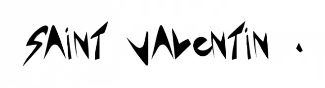
( Léa Morand - alealaplage.weebly.com/ )
A bold, angular font with sharp, geometric lines and a dynamic style.
![Saint Valentin 1.3 Frei Schriftart Herunterladen]() Herunterladen 67 Downloads@WebFont
Herunterladen 67 Downloads@WebFont -
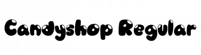
( Fonts by Vable Studio - Azka Rizki - Personal-use only. For commercial use please contact owner. )
A playful, bubble-like font with bold, rounded characters.
![Candyshop Regular Frei Schriftart Herunterladen]() Herunterladen 67 Downloads@WebFont
Herunterladen 67 Downloads@WebFont -
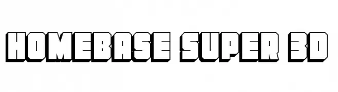
( Fonts by Daniel Zadorozny - www.iconian.com - Personal-use only. For commercial use please contact owner. )
A bold, 3D geometric font with a retro, blocky style.
![Homebase Super 3D Frei Schriftart Herunterladen]() Herunterladen 67 Downloads@WebFont
Herunterladen 67 Downloads@WebFont -
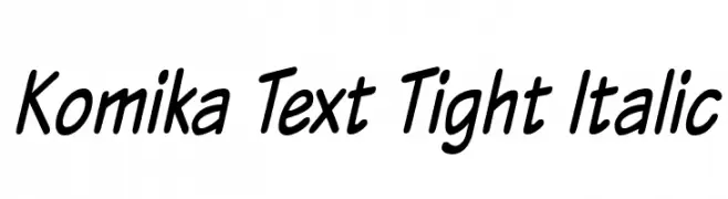
( Fonts by Vigilante Typeface Corporation Larry Yerkes. Personal-use only. For commercial use please contact owner. )
A playful, handwritten italic font with bold, rounded characters.
![Komika Text Tight Italic Frei Schriftart Herunterladen]() Herunterladen 67 Downloads@WebFont
Herunterladen 67 Downloads@WebFont -
( Fonts by Kong Font - Personal-use only. For commercial use please contact owner. )
A bold, brush-style font with dynamic, hand-painted strokes.
![BlackDirty Frei Schriftart Herunterladen]() Herunterladen 67 Downloads@WebFont
Herunterladen 67 Downloads@WebFont -
( Fonts by wep - Wahyu Eka Prasetya - Personal-use only. For commercial use please contact owner. )
A bold, brush-style font with an energetic and handcrafted appearance.
![Cagens Frei Schriftart Herunterladen]() Herunterladen 67 Downloads@WebFont
Herunterladen 67 Downloads@WebFont -
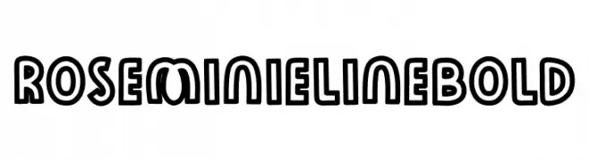
( Fonts by The Docallisme )
A bold, outlined font with a playful and three-dimensional appearance.
![Rose Minie LineBold Frei Schriftart Herunterladen]() Herunterladen 67 Downloads@WebFont
Herunterladen 67 Downloads@WebFont -
( Darrell Flood )
A bold, dynamic handwritten script font with fluid, connected characters.
![Ninja Note Frei Schriftart Herunterladen]() Herunterladen 67 Downloads@WebFont
Herunterladen 67 Downloads@WebFont -
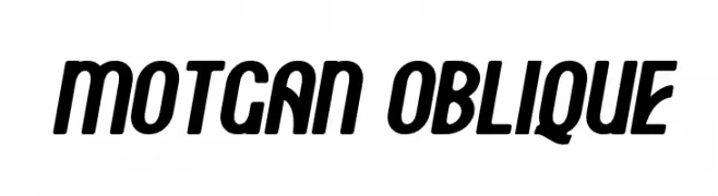
( Fonts by FallenGraphic Studio - Vava Aryanto - Personal-use only. For commercial use please contact owner. )
A bold, slanted font with thick strokes and rounded edges, exuding energy and modernity.
![Motgan Oblique Frei Schriftart Herunterladen]() Herunterladen 67 Downloads@WebFont
Herunterladen 67 Downloads@WebFont -
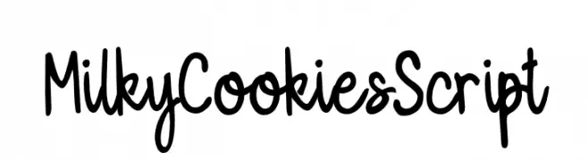
( Fonts by Hanaksara Studio - Darul Qutni Hakiki - Personal-use only. For commercial use please contact owner. )
A playful, handwritten script font with a casual and friendly style.
![MilkyCookiesScript Frei Schriftart Herunterladen]() Herunterladen 67 Downloads@WebFont
Herunterladen 67 Downloads@WebFont -
( Thirtypath - www.thirtypath.com )
An elegant script font with ornate swashes and flowing cursive letterforms.
![Andieny Frei Schriftart Herunterladen]() Herunterladen 67 Downloads@WebFont
Herunterladen 67 Downloads@WebFont -
( Fonts by Mans Greback - www.mansgreback.com - Personal-use only. For commercial use please contact owner. )
A bold, modern font with high contrast and a strong presence.
![Decary Sans PERSONAL USE Regular Frei Schriftart Herunterladen]() Herunterladen 67 Downloads@WebFont
Herunterladen 67 Downloads@WebFont -
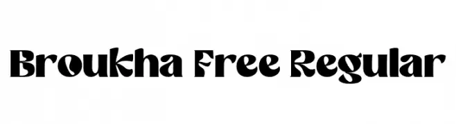
( Fonts by Maulana Creative )
A bold, geometric font with sharp angles and unique cutouts.
![Broukha Free Regular Frei Schriftart Herunterladen]() Herunterladen 67 Downloads@WebFont
Herunterladen 67 Downloads@WebFont -
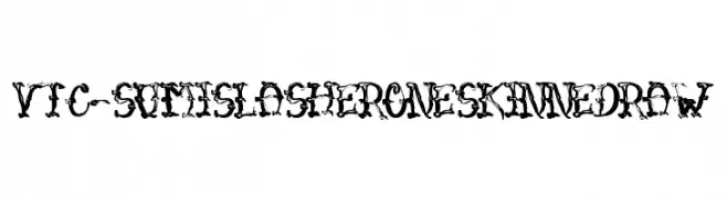
( Fonts by Vigilante Typeface Corporation Larry Yerkes. Personal-use only. For commercial use please contact owner. )
A bold, chaotic, and decorative font with an ink-splatter aesthetic.
![VTC-SumiSlasherOneSkinnedRaw Frei Schriftart Herunterladen]() Herunterladen 67 Downloads@WebFont
Herunterladen 67 Downloads@WebFont -
( Fonts by Kat`s Fun Fonts - Personal-use only. For commercial use please contact owner. )
A playful, quirky handwritten font with uneven letterforms and a casual appearance.
![KR Bad Boyz Frei Schriftart Herunterladen]() Herunterladen 67 Downloads@WebFont
Herunterladen 67 Downloads@WebFont -
( weknow - Wino S Kadir - www.creativefabrica.com/designer/weknow/ )
A modern, bold, and italicized font with consistent stroke thickness and a sleek design.
![Essential Arrangement Bold Italic Frei Schriftart Herunterladen]() Herunterladen 67 Downloads@WebFont
Herunterladen 67 Downloads@WebFont -
( Fontone.net - www.fontone.net )
A distressed, grunge-style font with a bold, hand-drawn appearance.
![Schmuddel Frei Schriftart Herunterladen]() Herunterladen 67 Downloads@WebFont
Herunterladen 67 Downloads@WebFont -
( Fonts by Balpirick - Personal-use only. For commercial use please contact owner. )
A sophisticated script font with flowing, cursive characters and medium contrast.
![Gelyti Frei Schriftart Herunterladen]() Herunterladen 67 Downloads@WebFont
Herunterladen 67 Downloads@WebFont -
( Fonts by Craft Supply Co - Personal-use only. For commercial use please contact owner. )
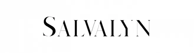
A high-contrast serif font with sharp serifs and a modern, elegant style.
![Salvalyn Frei Schriftart Herunterladen]() Herunterladen 67 Downloads@WebFont
Herunterladen 67 Downloads@WebFont -
( Noto is a trademark of Google Inc. Noto fonts are open source. All Noto fonts are published under the SIL Open Font License, Version 1.1 )
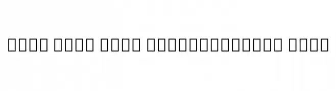
A bold, semi-condensed sans-serif font with uniform strokes and balanced spacing.
![Noto Sans Thai SemiCondensed Bold Frei Schriftart Herunterladen]() Herunterladen 67 Downloads@WebFont
Herunterladen 67 Downloads@WebFont -
( Fonts by Maulana Creative - Gilang Maulana - Personal-use only. For commercial use please contact owner. )
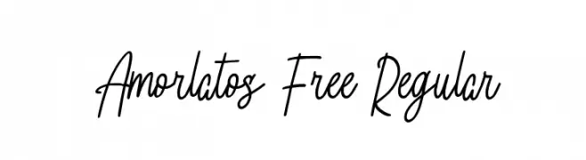
A modern, handwritten cursive font with elegant, fluid strokes.
![Amorlatos Free Regular Frei Schriftart Herunterladen]() Herunterladen 67 Downloads@WebFont
Herunterladen 67 Downloads@WebFont


Welche Schriften sind gerade am populärsten?
Poppins, Roboto, Montserrat, Open Sans und Lato sind wegen ihrer klaren Formen und breiten Einsetzbarkeit sehr gefragt – von Markenauftritt über Landingpages bis hin zu Postern.
Welche Fonts eignen sich für Logos?
Geometrische Sans‑Serifs (z. B. Poppins, Familien im Gotham‑Stil) sind ein häufiger Griff für sauberes, skalierbares Branding. Für eine persönlichere Note bleiben Scripts und Handschrift‑Stile beliebt. Kombinieren Sie einen prägnanten Headline‑Font mit einer neutralen Brotschrift für Wiedererkennung und Harmonie.
Wie oft wird die Top‑Liste aktualisiert?
Regelmäßig – basierend auf realen Downloads und Interaktionen. Schauen Sie öfter vorbei, um aufstrebende Favoriten früh zu entdecken.
💡 Tipp: Seite bookmarken – Trends wechseln schnell, und heutige Top‑Schriften inspirieren morgen vielleicht das Rebranding.