Willkommen bei den Top‑Schriften – hier treffen Beliebtheit und Qualität aufeinander. Das sind die in diesem Jahr am häufigsten heruntergeladenen und genutzten Fonts. Wenn Sie sichere Optionen für Logo, Web oder Social suchen, starten Sie hier.
Jeder Top‑Font überzeugt durch Balance, Lesbarkeit und Vielseitigkeit. Sie finden moderne Sans‑Serifs, elegante Scripts, Vintage‑Serifs und minimalistische Displays.
-
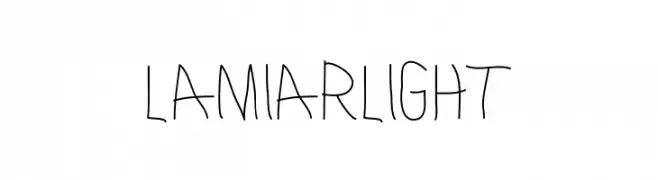
( Fonts by antipixel - Personal-use only. For commercial use please contact owner. )
A playful, handwritten font with a whimsical and casual style.
 Herunterladen 66 Downloads@WebFont
 -
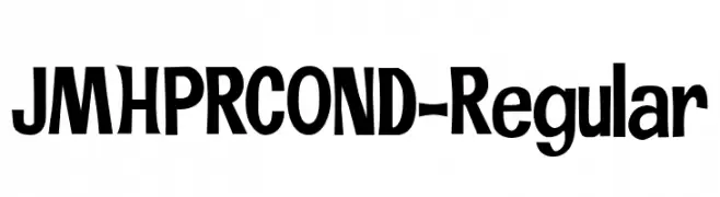
( Fonts by Jorge Morón )
A bold, condensed font with dynamic characters and strong visual impact.
![JMHPRCOND-Regular Frei Schriftart Herunterladen]() Herunterladen 66 Downloads@WebFont
Herunterladen 66 Downloads@WebFont -
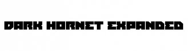
( Fonts by Daniel Zadorozny - www.iconian.com - Personal-use only. For commercial use please contact owner. )
A bold, geometric font with a futuristic and industrial style.
![Dark Hornet Expanded Frei Schriftart Herunterladen]() Herunterladen 66 Downloads@WebFont
Herunterladen 66 Downloads@WebFont -
( Fonts by Creavora Studio - Personal-use only. For commercial use please contact owner. )
A bold, high-contrast serif font with dramatic strokes and elegant serifs.
![Riglia Frei Schriftart Herunterladen]() Herunterladen 66 Downloads@WebFont
Herunterladen 66 Downloads@WebFont -
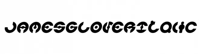
( weknow - Wino S Kadir - www.creativefabrica.com/designer/weknow/ )
A bold, geometric font with circular cut-out designs, ideal for modern projects.
![JAMES GLOVER Italic Frei Schriftart Herunterladen]() Herunterladen 66 Downloads@WebFont
Herunterladen 66 Downloads@WebFont -
( Fonts by Eifetstype - Stefie Justprince - Personal-use only. For commercial use please contact owner. )
A bold, geometric font with strong, angular lines and a modern aesthetic.
![BrisklyCabrales Frei Schriftart Herunterladen]() Herunterladen 66 Downloads@WebFont
Herunterladen 66 Downloads@WebFont -
( Fonts by deDi artStudio - Personal-use only. For commercial use please contact owner. )
An elegant script font with flowing cursive letters and intricate swashes.
![Beautylope Frei Schriftart Herunterladen]() Herunterladen 66 Downloads@WebFont
Herunterladen 66 Downloads@WebFont -
( Fonts by Typodermic Fonts - Raymond Larabie - Personal-use only. For commercial use please contact owner. )
A bold, geometric font with sharp angles and a modern aesthetic.
![Tork-Bold Frei Schriftart Herunterladen]() Herunterladen 66 Downloads@WebFont
Herunterladen 66 Downloads@WebFont -
( Woodcutter - woodcutter Manero - www.woodcutter.es )
A bold, fragmented font with a dynamic and edgy appearance.
![Rota en mil Pedazos Frei Schriftart Herunterladen]() Herunterladen 66 Downloads@WebFont
Herunterladen 66 Downloads@WebFont -
( Fonts by antipixel - Personal-use only. For commercial use please contact owner. )
Outlined, playful icons for food, drinks, desserts, and navigation.
![EscalopeSoft-Icons Frei Schriftart Herunterladen]() Herunterladen 66 Downloads@WebFont
Herunterladen 66 Downloads@WebFont -
( Fonts by Daniel Zadorozny - www.iconian.com - Personal-use only. For commercial use please contact owner. )
A bold, 3D italic font with outlined characters and a modern, dynamic style.
![Blue Cobra 3D Italic Frei Schriftart Herunterladen]() Herunterladen 66 Downloads@WebFont
Herunterladen 66 Downloads@WebFont -
( Fonts by Dikas Studio - Andika Setiawan - Personal-use only. For commercial use please contact owner. )
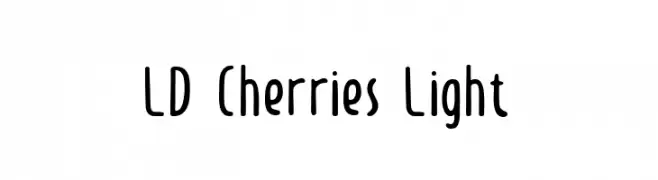
A playful and whimsical font with rounded, consistent letterforms.
![LD Cherries Light Frei Schriftart Herunterladen]() Herunterladen 66 Downloads@WebFont
Herunterladen 66 Downloads@WebFont -
( Fonts by Garisman Studio - Risman Ginarwan - Personal-use only. For commercial use please contact owner. )
A bold, expressive brush-style font with dynamic strokes.
![Austellia Frei Schriftart Herunterladen]() Herunterladen 66 Downloads@WebFont
Herunterladen 66 Downloads@WebFont -
( Food on the Wall - www.foodonthewall.com )
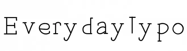
A clean, modern font with a slight vintage touch, featuring consistent stroke width and versatile characters.
![EverydayTypo Frei Schriftart Herunterladen]() Herunterladen 66 Downloads@WebFont
Herunterladen 66 Downloads@WebFont -
( Fonts by Woodcutter )
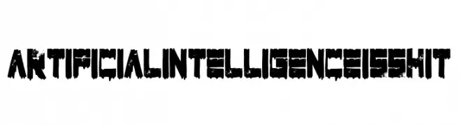
A bold, distressed font with a gritty, urban street art style.
![Artificial Intelligence Is Shit Frei Schriftart Herunterladen]() Herunterladen 66 Downloads@WebFont
Herunterladen 66 Downloads@WebFont -
( Fonts by Behind the Ink )
A delicate, handwritten script font with elegant, flowing strokes.
![Acoustic Frei Schriftart Herunterladen]() Herunterladen 66 Downloads@WebFont
Herunterladen 66 Downloads@WebFont -
( Fonts by Daniel Zadorozny - www.iconian.com - Personal-use only. For commercial use please contact owner. )
A futuristic, bold font with a gradient effect created by horizontal lines.
![Astro Armada Gradient Frei Schriftart Herunterladen]() Herunterladen 66 Downloads@WebFont
Herunterladen 66 Downloads@WebFont -
( Fonts by Ditatype - Personal-use only. For commercial use please contact owner. )
A dynamic and flowing script font with elegant, cursive strokes.
![Rossiland Personal Use Frei Schriftart Herunterladen]() Herunterladen 66 Downloads@WebFont
Herunterladen 66 Downloads@WebFont -
( Fonts by Vladimir Nikolic - Personal-use only. For commercial use please contact owner. )
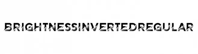
A bold, geometric font with a dynamic halftone pattern.
![Brightness Inverted Regular Frei Schriftart Herunterladen]() Herunterladen 66 Downloads@WebFont
Herunterladen 66 Downloads@WebFont -
( Eugenio De Riso - www.eugenioderiso.com )
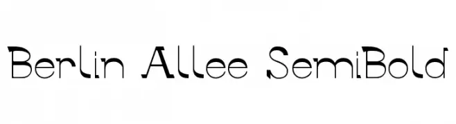
A modern geometric font with bold, angular uppercase and smooth lowercase letters.
![Berlin Allee SemiBold Frei Schriftart Herunterladen]() Herunterladen 66 Downloads@WebFont
Herunterladen 66 Downloads@WebFont -
( Iconian Fonts - Daniel Zadorozny - www.iconian.com )
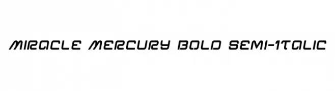
A bold, semi-italic font with a modern, geometric design.
![Miracle Mercury Bold Semi-Italic Frei Schriftart Herunterladen]() Herunterladen 66 Downloads@WebFont
Herunterladen 66 Downloads@WebFont -
( Fonts by Si Panji )
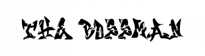
A bold, angular font with a fragmented, dynamic style.
![The Bossman Frei Schriftart Herunterladen]() Herunterladen 66 Downloads@WebFont
Herunterladen 66 Downloads@WebFont -
( Noto is a trademark of Google Inc. Noto fonts are open source. All Noto fonts are published under the SIL Open Font License, Version 1.1 )
A clean, modern font with balanced spacing and clear numerals.
![Noto Sans Devanagari ExtraCondensed Medium Frei Schriftart Herunterladen]() Herunterladen 66 Downloads@WebFont
Herunterladen 66 Downloads@WebFont -
( Fonts by Mystical Type - Candi Erwanto - Personal-use only. For commercial use please contact owner. )
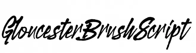
A bold, cursive brush script font with dynamic and fluid strokes.
![GloucesterBrushScript Frei Schriftart Herunterladen]() Herunterladen 66 Downloads@WebFont
Herunterladen 66 Downloads@WebFont -
( Fonts by CannotIntoSpaceFonts - KineticPlasma Fonts - Personal-use only. For commercial use please contact owner. )
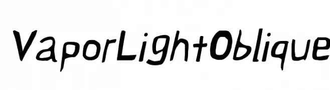
A dynamic, oblique font with a playful, hand-drawn style.
![Vapor Light Oblique Frei Schriftart Herunterladen]() Herunterladen 66 Downloads@WebFont
Herunterladen 66 Downloads@WebFont -
( Fonts by sronstudio - Yusron Billah - Personal-use only. For commercial use please contact owner. )
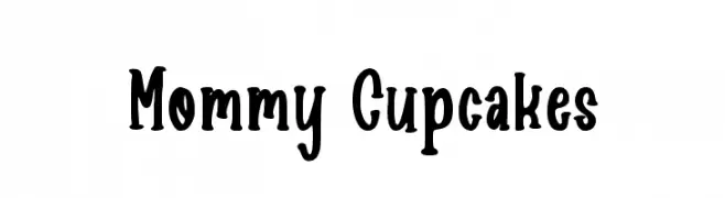
A playful, bold, and rounded font with a hand-drawn, vintage charm.
![Mommy Cupcakes Frei Schriftart Herunterladen]() Herunterladen 66 Downloads@WebFont
Herunterladen 66 Downloads@WebFont -
( Fonts by George Csfr )
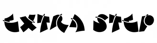
A bold, geometric font with dynamic and artistic design elements.
![Extra Step Frei Schriftart Herunterladen]() Herunterladen 66 Downloads@WebFont
Herunterladen 66 Downloads@WebFont -
( Noto is a trademark of Google Inc. Noto fonts are open source. All Noto fonts are published under the SIL Open Font License, Version 1.1 )
Ultra-light, extra condensed sans-serif optimized for UI clarity.
![Noto Sans Myanmar UI ExtraCondensed ExtraLight Frei Schriftart Herunterladen]() Herunterladen 66 Downloads@WebFont
Herunterladen 66 Downloads@WebFont -
( Fonts by Peter Wiegel - www.peter-wiegel.de - Personal-use only. For commercial use please contact owner. )
A classic blackletter font with ornate, medieval-inspired letterforms.
![CAT Franken-Deutsch Frei Schriftart Herunterladen]() Herunterladen 66 Downloads@WebFont
Herunterladen 66 Downloads@WebFont -
( Fonts by Haksen Studio - Sarwo Edhi Prayitno - Personal-use only. For commercial use please contact owner. )
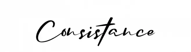
A dynamic, fluid handwritten script with elegant, flowing strokes.
![Consistance Frei Schriftart Herunterladen]() Herunterladen 66 Downloads@WebFont
Herunterladen 66 Downloads@WebFont -
( Font Environment - www.fontenvironment.com/ )
A playful, outlined font with bold, rounded letterforms.
![TPF Gaiety Outlined Frei Schriftart Herunterladen]() Herunterladen 66 Downloads@WebFont
Herunterladen 66 Downloads@WebFont -
( Fonts by Arterfak Project )
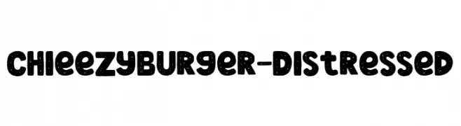
A bold, distressed font with a playful and vintage feel.
![ChieezyBurger-Distressed Frei Schriftart Herunterladen]() Herunterladen 66 Downloads@WebFont
Herunterladen 66 Downloads@WebFont -
( Fonts by Masa Aska Sanurumi )
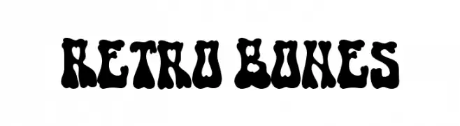
A bold, playful font with a retro, bone-like design.
![Retro Bones Frei Schriftart Herunterladen]() Herunterladen 66 Downloads@WebFont
Herunterladen 66 Downloads@WebFont -
( Fonts by Bexxtype - Personal-use only. For commercial use please contact owner. )
An elegant script font with ornate, flowing characters and a classic appeal.
![Sabena Frei Schriftart Herunterladen]() Herunterladen 66 Downloads@WebFont
Herunterladen 66 Downloads@WebFont -
( Fonts by Fontfabric - Svetoslav Simov - Personal-use only. For commercial use please contact owner. )
A vintage collection of rustic, handcrafted icons and symbols.
![Nexa Rust Extras Demo Icons Frei Schriftart Herunterladen]() Herunterladen 66 Downloads@WebFont
Herunterladen 66 Downloads@WebFont


Welche Schriften sind gerade am populärsten?
Poppins, Roboto, Montserrat, Open Sans und Lato sind wegen ihrer klaren Formen und breiten Einsetzbarkeit sehr gefragt – von Markenauftritt über Landingpages bis hin zu Postern.
Welche Fonts eignen sich für Logos?
Geometrische Sans‑Serifs (z. B. Poppins, Familien im Gotham‑Stil) sind ein häufiger Griff für sauberes, skalierbares Branding. Für eine persönlichere Note bleiben Scripts und Handschrift‑Stile beliebt. Kombinieren Sie einen prägnanten Headline‑Font mit einer neutralen Brotschrift für Wiedererkennung und Harmonie.
Wie oft wird die Top‑Liste aktualisiert?
Regelmäßig – basierend auf realen Downloads und Interaktionen. Schauen Sie öfter vorbei, um aufstrebende Favoriten früh zu entdecken.
💡 Tipp: Seite bookmarken – Trends wechseln schnell, und heutige Top‑Schriften inspirieren morgen vielleicht das Rebranding.