Willkommen bei den Top‑Schriften – hier treffen Beliebtheit und Qualität aufeinander. Das sind die in diesem Jahr am häufigsten heruntergeladenen und genutzten Fonts. Wenn Sie sichere Optionen für Logo, Web oder Social suchen, starten Sie hier.
Jeder Top‑Font überzeugt durch Balance, Lesbarkeit und Vielseitigkeit. Sie finden moderne Sans‑Serifs, elegante Scripts, Vintage‑Serifs und minimalistische Displays.
-
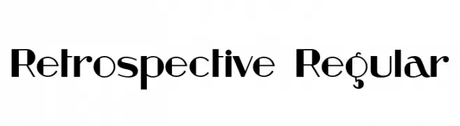
( Fonts by Vladimir Nikolic - https://www.creativefabrica.com/product/educated-deers/ref/144265/ - Personal-use only. For commercial use please contact owner. )
A bold, geometric font blending modern and retro styles.
 Herunterladen 69 Downloads@WebFont
 -
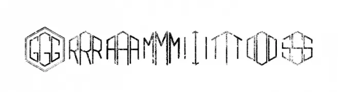
( Fonts by Woodcutter Manero - www.woodcutter.es - Personal-use only. For commercial use please contact owner. )
A geometric font with hexagonal frames and a futuristic, industrial style.
![Gramitos Frei Schriftart Herunterladen]() Herunterladen 69 Downloads@WebFont
Herunterladen 69 Downloads@WebFont -
( Fonts by AlifRyanZulfikar - Personal-use only. For commercial use please contact owner. )
A whimsical and flowing script font with elegant, cursive letterforms.
![Dream Heart - Personal Use Frei Schriftart Herunterladen]() Herunterladen 69 Downloads@WebFont
Herunterladen 69 Downloads@WebFont -
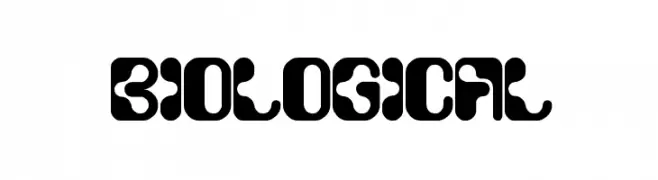
( Fonts by Wino S Kadir - weknow - www.revolge.com/shop/weknow/ - Personal-use only. For commercial use please contact owner. )
A bold, futuristic font with rounded edges and a playful, organic design.
![biological Frei Schriftart Herunterladen]() Herunterladen 69 Downloads@WebFont
Herunterladen 69 Downloads@WebFont -
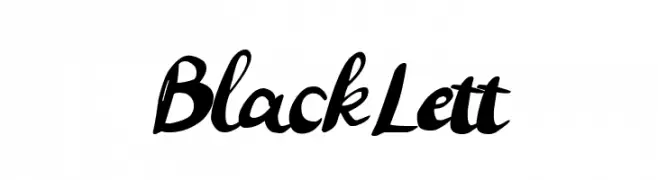
( Fonts by Gigih Wiryana - Personal-use only. For commercial use please contact owner. )
A bold, expressive handwritten script font with fluid, connected letters.
![Black Lett Frei Schriftart Herunterladen]() Herunterladen 69 Downloads@WebFont
Herunterladen 69 Downloads@WebFont -
( Fonts by Manuel Ramos - www.infinitismo.com - Personal-use only. For commercial use please contact owner. )
A geometric and artistic font with sharp angles and modern elements.
![Graff Frei Schriftart Herunterladen]() Herunterladen 69 Downloads@WebFont
Herunterladen 69 Downloads@WebFont -
( Fonts by CannotIntoSpaceFonts - KineticPlasma Fonts - Personal-use only. For commercial use please contact owner. )
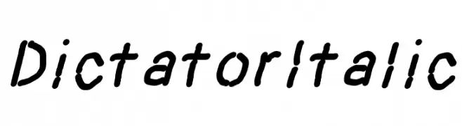
A handwritten, italic-style font with a casual and organic flow.
![Dictator Italic Frei Schriftart Herunterladen]() Herunterladen 69 Downloads@WebFont
Herunterladen 69 Downloads@WebFont -
( Fonts by sronstudio - Yusron Billah - Personal-use only. For commercial use please contact owner. )
A stylish, elegant script font with a handwritten feel and fluid, connected characters.
![Tantinotes Frei Schriftart Herunterladen]() Herunterladen 69 Downloads@WebFont
Herunterladen 69 Downloads@WebFont -
( 010Bus )
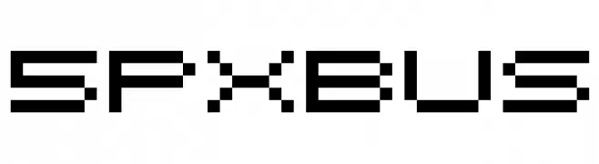
A pixelated, retro-style font with a digital, geometric design.
![5pxbus Frei Schriftart Herunterladen]() Herunterladen 69 Downloads@WebFont
Herunterladen 69 Downloads@WebFont -
( London's Letters - www.londonsletters.com/ )
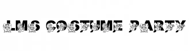
A playful font with bold letters and cartoon characters in costumes.
![LMS Costume Party Frei Schriftart Herunterladen]() Herunterladen 69 Downloads@WebFont
Herunterladen 69 Downloads@WebFont -
( Fonts by Andika Fez - Personal-use only. For commercial use please contact owner. )
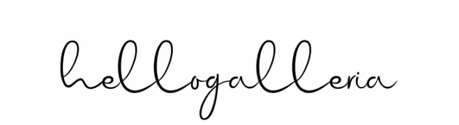
A lively, handwritten font with fluid strokes and playful curves.
![hellogalleria Frei Schriftart Herunterladen]() Herunterladen 69 Downloads@WebFont
Herunterladen 69 Downloads@WebFont -
( Fonts by Letteralle Studios - Annas Yahya - Personal-use only. For commercial use please contact owner. )
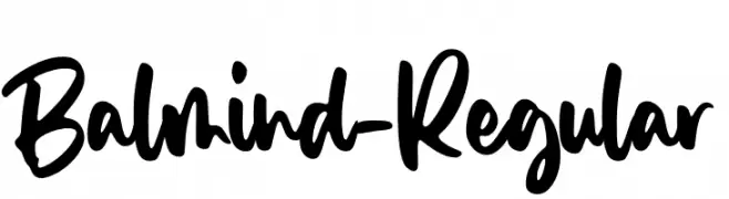
A bold, handwritten font with a playful and energetic style.
![Balmind-Regular Frei Schriftart Herunterladen]() Herunterladen 69 Downloads@WebFont
Herunterladen 69 Downloads@WebFont -
( Fonts by Kat`s Fun Fonts - Personal-use only. For commercial use please contact owner. )
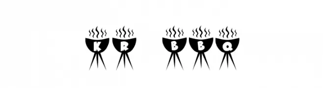
A decorative font with letters styled as barbecue grills, perfect for thematic designs.
![KR BBQ Frei Schriftart Herunterladen]() Herunterladen 69 Downloads@WebFont
Herunterladen 69 Downloads@WebFont -
( Fonts by Arterfak Project - Ahmad Ramzi Fahruddin - Personal-use only. For commercial use please contact owner. )
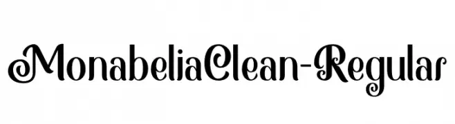
A decorative and elegant font with intricate loops and swirls.
![MonabeliaClean-Regular Frei Schriftart Herunterladen]() Herunterladen 69 Downloads@WebFont
Herunterladen 69 Downloads@WebFont -
( Fonts by Attype Studio - Fadli Ramadhan Iskandar - Personal-use only. For commercial use please contact owner. )
A rough, textured script font with a hand-crafted, artistic feel.
![Yilactha Rough - Personal Use Frei Schriftart Herunterladen]() Herunterladen 69 Downloads@WebFont
Herunterladen 69 Downloads@WebFont -
( Fonts by Edric Studio - Personal-use only. For commercial use please contact owner. )
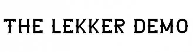
A bold, decorative font with vintage and modern elements, ideal for standout designs.
![The Lekker DEMO Frei Schriftart Herunterladen]() Herunterladen 69 Downloads@WebFont
Herunterladen 69 Downloads@WebFont -
( Fonts by Md Shohail Bhuian - Personal-use only. For commercial use please contact owner. )
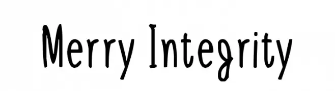
A playful, hand-drawn font with a whimsical and casual style.
![Merry Integrity Frei Schriftart Herunterladen]() Herunterladen 69 Downloads@WebFont
Herunterladen 69 Downloads@WebFont -
( Fonts by junkohanhero - Personal-use only. For commercial use please contact owner. )
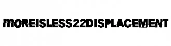
A bold, distressed font with a glitch-like, fragmented appearance.
![More is less 22 Displacement Frei Schriftart Herunterladen]() Herunterladen 69 Downloads@WebFont
Herunterladen 69 Downloads@WebFont -
( Roger White - web.archive.org/web/20120416090521/www.rogersfonts.org.uk/ )
A geometric, hollow font with angular and futuristic elements.
![Dublin Hollow Frei Schriftart Herunterladen]() Herunterladen 69 Downloads@WebFont
Herunterladen 69 Downloads@WebFont -
( Fonts by ToniStudio )
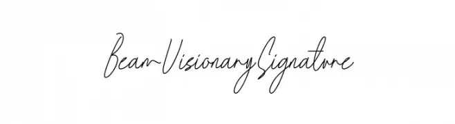
A delicate, modern handwritten script with a signature-like appearance.
![Beam Visionary Signature Frei Schriftart Herunterladen]() Herunterladen 69 Downloads@WebFont
Herunterladen 69 Downloads@WebFont -
( Fonts by Vladimir Nikolic - www.creativefabrica.com/designer/vladimirnikolic/ - Personal-use only. For commercial use please contact owner. )
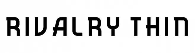
A modern, geometric font with a futuristic and structured design.
![Rivalry Thin Frei Schriftart Herunterladen]() Herunterladen 69 Downloads@WebFont
Herunterladen 69 Downloads@WebFont -
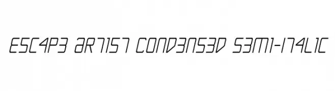
( Fonts by Daniel Zadorozny - www.iconian.com )
A modern, condensed, semi-italic font with a sleek and dynamic appearance.
![Escape Artist Condensed Semi-Italic Frei Schriftart Herunterladen]() Herunterladen 69 Downloads@WebFont
Herunterladen 69 Downloads@WebFont -
( Fonts by Beautypes - Bhakti Al Akbar Pasaribu - Personal-use only. For commercial use please contact owner. )
A playful, cursive font with a handwritten, whimsical style.
![Bellasya Frei Schriftart Herunterladen]() Herunterladen 69 Downloads@WebFont
Herunterladen 69 Downloads@WebFont -
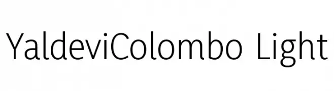
( Fonts by Mooniak - Personal-use only. For commercial use please contact owner. )
A modern, light sans-serif typeface with clean lines and excellent readability.
![YaldeviColombo Light Frei Schriftart Herunterladen]() Herunterladen 69 Downloads@WebFont
Herunterladen 69 Downloads@WebFont -
( Java Pep )
An elegant font with swash elements, combining classic and modern styles.
![Mellifret_Swash Frei Schriftart Herunterladen]() Herunterladen 69 Downloads@WebFont
Herunterladen 69 Downloads@WebFont -
( Mai Xiong )
A lively and dynamic handwritten font with fluid strokes.
![JustMai Frei Schriftart Herunterladen]() Herunterladen 69 Downloads@WebFont
Herunterladen 69 Downloads@WebFont -
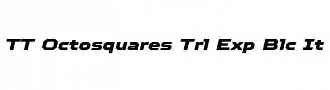
( Fonts by TypeType Foundry )
A bold, geometric font with an italic slant and expanded width.
![TT Octosquares Trl Exp Blc It Frei Schriftart Herunterladen]() Herunterladen 69 Downloads@WebFont
Herunterladen 69 Downloads@WebFont -
( Fonts by PutraCetol Studio )
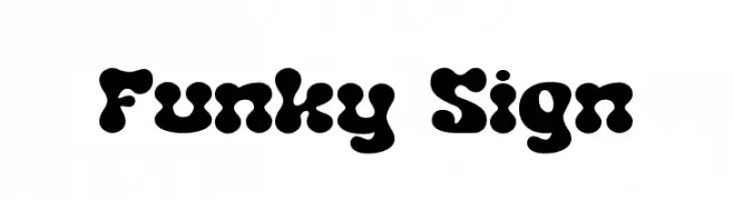
A playful, bold font with rounded, bubbly characters and a whimsical style.
![Funky Sign Frei Schriftart Herunterladen]() Herunterladen 69 Downloads@WebFont
Herunterladen 69 Downloads@WebFont -
( Fonts by Vladimir Nikolic - https://www.creativefabrica.com/product/educated-deers/ref/144265/ - Personal-use only. For commercial use please contact owner. )
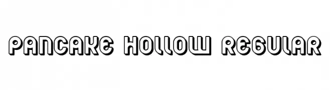
A bold, hollow, and playful font with a modern geometric style.
![Pancake Hollow Regular Frei Schriftart Herunterladen]() Herunterladen 69 Downloads@WebFont
Herunterladen 69 Downloads@WebFont -
( Fonts by Daniel Zadorozny - www.iconian.com - Personal-use only. For commercial use please contact owner. )
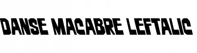
A bold, angular font with a leftward slant, exuding energy and modernity.
![Danse Macabre Leftalic Frei Schriftart Herunterladen]() Herunterladen 69 Downloads@WebFont
Herunterladen 69 Downloads@WebFont -
( Fonts by Hanoded - David Kerkhoff - Personal-use only. For commercial use please contact owner. )
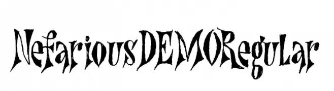
A sharp, gothic-inspired font with dramatic serifs and a dark, edgy aesthetic.
![Nefarious DEMO Regular Frei Schriftart Herunterladen]() Herunterladen 69 Downloads@WebFont
Herunterladen 69 Downloads@WebFont -
( Fonts by I Shofyan - Personal-use only. For commercial use please contact owner. )
A bold, narrow font with a modern and dramatic style.
![KURRAWAL Frei Schriftart Herunterladen]() Herunterladen 69 Downloads@WebFont
Herunterladen 69 Downloads@WebFont -
( Fonts by Vincenzo Vuono - Personal-use only. For commercial use please contact owner. )
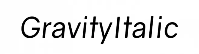
A modern, italicized font with clean lines and a professional appearance.
![Gravity Italic Frei Schriftart Herunterladen]() Herunterladen 69 Downloads@WebFont
Herunterladen 69 Downloads@WebFont -
( Iconian Fonts - Daniel Zadorozny - www.iconian.com )
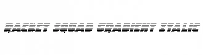
A bold, italicized font with a gradient effect and dynamic style.
![Racket Squad Gradient Italic Frei Schriftart Herunterladen]() Herunterladen 69 Downloads@WebFont
Herunterladen 69 Downloads@WebFont -
( Blambot - www.blambot.com )
A geometric and calligraphic font with a modern, artistic flair.
![Yoshitoshi Frei Schriftart Herunterladen]() Herunterladen 69 Downloads@WebFont
Herunterladen 69 Downloads@WebFont


Welche Schriften sind gerade am populärsten?
Poppins, Roboto, Montserrat, Open Sans und Lato sind wegen ihrer klaren Formen und breiten Einsetzbarkeit sehr gefragt – von Markenauftritt über Landingpages bis hin zu Postern.
Welche Fonts eignen sich für Logos?
Geometrische Sans‑Serifs (z. B. Poppins, Familien im Gotham‑Stil) sind ein häufiger Griff für sauberes, skalierbares Branding. Für eine persönlichere Note bleiben Scripts und Handschrift‑Stile beliebt. Kombinieren Sie einen prägnanten Headline‑Font mit einer neutralen Brotschrift für Wiedererkennung und Harmonie.
Wie oft wird die Top‑Liste aktualisiert?
Regelmäßig – basierend auf realen Downloads und Interaktionen. Schauen Sie öfter vorbei, um aufstrebende Favoriten früh zu entdecken.
💡 Tipp: Seite bookmarken – Trends wechseln schnell, und heutige Top‑Schriften inspirieren morgen vielleicht das Rebranding.