Willkommen bei den Top‑Schriften – hier treffen Beliebtheit und Qualität aufeinander. Das sind die in diesem Jahr am häufigsten heruntergeladenen und genutzten Fonts. Wenn Sie sichere Optionen für Logo, Web oder Social suchen, starten Sie hier.
Jeder Top‑Font überzeugt durch Balance, Lesbarkeit und Vielseitigkeit. Sie finden moderne Sans‑Serifs, elegante Scripts, Vintage‑Serifs und minimalistische Displays.
-
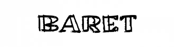
( Fonts by wep - Wahyu Eka Prasetya - Personal-use only. For commercial use please contact owner. )
A bold, distressed font with a hand-drawn, grunge aesthetic.
 Herunterladen 68 Downloads@WebFont
 -
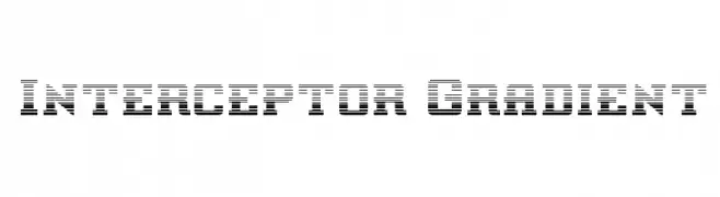
( Iconian Fonts - Daniel Zadorozny - www.iconian.com )
A bold, decorative font with a unique gradient effect and vintage-modern appeal.
![Interceptor Gradient Frei Schriftart Herunterladen]() Herunterladen 68 Downloads@WebFont
Herunterladen 68 Downloads@WebFont -
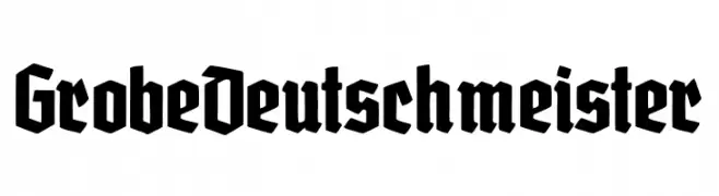
( Fonts by Peter Wiegel - www.peter-wiegel.de - Personal-use only. For commercial use please contact owner. )
A bold, blackletter font with sharp, angular lines and a Gothic aesthetic.
![GrobeDeutschmeister Frei Schriftart Herunterladen]() Herunterladen 68 Downloads@WebFont
Herunterladen 68 Downloads@WebFont -
( Fonts by Eddy Goodboy - Personal-use only. For commercial use please contact owner. )
A decorative and elegant script font with flowing, cursive characters.
![July Frei Schriftart Herunterladen]() Herunterladen 68 Downloads@WebFont
Herunterladen 68 Downloads@WebFont -
( Fonts by Vladimir Nikolic - Personal-use only. For commercial use please contact owner. )
A bold, geometric font with a modern, industrial feel.
![Spirit Regular Frei Schriftart Herunterladen]() Herunterladen 68 Downloads@WebFont
Herunterladen 68 Downloads@WebFont -
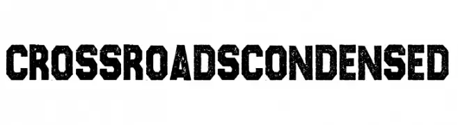
( Fonts by Billy Argel )
A bold, condensed font with a distressed, vintage texture.
![CROSSROADS CONDENSED Frei Schriftart Herunterladen]() Herunterladen 68 Downloads@WebFont
Herunterladen 68 Downloads@WebFont -
( Fonts by Nick Curtis - Personal-use only. For commercial use please contact owner. )
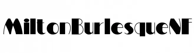
A bold, Art Deco-inspired font with high contrast and geometric shapes.
![MiltonBurlesqueNF Frei Schriftart Herunterladen]() Herunterladen 68 Downloads@WebFont
Herunterladen 68 Downloads@WebFont -
( Fonts by Edric Studio - Personal-use only. For commercial use please contact owner. )
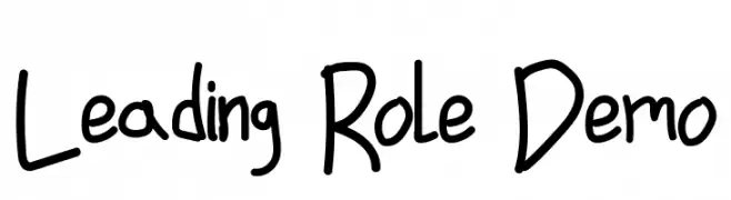
A playful, handwritten font with irregular, whimsical strokes.
![Leading Role Demo Frei Schriftart Herunterladen]() Herunterladen 68 Downloads@WebFont
Herunterladen 68 Downloads@WebFont -
( Fonts by Darrell Flood - Personal-use only. For commercial use please contact owner. )
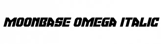
A bold, futuristic italic font with sharp, angular lines and a geometric design.
![Moonbase Omega Italic Frei Schriftart Herunterladen]() Herunterladen 68 Downloads@WebFont
Herunterladen 68 Downloads@WebFont -
( Cheapskate Fonts )
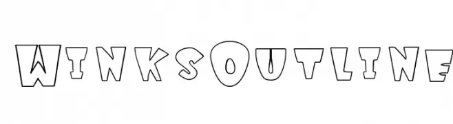
A playful, bold outline font with geometric, block-like letters.
![WinksOutline Frei Schriftart Herunterladen]() Herunterladen 68 Downloads@WebFont
Herunterladen 68 Downloads@WebFont -
( Fonts by AlifRyanZulfikar - Personal-use only. For commercial use please contact owner. )
A playful, handwritten font with flowing, interconnected letterforms.
![Dartie - Personal Use Frei Schriftart Herunterladen]() Herunterladen 68 Downloads@WebFont
Herunterladen 68 Downloads@WebFont -
( Fonts by Ahmad Zulfikar Ali - Personal-use only. For commercial use please contact owner. )
A bold, expressive script font with high contrast and flowing cursive design.
![Magnitudo Frei Schriftart Herunterladen]() Herunterladen 68 Downloads@WebFont
Herunterladen 68 Downloads@WebFont -
( Fonts by madeDeduk - Personal-use only. For commercial use please contact owner. )
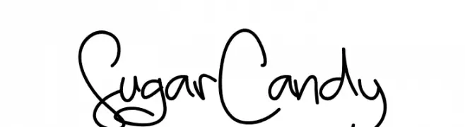
A playful and whimsical handwritten font with fluid strokes.
![SugarCandy Frei Schriftart Herunterladen]() Herunterladen 68 Downloads@WebFont
Herunterladen 68 Downloads@WebFont -
( Fonts by Abo Daniel Studio - Panggah Laksono - Personal-use only. For commercial use please contact owner. )
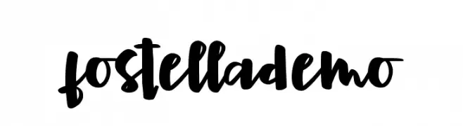
A bold, playful handwritten font with a modern and dynamic style.
![fostella demo Frei Schriftart Herunterladen]() Herunterladen 68 Downloads@WebFont
Herunterladen 68 Downloads@WebFont -
( Fonts by www.chequered.ink - Chequered Ink - Personal-use only. For commercial use please contact owner. )
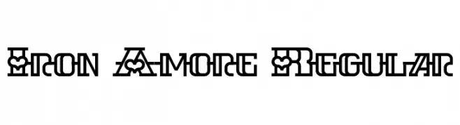
A bold, decorative font with geometric patterns and strong visual impact.
![Iron Amore Regular Frei Schriftart Herunterladen]() Herunterladen 68 Downloads@WebFont
Herunterladen 68 Downloads@WebFont -
( Fonts by StringLabs - stringlabscreative.com - Personal-use only. For commercial use please contact owner. )
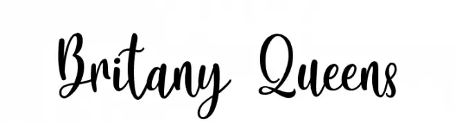
A lively, cursive font with interconnected letters and a playful, handwritten style.
![Britany Queens Frei Schriftart Herunterladen]() Herunterladen 68 Downloads@WebFont
Herunterladen 68 Downloads@WebFont -
( Fonts by zone108.main.jp - Personal-use only. For commercial use please contact owner. )
A clean, modern monospaced font with uniform character widths and a structured appearance.
![Soko Regular Frei Schriftart Herunterladen]() Herunterladen 68 Downloads@WebFont
Herunterladen 68 Downloads@WebFont -
( Noto is a trademark of Google Inc. Noto fonts are open source. All Noto fonts are published under the SIL Open Font License, Version 1.1 )
A modern, extra condensed font for the Armenian script.
![Noto Sans Armenian ExtraCondensed Frei Schriftart Herunterladen]() Herunterladen 68 Downloads@WebFont
Herunterladen 68 Downloads@WebFont -
( Fonts by Daniel Zadorozny - www.iconian.com - Personal-use only. For commercial use please contact owner. )
A bold, angular font with a futuristic and geometric design.
![Sleigher Laser Frei Schriftart Herunterladen]() Herunterladen 68 Downloads@WebFont
Herunterladen 68 Downloads@WebFont -
( Fonts by Vladimir Nikolic - Personal-use only. For commercial use please contact owner. )
A bold, playful font with rounded edges and a slight italic slant.
![Subscribe Italic Frei Schriftart Herunterladen]() Herunterladen 68 Downloads@WebFont
Herunterladen 68 Downloads@WebFont -
( Fonts by Letterena Studios )
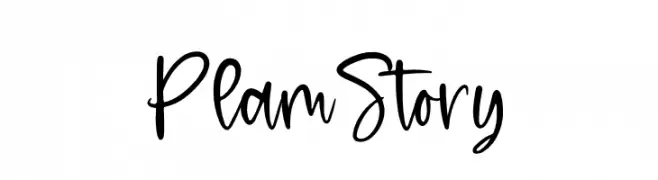
A playful, handwritten font with dynamic strokes and a casual style.
![Plam Story Frei Schriftart Herunterladen]() Herunterladen 68 Downloads@WebFont
Herunterladen 68 Downloads@WebFont -
( Fonts by Maulana Creative - Gilang Maulana - Personal-use only. For commercial use please contact owner. )
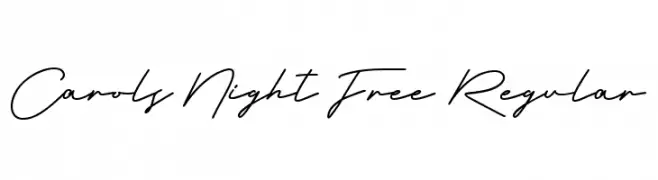
An elegant, flowing script font with a natural handwriting style.
![Carols Night Free Regular Frei Schriftart Herunterladen]() Herunterladen 68 Downloads@WebFont
Herunterladen 68 Downloads@WebFont -
( Noto is a trademark of Google Inc. Noto fonts are open source. All Noto fonts are published under the SIL Open Font License, Version 1.1 )
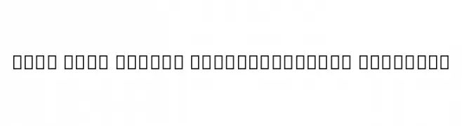
A modern, extra condensed sans-serif font with semi-bold weight.
![Noto Sans Arabic ExtraCondensed SemiBold Frei Schriftart Herunterladen]() Herunterladen 68 Downloads@WebFont
Herunterladen 68 Downloads@WebFont -
( Fonts by Letterafa Studio - Ahmad Afandi - Personal-use only. For commercial use please contact owner. )
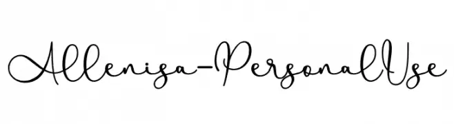
A playful and elegant handwritten script font with fluid, interconnected strokes.
![Allenisa - Personal Use Frei Schriftart Herunterladen]() Herunterladen 68 Downloads@WebFont
Herunterladen 68 Downloads@WebFont -
( Eva Barabasne Olasz - www.etsy.com/ie/shop/digitaltypefaces )
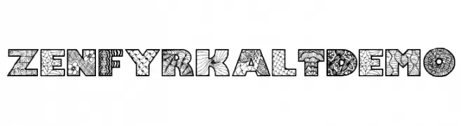
A decorative font with intricate patterns and textures, ideal for creative projects.
![Zenfyrkalt Demo Frei Schriftart Herunterladen]() Herunterladen 68 Downloads@WebFont
Herunterladen 68 Downloads@WebFont -
( Fonts by Balpirick Studio - https://www.creativefabrica.com/designer/balpirick/ref/308299/ - Personal-use only. For commercial use please contact owner. )
A dynamic, expressive handwritten font with varied stroke thickness.
![Carliman Frei Schriftart Herunterladen]() Herunterladen 68 Downloads@WebFont
Herunterladen 68 Downloads@WebFont -
( Misti's Fonts - mistifonts.com/ )
A casual, handwritten font with bold strokes and a playful style.
![TexasWoman Frei Schriftart Herunterladen]() Herunterladen 68 Downloads@WebFont
Herunterladen 68 Downloads@WebFont -
( Fonts by StringLabs - stringlabscreative.com - Personal-use only. For commercial use please contact owner. )
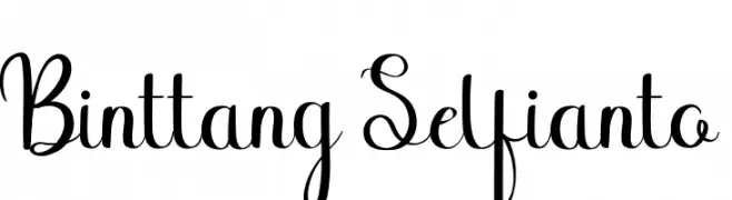
A playful and elegant script font with modern, graceful curves.
![Binttang Selfianto Frei Schriftart Herunterladen]() Herunterladen 68 Downloads@WebFont
Herunterladen 68 Downloads@WebFont -
( Fonts by Redy Studio - Nfajry Redy - Personal-use only. For commercial use please contact owner. )
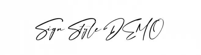
A dynamic, handwritten-style font with fluid, interconnected characters.
![Sign Style DEMO Frei Schriftart Herunterladen]() Herunterladen 68 Downloads@WebFont
Herunterladen 68 Downloads@WebFont -
( Fonts by Runsell Studio - Personal-use only. For commercial use please contact owner. )
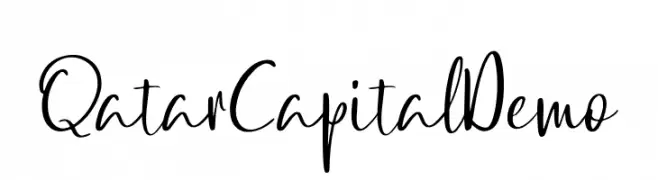
A dynamic, fluid script font with an elegant handwritten style.
![QatarCapitalDemo Frei Schriftart Herunterladen]() Herunterladen 68 Downloads@WebFont
Herunterladen 68 Downloads@WebFont -
( weknow - Wino S Kadir - www.creativefabrica.com/designer/weknow/ )
A sleek, modern italic font with continuous line design and smooth curves.
![EVERYTHING Italic Frei Schriftart Herunterladen]() Herunterladen 68 Downloads@WebFont
Herunterladen 68 Downloads@WebFont -
( Manta Fonts )
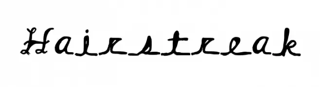
A whimsical, decorative font with curly, looping strokes and artistic embellishments.
![Hairstreak Frei Schriftart Herunterladen]() Herunterladen 68 Downloads@WebFont
Herunterladen 68 Downloads@WebFont -
( Fonts by Vladimir Nikolic - https://www.creativefabrica.com/product/educated-deers/ref/144265/ - Personal-use only. For commercial use please contact owner. )
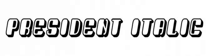
A bold, italic, 3D font with a modern and impactful style.
![President Italic Frei Schriftart Herunterladen]() Herunterladen 68 Downloads@WebFont
Herunterladen 68 Downloads@WebFont -
( weknow - Wino S Kadir - www.creativefabrica.com/designer/weknow/ )
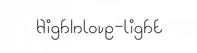
A playful and modern font with rounded, looping strokes.
![High In love-light Frei Schriftart Herunterladen]() Herunterladen 68 Downloads@WebFont
Herunterladen 68 Downloads@WebFont -
( Fonts on us )
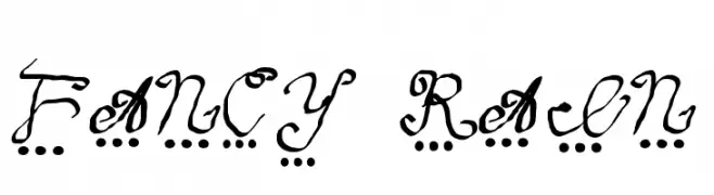
A whimsical, decorative handwritten font with playful dot embellishments.
![fancy rain Frei Schriftart Herunterladen]() Herunterladen 68 Downloads@WebFont
Herunterladen 68 Downloads@WebFont


Welche Schriften sind gerade am populärsten?
Poppins, Roboto, Montserrat, Open Sans und Lato sind wegen ihrer klaren Formen und breiten Einsetzbarkeit sehr gefragt – von Markenauftritt über Landingpages bis hin zu Postern.
Welche Fonts eignen sich für Logos?
Geometrische Sans‑Serifs (z. B. Poppins, Familien im Gotham‑Stil) sind ein häufiger Griff für sauberes, skalierbares Branding. Für eine persönlichere Note bleiben Scripts und Handschrift‑Stile beliebt. Kombinieren Sie einen prägnanten Headline‑Font mit einer neutralen Brotschrift für Wiedererkennung und Harmonie.
Wie oft wird die Top‑Liste aktualisiert?
Regelmäßig – basierend auf realen Downloads und Interaktionen. Schauen Sie öfter vorbei, um aufstrebende Favoriten früh zu entdecken.
💡 Tipp: Seite bookmarken – Trends wechseln schnell, und heutige Top‑Schriften inspirieren morgen vielleicht das Rebranding.