Willkommen bei den Top‑Schriften – hier treffen Beliebtheit und Qualität aufeinander. Das sind die in diesem Jahr am häufigsten heruntergeladenen und genutzten Fonts. Wenn Sie sichere Optionen für Logo, Web oder Social suchen, starten Sie hier.
Jeder Top‑Font überzeugt durch Balance, Lesbarkeit und Vielseitigkeit. Sie finden moderne Sans‑Serifs, elegante Scripts, Vintage‑Serifs und minimalistische Displays.
-
( Fonts by HansCo - Burhan Afif - Personal-use only. For commercial use please contact owner. )
A graceful script font with flowing, cursive letters and a sophisticated, handwritten style.
 Herunterladen 69 Downloads@WebFont
 -
( Fonts by Modestype Studio )
A bold, playful font with thick, rounded characters and a whimsical style.
![El-Fatso Frei Schriftart Herunterladen]() Herunterladen 69 Downloads@WebFont
Herunterladen 69 Downloads@WebFont -
( Fonts by baybilson )
A cursive, handwritten font with a casual and elegant style.
![Easy-free Frei Schriftart Herunterladen]() Herunterladen 69 Downloads@WebFont
Herunterladen 69 Downloads@WebFont -
( Fonts by lyanatha - Ana Natalia - Personal-use only. For commercial use please contact owner. )
An elegant, flowing script font with a modern, calligraphic style.
![Honabite Frei Schriftart Herunterladen]() Herunterladen 69 Downloads@WebFont
Herunterladen 69 Downloads@WebFont -
( Martin Sørensen )
A playful, bold handwritten font with expressive strokes and a casual style.
![Svampens Handwriting Frei Schriftart Herunterladen]() Herunterladen 69 Downloads@WebFont
Herunterladen 69 Downloads@WebFont -
( Fonts by Tommaso Poli - Personal-use only. For commercial use please contact owner. )
A geometric and artistic font with playful, decorative elements.
![Panique Frei Schriftart Herunterladen]() Herunterladen 69 Downloads@WebFont
Herunterladen 69 Downloads@WebFont -
( Fonts by Integritype Studio )
A sophisticated, elegant handwritten script with fluid, continuous strokes.
![Britties Signature Frei Schriftart Herunterladen]() Herunterladen 69 Downloads@WebFont
Herunterladen 69 Downloads@WebFont -
( Noto is a trademark of Google Inc. Noto fonts are open source. All Noto fonts are published under the SIL Open Font License, Version 1.1 )
A modern sans-serif font with semi-condensed proportions and uniform stroke width.
![Noto Sans Georgian SemiCondensed Frei Schriftart Herunterladen]() Herunterladen 69 Downloads@WebFont
Herunterladen 69 Downloads@WebFont -
( Fonts by Say Studio - Personal-use only. For commercial use please contact owner. )
A whimsical, handwritten font with playful and artistic strokes.
![margarethdemo Frei Schriftart Herunterladen]() Herunterladen 69 Downloads@WebFont
Herunterladen 69 Downloads@WebFont -
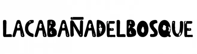
( Fonts by Woodcutter - woodcutter Manero - Personal-use only. For commercial use please contact owner. )
A bold, distressed font with a rustic, hand-crafted appearance.
![La Cabaña del Bosque Frei Schriftart Herunterladen]() Herunterladen 69 Downloads@WebFont
Herunterladen 69 Downloads@WebFont -
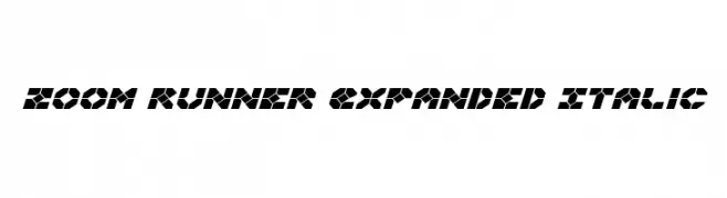
( Fonts by Iconian Fonts )
A bold, geometric, and futuristic font with an expanded and italic style.
![Zoom Runner Expanded Italic Frei Schriftart Herunterladen]() Herunterladen 69 Downloads@WebFont
Herunterladen 69 Downloads@WebFont -
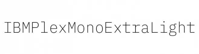
( Fonts by IBM )
A modern, monospaced font with an extra-light weight and geometric design.
![IBM Plex Mono ExtraLight Frei Schriftart Herunterladen]() Herunterladen 69 Downloads@WebFont
Herunterladen 69 Downloads@WebFont -
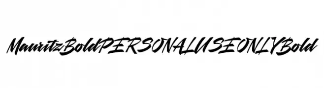
( Fonts by Mans Greback - Personal-use only. For commercial use please contact owner. )
A bold, dynamic script font with sweeping curves and sharp angles, perfect for modern and decorative uses.
![Mauritz Bold PERSONAL USE ONLY Bold Frei Schriftart Herunterladen]() Herunterladen 69 Downloads@WebFont
Herunterladen 69 Downloads@WebFont -
( Fonts by NJ Studio - Personal-use only. For commercial use please contact owner. )
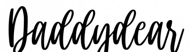
A lively, expressive handwritten font with fluid, connected strokes.
![Daddy dear Frei Schriftart Herunterladen]() Herunterladen 69 Downloads@WebFont
Herunterladen 69 Downloads@WebFont -
( Fonts by Go Letter )
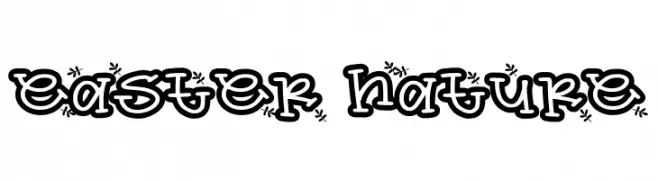
A playful, nature-inspired font with floral accents and a bold, cartoonish style.
![easter nature Frei Schriftart Herunterladen]() Herunterladen 69 Downloads@WebFont
Herunterladen 69 Downloads@WebFont -
( Fonts by Vladimir Nikolic - www.creativefabrica.com/designer/vladimirnikolic/ - Personal-use only. For commercial use please contact owner. )
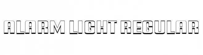
A bold, geometric font with a 3D shadow effect, perfect for impactful designs.
![Alarm Light Regular Frei Schriftart Herunterladen]() Herunterladen 69 Downloads@WebFont
Herunterladen 69 Downloads@WebFont -
( Fonts by D&K Project - Degi Kurniawan - Personal-use only. For commercial use please contact owner. )
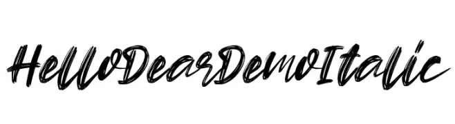
A bold, brush-style italic font with dynamic and expressive strokes.
![Hello Dear Demo Italic Frei Schriftart Herunterladen]() Herunterladen 69 Downloads@WebFont
Herunterladen 69 Downloads@WebFont -
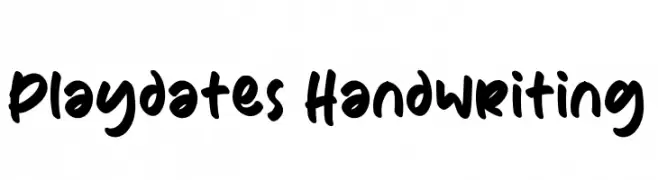
( Fonts by Eifetstype - Stefie Justprince - Personal-use only. For commercial use please contact owner. )
A bold, playful handwriting font with rounded strokes and a lively, informal style.
![Playdates Handwriting Frei Schriftart Herunterladen]() Herunterladen 69 Downloads@WebFont
Herunterladen 69 Downloads@WebFont -
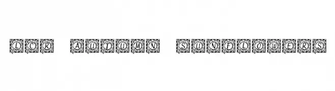
( LeChefRene - members.aol.com/lcrfonts/ )
A decorative font with characters encased in sunflower-themed borders.
![LCR Autumn Sunflowers Frei Schriftart Herunterladen]() Herunterladen 69 Downloads@WebFont
Herunterladen 69 Downloads@WebFont -
( Fonts by Mans Greback - www.mansgreback.com - Personal-use only. For commercial use please contact owner. )
A modern, high-contrast font with elegant, slender characters.
![Sygma Bold Frei Schriftart Herunterladen]() Herunterladen 69 Downloads@WebFont
Herunterladen 69 Downloads@WebFont -
( Fonts by Nasrun - Personal-use only. For commercial use please contact owner. )
A lively and energetic handwritten font with irregular strokes and playful style.
![ReadfasterRegular Frei Schriftart Herunterladen]() Herunterladen 69 Downloads@WebFont
Herunterladen 69 Downloads@WebFont -
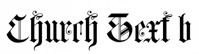
( Fonts by Torre de Prata - Marcos André Falcão Malafaia - Personal-use only. For commercial use please contact owner. )
A decorative Blackletter font with intricate details and a historical, Gothic style.
![Church Text b Frei Schriftart Herunterladen]() Herunterladen 69 Downloads@WebFont
Herunterladen 69 Downloads@WebFont -
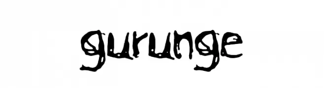
( Xavier Juanola - www.donodesign.com )
A bold, hand-drawn font with an expressive, graffiti-like style.
![gurunge Frei Schriftart Herunterladen]() Herunterladen 69 Downloads@WebFont
Herunterladen 69 Downloads@WebFont -
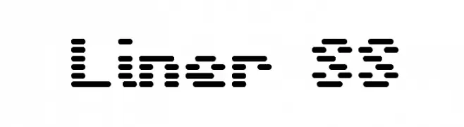
( BRIDGEco - bridgeco.jp/ )
A dot matrix style font with a modern, digital aesthetic.
![Liner SS Frei Schriftart Herunterladen]() Herunterladen 69 Downloads@WebFont
Herunterladen 69 Downloads@WebFont -
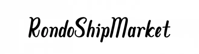
( Fonts by Chamdan Chakim - Personal-use only. For commercial use please contact owner. )
A playful and dynamic script font with fluid, connected strokes and moderate contrast.
![Rondo Ship Market Frei Schriftart Herunterladen]() Herunterladen 69 Downloads@WebFont
Herunterladen 69 Downloads@WebFont -
( Fonts by Ditatype - Personal-use only. For commercial use please contact owner. )
A lively handwritten font with fluid strokes and playful curves.
![Batterlife Personal Use Frei Schriftart Herunterladen]() Herunterladen 69 Downloads@WebFont
Herunterladen 69 Downloads@WebFont -
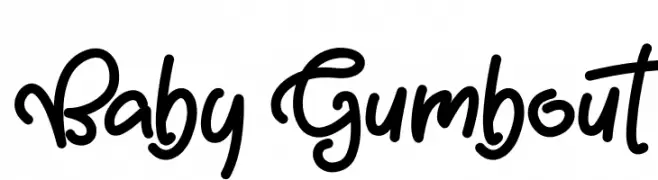
( Fonts by Mabhal Studio - Abdullah - Personal-use only. For commercial use please contact owner. )
A playful, bold, and rounded hand-drawn font with whimsical character.
![Baby Gumbout Frei Schriftart Herunterladen]() Herunterladen 69 Downloads@WebFont
Herunterladen 69 Downloads@WebFont -
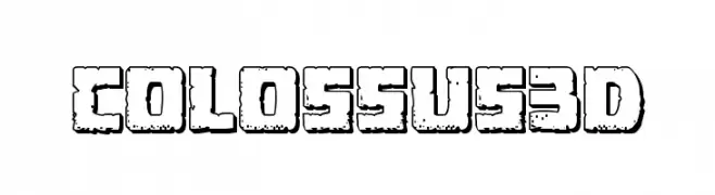
( Iconian Fonts - Daniel Zadorozny - www.iconian.com )
A bold, textured 3D font with a rugged, industrial look.
![Colossus 3D Frei Schriftart Herunterladen]() Herunterladen 69 Downloads@WebFont
Herunterladen 69 Downloads@WebFont -
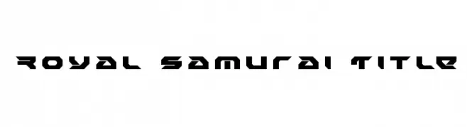
( Iconian Fonts - Daniel Zadorozny - www.iconian.com )
A bold, angular font with a futuristic and geometric design.
![Royal Samurai Title Frei Schriftart Herunterladen]() Herunterladen 69 Downloads@WebFont
Herunterladen 69 Downloads@WebFont -
( Fonts by Daniel Zadorozny - www.iconian.com - Personal-use only. For commercial use please contact owner. )
A futuristic, expanded italic font with geometric and dynamic design.
![Sky Ridge Expanded Italic Frei Schriftart Herunterladen]() Herunterladen 69 Downloads@WebFont
Herunterladen 69 Downloads@WebFont -
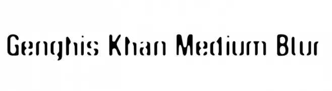
( Fonts by Uroboros Design - Mahir Huseynov - Personal-use only. For commercial use please contact owner. )
A bold, modern font with a blurred effect and rounded characters.
![Genghis Khan Medium Blur Frei Schriftart Herunterladen]() Herunterladen 69 Downloads@WebFont
Herunterladen 69 Downloads@WebFont -
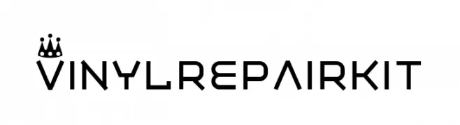
( Fonts by Pizzadude - Jakob Fischer - Personal-use only. For commercial use please contact owner. )
A modern, geometric font with angular, tech-inspired characters.
![Vinyl repair kit Frei Schriftart Herunterladen]() Herunterladen 69 Downloads@WebFont
Herunterladen 69 Downloads@WebFont -
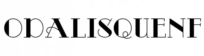
( Fonts by Nick Curtis - Personal-use only. For commercial use please contact owner. )
A high-contrast, elegant serif font with decorative elements.
![OdalisqueNF Frei Schriftart Herunterladen]() Herunterladen 69 Downloads@WebFont
Herunterladen 69 Downloads@WebFont -
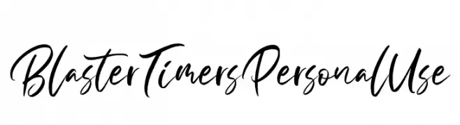
( Fonts by Din Studio - Donis Miftahudin - Personal-use only. For commercial use please contact owner. )
A dynamic and expressive handwritten font with fluid, sweeping strokes.
![BlasterTimersPersonalUse Frei Schriftart Herunterladen]() Herunterladen 69 Downloads@WebFont
Herunterladen 69 Downloads@WebFont -
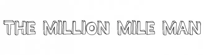
( Fonts by Geronimo Fonts - Personal-use only. For commercial use please contact owner. )
A bold, 3D cartoon-style font with thick outlines and uppercase letters.
![THE MILLION MILE MAN Frei Schriftart Herunterladen]() Herunterladen 69 Downloads@WebFont
Herunterladen 69 Downloads@WebFont


Welche Schriften sind gerade am populärsten?
Poppins, Roboto, Montserrat, Open Sans und Lato sind wegen ihrer klaren Formen und breiten Einsetzbarkeit sehr gefragt – von Markenauftritt über Landingpages bis hin zu Postern.
Welche Fonts eignen sich für Logos?
Geometrische Sans‑Serifs (z. B. Poppins, Familien im Gotham‑Stil) sind ein häufiger Griff für sauberes, skalierbares Branding. Für eine persönlichere Note bleiben Scripts und Handschrift‑Stile beliebt. Kombinieren Sie einen prägnanten Headline‑Font mit einer neutralen Brotschrift für Wiedererkennung und Harmonie.
Wie oft wird die Top‑Liste aktualisiert?
Regelmäßig – basierend auf realen Downloads und Interaktionen. Schauen Sie öfter vorbei, um aufstrebende Favoriten früh zu entdecken.
💡 Tipp: Seite bookmarken – Trends wechseln schnell, und heutige Top‑Schriften inspirieren morgen vielleicht das Rebranding.