Willkommen bei den Top‑Schriften – hier treffen Beliebtheit und Qualität aufeinander. Das sind die in diesem Jahr am häufigsten heruntergeladenen und genutzten Fonts. Wenn Sie sichere Optionen für Logo, Web oder Social suchen, starten Sie hier.
Jeder Top‑Font überzeugt durch Balance, Lesbarkeit und Vielseitigkeit. Sie finden moderne Sans‑Serifs, elegante Scripts, Vintage‑Serifs und minimalistische Displays.
-
( Fonts by wep - Wahyu Eka Prasetya - Personal-use only. For commercial use please contact owner. )
A bold, distressed font with a textured, weathered appearance.
 Herunterladen 67 Downloads@WebFont
 -
( Fonts by Peter Wiegel - www.peter-wiegel.de - Personal-use only. For commercial use please contact owner. )
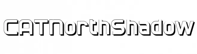
A bold, geometric font with a three-dimensional shadow effect.
![CATNorthShadow Frei Schriftart Herunterladen]() Herunterladen 67 Downloads@WebFont
Herunterladen 67 Downloads@WebFont -
( Fonts by Vladimir Nikolic - www.creativefabrica.com/designer/vladimirnikolic/ - Personal-use only. For commercial use please contact owner. )
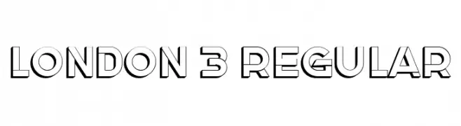
A bold, geometric font with a 3D shadow effect, offering a modern and structured look.
![London 3 Regular Frei Schriftart Herunterladen]() Herunterladen 67 Downloads@WebFont
Herunterladen 67 Downloads@WebFont -
( Fonts by Almarkhatype - Abdul Malik Wisnu - Personal-use only. For commercial use please contact owner. )
A cursive, handwritten font with elegant, flowing strokes.
![chadelova Frei Schriftart Herunterladen]() Herunterladen 67 Downloads@WebFont
Herunterladen 67 Downloads@WebFont -
( Fonts by Edwin Prayogi M - Personal-use only. For commercial use please contact owner. )
A bold, playful handwritten font with rounded, irregular letterforms.
![Wala Frei Schriftart Herunterladen]() Herunterladen 67 Downloads@WebFont
Herunterladen 67 Downloads@WebFont -
( Fonts by Irfan Hidayat - Personal-use only. For commercial use please contact owner. )
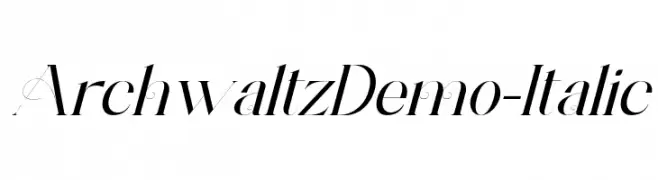
An elegant, italicized serif font with high contrast and decorative serifs.
![ArchwaltzDemo-Italic Frei Schriftart Herunterladen]() Herunterladen 67 Downloads@WebFont
Herunterladen 67 Downloads@WebFont -
( Fonts by Creatype Studio - Rian Rahardi - Personal-use only. For commercial use please contact owner. )
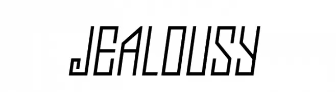
A bold, angular font with a futuristic and geometric design.
![Jealousy Frei Schriftart Herunterladen]() Herunterladen 67 Downloads@WebFont
Herunterladen 67 Downloads@WebFont -
( Fonts by Nirmana Visual - Sigit Dwipa - Personal-use only. For commercial use please contact owner. )
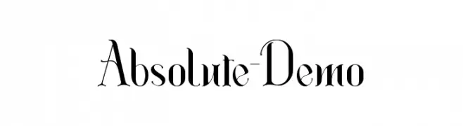
An elegant and artistic font with flowing, decorative letterforms.
![Absolute - Demo Frei Schriftart Herunterladen]() Herunterladen 67 Downloads@WebFont
Herunterladen 67 Downloads@WebFont -
( Fonts by Attype Studio )
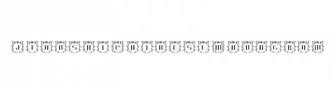
A decorative and ornate font with bold, framed capital letters.
![Jianshi Chinese Monogram Frei Schriftart Herunterladen]() Herunterladen 67 Downloads@WebFont
Herunterladen 67 Downloads@WebFont -
( Fonts by Md Shohail Bhuian - Personal-use only. For commercial use please contact owner. )
A playful, handwritten-style font with consistent stroke width and casual appeal.
![Travel Frei Schriftart Herunterladen]() Herunterladen 67 Downloads@WebFont
Herunterladen 67 Downloads@WebFont -
( Mirz123 - Michelle Lehmann - www.scriptmonkeys.us )
A pixelated, retro-style font with a digital and blocky appearance.
![Pixel-Noir Regular Frei Schriftart Herunterladen]() Herunterladen 67 Downloads@WebFont
Herunterladen 67 Downloads@WebFont -
( Fonts by Andi Moz )
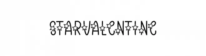
A decorative font with star motifs integrated into bold, playful characters.
![Star Valentine Frei Schriftart Herunterladen]() Herunterladen 67 Downloads@WebFont
Herunterladen 67 Downloads@WebFont -
( Fonts by Tri Sakti Oktaviano )
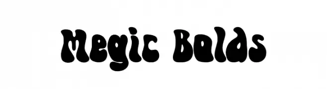
A bold, playful font with rounded, exaggerated shapes for a whimsical look.
![Megic Bolds Frei Schriftart Herunterladen]() Herunterladen 67 Downloads@WebFont
Herunterladen 67 Downloads@WebFont -
( Fonts by www.junkohanhero.com - Personal-use only. For commercial use please contact owner. )
A hand-drawn, distressed font with dramatic serifs and artistic flair.
![Synonym Blank Frei Schriftart Herunterladen]() Herunterladen 67 Downloads@WebFont
Herunterladen 67 Downloads@WebFont -
( Fonts by Televo - Personal-use only. For commercial use please contact owner. )
A bold, decorative font with gothic and tribal influences, featuring intricate and angular designs.
![KHScala Regular Frei Schriftart Herunterladen]() Herunterladen 67 Downloads@WebFont
Herunterladen 67 Downloads@WebFont -
( Fonts by CannotIntoSpaceFonts - KineticPlasma Fonts - Personal-use only. For commercial use please contact owner. )
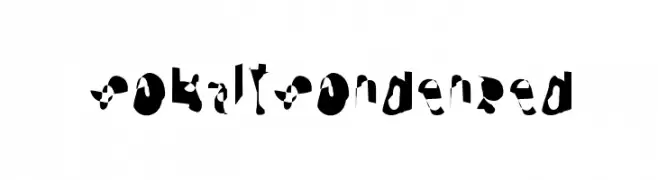
A bold, abstract font with fragmented, condensed characters for a striking visual impact.
![Cobalt Condensed Frei Schriftart Herunterladen]() Herunterladen 67 Downloads@WebFont
Herunterladen 67 Downloads@WebFont -
( Fonts by nariswari_creative - Taufik Dwi Purnomo - Personal-use only. For commercial use please contact owner. )
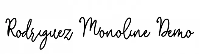
A smooth, monoline script font with elegant, connected characters.
![Rodriguez Monoline Demo Frei Schriftart Herunterladen]() Herunterladen 67 Downloads@WebFont
Herunterladen 67 Downloads@WebFont -
( Fonts by Pixel Sagas - Neale and Shayna Davidson - Personal-use only. For commercial use please contact owner. )
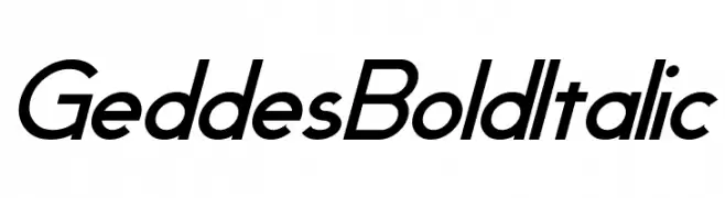
A bold, italicized font with a modern and dynamic style.
![Geddes Bold Italic Frei Schriftart Herunterladen]() Herunterladen 67 Downloads@WebFont
Herunterladen 67 Downloads@WebFont -
( Fonts by Creative Lab - Creative LAB - Personal-use only. For commercial use please contact owner. )
A playful, handwritten script font with dynamic curves and bold strokes.
![Handley Frei Schriftart Herunterladen]() Herunterladen 67 Downloads@WebFont
Herunterladen 67 Downloads@WebFont -
( Fonts by Leonard Posavec - LeoSupply.co - Leonard Posavec - Personal-use only. For commercial use please contact owner. )
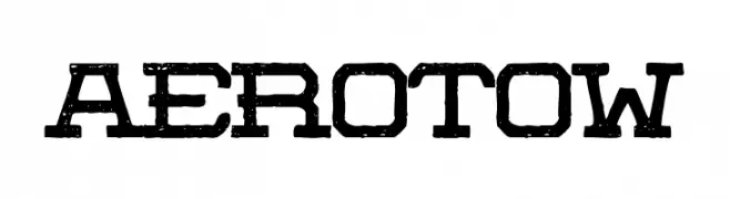
A bold, distressed font with a vintage, industrial style.
![Aerotow Frei Schriftart Herunterladen]() Herunterladen 67 Downloads@WebFont
Herunterladen 67 Downloads@WebFont -
( Fonts by kokostd - Haris Anggar - Personal-use only. For commercial use please contact owner. )
A bold, playful handwritten font with thick strokes and rounded edges.
![Batara Frei Schriftart Herunterladen]() Herunterladen 67 Downloads@WebFont
Herunterladen 67 Downloads@WebFont -
( Fonts by Edric Studio - Personal-use only. For commercial use please contact owner. )
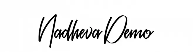
A dynamic and flowing script font with elegant, fluid letterforms.
![Nadheva Demo Frei Schriftart Herunterladen]() Herunterladen 67 Downloads@WebFont
Herunterladen 67 Downloads@WebFont -
( Fonts by Iconian Fonts - Daniel Zadorozny - Personal-use only. For commercial use please contact owner. )
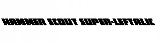
A bold, left-slanted font with a dynamic and modern style.
![Hammer Scout Super-Leftalic Frei Schriftart Herunterladen]() Herunterladen 67 Downloads@WebFont
Herunterladen 67 Downloads@WebFont -
( Fonts by twinletter )
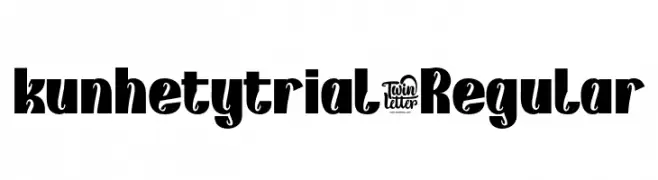
A bold, decorative font with high contrast and artistic flair.
![kunhetytrial-Regular Frei Schriftart Herunterladen]() Herunterladen 67 Downloads@WebFont
Herunterladen 67 Downloads@WebFont -
( Fonts by Airotype Studio - Personal-use only. For commercial use please contact owner. )
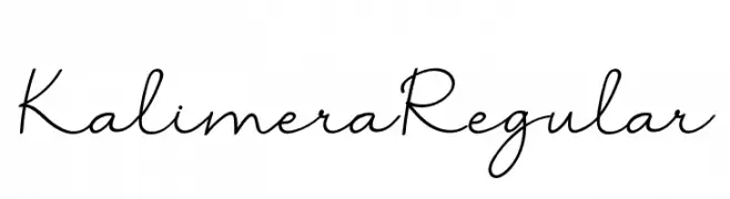
A cursive, handwritten-style font with elegant, flowing strokes.
![KalimeraRegular Frei Schriftart Herunterladen]() Herunterladen 67 Downloads@WebFont
Herunterladen 67 Downloads@WebFont -
( Fonts by Kong Font - https://fontkong.com/ - Personal-use only. For commercial use please contact owner. )
An elegant and flowing script font with decorative swashes.
![Beckhand Swash Frei Schriftart Herunterladen]() Herunterladen 67 Downloads@WebFont
Herunterladen 67 Downloads@WebFont -
( Fonts by Daniel Zadorozny - www.iconian.com - Personal-use only. For commercial use please contact owner. )
A bold, angular, and expanded italic font with a futuristic style.
![Emerald Beacon Expanded Italic Frei Schriftart Herunterladen]() Herunterladen 67 Downloads@WebFont
Herunterladen 67 Downloads@WebFont -
( Fonts by Rizal Mustiko - Personal-use only. For commercial use please contact owner. )
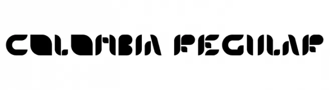
A bold, geometric font with a modern and futuristic style.
![Colombia Regular Frei Schriftart Herunterladen]() Herunterladen 67 Downloads@WebFont
Herunterladen 67 Downloads@WebFont -
( Iconian Fonts - Daniel Zadorozny - www.iconian.com )
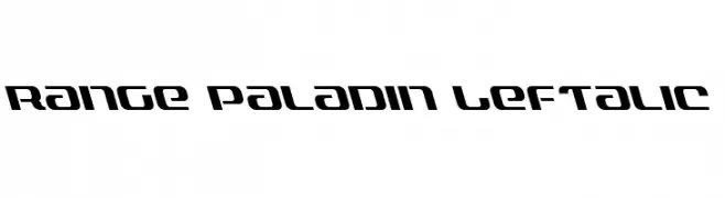
A bold, futuristic font with a leftward slant and high contrast strokes.
![Range Paladin Leftalic Frei Schriftart Herunterladen]() Herunterladen 67 Downloads@WebFont
Herunterladen 67 Downloads@WebFont -
( Rajendra Bitling - www.rbitling.com )
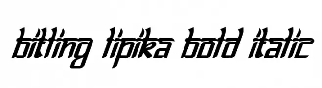
A bold, italicized font with a futuristic, angular design.
![Bitling lipika Bold Italic Frei Schriftart Herunterladen]() Herunterladen 67 Downloads@WebFont
Herunterladen 67 Downloads@WebFont -
( Fonts by Kat`s Fun Fonts - Personal-use only. For commercial use please contact owner. )
A whimsical collection of Irish-themed decorative symbols.
![KR Irish Kat 3 Frei Schriftart Herunterladen]() Herunterladen 67 Downloads@WebFont
Herunterladen 67 Downloads@WebFont -
( Moved on our website )
![nofiles Frei Schriftart Herunterladen]() Herunterladen 67 Downloads@WebFont
Herunterladen 67 Downloads@WebFont -
( Fonts by junkohanhero - Personal-use only. For commercial use please contact owner. )
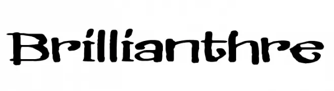
A bold, brush-style font with expressive, hand-painted characteristics.
![Brillianthre Frei Schriftart Herunterladen]() Herunterladen 67 Downloads@WebFont
Herunterladen 67 Downloads@WebFont -
( Copyright 2018 The Mali Project Authors (https://github.com/cadsondemak/Mali) )
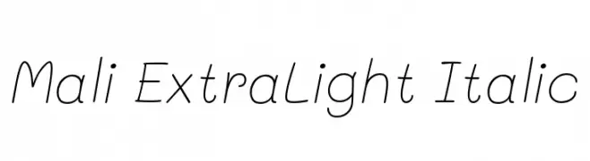
A sleek, elegant, and modern italic font with a light, flowing style.
![Mali ExtraLight Italic Frei Schriftart Herunterladen]() Herunterladen 67 Downloads@WebFont
Herunterladen 67 Downloads@WebFont -
( Fonts by Haksen Studio - Sarwo Edhi Prayitno - Personal-use only. For commercial use please contact owner. )
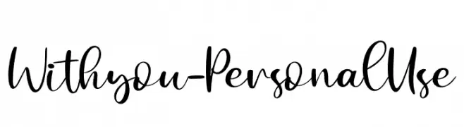
A lively and flowing script font with elegant cursive letterforms.
![Withyou - Personal Use Frei Schriftart Herunterladen]() Herunterladen 67 Downloads@WebFont
Herunterladen 67 Downloads@WebFont


Welche Schriften sind gerade am populärsten?
Poppins, Roboto, Montserrat, Open Sans und Lato sind wegen ihrer klaren Formen und breiten Einsetzbarkeit sehr gefragt – von Markenauftritt über Landingpages bis hin zu Postern.
Welche Fonts eignen sich für Logos?
Geometrische Sans‑Serifs (z. B. Poppins, Familien im Gotham‑Stil) sind ein häufiger Griff für sauberes, skalierbares Branding. Für eine persönlichere Note bleiben Scripts und Handschrift‑Stile beliebt. Kombinieren Sie einen prägnanten Headline‑Font mit einer neutralen Brotschrift für Wiedererkennung und Harmonie.
Wie oft wird die Top‑Liste aktualisiert?
Regelmäßig – basierend auf realen Downloads und Interaktionen. Schauen Sie öfter vorbei, um aufstrebende Favoriten früh zu entdecken.
💡 Tipp: Seite bookmarken – Trends wechseln schnell, und heutige Top‑Schriften inspirieren morgen vielleicht das Rebranding.