Willkommen bei den Top‑Schriften – hier treffen Beliebtheit und Qualität aufeinander. Das sind die in diesem Jahr am häufigsten heruntergeladenen und genutzten Fonts. Wenn Sie sichere Optionen für Logo, Web oder Social suchen, starten Sie hier.
Jeder Top‑Font überzeugt durch Balance, Lesbarkeit und Vielseitigkeit. Sie finden moderne Sans‑Serifs, elegante Scripts, Vintage‑Serifs und minimalistische Displays.
-
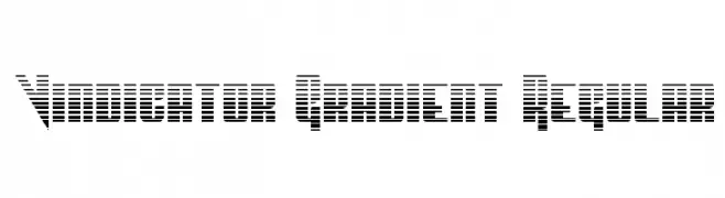
( Fonts by Daniel Zadorozny - www.iconian.com )
A bold, geometric font with a gradient effect created by horizontal lines.
 Herunterladen 68 Downloads@WebFont
 -
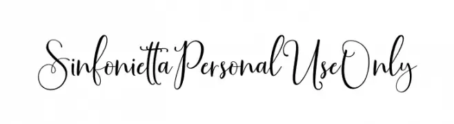
( Fonts by Jimtype Studio - Personal-use only. For commercial use please contact owner. )
An elegant and flowing script font with graceful curves and swashes.
![SinfoniettaPersonalUseOnly Frei Schriftart Herunterladen]() Herunterladen 68 Downloads@WebFont
Herunterladen 68 Downloads@WebFont -
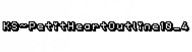
( Shoko Halfmoon - shoko.halfmoon.jp/ )
A pixelated, outlined font with a retro video game style.
![KS-PetitHeartOutline10_4 Frei Schriftart Herunterladen]() Herunterladen 68 Downloads@WebFont
Herunterladen 68 Downloads@WebFont -
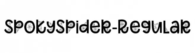
( Fonts by Font Bundles )
A bold, decorative font with spider web motifs, perfect for spooky themes.
![SpokySpider-Regular Frei Schriftart Herunterladen]() Herunterladen 68 Downloads@WebFont
Herunterladen 68 Downloads@WebFont -
( Copyright 2010 The Corinthia Project Authors (https://github.com/googlefonts/corinthia) )
A refined, cursive script font with elegant calligraphic strokes.
![Corinthia Regular Frei Schriftart Herunterladen]() Herunterladen 68 Downloads@WebFont
Herunterladen 68 Downloads@WebFont -
![bitstorm superextended oblique Frei Schriftart Herunterladen]() Herunterladen 68 Downloads@WebFont
Herunterladen 68 Downloads@WebFont -
( Fonts by Maulana Creative - Gilang Maulana - Personal-use only. For commercial use please contact owner. )
A dynamic and expressive handwritten font with fluid, flowing letterforms.
![Hardtrack Free Frei Schriftart Herunterladen]() Herunterladen 68 Downloads@WebFont
Herunterladen 68 Downloads@WebFont -
( weknow - Wino S Kadir - www.creativefabrica.com/designer/weknow/ )
A bold, jagged font with an energetic and playful design.
![Shake It Off Bold Frei Schriftart Herunterladen]() Herunterladen 68 Downloads@WebFont
Herunterladen 68 Downloads@WebFont -
( Fonts by Peter Wiegel - www.peter-wiegel.de - Personal-use only. For commercial use please contact owner. )
A modern, geometric font with clean lines and a minimalist style.
![BernardoModaSemibold Frei Schriftart Herunterladen]() Herunterladen 68 Downloads@WebFont
Herunterladen 68 Downloads@WebFont -
( Fonts by Apon Bahrainy - Personal-use only. For commercial use please contact owner. )
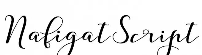
A modern, elegant script font with flowing, cursive characters.
![NafigatScript Frei Schriftart Herunterladen]() Herunterladen 68 Downloads@WebFont
Herunterladen 68 Downloads@WebFont -
( Fonts by Letterara - Thomas Aradea - Personal-use only. For commercial use please contact owner. )
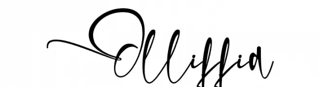
A dynamic, cursive handwritten font with expressive, flowing letterforms.
![Olliffia Frei Schriftart Herunterladen]() Herunterladen 68 Downloads@WebFont
Herunterladen 68 Downloads@WebFont -
( Iconian Fonts - Daniel Zadorozny - www.iconian.com )
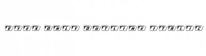
A modern, italicized font with bold folder-like outlines and medium contrast.
![Eyes Only Outline Italic Frei Schriftart Herunterladen]() Herunterladen 68 Downloads@WebFont
Herunterladen 68 Downloads@WebFont -
( Noto is a trademark of Google Inc. Noto fonts are open source. All Noto fonts are published under the SIL Open Font License, Version 1.1 )
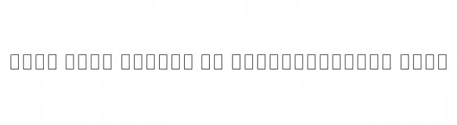
A modern, thin, semi-condensed sans-serif font with a sleek and elegant design.
![Noto Sans Arabic UI SemiCondensed Thin Frei Schriftart Herunterladen]() Herunterladen 68 Downloads@WebFont
Herunterladen 68 Downloads@WebFont -
![Stars From Our Eyes Frei Schriftart Herunterladen]() Herunterladen 68 Downloads@WebFont
Herunterladen 68 Downloads@WebFont -
( Fonts by Al Ghul - Personal-use only. For commercial use please contact owner. )
A playful, bold handwritten font with rounded, informal letterforms.
![Smart Home Frei Schriftart Herunterladen]() Herunterladen 68 Downloads@WebFont
Herunterladen 68 Downloads@WebFont -
( Fonts by Wino S Kadir - weknow - www.revolge.com/shop/weknow/ - Personal-use only. For commercial use please contact owner. )
A futuristic, geometric font with rounded edges and consistent stroke width.
![Raynaliz Frei Schriftart Herunterladen]() Herunterladen 68 Downloads@WebFont
Herunterladen 68 Downloads@WebFont -
( Fonts by Storytype Studio )
A playful, bold font with rounded, bubble-like characters.
![GLOREST SHUFLE Frei Schriftart Herunterladen]() Herunterladen 68 Downloads@WebFont
Herunterladen 68 Downloads@WebFont -
( Fonts by Typebae Foundry )
![Blustrue Frei Schriftart Herunterladen]() Herunterladen 68 Downloads@WebFont
Herunterladen 68 Downloads@WebFont -
( Fonts by Vladimir Nikolic - https://www.creativefabrica.com/product/educated-deers/ref/144265/ - Personal-use only. For commercial use please contact owner. )
A geometric, hollow font with a futuristic and modern design.
![Imbecile Hollow Regular Frei Schriftart Herunterladen]() Herunterladen 68 Downloads@WebFont
Herunterladen 68 Downloads@WebFont -
( Fonts by Vladimir Nikolic - www.creativefabrica.com/designer/vladimirnikolic/ - Personal-use only. For commercial use please contact owner. )
A bold, decorative font with a striped, three-dimensional effect.
![Marshland Regular Frei Schriftart Herunterladen]() Herunterladen 68 Downloads@WebFont
Herunterladen 68 Downloads@WebFont -
( Fonts by Judith Tenreiro - Personal-use only. For commercial use please contact owner. )
A playful, bold, and hand-drawn style font with rounded edges.
![Judymlky Regular Frei Schriftart Herunterladen]() Herunterladen 68 Downloads@WebFont
Herunterladen 68 Downloads@WebFont -
( Fonts by One Design - Personal-use only. For commercial use please contact owner. )
A bold, expressive handwritten font with smooth, flowing curves.
![Black Coffee Frei Schriftart Herunterladen]() Herunterladen 68 Downloads@WebFont
Herunterladen 68 Downloads@WebFont -
( Fonts by Zetafonts - Personal-use only. For commercial use please contact owner. )
A modern, ultra-light font with geometric shapes and consistent spacing.
![AristotelicaSmallCaps-UltraLigh Frei Schriftart Herunterladen]() Herunterladen 68 Downloads@WebFont
Herunterladen 68 Downloads@WebFont -
( Fonts by Khurasan™ )
A bold, playful font with rounded edges and a bubbly appearance.
![Aku Ceria Frei Schriftart Herunterladen]() Herunterladen 68 Downloads@WebFont
Herunterladen 68 Downloads@WebFont -
( Fonts by Peter Wiegel - www.peter-wiegel.de - Personal-use only. For commercial use please contact owner. )
Bold, geometric pictograms and sans-serif numerals for signage.
![Zeichen Zweihundert Frei Schriftart Herunterladen]() Herunterladen 68 Downloads@WebFont
Herunterladen 68 Downloads@WebFont -
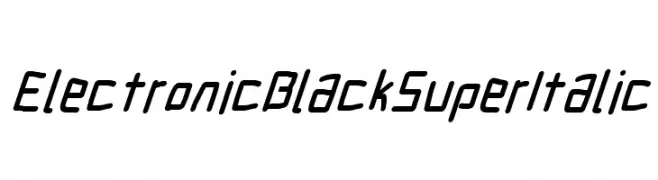
( Fonts by CannotIntoSpaceFonts - KineticPlasma Fonts - Personal-use only. For commercial use please contact owner. )
A bold, italicized font with a futuristic and geometric style.
![Electronic Black SuperItalic Frei Schriftart Herunterladen]() Herunterladen 68 Downloads@WebFont
Herunterladen 68 Downloads@WebFont -
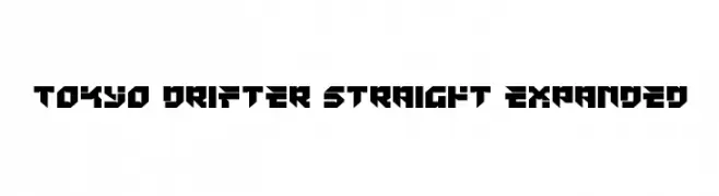
( Iconian Fonts - Daniel Zadorozny - www.iconian.com )
A bold, geometric font with sharp angles and a futuristic style.
![Tokyo Drifter Straight Expanded Frei Schriftart Herunterladen]() Herunterladen 68 Downloads@WebFont
Herunterladen 68 Downloads@WebFont -
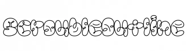
( Fonts by Jadatype )
A playful, bubbly outline font with a whimsical, cartoonish style.
![Scrouble Outline Frei Schriftart Herunterladen]() Herunterladen 68 Downloads@WebFont
Herunterladen 68 Downloads@WebFont -
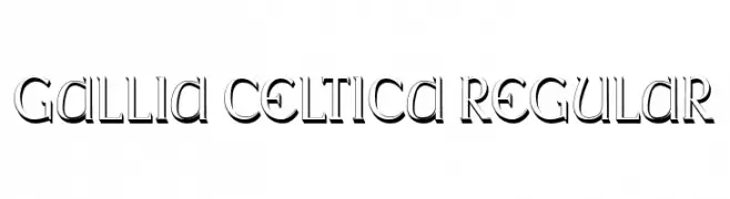
( Fonts by Vladimir Nikolic )
A bold, decorative font with a three-dimensional shadow effect and pronounced serifs.
![Gallia Celtica Regular Frei Schriftart Herunterladen]() Herunterladen 68 Downloads@WebFont
Herunterladen 68 Downloads@WebFont -
( Fonts by Greg Medina - www.dcoxy.com - Personal-use only. For commercial use please contact owner. )
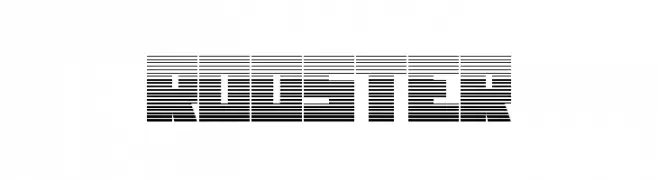
A bold, modern font with a unique horizontal striped pattern and tight character spacing.
![ROOSTER Frei Schriftart Herunterladen]() Herunterladen 68 Downloads@WebFont
Herunterladen 68 Downloads@WebFont -
( Fonts by HastaType - Salman Mashudi - Personal-use only. For commercial use please contact owner. )
A bold, flowing script font with elegant, interconnected curves.
![Legends Frei Schriftart Herunterladen]() Herunterladen 68 Downloads@WebFont
Herunterladen 68 Downloads@WebFont -
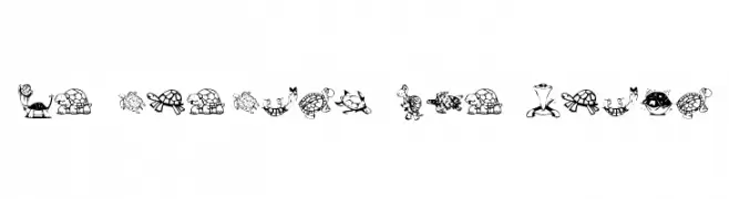
( Fonts by Kat`s Fun Fonts - Personal-use only. For commercial use please contact owner. )
Cartoon turtle illustrations replace standard alphanumeric characters.
![KR Turtles For Julie Frei Schriftart Herunterladen]() Herunterladen 68 Downloads@WebFont
Herunterladen 68 Downloads@WebFont -
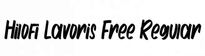
( Fonts by Maulana Creative - Gilang Maulana - Personal-use only. For commercial use please contact owner. )
A bold, handwritten font with a dynamic and playful style.
![Hilofi Lavoris Free Regular Frei Schriftart Herunterladen]() Herunterladen 68 Downloads@WebFont
Herunterladen 68 Downloads@WebFont -
( imagex - www.imagex-fonts.com )
A bold, angular font with a futuristic and edgy design.
![Zoxoz Frei Schriftart Herunterladen]() Herunterladen 68 Downloads@WebFont
Herunterladen 68 Downloads@WebFont -
( Fonts by Creatype Studio - Rian Rahardi - Personal-use only. For commercial use please contact owner. )
A bold, brush-style handwritten font with dynamic strokes.
![Mastery Frei Schriftart Herunterladen]() Herunterladen 68 Downloads@WebFont
Herunterladen 68 Downloads@WebFont


Welche Schriften sind gerade am populärsten?
Poppins, Roboto, Montserrat, Open Sans und Lato sind wegen ihrer klaren Formen und breiten Einsetzbarkeit sehr gefragt – von Markenauftritt über Landingpages bis hin zu Postern.
Welche Fonts eignen sich für Logos?
Geometrische Sans‑Serifs (z. B. Poppins, Familien im Gotham‑Stil) sind ein häufiger Griff für sauberes, skalierbares Branding. Für eine persönlichere Note bleiben Scripts und Handschrift‑Stile beliebt. Kombinieren Sie einen prägnanten Headline‑Font mit einer neutralen Brotschrift für Wiedererkennung und Harmonie.
Wie oft wird die Top‑Liste aktualisiert?
Regelmäßig – basierend auf realen Downloads und Interaktionen. Schauen Sie öfter vorbei, um aufstrebende Favoriten früh zu entdecken.
💡 Tipp: Seite bookmarken – Trends wechseln schnell, und heutige Top‑Schriften inspirieren morgen vielleicht das Rebranding.