Willkommen bei den Top‑Schriften – hier treffen Beliebtheit und Qualität aufeinander. Das sind die in diesem Jahr am häufigsten heruntergeladenen und genutzten Fonts. Wenn Sie sichere Optionen für Logo, Web oder Social suchen, starten Sie hier.
Jeder Top‑Font überzeugt durch Balance, Lesbarkeit und Vielseitigkeit. Sie finden moderne Sans‑Serifs, elegante Scripts, Vintage‑Serifs und minimalistische Displays.
-
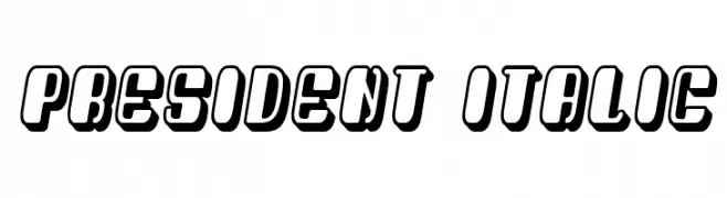
( Fonts by Vladimir Nikolic - https://www.creativefabrica.com/product/educated-deers/ref/144265/ - Personal-use only. For commercial use please contact owner. )
A bold, italic, 3D font with a modern and impactful style.
 Herunterladen 68 Downloads@WebFont
 -
( Mercè SV )
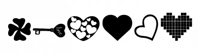
A playful dingbat font with diverse heart and love-themed icons.
![LOVE_AMY Frei Schriftart Herunterladen]() Herunterladen 68 Downloads@WebFont
Herunterladen 68 Downloads@WebFont -
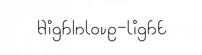
( weknow - Wino S Kadir - www.creativefabrica.com/designer/weknow/ )
A playful and modern font with rounded, looping strokes.
![High In love-light Frei Schriftart Herunterladen]() Herunterladen 68 Downloads@WebFont
Herunterladen 68 Downloads@WebFont -
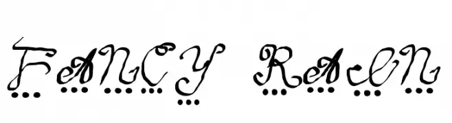
( Fonts on us )
A whimsical, decorative handwritten font with playful dot embellishments.
![fancy rain Frei Schriftart Herunterladen]() Herunterladen 68 Downloads@WebFont
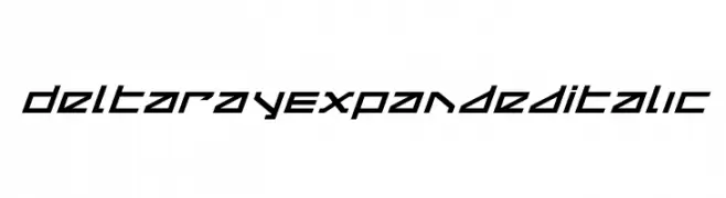
Herunterladen 68 Downloads@WebFont -
![Delta Ray Expanded Italic Frei Schriftart Herunterladen]() Herunterladen 68 Downloads@WebFont
Herunterladen 68 Downloads@WebFont -
( Fonts by Letterafa Studio - Ahmad Afandi - Personal-use only. For commercial use please contact owner. )
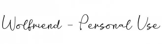
A playful handwritten font with a casual elegance and modern appeal.
![Wolfriend - Personal Use Frei Schriftart Herunterladen]() Herunterladen 68 Downloads@WebFont
Herunterladen 68 Downloads@WebFont -
( Fonts by Almarkhatype - Abdul Malik Wisnu - Personal-use only. For commercial use please contact owner. )
A bold, condensed font ideal for impactful headlines.
![Blackheat Frei Schriftart Herunterladen]() Herunterladen 68 Downloads@WebFont
Herunterladen 68 Downloads@WebFont -
( ingoFonts - Ingo Zimmermann - www.ingofonts.com )
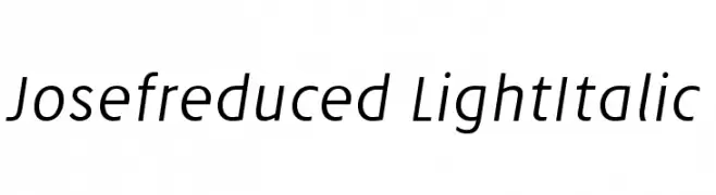
A sleek, modern light italic font with elegant slanted characters.
![Josefreduced-LightItalic Frei Schriftart Herunterladen]() Herunterladen 68 Downloads@WebFont
Herunterladen 68 Downloads@WebFont -
( Fonts by Colllab Studio - Personal-use only. For commercial use please contact owner. )
A lively, handwritten cursive font with dynamic strokes and a playful style.
![Beauty Bailey Frei Schriftart Herunterladen]() Herunterladen 68 Downloads@WebFont
Herunterladen 68 Downloads@WebFont -
( Southype - Rodrigo Gonzalez - www.southype.com )
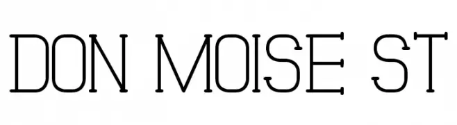
A modern, geometric font with a monospaced appearance and consistent stroke width.
![Don Moise St Frei Schriftart Herunterladen]() Herunterladen 68 Downloads@WebFont
Herunterladen 68 Downloads@WebFont -
( Fonts by Fitrah Type )
A bold, 3D graffiti-style font with strong extruded effects and high contrast.
![Crysh Graffiti Extrude Frei Schriftart Herunterladen]() Herunterladen 68 Downloads@WebFont
Herunterladen 68 Downloads@WebFont -
( Fonts by Daniel Zadorozny - www.iconian.com - Personal-use only. For commercial use please contact owner. )
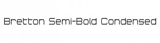
A geometric, semi-bold, condensed font with a modern and technical style.
![Bretton Semi-Bold Condensed Frei Schriftart Herunterladen]() Herunterladen 68 Downloads@WebFont
Herunterladen 68 Downloads@WebFont -
( Fonts by Daniel Zadorozny - www.iconian.com - Personal-use only. For commercial use please contact owner. )
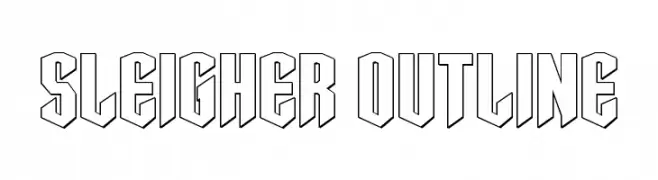
A bold, outlined font with a three-dimensional, geometric style.
![Sleigher Outline Frei Schriftart Herunterladen]() Herunterladen 68 Downloads@WebFont
Herunterladen 68 Downloads@WebFont -
( Fonts by Scratchones )
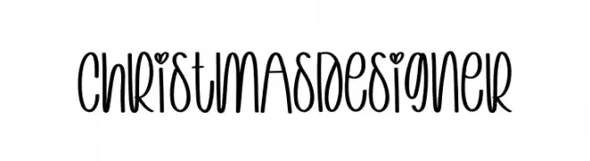
A playful, handwritten font with heart details and consistent stroke width.
![Christmas Designer Frei Schriftart Herunterladen]() Herunterladen 68 Downloads@WebFont
Herunterladen 68 Downloads@WebFont -
( Fonts by Balpirick Studio - https://www.creativefabrica.com/designer/balpirick/ref/308299/ - Personal-use only. For commercial use please contact owner. )
A playful, cursive script font with flowing, connected letterforms.
![Candylife Frei Schriftart Herunterladen]() Herunterladen 68 Downloads@WebFont
Herunterladen 68 Downloads@WebFont -
( Fonts by Creaditive Design - Aditiyo DP - Personal-use only. For commercial use please contact owner. )
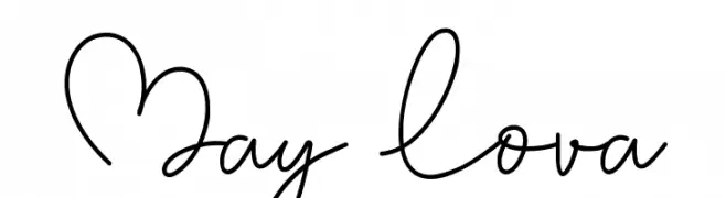
A playful and elegant handwritten font with smooth, flowing lines.
![May Lova Frei Schriftart Herunterladen]() Herunterladen 68 Downloads@WebFont
Herunterladen 68 Downloads@WebFont -
( Misti's Fonts - mistifonts.com/ )
A whimsical, handwritten script font with playful, flowing characters.
![UnicornSparkles Frei Schriftart Herunterladen]() Herunterladen 68 Downloads@WebFont
Herunterladen 68 Downloads@WebFont -
( Fonts by Peter Wiegel - www.peter-wiegel.de - Personal-use only. For commercial use please contact owner. )
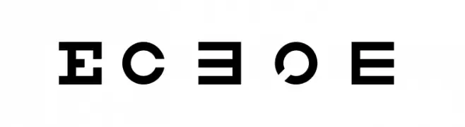
A bold, geometric font with strong, impactful letterforms.
![Eyechart Frei Schriftart Herunterladen]() Herunterladen 68 Downloads@WebFont
Herunterladen 68 Downloads@WebFont -
( Fonts by Booga Letter - Fajar Wicaksono - Personal-use only. For commercial use please contact owner. )
A playful, handwritten font with a casual and friendly appearance.
![Green Hill Frei Schriftart Herunterladen]() Herunterladen 68 Downloads@WebFont
Herunterladen 68 Downloads@WebFont -
( Fonts by Zetafonts - Personal-use only. For commercial use please contact owner. )
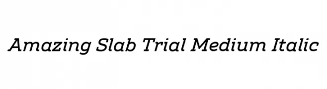
A medium weight, italic slab serif font with a modern and elegant style.
![Amazing Slab Trial Medium Italic Frei Schriftart Herunterladen]() Herunterladen 68 Downloads@WebFont
Herunterladen 68 Downloads@WebFont -
( Thomas Mettendorf - www.schmalfett.de )
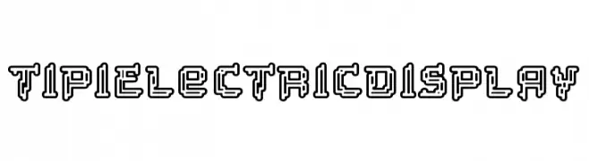
A bold, geometric font with a three-dimensional, outlined design.
![Tipi Electric Display Frei Schriftart Herunterladen]() Herunterladen 68 Downloads@WebFont
Herunterladen 68 Downloads@WebFont -
( Vladimir Nikolic - www.coroflot.com/vladimirnikolic )
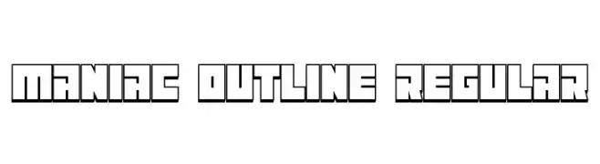
A bold, geometric outline font with a modern, futuristic style.
![Maniac Outline Regular Frei Schriftart Herunterladen]() Herunterladen 68 Downloads@WebFont
Herunterladen 68 Downloads@WebFont -
( Fonts by Syaf Rizal - Khurasan - Personal-use only. For commercial use please contact owner. )
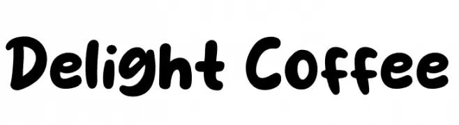
A playful, bold font with rounded, thick strokes and a whimsical touch.
![Delight Coffee Frei Schriftart Herunterladen]() Herunterladen 68 Downloads@WebFont
Herunterladen 68 Downloads@WebFont -
( Fonts by Hyee Gun - Personal-use only. For commercial use please contact owner. )
A playful and elegant handwritten font with flowing, interconnected letterforms.
![Leumang Frei Schriftart Herunterladen]() Herunterladen 68 Downloads@WebFont
Herunterladen 68 Downloads@WebFont -
( Fonts by Vladimir Nikolic - Personal-use only. For commercial use please contact owner. )
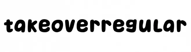
A playful, bold font with rounded, bubbly characters.
![Takeover Regular Frei Schriftart Herunterladen]() Herunterladen 68 Downloads@WebFont
Herunterladen 68 Downloads@WebFont -
( Fonts by GGBot - www.ggbot.net - Personal-use only. For commercial use please contact owner. )
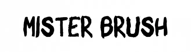
A bold, expressive brush-style font with dynamic, hand-painted strokes.
![Mister Brush Frei Schriftart Herunterladen]() Herunterladen 68 Downloads@WebFont
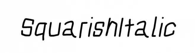
Herunterladen 68 Downloads@WebFont -
![Squarish Italic Frei Schriftart Herunterladen]() Herunterladen 68 Downloads@WebFont
Herunterladen 68 Downloads@WebFont -
( Fonts by Vladimir Nikolic - https://www.creativefabrica.com/product/educated-deers/ref/144265/ - Personal-use only. For commercial use please contact owner. )
Bold, geometric font with thick outlines and sharp angles.
![Idiotism Regular Frei Schriftart Herunterladen]() Herunterladen 68 Downloads@WebFont
Herunterladen 68 Downloads@WebFont -
( Fonts by Almarkhatype - Abdul Malik Wisnu - Personal-use only. For commercial use please contact owner. )
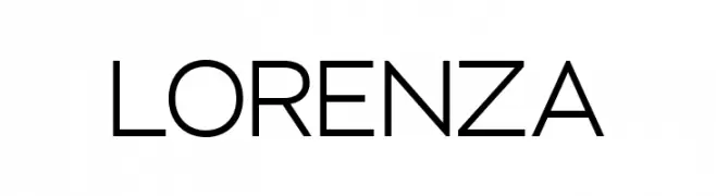
A modern, geometric sans-serif font with clean lines and balanced proportions.
![LORENZA Frei Schriftart Herunterladen]() Herunterladen 68 Downloads@WebFont
Herunterladen 68 Downloads@WebFont -
( Fonts by Vladimir Nikolic - https://www.creativefabrica.com/product/educated-deers/ref/144265/ - Personal-use only. For commercial use please contact owner. )
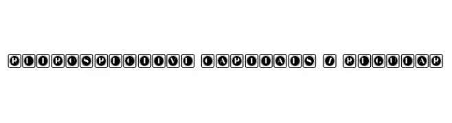
A bold, decorative font with characters enclosed in retro-style squares.
![Retrospective Capitals 7 Regular Frei Schriftart Herunterladen]() Herunterladen 68 Downloads@WebFont
Herunterladen 68 Downloads@WebFont -
( Fonts by Wino S Kadir - weknow - www.revolge.com/shop/weknow/ - Personal-use only. For commercial use please contact owner. )
A bold, modern font with geometric and futuristic elements.
![we know Frei Schriftart Herunterladen]() Herunterladen 68 Downloads@WebFont
Herunterladen 68 Downloads@WebFont -
( Eddy Glyn Lucas - www.findingyogurt.blogspot.com )
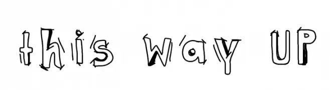
A playful, hand-drawn font with quirky, uneven strokes and a whimsical style.
![this way UP Frei Schriftart Herunterladen]() Herunterladen 68 Downloads@WebFont
Herunterladen 68 Downloads@WebFont -
( Fonts by Daniel Zadorozny - www.iconian.com )
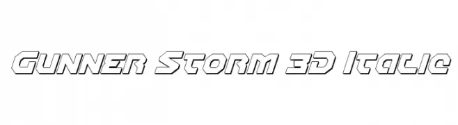
A bold, 3D italic font with a futuristic and dynamic style.
![Gunner Storm 3D Italic Frei Schriftart Herunterladen]() Herunterladen 68 Downloads@WebFont
Herunterladen 68 Downloads@WebFont -
( Fonts by Creaditive Design - Aditiyo DP - Personal-use only. For commercial use please contact owner. )
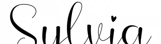
An elegant and flowing script font with graceful curves and delicate strokes.
![Sylvia Frei Schriftart Herunterladen]() Herunterladen 68 Downloads@WebFont
Herunterladen 68 Downloads@WebFont -
( Eduardo Poconeh )
A bold, angular font with a modern and edgy design.
![Poconeh Frei Schriftart Herunterladen]() Herunterladen 68 Downloads@WebFont
Herunterladen 68 Downloads@WebFont


Welche Schriften sind gerade am populärsten?
Poppins, Roboto, Montserrat, Open Sans und Lato sind wegen ihrer klaren Formen und breiten Einsetzbarkeit sehr gefragt – von Markenauftritt über Landingpages bis hin zu Postern.
Welche Fonts eignen sich für Logos?
Geometrische Sans‑Serifs (z. B. Poppins, Familien im Gotham‑Stil) sind ein häufiger Griff für sauberes, skalierbares Branding. Für eine persönlichere Note bleiben Scripts und Handschrift‑Stile beliebt. Kombinieren Sie einen prägnanten Headline‑Font mit einer neutralen Brotschrift für Wiedererkennung und Harmonie.
Wie oft wird die Top‑Liste aktualisiert?
Regelmäßig – basierend auf realen Downloads und Interaktionen. Schauen Sie öfter vorbei, um aufstrebende Favoriten früh zu entdecken.
💡 Tipp: Seite bookmarken – Trends wechseln schnell, und heutige Top‑Schriften inspirieren morgen vielleicht das Rebranding.