Willkommen bei den Top‑Schriften – hier treffen Beliebtheit und Qualität aufeinander. Das sind die in diesem Jahr am häufigsten heruntergeladenen und genutzten Fonts. Wenn Sie sichere Optionen für Logo, Web oder Social suchen, starten Sie hier.
Jeder Top‑Font überzeugt durch Balance, Lesbarkeit und Vielseitigkeit. Sie finden moderne Sans‑Serifs, elegante Scripts, Vintage‑Serifs und minimalistische Displays.
-
( Fonts by Peter Wiegel - www.peter-wiegel.de - Personal-use only. For commercial use please contact owner. )
A bold, geometric font with strong, impactful letterforms.
 Herunterladen 68 Downloads@WebFont
 -
( Fonts by Booga Letter - Fajar Wicaksono - Personal-use only. For commercial use please contact owner. )
A playful, handwritten font with a casual and friendly appearance.
![Green Hill Frei Schriftart Herunterladen]() Herunterladen 68 Downloads@WebFont
Herunterladen 68 Downloads@WebFont -
( Fonts by Zetafonts - Personal-use only. For commercial use please contact owner. )
A medium weight, italic slab serif font with a modern and elegant style.
![Amazing Slab Trial Medium Italic Frei Schriftart Herunterladen]() Herunterladen 68 Downloads@WebFont
Herunterladen 68 Downloads@WebFont -
( Thomas Mettendorf - www.schmalfett.de )
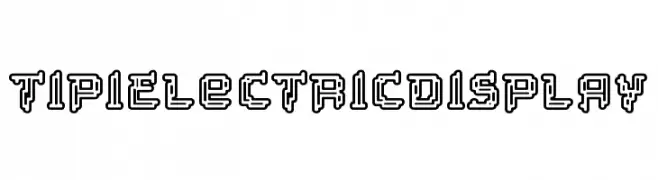
A bold, geometric font with a three-dimensional, outlined design.
![Tipi Electric Display Frei Schriftart Herunterladen]() Herunterladen 68 Downloads@WebFont
Herunterladen 68 Downloads@WebFont -
( Vladimir Nikolic - www.coroflot.com/vladimirnikolic )
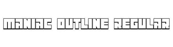
A bold, geometric outline font with a modern, futuristic style.
![Maniac Outline Regular Frei Schriftart Herunterladen]() Herunterladen 68 Downloads@WebFont
Herunterladen 68 Downloads@WebFont -
( Fonts by Syaf Rizal - Khurasan - Personal-use only. For commercial use please contact owner. )
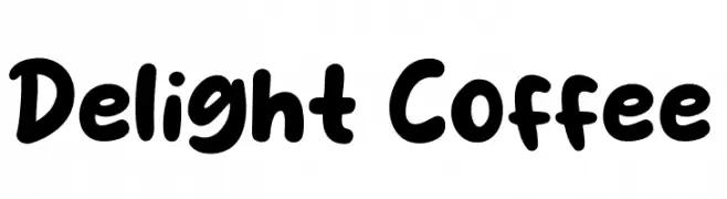
A playful, bold font with rounded, thick strokes and a whimsical touch.
![Delight Coffee Frei Schriftart Herunterladen]() Herunterladen 68 Downloads@WebFont
Herunterladen 68 Downloads@WebFont -
( Fonts by Hyee Gun - Personal-use only. For commercial use please contact owner. )
A playful and elegant handwritten font with flowing, interconnected letterforms.
![Leumang Frei Schriftart Herunterladen]() Herunterladen 68 Downloads@WebFont
Herunterladen 68 Downloads@WebFont -
( Fonts by Vladimir Nikolic - Personal-use only. For commercial use please contact owner. )
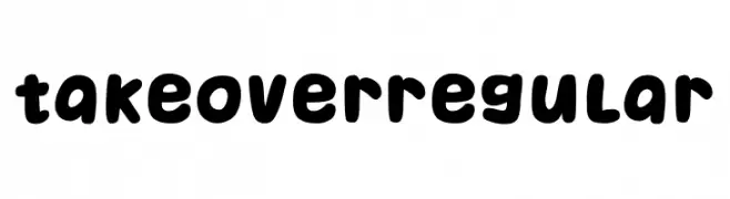
A playful, bold font with rounded, bubbly characters.
![Takeover Regular Frei Schriftart Herunterladen]() Herunterladen 68 Downloads@WebFont
Herunterladen 68 Downloads@WebFont -
( Fonts by GGBot - www.ggbot.net - Personal-use only. For commercial use please contact owner. )
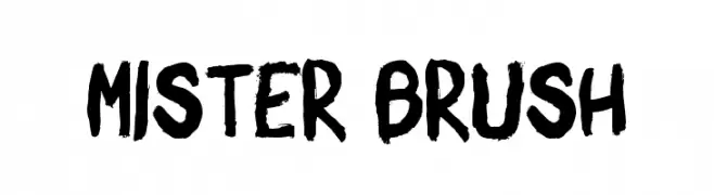
A bold, expressive brush-style font with dynamic, hand-painted strokes.
![Mister Brush Frei Schriftart Herunterladen]() Herunterladen 68 Downloads@WebFont
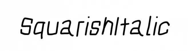
Herunterladen 68 Downloads@WebFont -
![Squarish Italic Frei Schriftart Herunterladen]() Herunterladen 68 Downloads@WebFont
Herunterladen 68 Downloads@WebFont -
( Fonts by Vladimir Nikolic - https://www.creativefabrica.com/product/educated-deers/ref/144265/ - Personal-use only. For commercial use please contact owner. )
Bold, geometric font with thick outlines and sharp angles.
![Idiotism Regular Frei Schriftart Herunterladen]() Herunterladen 68 Downloads@WebFont
Herunterladen 68 Downloads@WebFont -
( Fonts by Almarkhatype - Abdul Malik Wisnu - Personal-use only. For commercial use please contact owner. )
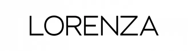
A modern, geometric sans-serif font with clean lines and balanced proportions.
![LORENZA Frei Schriftart Herunterladen]() Herunterladen 68 Downloads@WebFont
Herunterladen 68 Downloads@WebFont -
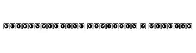
( Fonts by Vladimir Nikolic - https://www.creativefabrica.com/product/educated-deers/ref/144265/ - Personal-use only. For commercial use please contact owner. )
A bold, decorative font with characters enclosed in retro-style squares.
![Retrospective Capitals 7 Regular Frei Schriftart Herunterladen]() Herunterladen 68 Downloads@WebFont
Herunterladen 68 Downloads@WebFont -
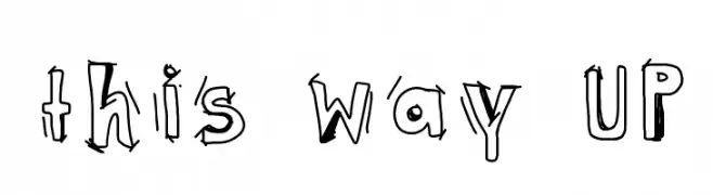
( Eddy Glyn Lucas - www.findingyogurt.blogspot.com )
A playful, hand-drawn font with quirky, uneven strokes and a whimsical style.
![this way UP Frei Schriftart Herunterladen]() Herunterladen 68 Downloads@WebFont
Herunterladen 68 Downloads@WebFont -
( Fonts by Daniel Zadorozny - www.iconian.com )
A bold, 3D italic font with a futuristic and dynamic style.
![Gunner Storm 3D Italic Frei Schriftart Herunterladen]() Herunterladen 68 Downloads@WebFont
Herunterladen 68 Downloads@WebFont -
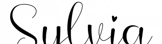
( Fonts by Creaditive Design - Aditiyo DP - Personal-use only. For commercial use please contact owner. )
An elegant and flowing script font with graceful curves and delicate strokes.
![Sylvia Frei Schriftart Herunterladen]() Herunterladen 68 Downloads@WebFont
Herunterladen 68 Downloads@WebFont -
( Eduardo Poconeh )
A bold, angular font with a modern and edgy design.
![Poconeh Frei Schriftart Herunterladen]() Herunterladen 68 Downloads@WebFont
Herunterladen 68 Downloads@WebFont -
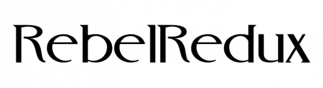
( Fonts by Jay Batchelor - Personal-use only. For commercial use please contact owner. )
A modern, elegant font with sharp angles and smooth curves.
![RebelRedux Frei Schriftart Herunterladen]() Herunterladen 68 Downloads@WebFont
Herunterladen 68 Downloads@WebFont -
( Fonts by Vigilante Typeface Corporation Larry Yerkes. Personal-use only. For commercial use please contact owner. )
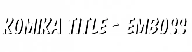
A bold, embossed font with a dynamic, three-dimensional style.
![Komika Title - Emboss Frei Schriftart Herunterladen]() Herunterladen 68 Downloads@WebFont
Herunterladen 68 Downloads@WebFont -
( iwfx - twitter.com/iwfx )
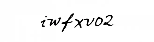
A cursive, handwritten font with fluid, connected strokes.
![iwfxv02 Frei Schriftart Herunterladen]() Herunterladen 68 Downloads@WebFont
Herunterladen 68 Downloads@WebFont -
( Fonts by Kong Font - Personal-use only. For commercial use please contact owner. )
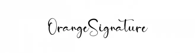
A graceful, cursive font with elegant loops and swirls.
![Orange Signature Frei Schriftart Herunterladen]() Herunterladen 68 Downloads@WebFont
Herunterladen 68 Downloads@WebFont -
( Fonts by Letterena Studios - letterena.com - Personal-use only. For commercial use please contact owner. )
A bold, expressive brush-style font with dynamic, hand-painted strokes.
![Xantorid Frei Schriftart Herunterladen]() Herunterladen 68 Downloads@WebFont
Herunterladen 68 Downloads@WebFont -
( Fonts by Yoga Letter - Isroni Yoga Prasetya - Personal-use only. For commercial use please contact owner. )
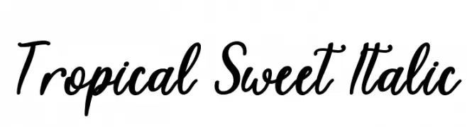
A lively, cursive font with a playful and elegant handwritten style.
![Tropical Sweet Italic Frei Schriftart Herunterladen]() Herunterladen 68 Downloads@WebFont
Herunterladen 68 Downloads@WebFont -
( Fonts by Ahwe Project - Dida Ahluddin - Personal-use only. For commercial use please contact owner. )
A lively and elegant script font with flowing, cursive letterforms.
![Dhelman Frei Schriftart Herunterladen]() Herunterladen 68 Downloads@WebFont
Herunterladen 68 Downloads@WebFont -
( Fonts by a Neale Davidson - www.pixelsagas.com. Personal-use only. For commercial use please contact owner. )
A futuristic, abstract font with angular, geometric shapes.
![Graalen Italic Frei Schriftart Herunterladen]() Herunterladen 68 Downloads@WebFont
Herunterladen 68 Downloads@WebFont -
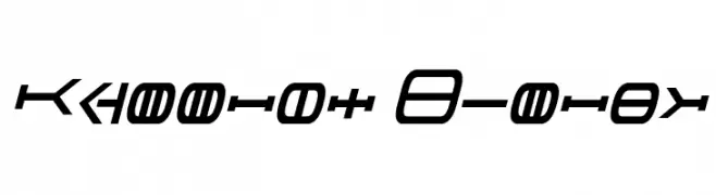
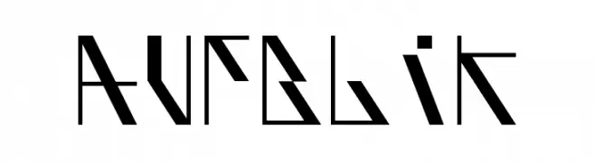
( Alfred Moustache )
A bold, geometric font with sharp angles and a futuristic style.
![AufBliK Frei Schriftart Herunterladen]() Herunterladen 68 Downloads@WebFont
Herunterladen 68 Downloads@WebFont -
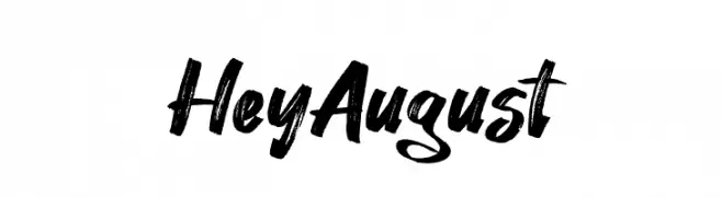
( Fonts by Khurasan - Syaf Rizal - Personal-use only. For commercial use please contact owner. )
A bold, brush script font with dynamic, hand-painted strokes.
![Hey August Frei Schriftart Herunterladen]() Herunterladen 68 Downloads@WebFont
Herunterladen 68 Downloads@WebFont -
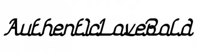
( weknow - Wino S Kadir - www.creativefabrica.com/designer/weknow/ )
A bold, cursive script font with elegant, flowing connections.
![Authentic Love Bold Frei Schriftart Herunterladen]() Herunterladen 68 Downloads@WebFont
Herunterladen 68 Downloads@WebFont -
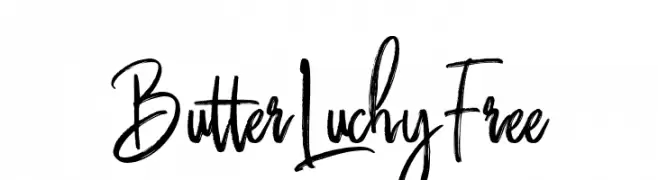
( Fonts by FHFont - Ferry Hadriyan - Personal-use only. For commercial use please contact owner. )
A lively, handwritten font with dynamic, cursive strokes.
![ButterLuchyFree Frei Schriftart Herunterladen]() Herunterladen 68 Downloads@WebFont
Herunterladen 68 Downloads@WebFont -
( Monroe Greco )
A playful, wavy font resembling silly string with consistent stroke thickness.
![MGsillystring Frei Schriftart Herunterladen]() Herunterladen 68 Downloads@WebFont
Herunterladen 68 Downloads@WebFont -
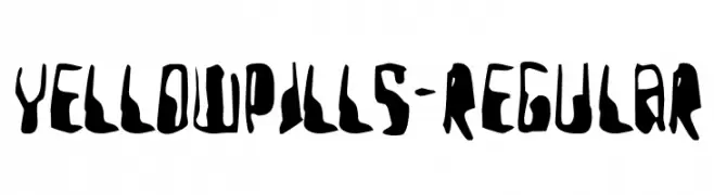
( Personal-use only. For commercial use please contact owner. )
A bold, irregular, and artistic font with a hand-drawn appearance.
![YellowPills-Regular Frei Schriftart Herunterladen]() Herunterladen 68 Downloads@WebFont
Herunterladen 68 Downloads@WebFont -
( kizzles the cat )
A playful, hand-drawn font with quirky, irregular shapes and a whimsical style.
![full hole Frei Schriftart Herunterladen]() Herunterladen 68 Downloads@WebFont
Herunterladen 68 Downloads@WebFont -
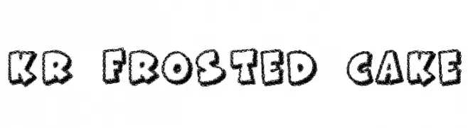
( Fonts by Kat`s Fun Fonts - Personal-use only. For commercial use please contact owner. )
A playful, textured font with a frosted, hand-drawn appearance.
![KR Frosted Cake Frei Schriftart Herunterladen]() Herunterladen 68 Downloads@WebFont
Herunterladen 68 Downloads@WebFont -
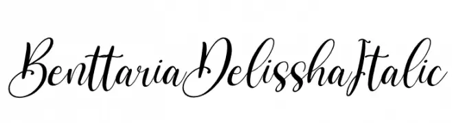
( Fonts by Perspectype Studio - Personal-use only. For commercial use please contact owner. )
An elegant script font with flowing, cursive letters and ornate details.
![Benttaria Delissha Italic Frei Schriftart Herunterladen]() Herunterladen 68 Downloads@WebFont
Herunterladen 68 Downloads@WebFont -
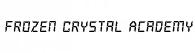
( Iconian Fonts - Daniel Zadorozny - www.iconian.com )
A digital, futuristic font with geometric, angular characters resembling LED displays.
![Frozen Crystal Academy Frei Schriftart Herunterladen]() Herunterladen 68 Downloads@WebFont
Herunterladen 68 Downloads@WebFont


Welche Schriften sind gerade am populärsten?
Poppins, Roboto, Montserrat, Open Sans und Lato sind wegen ihrer klaren Formen und breiten Einsetzbarkeit sehr gefragt – von Markenauftritt über Landingpages bis hin zu Postern.
Welche Fonts eignen sich für Logos?
Geometrische Sans‑Serifs (z. B. Poppins, Familien im Gotham‑Stil) sind ein häufiger Griff für sauberes, skalierbares Branding. Für eine persönlichere Note bleiben Scripts und Handschrift‑Stile beliebt. Kombinieren Sie einen prägnanten Headline‑Font mit einer neutralen Brotschrift für Wiedererkennung und Harmonie.
Wie oft wird die Top‑Liste aktualisiert?
Regelmäßig – basierend auf realen Downloads und Interaktionen. Schauen Sie öfter vorbei, um aufstrebende Favoriten früh zu entdecken.
💡 Tipp: Seite bookmarken – Trends wechseln schnell, und heutige Top‑Schriften inspirieren morgen vielleicht das Rebranding.