Willkommen bei den Top‑Schriften – hier treffen Beliebtheit und Qualität aufeinander. Das sind die in diesem Jahr am häufigsten heruntergeladenen und genutzten Fonts. Wenn Sie sichere Optionen für Logo, Web oder Social suchen, starten Sie hier.
Jeder Top‑Font überzeugt durch Balance, Lesbarkeit und Vielseitigkeit. Sie finden moderne Sans‑Serifs, elegante Scripts, Vintage‑Serifs und minimalistische Displays.
-
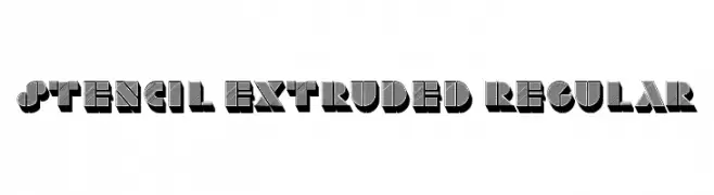
( Fonts by Vladimir Nikolic - www.creativefabrica.com/designer/vladimirnikolic/ - Personal-use only. For commercial use please contact owner. )
A bold, three-dimensional stencil font with an industrial, vintage aesthetic.
 Herunterladen 67 Downloads@WebFont
 -
( Fonts by Jujun Gag - Personal-use only. For commercial use please contact owner. )
A playful, rounded font with a whimsical and friendly style.
![Bottler Shake Frei Schriftart Herunterladen]() Herunterladen 67 Downloads@WebFont
Herunterladen 67 Downloads@WebFont -
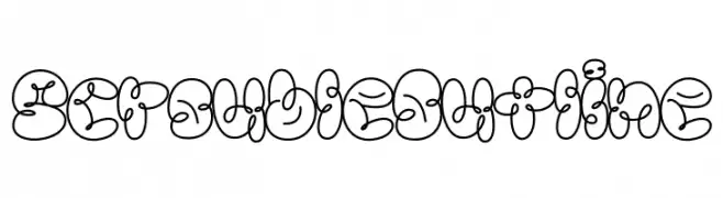
( Fonts by Jadatype )
A playful, bubbly outline font with a whimsical, cartoonish style.
![Scrouble Outline Frei Schriftart Herunterladen]() Herunterladen 67 Downloads@WebFont
Herunterladen 67 Downloads@WebFont -
( Fonts by Greg Medina - www.dcoxy.com - Personal-use only. For commercial use please contact owner. )
A decorative font with cartoonish zombie characters for each letter and number.
![zombiz Frei Schriftart Herunterladen]() Herunterladen 67 Downloads@WebFont
Herunterladen 67 Downloads@WebFont -
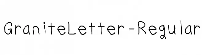
( Harried Type - H.G. Blakeman - harriedtype.com )
A playful, handwritten font with a casual and whimsical style.
![GraniteLetter-Regular Frei Schriftart Herunterladen]() Herunterladen 67 Downloads@WebFont
Herunterladen 67 Downloads@WebFont -
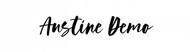
( Fonts by Geranium Space - Megi Satyo Widodo - Personal-use only. For commercial use please contact owner. )
A bold, dynamic handwritten font with fluid and expressive strokes.
![Austine Demo Frei Schriftart Herunterladen]() Herunterladen 67 Downloads@WebFont
Herunterladen 67 Downloads@WebFont -
( Che Lin )
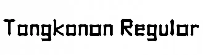
A bold, angular font with tribal-inspired design elements.
![Tongkonan Regular Frei Schriftart Herunterladen]() Herunterladen 67 Downloads@WebFont
Herunterladen 67 Downloads@WebFont -
( Harried Type - H.G. Blakeman - harriedtype.com )
A playful, irregular handwritten font with quirky letterforms.
![June 5 Frei Schriftart Herunterladen]() Herunterladen 67 Downloads@WebFont
Herunterladen 67 Downloads@WebFont -
( imagex - www.imagex-fonts.com )
A bold, angular font with a futuristic and edgy design.
![Zoxoz Frei Schriftart Herunterladen]() Herunterladen 67 Downloads@WebFont
Herunterladen 67 Downloads@WebFont -
( JOEBOB graphics - Joe vanderHam - www.joebob.nl )
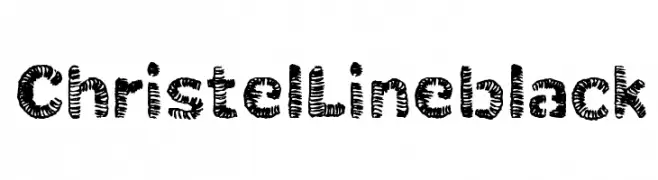
A bold, textured, and playful font with a hand-drawn aesthetic.
![ChristelLineblack Frei Schriftart Herunterladen]() Herunterladen 67 Downloads@WebFont
Herunterladen 67 Downloads@WebFont -
( Parker Creative - Alan Parker - fontbundles.net/parker-creative Sponsoren Schriftart )
A modern, rounded sans-serif font with bold, smooth curves and a friendly appearance.
![Provoke Regular-Rounded Frei Schriftart Herunterladen]() Herunterladen 67 Downloads
Herunterladen 67 Downloads -
( Fonts by Letterayu )
Hand-drawn floral decorative illustrations with a whimsical, organic style.
![Flowering Frei Schriftart Herunterladen]() Herunterladen 67 Downloads@WebFont
Herunterladen 67 Downloads@WebFont -
( Fonts by Vladimir Nikolic - Personal-use only. For commercial use please contact owner. )
A bold, geometric font with a three-dimensional outline effect.
![Highlight Regular Frei Schriftart Herunterladen]() Herunterladen 67 Downloads@WebFont
Herunterladen 67 Downloads@WebFont -
( Glyphobet Font Foundry - glyphobet.net/typography/ )
A geometric and intricate font with knot-like designs and consistent line weight.
![Locus Knots Frei Schriftart Herunterladen]() Herunterladen 67 Downloads@WebFont
Herunterladen 67 Downloads@WebFont -
( Fonts by Bisho )
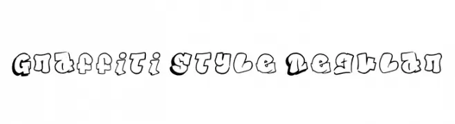
A bold, graffiti-inspired font with a dynamic, urban aesthetic.
![Graffiti Style Regular Frei Schriftart Herunterladen]() Herunterladen 67 Downloads@WebFont
Herunterladen 67 Downloads@WebFont -
( Fonts by typeformerstudio.com - Personal-use only. For commercial use please contact owner. )
A bold, high-contrast font with sharp serifs and elegant curves.
![Garis Frei Schriftart Herunterladen]() Herunterladen 67 Downloads@WebFont
Herunterladen 67 Downloads@WebFont -
( Fonts by Hendra Pratama - HPTypework - https://hptypework.com - Personal-use only. For commercial use please contact owner. )
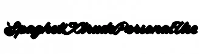
A bold, expressive script font with a fluid, interconnected style.
![SpaghetiXtrudePersonalUse Frei Schriftart Herunterladen]() Herunterladen 67 Downloads@WebFont
Herunterladen 67 Downloads@WebFont -
( Fonts by Bluestype Studio - Jefri Dwi Alfatah - Personal-use only. For commercial use please contact owner. )
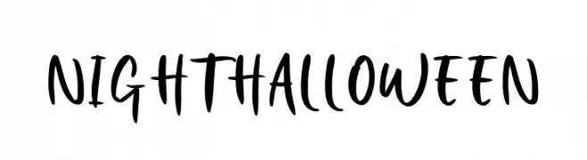
A bold, handwritten font with a playful and energetic style.
![Night Halloween Frei Schriftart Herunterladen]() Herunterladen 67 Downloads@WebFont
Herunterladen 67 Downloads@WebFont -
( Fonts by Eko Bimantara - Personal-use only. For commercial use please contact owner. )
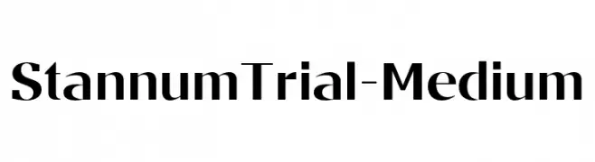
A modern, sleek font with clean lines and balanced structure.
![StannumTrial-Medium Frei Schriftart Herunterladen]() Herunterladen 67 Downloads@WebFont
Herunterladen 67 Downloads@WebFont -
( Fonts by Muhammad Yafinuha )
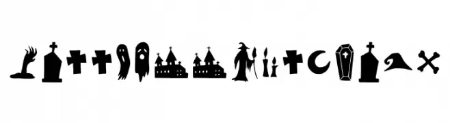
Halloween-themed decorative dingbat font with spooky icons.
![Halloween Clipart Frei Schriftart Herunterladen]() Herunterladen 67 Downloads@WebFont
Herunterladen 67 Downloads@WebFont -
( Fonts by Ketapel Creative - Personal-use only. For commercial use please contact owner. )
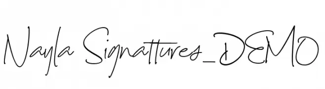
A fluid, elegant handwritten font with a delicate and sophisticated appearance.
![Nayla Signattures_DEMO Frei Schriftart Herunterladen]() Herunterladen 67 Downloads@WebFont
Herunterladen 67 Downloads@WebFont -
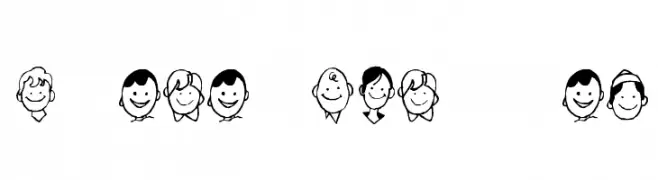
( Fonts by Kat`s Fun Fonts - Personal-use only. For commercial use please contact owner. )
Hand-drawn cartoon boy faces in a playful dingbat style.
![KR Barb's Class Boys Frei Schriftart Herunterladen]() Herunterladen 67 Downloads@WebFont
Herunterladen 67 Downloads@WebFont -
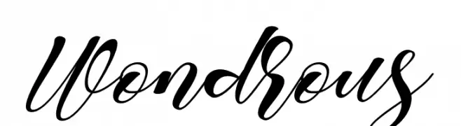
( Fonts by Muhammad Akbar - Personal-use only. For commercial use please contact owner. )
A modern, elegant script font with flowing, cursive letters and intricate flourishes.
![Wondrous Frei Schriftart Herunterladen]() Herunterladen 67 Downloads@WebFont
Herunterladen 67 Downloads@WebFont -
( Måns Grebäck - www.mansgreback.com )
A playful, decorative font with circular accents on each stroke.
![Tomino PERSONAL USE ONLY Frei Schriftart Herunterladen]() Herunterladen 67 Downloads@WebFont
Herunterladen 67 Downloads@WebFont -
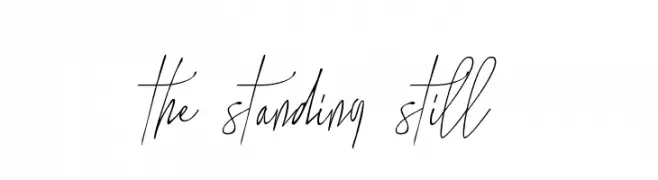
( Sigit Nur Wicaksono - creativemarket.com/ogit )
An elegant, flowing script font with thin strokes and graceful curves.
![the standing still Frei Schriftart Herunterladen]() Herunterladen 67 Downloads@WebFont
Herunterladen 67 Downloads@WebFont -
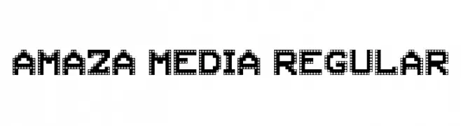
( Nisasyh )
A playful, star-patterned decorative font ideal for fun and engaging designs.
![AMAZA MEDIA Regular Frei Schriftart Herunterladen]() Herunterladen 67 Downloads@WebFont
Herunterladen 67 Downloads@WebFont -
( Fonts by Daniel Zadorozny - www.iconian.com - Personal-use only. For commercial use please contact owner. )
A bold, two-tone italic font with a dynamic, futuristic style.
![Urban Defender TwoTone Italic Frei Schriftart Herunterladen]() Herunterladen 67 Downloads@WebFont
Herunterladen 67 Downloads@WebFont -
( Fonts by Vladimir Nikolic - www.creativefabrica.com/designer/vladimirnikolic/ - Personal-use only. For commercial use please contact owner. )
A bold, modern font with a 3D effect and geometric design.
![Notinch Regular Frei Schriftart Herunterladen]() Herunterladen 67 Downloads@WebFont
Herunterladen 67 Downloads@WebFont -
( Fonts by Letterative Studio - Personal-use only. For commercial use please contact owner. )
A lively, flowing script font with elegant, cursive letterforms.
![Alpinet Frei Schriftart Herunterladen]() Herunterladen 67 Downloads@WebFont
Herunterladen 67 Downloads@WebFont -
( Fonts by weknow - Wino S Kadir - Personal-use only. For commercial use please contact owner. )
A modern, playful font with geometric and rounded elements, perfect for creative projects.
![Thermometer-Light Frei Schriftart Herunterladen]() Herunterladen 67 Downloads@WebFont
Herunterladen 67 Downloads@WebFont -
( Fonts by Muhammad Yafinuha )
Hand-drawn botanical decorative font with leafy illustrations.
![Dedaunan Frei Schriftart Herunterladen]() Herunterladen 67 Downloads@WebFont
Herunterladen 67 Downloads@WebFont -
( Misti's Fonts - mistifonts.com/ )
A playful, cursive handwritten font with smooth, flowing lines.
![HelloHeartache Frei Schriftart Herunterladen]() Herunterladen 67 Downloads@WebFont
Herunterladen 67 Downloads@WebFont -
( Fonts by StringLabs - stringlabscreative.com - Personal-use only. For commercial use please contact owner. )
A modern, handwritten font with fluid, expressive strokes.
![Angelwine Frei Schriftart Herunterladen]() Herunterladen 67 Downloads@WebFont
Herunterladen 67 Downloads@WebFont -
( Fonts by Kong Font - Personal-use only. For commercial use please contact owner. )
A bold, ornate blackletter font with dramatic, angular strokes.
![Black Wine Frei Schriftart Herunterladen]() Herunterladen 67 Downloads@WebFont
Herunterladen 67 Downloads@WebFont -
( Fonts by Idebareng )
A bold, playful font with a hand-drawn, whimsical style.
![Udon Star Frei Schriftart Herunterladen]() Herunterladen 67 Downloads@WebFont
Herunterladen 67 Downloads@WebFont


Welche Schriften sind gerade am populärsten?
Poppins, Roboto, Montserrat, Open Sans und Lato sind wegen ihrer klaren Formen und breiten Einsetzbarkeit sehr gefragt – von Markenauftritt über Landingpages bis hin zu Postern.
Welche Fonts eignen sich für Logos?
Geometrische Sans‑Serifs (z. B. Poppins, Familien im Gotham‑Stil) sind ein häufiger Griff für sauberes, skalierbares Branding. Für eine persönlichere Note bleiben Scripts und Handschrift‑Stile beliebt. Kombinieren Sie einen prägnanten Headline‑Font mit einer neutralen Brotschrift für Wiedererkennung und Harmonie.
Wie oft wird die Top‑Liste aktualisiert?
Regelmäßig – basierend auf realen Downloads und Interaktionen. Schauen Sie öfter vorbei, um aufstrebende Favoriten früh zu entdecken.
💡 Tipp: Seite bookmarken – Trends wechseln schnell, und heutige Top‑Schriften inspirieren morgen vielleicht das Rebranding.