Willkommen bei den Top‑Schriften – hier treffen Beliebtheit und Qualität aufeinander. Das sind die in diesem Jahr am häufigsten heruntergeladenen und genutzten Fonts. Wenn Sie sichere Optionen für Logo, Web oder Social suchen, starten Sie hier.
Jeder Top‑Font überzeugt durch Balance, Lesbarkeit und Vielseitigkeit. Sie finden moderne Sans‑Serifs, elegante Scripts, Vintage‑Serifs und minimalistische Displays.
-
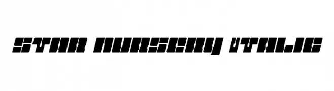
( Iconian Fonts - Daniel Zadorozny - www.iconian.com )
A bold, geometric font with a futuristic and industrial design.
 Herunterladen 67 Downloads@WebFont
 -
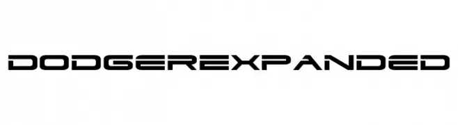
( Fonts by Iconian Fonts - Daniel Zadorozny - Personal-use only. For commercial use please contact owner. )
A futuristic, geometric font with bold, expanded characters and a modern aesthetic.
![Dodger Expanded Frei Schriftart Herunterladen]() Herunterladen 67 Downloads@WebFont
Herunterladen 67 Downloads@WebFont -
( Noto is a trademark of Google Inc. Noto fonts are open source. All Noto fonts are published under the SIL Open Font License, Version 1.1 )
A modern, condensed sans-serif font with a semi-bold weight, ideal for clear and professional text.
![Noto Sans Tamil UI Condensed SemiBold Frei Schriftart Herunterladen]() Herunterladen 67 Downloads@WebFont
Herunterladen 67 Downloads@WebFont -
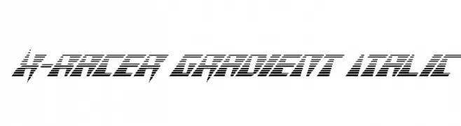
( Fonts by Iconian Fonts - Daniel Zadorozny - Personal-use only. For commercial use please contact owner. )
A dynamic, italicized font with a gradient line effect, exuding speed and modernity.
![X-Racer Gradient Italic Frei Schriftart Herunterladen]() Herunterladen 67 Downloads@WebFont
Herunterladen 67 Downloads@WebFont -
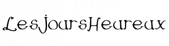
( -arnaud- )
A whimsical, hand-drawn style font with playful and irregular strokes.
![LesJoursHeureux Frei Schriftart Herunterladen]() Herunterladen 67 Downloads@WebFont
Herunterladen 67 Downloads@WebFont -
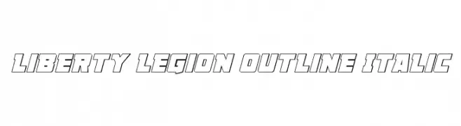
( Iconian Fonts - Daniel Zadorozny - www.iconian.com )
A bold, outlined, italic font with a modern and dynamic style.
![Liberty Legion Outline Italic Frei Schriftart Herunterladen]() Herunterladen 67 Downloads@WebFont
Herunterladen 67 Downloads@WebFont -
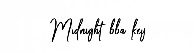
( Fonts by BBA Key - Personal-use only. For commercial use please contact owner. )
A dynamic and elegant script font with flowing letterforms and a sophisticated style.
![Midnight bba key Frei Schriftart Herunterladen]() Herunterladen 67 Downloads@WebFont
Herunterladen 67 Downloads@WebFont -
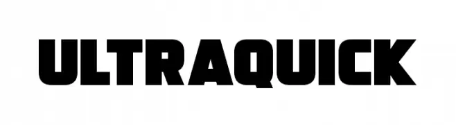
( Fonts by Darrell Flood - Personal-use only. For commercial use please contact owner. )
A bold, geometric font with thick strokes and a modern, impactful design.
![Ultraquick Frei Schriftart Herunterladen]() Herunterladen 67 Downloads@WebFont
Herunterladen 67 Downloads@WebFont -
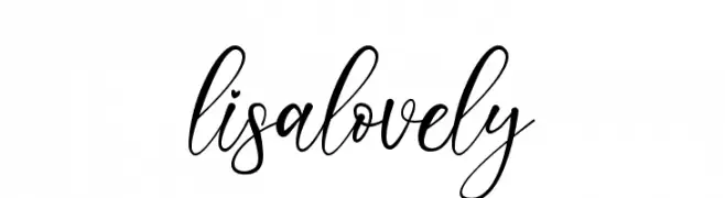
( Fonts by JunCreative - Personal-use only. For commercial use please contact owner. )
A charming and elegant script font with flowing, cursive letters.
![lisalovely Frei Schriftart Herunterladen]() Herunterladen 67 Downloads@WebFont
Herunterladen 67 Downloads@WebFont -
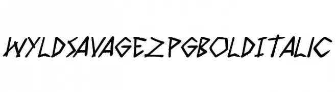
( Fonts by PressGang Studios - Andeh Pinkard - Personal-use only. For commercial use please contact owner. )
A bold, italicized, handwritten font with an edgy, dynamic style.
![Wyld Savagez PG Bold Italic Frei Schriftart Herunterladen]() Herunterladen 67 Downloads@WebFont
Herunterladen 67 Downloads@WebFont -
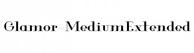
( Fonts by Hendrick Rolandez - Personal-use only. For commercial use please contact owner. )
A high-contrast, elegant serif font with a modern yet classic appeal.
![Glamor-MediumExtended Frei Schriftart Herunterladen]() Herunterladen 67 Downloads@WebFont
Herunterladen 67 Downloads@WebFont -
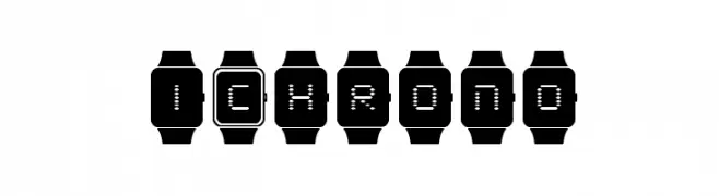
( Iconian Fonts - Daniel Zadorozny - www.iconian.com )
A digital watch-inspired font with segmented characters in watch frames.
![iChrono Frei Schriftart Herunterladen]() Herunterladen 67 Downloads@WebFont
Herunterladen 67 Downloads@WebFont -
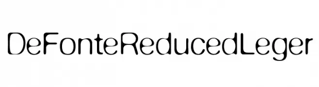
( Fonts by ingoFonts - Ingo Zimmermann - Personal-use only. For commercial use please contact owner. )
A modern, rounded font with consistent stroke width and friendly appearance.
![DeFonte Reduced Leger Frei Schriftart Herunterladen]() Herunterladen 67 Downloads@WebFont
Herunterladen 67 Downloads@WebFont -
( Fonts by Nick Curtis - Personal-use only. For commercial use please contact owner. )
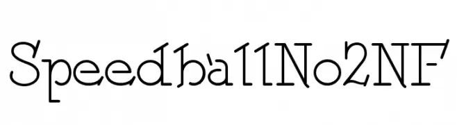
A geometric and decorative font with rounded serifs and consistent stroke width.
![SpeedballNo2NF Frei Schriftart Herunterladen]() Herunterladen 67 Downloads@WebFont
Herunterladen 67 Downloads@WebFont -
( Fonts by Gassstype )
![Elfinotes Frei Schriftart Herunterladen]() Herunterladen 67 Downloads@WebFont
Herunterladen 67 Downloads@WebFont -
( Fonts by Hedi Miftah - Personal-use only. For commercial use please contact owner. )
A bold, geometric font with a modern and futuristic style.
![Monta Frei Schriftart Herunterladen]() Herunterladen 67 Downloads@WebFont
Herunterladen 67 Downloads@WebFont -
( Fonts by Muhammad Wahyudin - Personal-use only. For commercial use please contact owner. )
A playful, handwritten font with dynamic strokes and a whimsical style.
![Monaghan Frei Schriftart Herunterladen]() Herunterladen 67 Downloads@WebFont
Herunterladen 67 Downloads@WebFont -
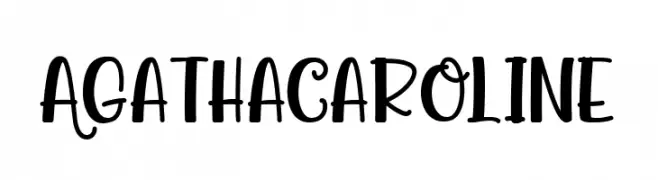
( Fonts by Beautypes - Bhakti Al Akbar Pasaribu - Personal-use only. For commercial use please contact owner. )
A playful and whimsical font with bold, flowing letterforms and dynamic strokes.
![Agatha Caroline Frei Schriftart Herunterladen]() Herunterladen 67 Downloads@WebFont
Herunterladen 67 Downloads@WebFont -
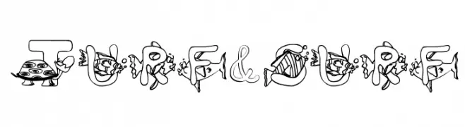
( Character )
A whimsical, cartoonish font with unique illustrations in each character.
![Turf&surf Frei Schriftart Herunterladen]() Herunterladen 67 Downloads@WebFont
Herunterladen 67 Downloads@WebFont -
( Noto is a trademark of Google Inc. Noto fonts are open source. All Noto fonts are published under the SIL Open Font License, Version 1.1 )
A bold, semi-condensed serif font with classic elegance and strong readability.
![Noto Serif Armenian SemiCondensed Bold Frei Schriftart Herunterladen]() Herunterladen 67 Downloads@WebFont
Herunterladen 67 Downloads@WebFont -
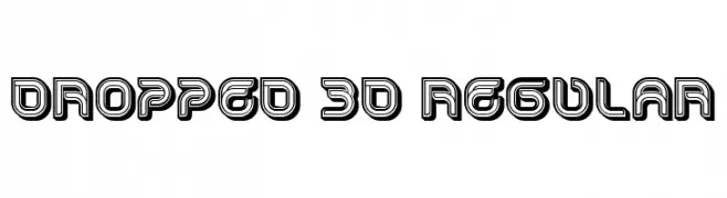
( Fonts by Vladimir Nikolic - https://www.creativefabrica.com/product/educated-deers/ref/144265/ - Personal-use only. For commercial use please contact owner. )
A bold, 3D font with a striking drop shadow effect and geometric design.
![Dropped 3D Regular Frei Schriftart Herunterladen]() Herunterladen 67 Downloads@WebFont
Herunterladen 67 Downloads@WebFont -
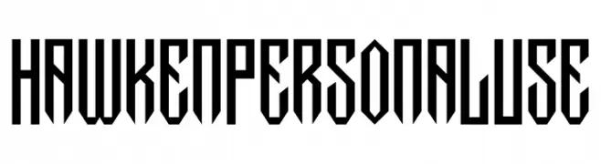
( Fonts by Din Studio - Donis Miftahudin - Personal-use only. For commercial use please contact owner. )
A bold, angular font with a geometric and striking design.
![Hawken Personal Use Frei Schriftart Herunterladen]() Herunterladen 67 Downloads@WebFont
Herunterladen 67 Downloads@WebFont -
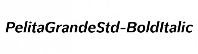
( Fonts by Lafontype - Anugrah Pasau - Personal-use only. For commercial use please contact owner. )
A bold, italic font with strong, consistent strokes and excellent readability.
![PelitaGrandeStd-BoldItalic Frei Schriftart Herunterladen]() Herunterladen 67 Downloads@WebFont
Herunterladen 67 Downloads@WebFont -
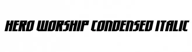
( Fonts by Daniel Zadorozny - www.iconian.com - Personal-use only. For commercial use please contact owner. )
A bold, condensed, and italicized font with a dynamic and modern style.
![Hero Worship Condensed Italic Frei Schriftart Herunterladen]() Herunterladen 67 Downloads@WebFont
Herunterladen 67 Downloads@WebFont -
( Fonts by Muhammad Wahyudin - Personal-use only. For commercial use please contact owner. )
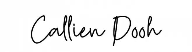
A playful, casual handwritten font with flowing, connected letterforms.
![Callien Pooh Frei Schriftart Herunterladen]() Herunterladen 67 Downloads@WebFont
Herunterladen 67 Downloads@WebFont -
( Fonts by Wiggly Pichi - Personal-use only. For commercial use please contact owner. )
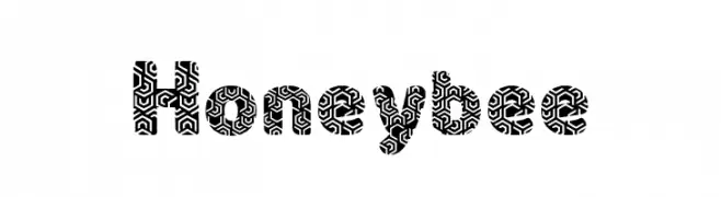
A bold, decorative font with intricate, maze-like patterns.
![Honey bee Frei Schriftart Herunterladen]() Herunterladen 67 Downloads@WebFont
Herunterladen 67 Downloads@WebFont -
( Fonts by Royaltype )
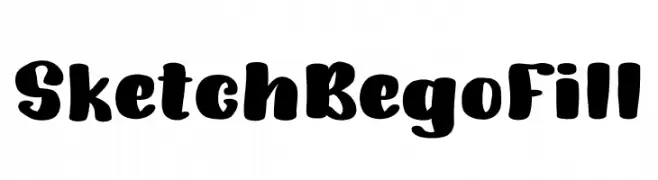
A bold, playful font with rounded, hand-drawn characters.
![SketchBegoFill Frei Schriftart Herunterladen]() Herunterladen 67 Downloads@WebFont
Herunterladen 67 Downloads@WebFont -
( Fonts by Vladimir Nikolic - https://www.creativefabrica.com/product/educated-deers/ref/144265/ - Personal-use only. For commercial use please contact owner. )
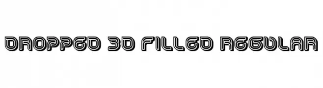
A bold, 3D font with filled interiors and outlined edges, offering a modern and dynamic look.
![Dropped 3D Filled Regular Frei Schriftart Herunterladen]() Herunterladen 67 Downloads@WebFont
Herunterladen 67 Downloads@WebFont -
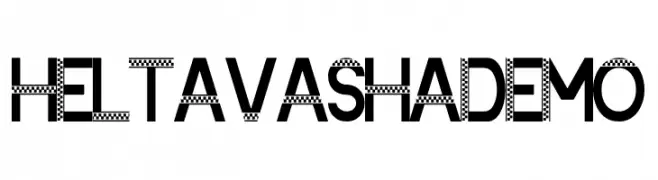
( Fonts by Akatype Studio - Personal-use only. For commercial use please contact owner. )
A bold, geometric font with a unique checkerboard pattern.
![Heltavasha Demo Frei Schriftart Herunterladen]() Herunterladen 67 Downloads@WebFont
Herunterladen 67 Downloads@WebFont -
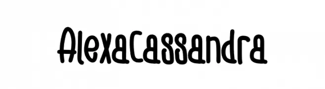
( Fonts by Eddy Goodboy - Personal-use only. For commercial use please contact owner. )
A playful, bold handwritten font with rounded, irregular letterforms.
![Alexa Cassandra Frei Schriftart Herunterladen]() Herunterladen 67 Downloads@WebFont
Herunterladen 67 Downloads@WebFont -
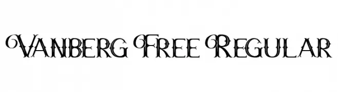
( Fonts by Maulana Creative - Gilang Maulana - Personal-use only. For commercial use please contact owner. )
An ornate and decorative font with elaborate swirls and flourishes.
![Vanberg Free Regular Frei Schriftart Herunterladen]() Herunterladen 67 Downloads@WebFont
Herunterladen 67 Downloads@WebFont -
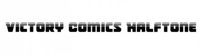
( Iconian Fonts - Daniel Zadorozny - www.iconian.com )
A bold, halftone comic-style font with a retro vibe.
![Victory Comics Halftone Frei Schriftart Herunterladen]() Herunterladen 67 Downloads@WebFont
Herunterladen 67 Downloads@WebFont -
( Copyright © 2017 IBM Corp. with Reserved Font Name "Plex" )
Modern, geometric sans-serif with high legibility and open forms.
![IBM Plex Sans Devanagari Regular Frei Schriftart Herunterladen]() Herunterladen 67 Downloads@WebFont
Herunterladen 67 Downloads@WebFont -
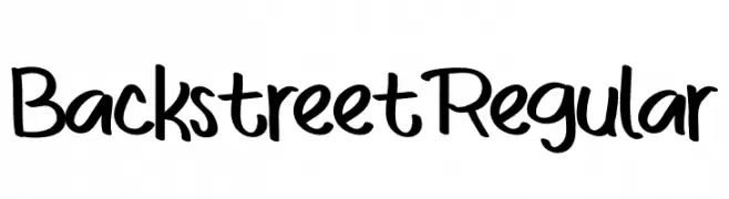
( Fonts by Eddy Goodboy - Personal-use only. For commercial use please contact owner. )
A playful, casual handwritten font with smooth, flowing lines.
![BackstreetRegular Frei Schriftart Herunterladen]() Herunterladen 67 Downloads@WebFont
Herunterladen 67 Downloads@WebFont -
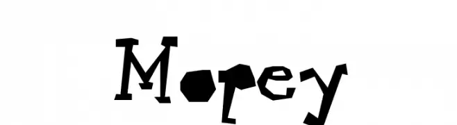
( Gregoryfonts - www.geocities.com/soho/coffeehouse/9609/fonts/fonts.html )
A playful, jagged font with a hand-cut, artistic style.
![Mopey Frei Schriftart Herunterladen]() Herunterladen 67 Downloads@WebFont
Herunterladen 67 Downloads@WebFont


Welche Schriften sind gerade am populärsten?
Poppins, Roboto, Montserrat, Open Sans und Lato sind wegen ihrer klaren Formen und breiten Einsetzbarkeit sehr gefragt – von Markenauftritt über Landingpages bis hin zu Postern.
Welche Fonts eignen sich für Logos?
Geometrische Sans‑Serifs (z. B. Poppins, Familien im Gotham‑Stil) sind ein häufiger Griff für sauberes, skalierbares Branding. Für eine persönlichere Note bleiben Scripts und Handschrift‑Stile beliebt. Kombinieren Sie einen prägnanten Headline‑Font mit einer neutralen Brotschrift für Wiedererkennung und Harmonie.
Wie oft wird die Top‑Liste aktualisiert?
Regelmäßig – basierend auf realen Downloads und Interaktionen. Schauen Sie öfter vorbei, um aufstrebende Favoriten früh zu entdecken.
💡 Tipp: Seite bookmarken – Trends wechseln schnell, und heutige Top‑Schriften inspirieren morgen vielleicht das Rebranding.