Willkommen bei den Top‑Schriften – hier treffen Beliebtheit und Qualität aufeinander. Das sind die in diesem Jahr am häufigsten heruntergeladenen und genutzten Fonts. Wenn Sie sichere Optionen für Logo, Web oder Social suchen, starten Sie hier.
Jeder Top‑Font überzeugt durch Balance, Lesbarkeit und Vielseitigkeit. Sie finden moderne Sans‑Serifs, elegante Scripts, Vintage‑Serifs und minimalistische Displays.
-
( Fonts by Balpirick Studio - Personal-use only. For commercial use please contact owner. )
A lively and modern script font with bold, flowing characters.
 Herunterladen 67 Downloads@WebFont
 -
( Noto is a trademark of Google Inc. Noto fonts are open source. All Noto fonts are published under the SIL Open Font License, Version 1.1 )
Light, extra-condensed sans-serif font.
![Noto Sans Khmer ExtraCondensed Light Frei Schriftart Herunterladen]() Herunterladen 67 Downloads@WebFont
Herunterladen 67 Downloads@WebFont -
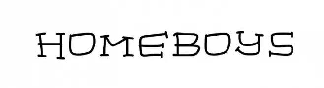
( Fonts by Geronimo Fonts - Personal-use only. For commercial use please contact owner. )
A playful, hand-drawn font with whimsical curves and an artistic style.
![homeboys Frei Schriftart Herunterladen]() Herunterladen 67 Downloads@WebFont
Herunterladen 67 Downloads@WebFont -
( Fonts by Locomotype - Arwan Sutanto - Personal-use only. For commercial use please contact owner. )
A playful, casual script font with smooth, flowing curves and a handwritten feel.
![Gunkid Frei Schriftart Herunterladen]() Herunterladen 67 Downloads@WebFont
Herunterladen 67 Downloads@WebFont -
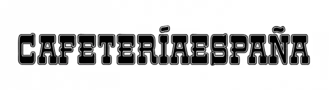
( Fonts by Woodcutter - woodcutter Manero - Personal-use only. For commercial use please contact owner. )
A bold, outlined decorative font with a vintage flair.
![Cafetería España Frei Schriftart Herunterladen]() Herunterladen 67 Downloads@WebFont
Herunterladen 67 Downloads@WebFont -
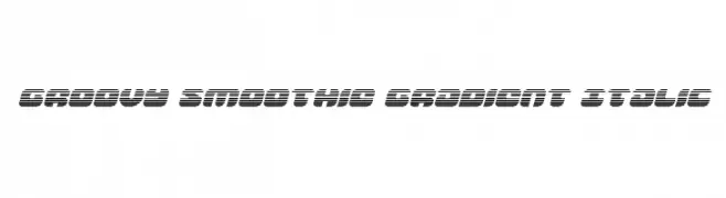
( Iconian Fonts - Daniel Zadorozny - www.iconian.com )
A bold, italicized font with a gradient effect created by horizontal lines.
![Groovy Smoothie Gradient Italic Frei Schriftart Herunterladen]() Herunterladen 67 Downloads@WebFont
Herunterladen 67 Downloads@WebFont -
( Fonts by Fargun Studio - Fajar Gunawan - Personal-use only. For commercial use please contact owner. )
A bold, brush-style font with dynamic, expressive strokes.
![Hokagata Frei Schriftart Herunterladen]() Herunterladen 67 Downloads@WebFont
Herunterladen 67 Downloads@WebFont -
( Fonts by Iconian Fonts )
A geometric, 3D font with bold outlines and a modern, tech-inspired style.
![Zoom Runner 3D Frei Schriftart Herunterladen]() Herunterladen 67 Downloads@WebFont
Herunterladen 67 Downloads@WebFont -
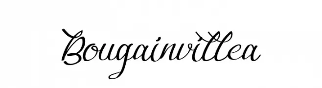
( Fonts by Nuryanto Dwi - Personal-use only. For commercial use please contact owner. )
An elegant, flowing script font with interconnected letters and subtle flourishes.
![Bougainvillea Frei Schriftart Herunterladen]() Herunterladen 67 Downloads@WebFont
Herunterladen 67 Downloads@WebFont -
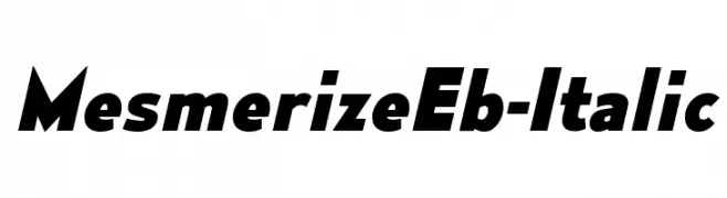
( Typodermic Fonts - Ray Larabie - www.typodermicfonts.com/ )
A bold, italic font with dynamic slanted letterforms and a modern style.
![MesmerizeEb-Italic Frei Schriftart Herunterladen]() Herunterladen 67 Downloads@WebFont
Herunterladen 67 Downloads@WebFont -
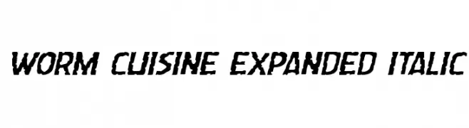
( Iconian Fonts - Daniel Zadorozny - www.iconian.com )
A bold, expanded, and italicized font with a rugged, textured appearance.
![Worm Cuisine Expanded Italic Frei Schriftart Herunterladen]() Herunterladen 67 Downloads@WebFont
Herunterladen 67 Downloads@WebFont -
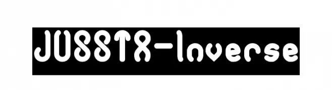
( weknow - Wino S Kadir - www.creativefabrica.com/designer/weknow/ )
A playful, rounded font with a tubular design and consistent stroke width.
![JUSSTA-Inverse Frei Schriftart Herunterladen]() Herunterladen 67 Downloads@WebFont
Herunterladen 67 Downloads@WebFont -
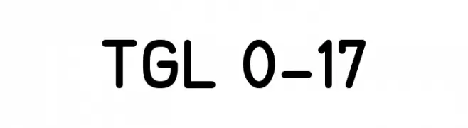
( Fonts by Peter Wiegel - www.peter-wiegel.de - Personal-use only. For commercial use please contact owner. )
A modern, rounded sans-serif font with excellent readability.
![TGL 0-17 Frei Schriftart Herunterladen]() Herunterladen 67 Downloads@WebFont
Herunterladen 67 Downloads@WebFont -
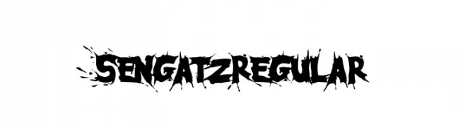
( Fonts by Adevio Studio - Personal-use only. For commercial use please contact owner. )
A bold, graffiti-inspired font with sharp, jagged edges and a dynamic, edgy style.
![SengatzRegular Frei Schriftart Herunterladen]() Herunterladen 67 Downloads@WebFont
Herunterladen 67 Downloads@WebFont -
( Fonts by AminMario - Amin Mario - Personal-use only. For commercial use please contact owner. )
A flowing, handwritten font with elegant, elongated strokes and a casual sophistication.
![Instalove Diary Frei Schriftart Herunterladen]() Herunterladen 67 Downloads@WebFont
Herunterladen 67 Downloads@WebFont -
( Noto is a trademark of Google Inc. Noto fonts are open source. All Noto fonts are published under the SIL Open Font License, Version 1.1 )
A series of uniform, rectangular blocks lacking recognizable characters.
![Noto Serif Lao Condensed ExtraBold Frei Schriftart Herunterladen]() Herunterladen 67 Downloads@WebFont
Herunterladen 67 Downloads@WebFont -
( Fonts by Fillo Graphic )
![Niscala Frei Schriftart Herunterladen]() Herunterladen 67 Downloads@WebFont
Herunterladen 67 Downloads@WebFont -
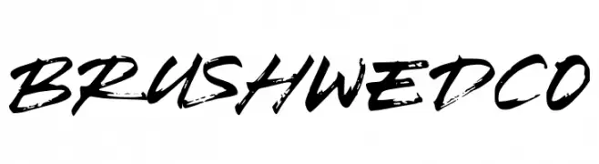
( Fonts by Kotak Kuning Studio - kotakkuning.com - Personal-use only. For commercial use please contact owner. )
A bold, brush script font with dynamic and expressive strokes.
![Brush Wedco Frei Schriftart Herunterladen]() Herunterladen 67 Downloads@WebFont
Herunterladen 67 Downloads@WebFont -
( Fonts by Chamdan Chakim - Personal-use only. For commercial use please contact owner. )
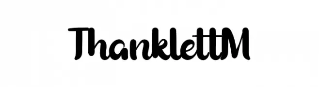
A bold, playful script font with smooth curves and whimsical details.
![Thanklett M Frei Schriftart Herunterladen]() Herunterladen 67 Downloads@WebFont
Herunterladen 67 Downloads@WebFont -
( Fonts by Joseph Dawson - Personal-use only. For commercial use please contact owner. )
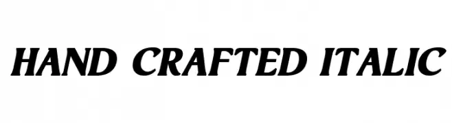
A bold, italicized font with high contrast and a hand-crafted feel.
![Hand Crafted Italic Frei Schriftart Herunterladen]() Herunterladen 67 Downloads@WebFont
Herunterladen 67 Downloads@WebFont -
( Fonts by niyos - Nur Huda - Personal-use only. For commercial use please contact owner. )
An elegant script font with flowing cursive strokes and decorative swashes.
![gealova Frei Schriftart Herunterladen]() Herunterladen 67 Downloads@WebFont
Herunterladen 67 Downloads@WebFont -
( Fonts by Marco Ballarè - Personal-use only. For commercial use please contact owner. )
A modern serif font with clean lines and balanced readability.
![Gotu Frei Schriftart Herunterladen]() Herunterladen 67 Downloads@WebFont
Herunterladen 67 Downloads@WebFont -
( Fonts by Daniel Zadorozny - www.iconian.com - Personal-use only. For commercial use please contact owner. )
A bold, halftone-effect font with a modern and striking design.
![Valiant Times Halftone Frei Schriftart Herunterladen]() Herunterladen 67 Downloads@WebFont
Herunterladen 67 Downloads@WebFont -
( Fonts by Upan Sulfan - Personal-use only. For commercial use please contact owner. )
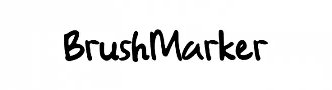
A bold, handwritten font with a playful brush marker style.
![Brush Marker Frei Schriftart Herunterladen]() Herunterladen 67 Downloads@WebFont
Herunterladen 67 Downloads@WebFont -
( Daiana Espósito - Daiana Espósito )
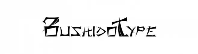
A bold, angular font with sharp edges and dynamic movement.
![BushidoType Frei Schriftart Herunterladen]() Herunterladen 67 Downloads@WebFont
Herunterladen 67 Downloads@WebFont -
( Fonts by Vladimir Nikolic - https://www.creativefabrica.com/product/educated-deers/ref/144265/ - Personal-use only. For commercial use please contact owner. )
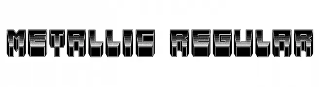
A bold, 3D metallic font with a futuristic and industrial look.
![Metallic Regular Frei Schriftart Herunterladen]() Herunterladen 67 Downloads@WebFont
Herunterladen 67 Downloads@WebFont -
( Fonts by StringLabs - stringlabscreative.com - Personal-use only. For commercial use please contact owner. )
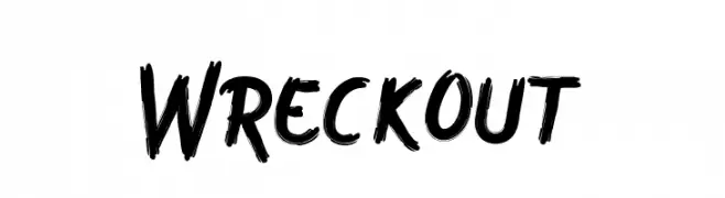
A bold, dynamic brush script with expressive strokes and a hand-painted look.
![Wreckout Frei Schriftart Herunterladen]() Herunterladen 67 Downloads@WebFont
Herunterladen 67 Downloads@WebFont -
( Woodcutter - woodcutter Manero - www.woodcutter.es )
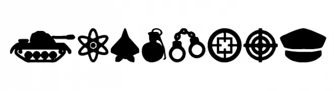
A bold collection of military-themed icons with consistent style and strong visual impact.
![war times Frei Schriftart Herunterladen]() Herunterladen 67 Downloads@WebFont
Herunterladen 67 Downloads@WebFont -
( weknow - Wino S Kadir - www.creativefabrica.com/designer/weknow/ )
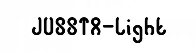
A playful, bold font with rounded, interconnected strokes and a modern, whimsical style.
![JUSSTA-Light Frei Schriftart Herunterladen]() Herunterladen 67 Downloads@WebFont
Herunterladen 67 Downloads@WebFont -
( Fonts by David Rakowski - Personal-use only. For commercial use please contact owner. )
A bold, textured, hand-drawn font with a gritty, urban style.
![Lower East Side Frei Schriftart Herunterladen]() Herunterladen 67 Downloads@WebFont
Herunterladen 67 Downloads@WebFont -
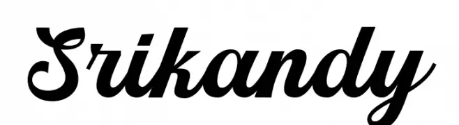
( Fonts by Picatype Studio - Personal-use only. For commercial use please contact owner. )
A bold, elegant script font with flowing cursive design.
![Srikandy Frei Schriftart Herunterladen]() Herunterladen 67 Downloads@WebFont
Herunterladen 67 Downloads@WebFont -
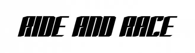
( Fonts by bringtypestudio.co - Bringtype Studio - Personal-use only. For commercial use please contact owner. )
A bold, angular font with a dynamic, forward-leaning design.
![RIDE AND RACE Frei Schriftart Herunterladen]() Herunterladen 67 Downloads@WebFont
Herunterladen 67 Downloads@WebFont -
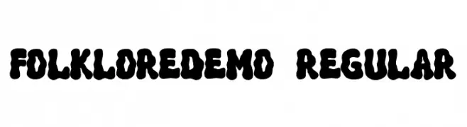
( Fonts by Dharmas Studio )
A bold, playful font with thick, rounded strokes and a whimsical retro style.
![FolkloreDEMO-Regular Frei Schriftart Herunterladen]() Herunterladen 67 Downloads@WebFont
Herunterladen 67 Downloads@WebFont -
( Fonts by Askmewhy - Personal-use only. For commercial use please contact owner. )
A bold, cursive script font with interconnected letters and elegant flourishes.
![Hiestoria Frei Schriftart Herunterladen]() Herunterladen 67 Downloads@WebFont
Herunterladen 67 Downloads@WebFont -
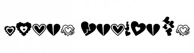
( Ms. DeVine - www.brushstock.com )
A playful, heart-themed decorative dingbat set.
![Loves DevineUS Frei Schriftart Herunterladen]() Herunterladen 67 Downloads@WebFont
Herunterladen 67 Downloads@WebFont


Welche Schriften sind gerade am populärsten?
Poppins, Roboto, Montserrat, Open Sans und Lato sind wegen ihrer klaren Formen und breiten Einsetzbarkeit sehr gefragt – von Markenauftritt über Landingpages bis hin zu Postern.
Welche Fonts eignen sich für Logos?
Geometrische Sans‑Serifs (z. B. Poppins, Familien im Gotham‑Stil) sind ein häufiger Griff für sauberes, skalierbares Branding. Für eine persönlichere Note bleiben Scripts und Handschrift‑Stile beliebt. Kombinieren Sie einen prägnanten Headline‑Font mit einer neutralen Brotschrift für Wiedererkennung und Harmonie.
Wie oft wird die Top‑Liste aktualisiert?
Regelmäßig – basierend auf realen Downloads und Interaktionen. Schauen Sie öfter vorbei, um aufstrebende Favoriten früh zu entdecken.
💡 Tipp: Seite bookmarken – Trends wechseln schnell, und heutige Top‑Schriften inspirieren morgen vielleicht das Rebranding.